
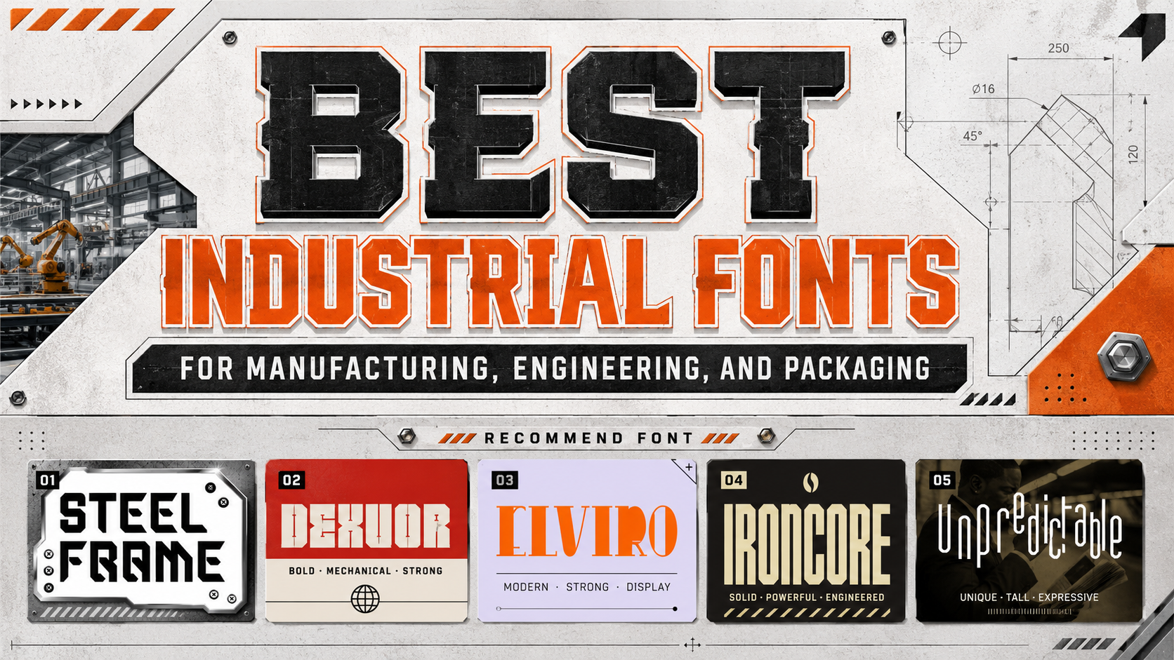
Industrial Design Fonts: Typography for Strength, Precision, and Innovation
Separate Brand Impact From Technical Information
The best industrial design fonts should communicate strength and engineered precision without making labels, specifications, or instructions difficult to read. Use an expressive display font for the logo, product family, model name, packaging headline, or campaign statement. Pair it with a simpler sans serif for dimensions, safety information, technical data, proposals, and interface text.
Before choosing a typeface, define three qualities the brand should express, such as durable, precise, and advanced or minimal, architectural, and dependable. The typography should reflect the actual product, customer, and competitive position rather than looking mechanical for its own sake.
What Makes an Industrial Font Effective?
Industrial typography often uses bold weight, geometric construction, compressed proportions, angular cuts, and controlled spacing. These features can suggest machinery, architecture, manufacturing, engineering, or technical innovation.
A strong system combines one distinctive display face with a readable companion. It also needs clear numerals, useful punctuation, and enough contrast to work across packaging, signage, websites, technical presentations, and mobile screens.
For packaging, use the display font for the brand and model name, then keep specifications, instructions, quantities, and warnings functional. For blueprints and engineering presentations, reserve decorative lettering for covers and section titles rather than measurements or dense annotations.
Jump to Recommended Fonts
Steel Frame Industrial Geometric Font | Dexvor Bold Industrial Display Font | Elviro Block Font | Ironcore Condensed Ligature Font | Unpredictable Display Sans Font
1. Steel Frame Industrial Geometric Font

Steel Frame uses thick strokes, sharp angles, wide proportions, and controlled inner spaces to create an engineered and architectural appearance. Its consistent geometry gives logos and major headlines a stable, authoritative silhouette while preserving clarity at large sizes. The font is particularly effective when a product identity should feel dependable, structural, and purpose-built.
PROS: Strong geometry, confident width, clear construction, excellent visual authority.
BEST FOR: Manufacturing, construction, architecture, engineering, machinery, industrial packaging, and technology branding.
2. Dexvor Bold Industrial Display Font

Dexvor combines tall, heavy characters with angular block geometry, rigid corners, narrow counters, and sharp mechanical cuts. Its vertical structure creates a powerful identity without requiring distressed surfaces or excessive decorative effects. The result feels energetic, technical, and suitable for projects that need a strong modern-industrial presence.
PROS: Tall proportions, mechanical strength, bold visibility, memorable technical character.
BEST FOR: Automotive products, tools, metal industries, engineering campaigns, posters, signage, and futuristic manufacturing brands.
3. Elviro Block Font

Elviro is built from wide, compact forms with thick strokes, minimal contrast, and mostly sharp edges. Its dense block construction communicates confidence and durability, while subtle curved cuts prevent the design from feeling completely rigid. It offers a clean industrial direction for brands that need strength without an aggressive cyber or distressed appearance.
PROS: Solid block structure, high visibility, clean industrial mood, professional versatility.
BEST FOR: Construction firms, real estate, architecture studios, equipment brands, corporate technology, packaging, and promotional signage.
4. Ironcore Condensed Ligature Font
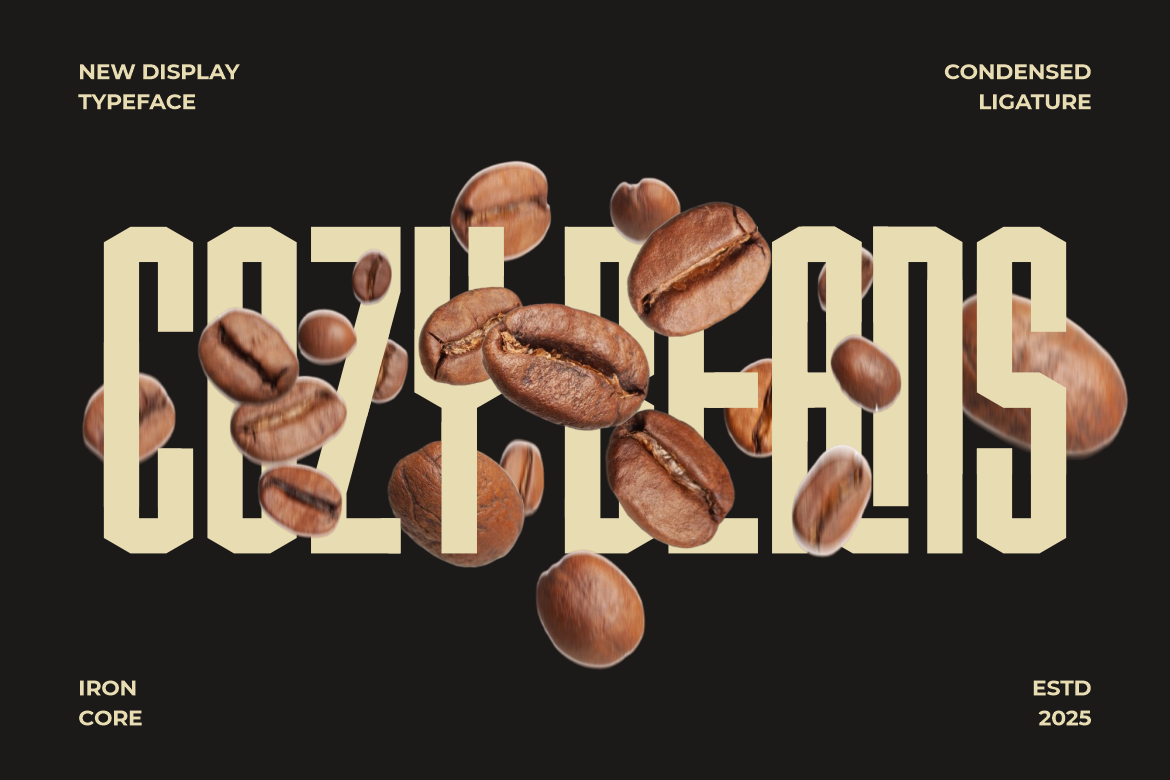
Ironcore uses tall, compact characters, tight vertical proportions, squared corners, and bold geometric precision. Its condensed structure saves horizontal space, while the ligatures add rhythm and customization to logos or product names. This makes it especially valuable for narrow packaging panels, long headlines, and labels where space and visual impact must work together.
PROS: Space-efficient, bold, refined, strong ligature options, excellent headline presence.
BEST FOR: Product labels, tools, sports equipment, coffee packaging, editorial headlines, posters, and compact industrial wordmarks.
5. Unpredictable Display Sans Font

Unpredictable takes a more creative approach through multiple letter heights and baseline positions. Designers can combine normal, low, and high characters with letters positioned above or below the standard baseline, producing irregular but coordinated wordmarks. It is a useful option for industrial startups that want innovation and movement rather than strict mechanical uniformity.
PROS: Flexible character heights, unusual baselines, strong customization, experimental personality.
BEST FOR: Creative technology, apparel, merchandise, product packaging, startup logos, labels, and unconventional promotional campaigns.
Comparison
| Font | Main Personality | Strongest Application | Ideal Brand Direction |
|---|---|---|---|
| Steel Frame | Wide, structural, precise | Corporate industrial identity | Reliable and architectural |
| Dexvor | Tall, angular, mechanical | High-impact campaigns | Powerful and futuristic |
| Elviro | Compact, blocky, clean | Packaging and signage | Stable and professional |
| Ironcore | Condensed, refined, bold | Narrow labels and logos | Technical and space-efficient |
| Unpredictable | Irregular, flexible, creative | Experimental wordmarks | Innovative and unconventional |
Common Mistakes
The first mistake is using an industrial display font for every layer of information. Heavy angles, narrow counters, compact spacing, and unusual ligatures can create an excellent logo but become tiring in technical specifications, instructions, or long presentations. Give the expressive font one focused role and use a clearer companion for functional communication.
Another mistake is assuming that dark colors, metallic gradients, scratches, and mechanical textures automatically create a convincing industrial identity. These treatments can make the design feel theatrical when the underlying typography and hierarchy are weak. Start with the wordmark in one color, refine the spacing, and confirm that the composition communicates strength before adding finishing effects.
The final mistake is approving the font only in a large digital mockup. Thin cuts may disappear during printing, condensed letters can close at small sizes, and irregular baselines may reduce clarity on technical labels. Test packaging proofs, signage, embroidery, vehicle graphics, websites, and mobile layouts, then confirm that the selected license covers the intended logo, packaging, advertising, webfont, or other commercial application.
Conclusion
Strong industrial design fonts help brands communicate durability, engineering competence, and modern innovation.
Steel Frame creates architectural authority, Dexvor provides tall mechanical power, and Elviro offers dependable block geometry. Ironcore delivers condensed efficiency with refined ligatures, while Unpredictable gives creative startups a more experimental industrial voice.
Use these PutraCetol Studio fonts where recognition matters most, then support them with readable typography, clear hierarchy, and disciplined production testing.
The strongest industrial identity does not simply look tough. It feels structured, functional, and designed to perform.
Explore these fonts and many more at PutraCetol.com to build a business identity that looks professional, trustworthy, and memorable.
Additionally, if you want to explore some free typography options, you can check out Putracetol Studio on Dafont. Happy reading and designing!