
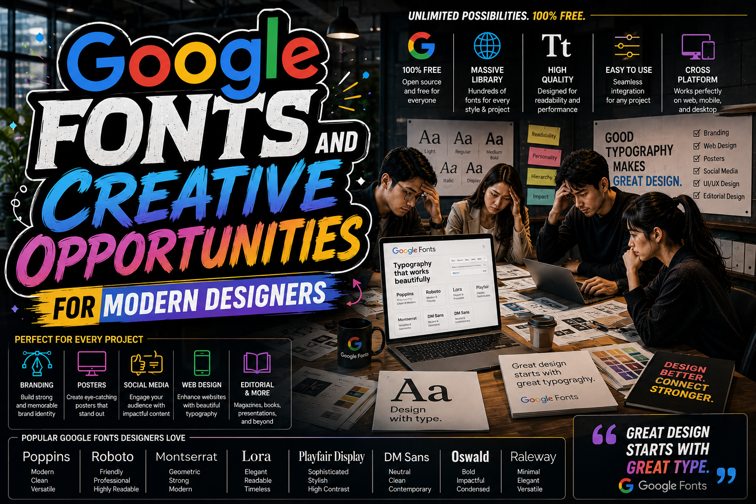
Google Fonts and Creative Opportunities for Modern Designers
Typography has become one of the most important aspects of digital design. Whether it’s a website, mobile app, branding project, or social media campaign, typography influences how audiences perceive information and interact with content.
One of the biggest innovations in modern typography is the rise of Google Fonts. By offering thousands of free and accessible typefaces, Google Fonts has opened creative opportunities for designers, developers, marketers, and brands worldwide.
Today, designers no longer need to rely solely on expensive font libraries or complicated licensing systems. Google Fonts provides an easy and efficient way to experiment with typography while maintaining professional quality across devices and platforms.
In this article, we’ll explore how Google Fonts creative opportunities are transforming digital design, improving user experience, and expanding branding possibilities.
Why Typography Matters in Digital Design
Typography is more than just text styling. It directly affects:
- Readability
- User experience
- Brand perception
- Visual hierarchy
- Emotional tone
A well-chosen typeface can make a website feel modern, luxurious, friendly, or professional. Poor typography, on the other hand, can reduce engagement and weaken credibility.
As digital platforms continue evolving, flexible typography systems have become essential.
What Makes Google Fonts So Popular?
Google Fonts has become one of the most widely used typography resources because it solves several common design problems at once.
1. Massive Font Collection
Google Fonts offers more than 1,000 free fonts across multiple categories:
- Serif
- Sans-serif
- Display
- Handwriting
- Monospace
This allows designers to experiment with different moods and visual styles without purchasing expensive licenses.
Creative Advantages
- More flexibility for branding
- Easier typography exploration
- Wider design possibilities
For modern designers, this accessibility dramatically expands creative freedom.
2. Easy Integration
One of the biggest strengths of Google Fonts is simplicity.
Fonts can be integrated directly into:
- Websites
- CMS platforms
- Web apps
- Design systems
Often, implementation only requires a few lines of code.
Why This Matters
Traditional font installation and licensing can be time-consuming. Google Fonts removes these barriers, making typography faster and more accessible for creators at every level.
3. Consistent Display Across Devices
Consistency is critical in branding and digital experience.
Google Fonts are optimized for:
- Different browsers
- Mobile devices
- Desktop screens
- Various operating systems
This ensures typography remains visually stable and professional regardless of where users access the content.
Google Fonts and User Experience
Typography strongly affects user behavior online.
Improved Readability
Readable typography encourages users to:
- Stay longer on websites
- Read more content
- Interact more comfortably
Google Fonts offers many highly optimized typefaces specifically designed for screen readability.
Better Engagement
Typography helps guide user attention through:
- Hierarchy
- Contrast
- Spacing
- Font weight
Well-structured typography improves navigation and overall engagement.
Global Language Support
One of the most valuable features of Google Fonts is multilingual support.
Many fonts support:
- Latin characters
- Asian scripts
- Cyrillic alphabets
- Arabic typography
This makes Google Fonts highly useful for international brands and multilingual websites.
Customization Flexibility
Modern digital design requires adaptable typography systems.
Google Fonts allows designers to customize:
- Font weights
- Italic styles
- Sizes
- Spacing
This flexibility improves layout control and visual hierarchy.
Variable Fonts
Many Google Fonts now include variable font technology.
Benefits include:
- Faster loading times
- Flexible weight adjustments
- More responsive typography systems
Variable fonts are becoming increasingly important in modern web design.
Best Ways to Use Google Fonts Creatively
Typography should always support the project’s purpose and audience.
Branding and Identity
Fonts help define brand personality.
Examples:
- Serif fonts → Elegant and premium
- Sans-serif → Modern and clean
- Display fonts → Bold and expressive
Google Fonts makes it easier to experiment with branding styles before finalizing identity systems.
Website and UI Design
Clean typography improves:
- Navigation
- Readability
- User comfort
Minimal sans-serif fonts remain popular for modern UI systems.
Social Media Graphics
Typography plays a major role in visual content creation.
Strong font combinations help:
- Increase visibility
- Improve hierarchy
- Strengthen branding consistency
Complementary Fonts from Putracetol
While Google Fonts provides accessibility and versatility, combining them with premium-style creative fonts can elevate branding even further.
Here are five strong typography recommendations from Putracetol.
Urban Dharma Hindi Font – Cultural and Expressive
An exotic typeface with ethnic-inspired character and artistic personality.
Best For
- Cultural projects
- Spiritual branding
- Artistic posters
Why It Works
It adds emotional and cultural depth that standard web fonts often cannot provide.
Vidage Elegant Serif Typeface – Classic and Luxurious
A sophisticated serif font designed for premium branding.
Best For
- Editorial layouts
- Fashion branding
- Luxury businesses
Why It Works
Its elegant structure creates a refined and timeless impression.
Flece Display Modern Sans Font – Minimal and Contemporary
A clean modern sans-serif with excellent digital readability.
Best For
- Startups
- UI design
- Technology branding
Why It Works
Its simplicity aligns perfectly with modern web aesthetics.
Zambeza Display Font – Bold and Artistic
An expressive display font with strong visual impact.
Best For
- Fashion campaigns
- Streetwear branding
- Creative posters
Why It Works
It captures attention quickly and creates memorable visuals.
Paperlight Script Calligraphy Font – Romantic and Elegant
A soft calligraphy font with graceful curves and refined rhythm.
Best For
- Weddings
- Handmade branding
- Lifestyle projects
Why It Works
It creates warmth and emotional connection.
Quick Summary Table
| Font | Characteristics | Best Use |
|---|---|---|
| Urban Dharma Hindi | Exotic, ethnic | Cultural, spiritual |
| Vidage Elegant Serif | Elegant, classic | Luxury, editorial |
| Flece Display Sans | Modern, clean | Startups, technology |
| Zambeza Display | Bold, expressive | Fashion, creative |
| Paperlight Script | Romantic, elegant | Weddings, handmade |
Common Typography Mistakes in Web Design
Even with access to great fonts, poor implementation can weaken the final result.
Using Too Many Fonts
Too many typography styles create inconsistency and visual clutter.
Best Practice
Use:
- 1 display font
- 1 body font
- Optional accent font
Ignoring Readability
Decorative fonts should not be used for long paragraphs.
Poor Hierarchy
Typography hierarchy helps users scan content efficiently.
Use:
- Different font sizes
- Weight variations
- Spacing consistency
Inconsistent Branding
Typography should remain consistent across:
- Websites
- Social media
- Packaging
- Marketing materials
Why Google Fonts Changed Modern Design
Before Google Fonts, web typography was limited and inconsistent. Designers often relied on:
- Default system fonts
- Expensive licenses
- Image-based text solutions
Google Fonts democratized typography by making professional fonts accessible to everyone.
This shift allowed:
- Better branding
- More creative freedom
- Improved web experiences
- Faster digital workflows
Final Thoughts
The rise of Google Fonts creative opportunities has transformed modern digital design. By offering free, accessible, and optimized typography resources, Google Fonts allows designers to experiment freely while maintaining professional quality across platforms.
Combined with creative fonts like Urban Dharma Hindi, Vidage Elegant Serif, Flece Display Modern Sans, Zambeza Display, and Paperlight Script from Putracetol, designers can build stronger visual identities tailored to specific audiences and industries.
Typography is no longer just a technical element, it is a core part of storytelling, branding, and user experience.
For more inspiration, creative resources, and practical design tips, visit Putracetol.com and explore creative resources that can elevate your next web project. Thank you for taking the time to read this article. If you are looking for more great articles, feel free to visit Putracetol Blog.
Additionally, if you want to explore some free typography options, you can check out Putracetol Studio on Dafont. Happy reading and designing!