
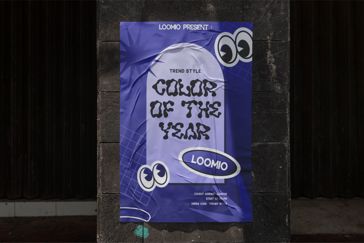
Poster design is one of the most direct forms of visual communication. Unlike books or websites, posters often have only a few seconds to capture attention, deliver a message, and leave a lasting impression. In this context, typography is not just a supporting element. It is often the main visual focus.
Fonts for poster design must work fast and work hard. They need to be readable from a distance, visually striking, and aligned with the theme of the event, product, or message being promoted. A strong poster font can attract viewers instantly, while a weak one can cause the message to be ignored entirely.
This article explores 8 recommended fonts for poster design, focusing on styles that balance readability, contrast, and visual character. Drawing inspiration from curated font collections at Putracetol.com, these recommendations are suitable for a wide range of poster applications, from music events and art exhibitions to formal events and product promotions.
Posters compete for attention in busy visual environments. Whether placed on streets, social media feeds, or event venues, posters are surrounded by noise. Typography helps cut through that noise.
The right poster font:
In poster design, fonts are often more important than images. A single bold headline can determine whether someone stops to look or keeps walking.
Before selecting specific fonts, it is important to understand what makes typography effective in poster design.
Poster text must be readable at a glance. Viewers may see the poster from several meters away or while moving.
Good poster fonts have:
Overly thin or complex fonts reduce legibility and should be avoided for main messages.
Contrast helps text stand out against backgrounds. This includes:
Bold fonts perform especially well for headlines, which are the core of most poster designs.
Typography should match the theme and mood of the poster. A music festival, art exhibition, or corporate event all require different visual tones.
The right font strengthens:
In posters, typography often becomes the central visual element. Headlines must be bold, expressive, and dominant.
Supporting text should complement the headline without competing with it.
Below are eight font recommendations organized by style and practical use. Each font type serves a specific purpose in poster design.

Votrag is a bold sans-serif font designed for clarity and strength. Sans-serif bold fonts are among the most effective choices for posters due to their visibility and modern appearance.
Votrag is ideal when the goal is instant visibility and message clarity.
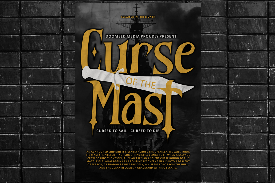
Black Crest is a display font created specifically for headlines. Display fonts are designed to attract attention and add personality.
Black Crest works best when used sparingly as a focal point.
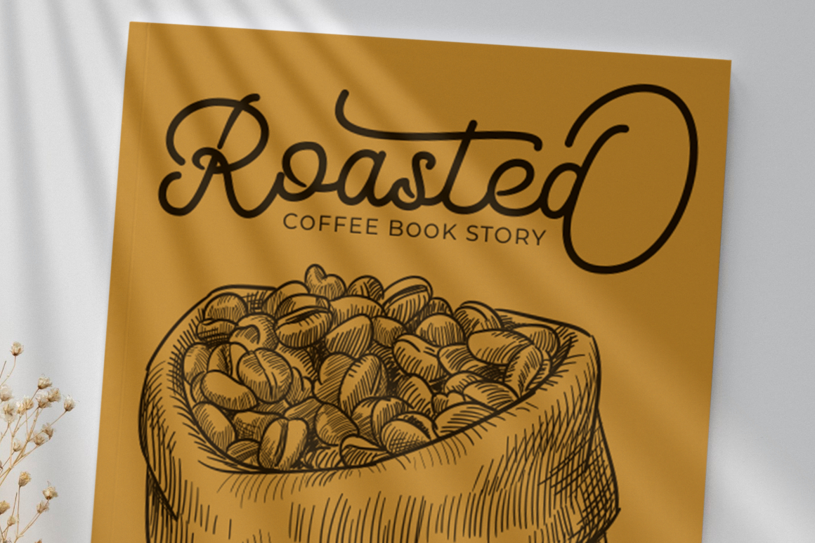
Script fonts like Marie Clarie add an artistic and human touch to poster design. They work well when creativity and emotion are central.
Script fonts should be used for short phrases or titles, not long text blocks.
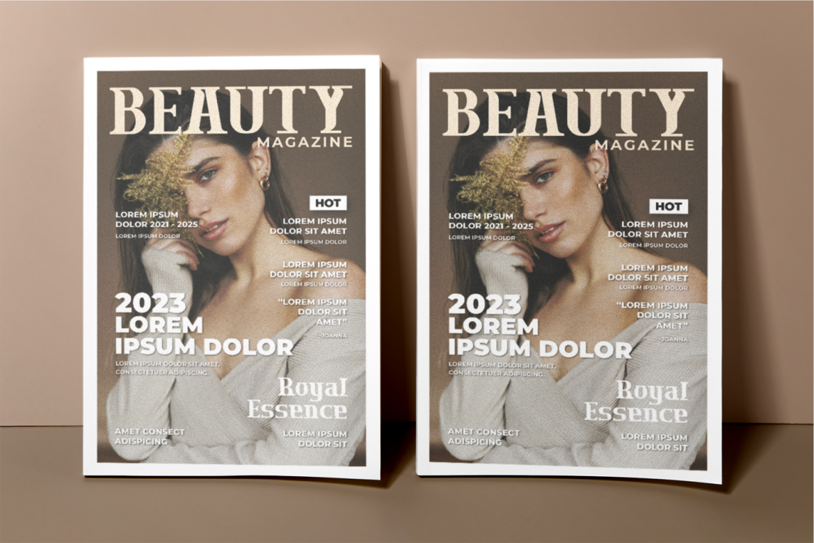
Luxerna is an elegant serif font that brings professionalism and refinement. Serif fonts are well-suited for formal posters.
Luxerna communicates credibility and sophistication.
Boldra is a high-energy font that works well for entertainment-focused posters. It combines boldness with playful rhythm.
Boldra helps convey excitement and movement.
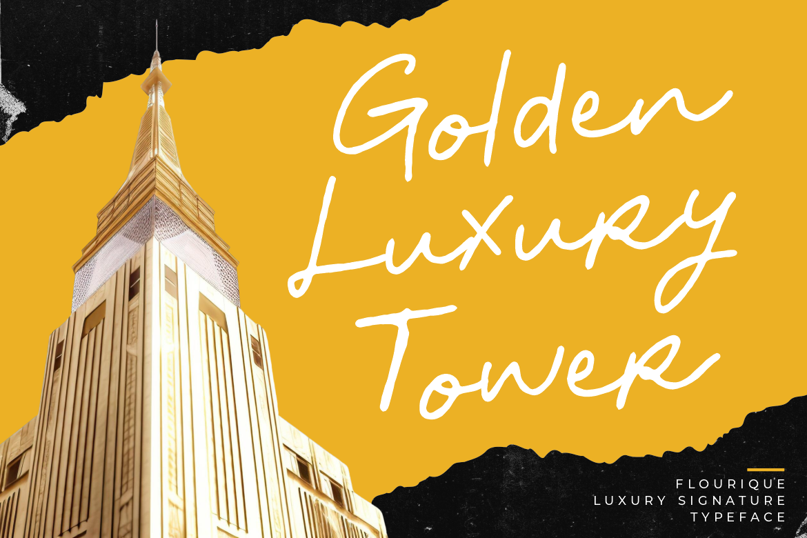
Flourique is a decorative script font that works well for artistic and cultural posters.
Flourique should be paired with simpler fonts for balance.

Crevia is a serif font designed with structure and clarity. It works well for formal posters that require authority.
Crevia supports formal communication without feeling outdated.
Modish Frame is a modern display font designed to support branding and product promotion.
Modish Frame works best when paired with neutral supporting fonts.
Choosing fonts for poster design becomes easier when aligned with event goals.
This alignment improves communication and audience response.
Most posters use more than one font. A strong combination strategy includes:
Avoid using too many fonts, as this reduces clarity and impact.
Designers should avoid:
Poster typography should always prioritize speed of communication.
Putracetol.com offers curated font collections designed for real-world design needs. Many fonts are created with headline usage, branding, and visual impact in mind.
Designers benefit from:
This makes it easier to design posters that are clear, engaging, and memorable.
Choosing the right fonts for poster design is a critical step in creating effective visual communication. Poster fonts must balance readability, contrast, aesthetics, and thematic relevance.
According to Putracetol.com, successful poster typography often relies on bold sans-serif fonts, expressive display fonts, artistic scripts, or elegant serif styles. Whether designing for music events, art exhibitions, formal occasions, or product promotions, the right font choice ensures the message is seen, understood, and remembered.
By selecting fonts thoughtfully and strategically, designers can create posters that not only attract attention but also communicate with clarity and confidence.
Thank you for taking the time to read this article. If you are looking for more great articles, feel free to visit Putracetol Blog
Additionally, if you want to explore some free typography options, you can check out Putracetol Studio on Dafont. Happy reading and designing!
