
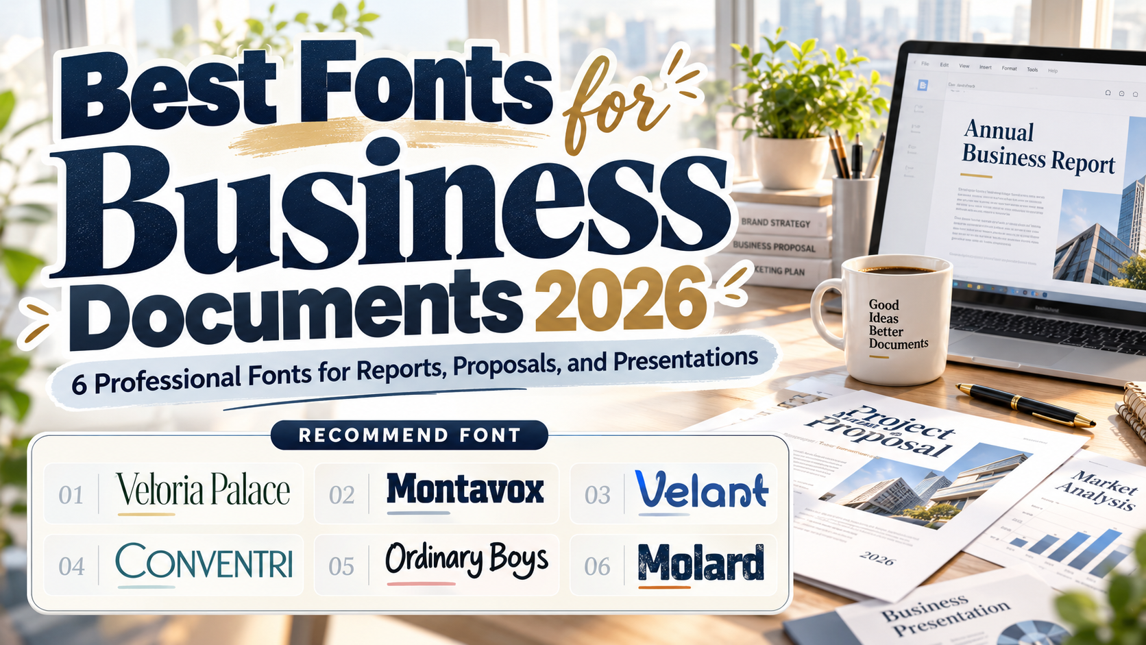
Best Fonts for Business Documents 2026: Professional Typography That Builds Credibility
A business document can contain excellent information and still feel unprofessional when its typography is difficult to read or inconsistent. Reports, proposals, pitch decks, whitepapers, presentations, and internal documents all rely on type to establish hierarchy, readability, and visual credibility.
Choosing the best fonts for business documents 2026 therefore requires more than finding a font that looks corporate. The typeface should match the organization’s personality, remain readable across print and digital formats, and work reliably within the document’s distribution workflow.
For branded documents, the most effective system often combines a distinctive font for titles and headings with a restrained typeface for longer paragraphs.
Initial Suggestion: Design a Typography System, Not Just a Font Choice
Start by defining three roles: headline, subheading, and body text. A distinctive serif or modern display font can give reports and presentations a recognizable brand voice, while long sections should prioritize comfortable reading.
Also consider how the document will be delivered. Custom fonts installed on one computer may be replaced when an editable Word or PowerPoint file is opened on another device that lacks them. Microsoft supports font embedding in Word and PowerPoint, although the font’s own embedding permissions still apply.
For finalized proposals, reports, and client documents, exporting to PDF with permitted font embedding can preserve the intended appearance across systems.
Jump to Recommended Fonts
1. Veloria Palace Classic Serif Font
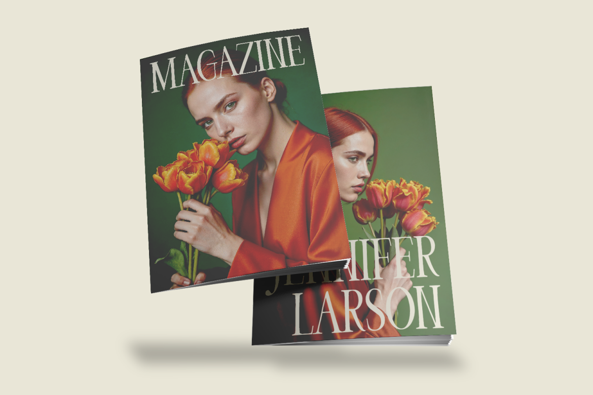
Veloria Palace brings tall, condensed proportions, refined contrast, and graceful serif details to formal document design. Its elegant structure makes it particularly effective for annual-report covers, executive proposals, section titles, editorial-style whitepapers, and premium corporate presentations where typography needs to convey heritage and sophistication.
PROS: Elegant proportions, polished serif character, strong editorial presence.
BEST FOR: Report covers, executive proposals, luxury businesses, whitepaper headings.
2. Montavox Corporate Logo Font

Montavox is a bold slab serif built around thick vertical strokes, squared serifs, and structured geometric proportions. That firm construction gives business documents an authoritative visual voice, especially in presentation titles, financial-report sections, corporate profiles, and proposal covers. Because of its weight, it is better suited to headings than dense body paragraphs.
PROS: Strong hierarchy, stable proportions, confident corporate personality.
BEST FOR: Corporate reports, consulting proposals, pitch decks, section headings.
3. Velant Unique Experimental Font
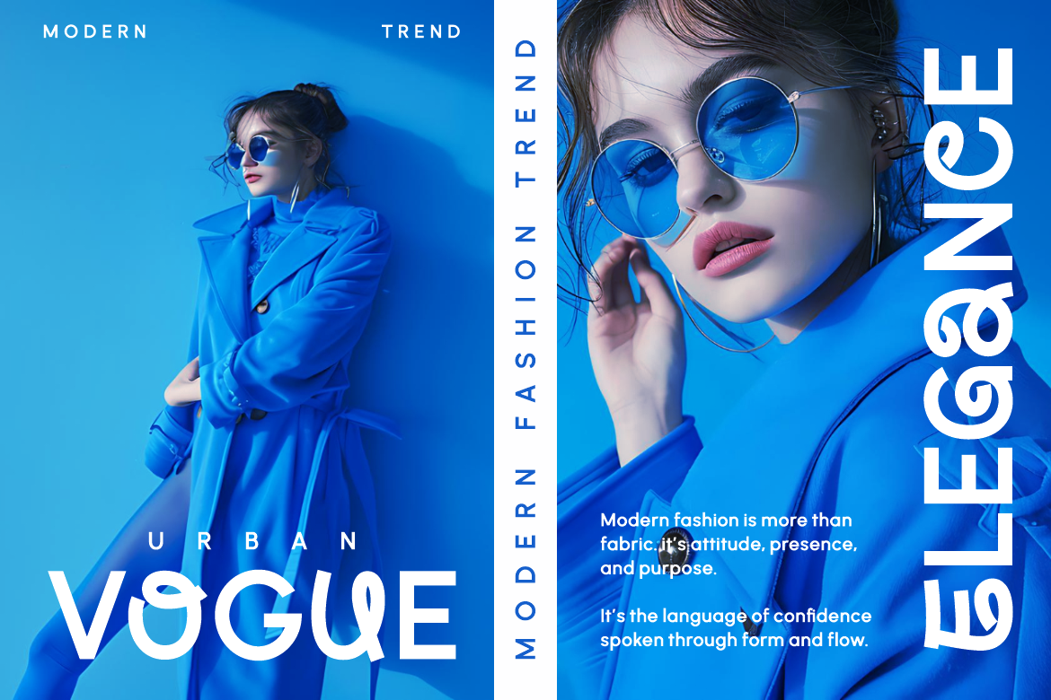
Velant introduces a more progressive direction through bold proportions and experimental display forms. It can help technology companies, design studios, startups, and innovation-focused businesses move away from predictable corporate typography while retaining a structured appearance. Use it selectively for presentation covers, chapter openers, key statements, and branded highlights rather than long reading sections.
PROS: Distinctive contemporary identity, strong display presence, creative personality.
BEST FOR: Startup decks, innovation reports, creative agencies, technology presentations.
4. Conventri Modern Font

Conventri combines clean sans-serif construction with curled decorative details and ligatures. The family includes regular, bold, display regular, and display bold styles, which gives designers more flexibility when building document hierarchy. Its modern foundation works particularly well in creative-business presentations and branded proposals, while the more decorative forms are best reserved for larger text.
PROS: Multiple styles, modern structure, distinctive decorative details.
BEST FOR: Creative proposals, presentation titles, agency documents, branded reports.
5. Ordinary Boys Elegant Font Duo
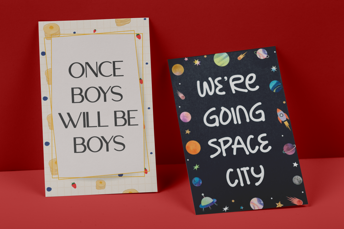
Ordinary Boys combines a modern sans serif with a handwriting style, providing two contrasting voices within one package. The sans-serif component can establish a polished contemporary foundation, while the handwriting style can add personality to quotes, signatures, introductions, or selected callouts. This makes the duo useful for businesses that want professional documents without appearing overly institutional.
PROS: Coordinated font pairing, clean sans serif plus expressive accent style.
BEST FOR: Boutique businesses, creative proposals, personal brands, presentation accents.
6. Molard Modern Various Font

Molard provides a sturdy modern sans-serif direction with clean and textured variants, multiple weights, and several stylistic versions. Its stronger forms can create confident titles, statistics pages, quotations, and branded presentation slides, while the different styles give designers room to vary emphasis without introducing unrelated font families.
PROS: Multiple styles, bold modern character, useful visual variation.
BEST FOR: Business presentations, creative reports, marketing decks, strong headings.
Comparison: Which Business Font Fits Your Document?
| Font | Character | Recommended Document Role |
|---|---|---|
| Veloria Palace | Refined, classic | Executive covers and headings |
| Montavox | Strong, corporate | Report and proposal titles |
| Velant | Experimental, modern | Startup and innovation decks |
| Conventri | Modern, expressive | Creative-business presentations |
| Ordinary Boys | Elegant, personal | Proposals and branded accents |
| Molard | Bold, versatile | Marketing reports and presentations |
For long reports, consider pairing these expressive fonts with a neutral body typeface. This preserves brand personality without sacrificing reading comfort.
Common Mistakes in Business Document Typography
One common mistake is using an attractive display font for every paragraph. A typeface that creates a memorable cover may become tiring across 20 pages of financial analysis. Establish hierarchy instead: use branded typography for titles, chapter headings, pull quotes, and important figures, while keeping long text simple. Avoid excessive font sizes, weights, colors, and decorative styles within the same document because inconsistency weakens the professional impression.
Another issue is ignoring document portability. Sending an editable presentation containing a custom font does not guarantee that every recipient will see the same layout. Test Word and PowerPoint files on another device, confirm whether embedding is permitted, and create a PDF version for final distribution when appropriate. Microsoft specifically notes that non-standard fonts may be substituted if they are unavailable on the recipient’s computer. Microsoft Support
Finally, check commercial licensing before rolling a typeface into company templates. Internal teams, external agencies, editable templates, websites, and other uses can require different coverage. Typography should be managed as a licensed business asset, not simply a decorative download.
Conclusion
The best fonts for business documents 2026 balance professionalism, readability, brand personality, and practical distribution. Veloria Palace brings refinement, Montavox creates corporate authority, Velant offers experimentation, Conventri adds contemporary personality, Ordinary Boys introduces elegant contrast, and Molard provides bold flexibility.
Explore these fonts at PutraCetol Studio and build a document typography system that makes reports, proposals, presentations, and branded communication feel consistent, intentional, and unmistakably yours.
Explore these fonts and many more at PutraCetol.com to build a business identity that looks professional, trustworthy, and memorable.
Additionally, if you want to explore some free typography options, you can check out Putracetol Studio on Dafont. Happy reading and designing!