
Designing a book is not only about layout, cover art, or illustrations. One of the most critical elements in book design is typography. The font used in a book directly affects readability, comfort, emotional tone, and how long readers can stay engaged with the text. A poorly chosen font can make even the best-written content feel tiring, while the right font can elevate the entire reading experience.
Fonts for book design must work harder than fonts for posters or logos. They need to remain clear over hundreds of pages, support the mood of the story, and feel consistent from beginning to end. This is why designers must choose book fonts carefully, based on readability, aesthetics, and genre suitability.
This article explores 8 recommended fonts for book design, inspired by typographic principles and curated font collections from Putracetol.com. Each font category serves a different purpose, from classic literature and academic texts to memoirs and children’s books. By understanding these options, designers and publishers can create books that are not only visually appealing but also comfortable and enjoyable to read.
Books are long-form reading experiences. Unlike digital content that is scanned quickly, books demand sustained attention. Typography plays a central role in supporting that attention.
The right book font:
Font choice is not decorative. It is functional, emotional, and strategic.
Before exploring specific recommendations, it is important to understand what makes a font suitable for books.
Readability is the most important requirement for book fonts. Readers should be able to move through paragraphs effortlessly.
Readable book fonts typically have:
Fonts that look attractive but sacrifice clarity should be avoided for long text.
Books require visual harmony. A font should feel consistent across pages and chapters.
Consistency helps:
Fonts with stable proportions and predictable rhythm perform best.
Book fonts must remain legible at different sizes. Body text is often set small, especially in novels and academic books.
A good book font:
This flexibility supports layout efficiency.
Typography subtly influences emotion. A font can feel serious, warm, playful, or formal.
Matching font style to genre:
Below are eight font recommendations categorized by style and book type. Each one offers specific strengths that make it suitable for certain publications.

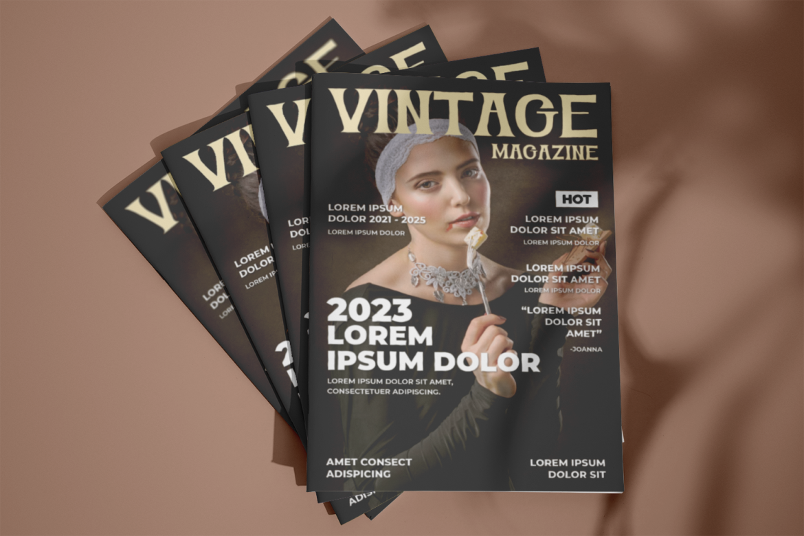
Luxerna is a classic serif font that brings a sense of tradition and refinement. Serif fonts are widely used in novels and literary works because their small strokes guide the eye smoothly across lines of text.
Luxerna is ideal when the goal is to create a classic and immersive reading experience.

Velant is a modern sans-serif font known for its clean structure and high readability. While serif fonts dominate traditional book design, sans-serif fonts are increasingly used in non-fiction and practical publications.
Velant supports clarity and efficiency, making it suitable for informative content.
Firanza represents a transitional style, combining the elegance of serif fonts with modern proportions. Transitional fonts bridge classic and contemporary design.
Firanza offers flexibility for books that need both warmth and structure.

Humanist fonts are inspired by natural handwriting and calligraphy. Linust has a friendly, organic feel that makes text feel more personal.
Linust helps readers feel emotionally connected to the text.
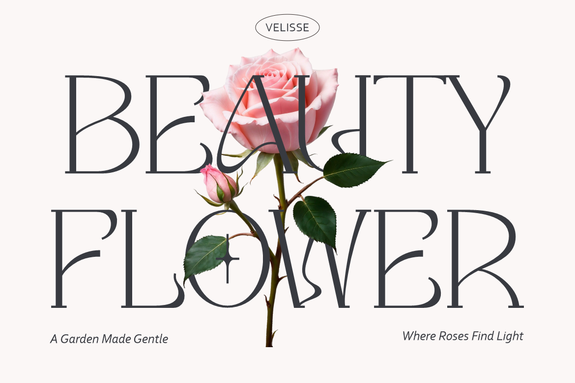
Velisse is another serif font designed with long-form reading in mind. It leans toward traditional book typography with strong vertical rhythm.
Velisse is well-suited for books that value timeless presentation.

Rolever is a modern sans-serif font designed for clarity and structure. It performs well in academic and reference materials where precision matters.
Rolever supports credibility and professionalism in academic contexts.
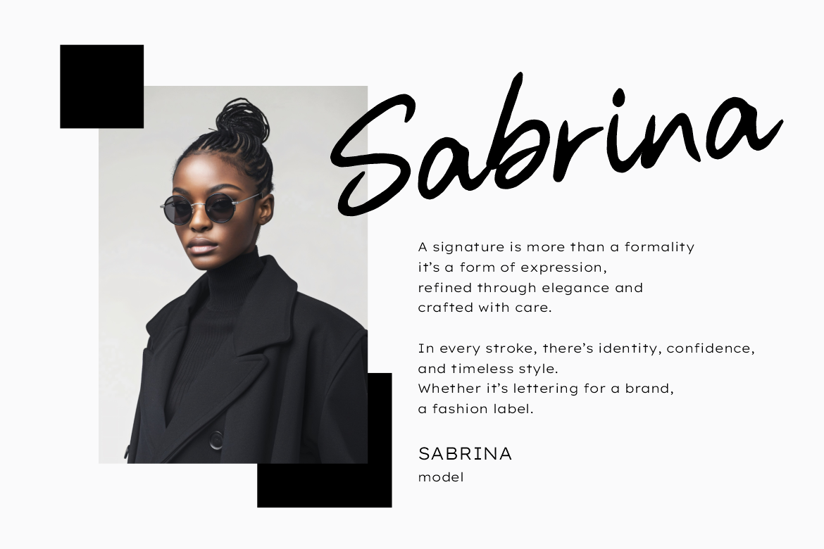
Handistry is a handwriting-style font that adds personality and intimacy. While not suitable for full body text in most books, it works well for selective use.
Handistry should be used sparingly to avoid fatigue.
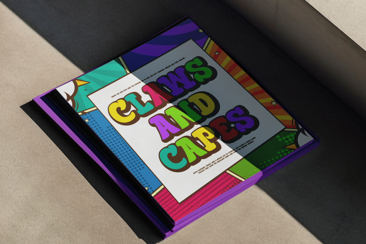
Mega Boldy is a playful font with strong readability, making it suitable for children’s books and educational materials.
Mega Boldy helps young readers engage with text comfortably.
Choosing fonts for book design becomes easier when matched with genre expectations.
Genre alignment helps readers feel at home with the content.
Serif fonts are traditionally preferred for long reading because their small strokes help guide the eye. Sans-serif fonts, however, work well in modern layouts and digital formats.
A common strategy:
This combination balances comfort and clarity.
Fonts should be tested in both print and digital formats when possible.
Print-focused fonts:
Digital-friendly fonts:
Many fonts from Putracetol.com are designed to perform well in both environments.
Designers should avoid:
Typography decisions should always prioritize the reader.
Putracetol.com curates fonts with real-world usability in mind. The collections emphasize readability, balance, and versatility, making them suitable for book design across genres.
Designers benefit from:
This makes it easier to build consistent and comfortable reading experiences.
Choosing the right fonts for book design is essential for creating a successful reading experience. Fonts must balance readability, aesthetics, and genre suitability to support long-form content effectively.
According to Putracetol.com, book fonts should never be chosen randomly. Whether using classic serif fonts like Luxerna and Velisse, modern sans-serif options like Velant and Rolever, or expressive fonts like Linust, Handistry, and Mega Boldy, typography should always serve the reader first.
By selecting fonts thoughtfully, designers can enhance storytelling, improve comfort, and reinforce the book’s visual identity from the first page to the last.
Thank you for taking the time to read this article. If you are looking for more great articles, feel free to visit Putracetol Blog
Additionally, if you want to explore some free typography options, you can check out Putracetol Studio on Dafont. Happy reading and designing!
