

Fonts for Electric Vehicle Brands: Typography for the Future of Mobility
Define the EV Brand Position Before Choosing a Font
The best fonts for electric vehicle brands should express more than speed. Electric mobility can represent technological progress, environmental responsibility, premium comfort, urban efficiency, adventure, or high-performance driving.
Start by defining three qualities the brand should communicate:
- Clean, intelligent, and dependable
- Fast, advanced, and competitive
- Sustainable, approachable, and modern
- Premium, refined, and innovative
- Rugged, powerful, and adventure-ready
A luxury electric sedan should not use the same typography as an off-road electric truck or a youth-focused electric scooter. The typeface must support the product’s real character.
Build a two-part typography system:
Primary display font: Logo, model name, campaign headline, charging-station branding
Functional companion: Specifications, navigation, battery information, interfaces, and legal text
This lets the brand feel distinctive without sacrificing clarity.
What Makes EV Typography Effective?
Modern EV typography often uses geometric construction, sleek lines, angular cuts, controlled spacing, and streamlined proportions. These features can suggest engineering precision, digital intelligence, and forward movement.
However, futuristic does not always mean aggressive. Premium EV brands may use wider spacing and restrained geometry, while performance brands can use slanted letters and speed-inspired extensions. Urban mobility platforms may benefit from friendlier, more rounded forms.
The identity should also work across:
- Vehicle badges
- Charging stations
- Mobile applications
- Dealer signage
- Packaging and accessories
- Digital advertising
- Launch presentations
- Model-number systems
Test the typography in monochrome before adding metallic gradients, neon accents, or motion effects. A strong EV wordmark should remain recognizable without decoration.
Jump to Recommended Fonts
Digitechno | Inferno Racers | Rapido Racers | Nitro Nova | Fastlane | Rock Road
1. Digitechno

Digitechno is a futuristic display typeface influenced by modern digital technology. It includes uppercase and lowercase characters, numerals, symbols, and alternate glyphs, giving designers room to customize model names and technology-led wordmarks. Its balance between technical personality and readable construction makes it one of the most flexible choices in this collection.
PROS: Readable futuristic style, alternate glyphs, broad branding versatility.
BEST FOR: EV startups, charging platforms, smart dashboards, mobility software, vehicle logos, and technology campaigns.
2. Inferno Racers

Inferno Racers combines angular geometry with bold curves to communicate speed and high-performance motion. Its five coordinated styles include regular, speedline, digital-dot, flame, and extended slanted treatments, allowing one EV campaign to create several related visual effects without switching type families.
PROS: Five styles, strong motion cues, high-impact campaign flexibility.
BEST FOR: Performance EVs, electric supercars, racing concepts, launch events, motorsport partnerships, and dynamic advertising.
3. Rapido Racers
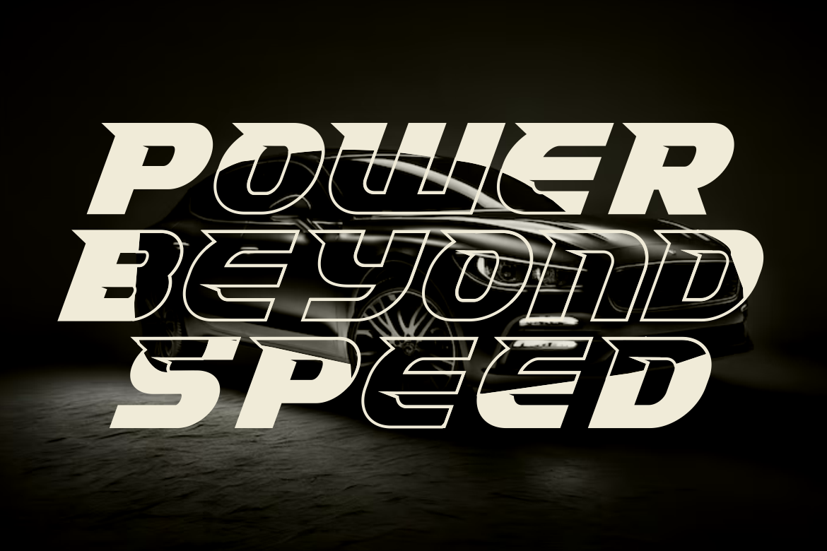
Rapido Racers offers 13 speed- and sport-oriented variations built around dynamic, quirky display forms. Its mixture of pixel-inspired detail and energetic styling gives electric mobility a younger and more expressive personality than conventional minimalist automotive typography.
PROS: Thirteen variations, lively visual rhythm, strong campaign adaptability.
BEST FOR: Youth-oriented EVs, electric motorcycles, esports partnerships, charging promotions, posters, and social media launches.
4. Nitro Nova
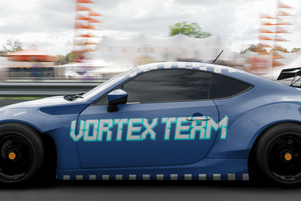
Nitro Nova uses sleek lines, sharp angles, and precise curves to combine digital technology with racing energy. Its modern display structure can make an electric model name feel fast and technically advanced without depending entirely on decorative effects.
PROS: Sleek construction, clear movement, modern technology character.
BEST FOR: Electric sports cars, performance trims, battery-technology campaigns, concept vehicles, and automotive headlines.
5. Fastlane Sport Font

Fastlane uses sharp angular cuts, aerodynamic forms, bold weight, and motion-inspired extensions. The family includes five styles and introduces enough texture and speed-related detail to support high-energy branding while maintaining a recognizable athletic silhouette.
PROS: Five styles, aerodynamic personality, bold promotional impact.
BEST FOR: Electric racing, high-performance sedans, automotive events, charging partnerships, sports sponsorships, and vehicle campaigns.
6. Rock Road Racing Font

Rock Road combines sharp, consistent angles with a hard and powerful display structure. It includes uppercase and lowercase forms, alternates, ligatures, numerals, punctuation, and multilingual support, making it useful for broader identity systems rather than one isolated headline.
PROS: Strong angular forms, ligature options, rugged identity, extensive character support.
BEST FOR: Electric trucks, off-road EVs, adventure vehicles, rugged charging equipment, apparel, and outdoor mobility branding.
Comparison
| Font | Main Personality | Strongest EV Application |
|---|---|---|
| Digitechno | Clean and technological | General EV and mobility branding |
| Inferno Racers | Fast and dramatic | Performance EV campaigns |
| Rapido Racers | Quirky and energetic | Youth and lifestyle mobility |
| Nitro Nova | Sleek and precise | Electric sports models |
| Fastlane | Athletic and aerodynamic | Racing and promotional branding |
| Rock Road | Rugged and powerful | Electric trucks and adventure EVs |
Common Mistakes
The first mistake is assuming every electric vehicle brand needs neon colors, circuit patterns, and aggressively futuristic lettering. These elements can quickly make unrelated companies look identical. Build the typography around the vehicle’s position, whether it emphasizes luxury, affordability, software, sustainability, performance, or outdoor capability.
Another mistake is using the display font for every layer of communication. Racing cuts and angular terminals may create an excellent model name but become difficult to read in battery specifications, charging instructions, navigation, and mobile interfaces. Use expressive typography for recognition and a simpler companion for functional information.
The final mistake is approving the identity only on a large presentation mockup. Test the font on a vehicle badge, charging screen, mobile advertisement, dealership sign, and small model label. Confirm the required commercial coverage for logos, websites, applications, advertising, merchandise, and other planned uses before launch.
Conclusion
Strong fonts for electric vehicle brands can communicate innovation, speed, precision, sustainability, and confidence before customers experience the vehicle itself.
Digitechno provides versatile digital character, while Inferno Racers and Fastlane create high-performance energy. Rapido Racers supports more youthful campaigns, Nitro Nova offers sleek speed, and Rock Road brings a rugged identity to electric trucks and adventure mobility.
Use these PutraCetol Studio fonts where brand recognition matters most, then support them with clear functional typography. The strongest EV identity should not merely look futuristic. It should make the brand’s vision of mobility visible and memorable.
Explore these fonts and many more at PutraCetol.com to build a business identity that looks professional, trustworthy, and memorable.
Additionally, if you want to explore some free typography options, you can check out Putracetol Studio on Dafont. Happy reading and designing!