
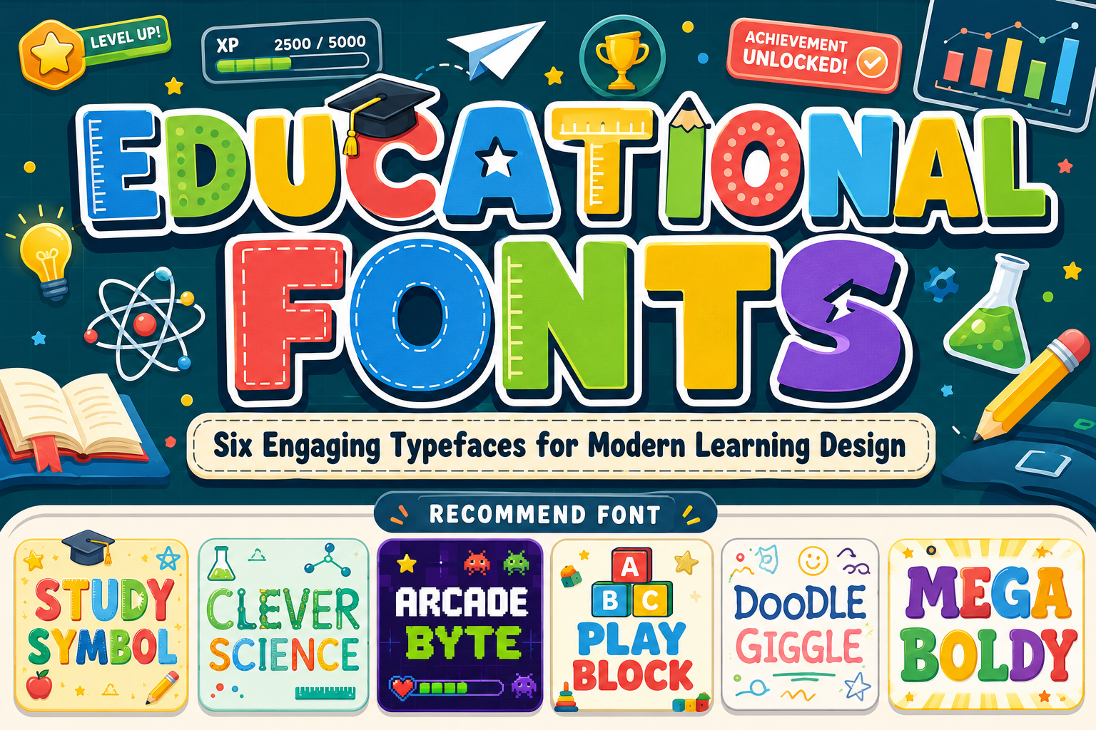
Educational Fonts: Typography for Clear, Engaging, and Professional Learning
The best educational fonts support the learner before they decorate the lesson. A playful display font can make a course cover, classroom poster, science activity, or educational game feel inviting, but longer explanations still need a simpler companion typeface.
Build a two-level system:
Display font: titles, subject labels, campaign graphics, badges, and activity headings
Functional font: paragraphs, instructions, questions, navigation, captions, and assessments
This separation keeps the visual identity engaging without making students work harder to read. For digital learning, maintain strong text contrast. WCAG 2.2 specifies at least 4.5:1 for normal text and 3:1 for qualifying large text, and unusual fonts may require stronger practical contrast.
What Makes an Educational Font Effective?
An effective educational typeface should match the learner’s age, the subject, and the medium.
Young audiences may respond well to rounded characters, soft edges, hand-drawn details, and cheerful proportions. Science and technology lessons can use themed or pixel-based display fonts to establish context, while university and corporate training normally need more controlled typography.
A good educational system should provide:
- Recognizable letterforms
- Open counters
- Clear numerals and punctuation
- Comfortable spacing
- Strong size hierarchy
- Consistency across slides, worksheets, and screens
Decorative typography should create interest at entry points. It should not dominate body copy, quizzes, form labels, or detailed instructions.
Using Educational Fonts Across Learning Media
For presentations, use expressive typography on the opening slide and major section dividers, then switch to readable text for explanations. In printed modules, reserve the display font for chapter titles, activity names, and callout boxes.
EdTech products should keep navigation, progress indicators, feedback, and assessment text functional. A themed font can still strengthen onboarding screens, achievement badges, game levels, and promotional campaigns.
Institutional branding can also combine friendliness with professionalism. The logo may use a distinctive educational display font, while official communication relies on a stable serif or sans serif family.
Jump to Recommended Fonts
Study Symbol | Clever Science | Arcade Byte | Play Block | Doodle Giggle | Mega Boldy
1. Study Symbol Quirky Education Theme Font

Study Symbol uses thick lines, soft edges, and a bold whimsical structure. Its ten themed variations reference books, apples, mathematics, pencils, rulers, graduation, and other school-related elements, making it useful for building a coordinated visual learning system.
PROS: Ten education-themed variations, strong visibility, cheerful personality.
BEST FOR: School posters, children’s books, activity titles, stickers, invitations, and classroom branding.
2. Clever Science Quirky Education Theme Font
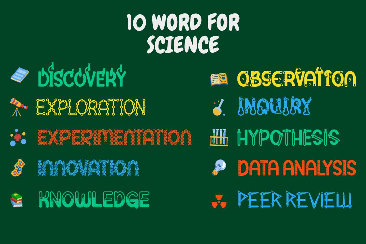
Clever Science combines rounded characters with eleven science-focused variations, including laboratory, DNA, magnet, microscope, tube, ruler, and other technical themes. It gives STEM materials a playful identity without requiring separate illustrations for every subject.
PROS: Eleven coordinated styles, strong STEM theme, versatile display system.
BEST FOR: Science clubs, laboratory activities, STEM events, educational packaging, and children’s magazines.
3. Arcade Byte Pixel Game Font

Arcade Byte uses thick pixel strokes, square edges, stepped corners, and grid-based geometry inspired by classic arcade and early console graphics. Its compact structure creates clear display impact for gamified learning and technology-related educational projects.
PROS: Recognizable pixel style, bold construction, nostalgic digital character.
BEST FOR: Coding courses, educational games, esports clubs, digital-literacy programs, and achievement screens.
4. Play Block Playful Display Font
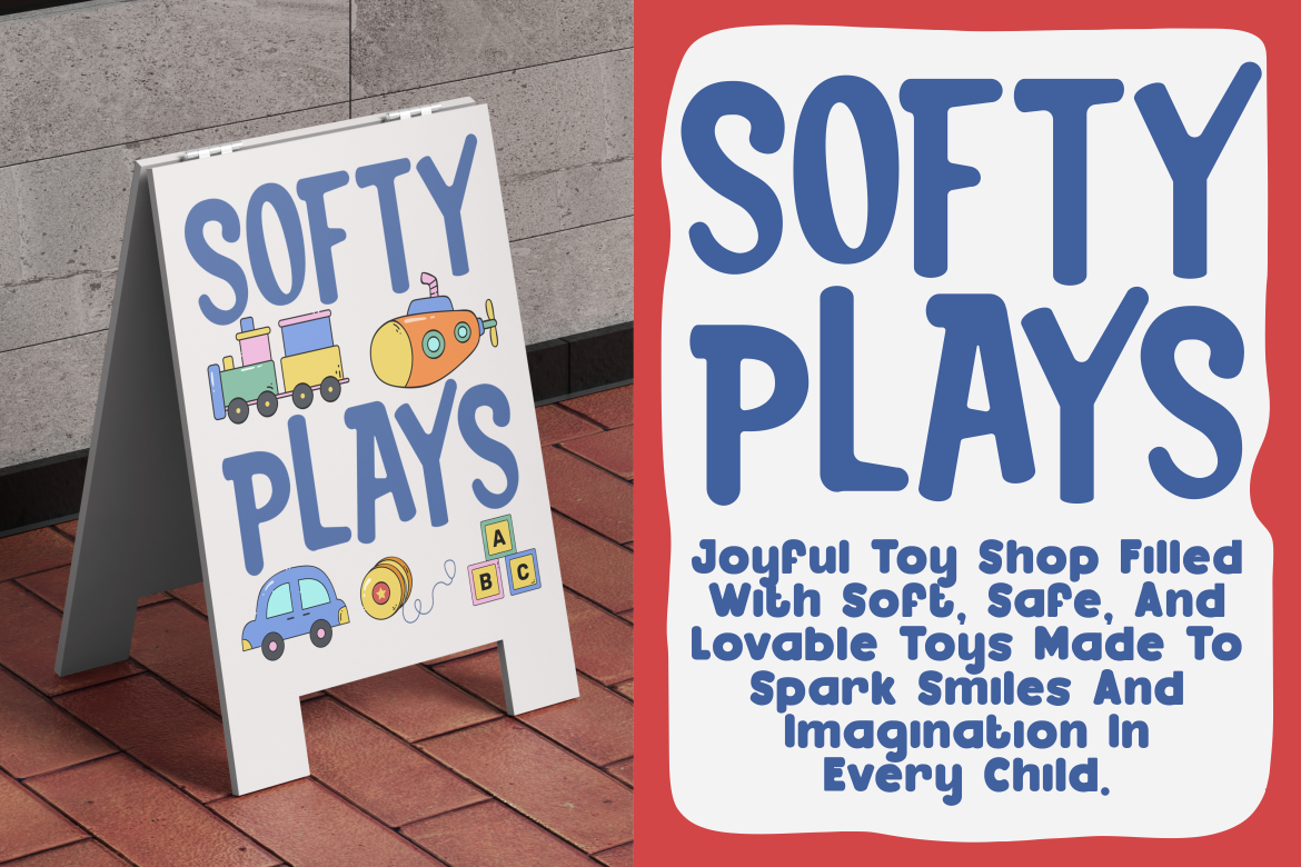
Play Block features thick, compact letterforms with rounded edges and slightly uneven curves. Its stable construction resembles building blocks while remaining cheerful and approachable, making it especially suitable for hands-on and early-learning themes.
PROS: Strong readability, friendly geometry, energetic block-inspired forms.
BEST FOR: Activity books, toy branding, daycare materials, educational games, and classroom headlines.
5. Doodle Giggle Playful Doodle Font

Doodle Giggle recreates the spontaneous feeling of children’s drawings through freehand shapes, irregular strokes, bubbly curves, and intentionally imperfect forms. Its handmade personality adds warmth to educational visuals and creative activities.
PROS: Authentic doodle character, warm visual tone, expressive handmade rhythm.
BEST FOR: Art classes, stationery, school posters, creative workshops, children’s branding, and book covers.
6. Mega Boldy Playful Bold Font
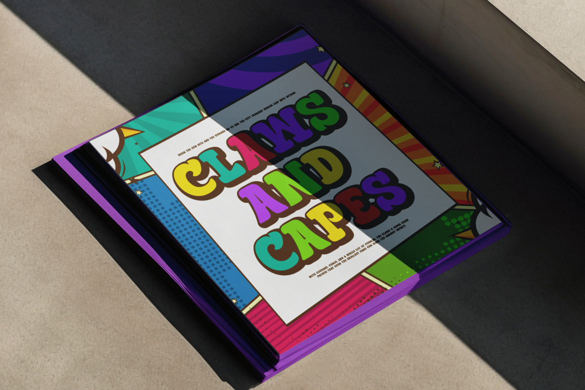
Mega Boldy uses chunky rounded letters, exaggerated bounce, smooth bubbly strokes, and a comic-inspired silhouette. Its substantial weight helps titles remain visible in colorful layouts while communicating optimism and youthful energy.
PROS: Bold impact, friendly curves, energetic comic personality.
BEST FOR: Preschool campaigns, educational apparel, storybooks, event posters, and playful course covers.
Comparison
| Font | Strongest Direction | Best Educational Use |
|---|---|---|
| Study Symbol | General school themes | Classroom identity |
| Clever Science | STEM and laboratory themes | Science education |
| Arcade Byte | Pixel gaming | Gamified learning |
| Play Block | Building and activity play | Early education |
| Doodle Giggle | Hand-drawn creativity | Art and craft lessons |
| Mega Boldy | Bold comic energy | Campaigns and children’s publishing |
Common Mistakes
The first mistake is using a playful display font for complete lessons. Decorative letterforms may work beautifully in a title but become tiring across instructions, paragraphs, and assessments. Keep the expressive font focused on hierarchy and pair it with a readable text family.
Another mistake is assuming that every educational design should look childish. University courses, professional certification, and corporate training need different levels of formality. Match the typography to the learner, subject, and credibility expected from the institution.
The final mistake is approving typography only at presentation size. Test worksheets in print, course screens on mobile devices, and activity headings at real dimensions. Also confirm that the selected license covers the intended presentation, publishing, website, application, editable template, or institutional use.
Conclusion
Strong educational fonts make learning materials easier to recognize, navigate, and remember. Study Symbol and Clever Science provide themed visual systems, Arcade Byte supports gamified learning, Play Block adds friendly structure, Doodle Giggle introduces handmade creativity, and Mega Boldy delivers confident youthful energy.
Use these PutraCetol Studio fonts for the moments where personality matters most, then support them with functional typography for sustained reading. The result can feel engaging without losing clarity, consistency, or professionalism.
Explore these fonts and many more at PutraCetol.com to build a business identity that looks professional, trustworthy, and memorable.
Additionally, if you want to explore some free typography options, you can check out Putracetol Studio on Dafont. Happy reading and designing!