
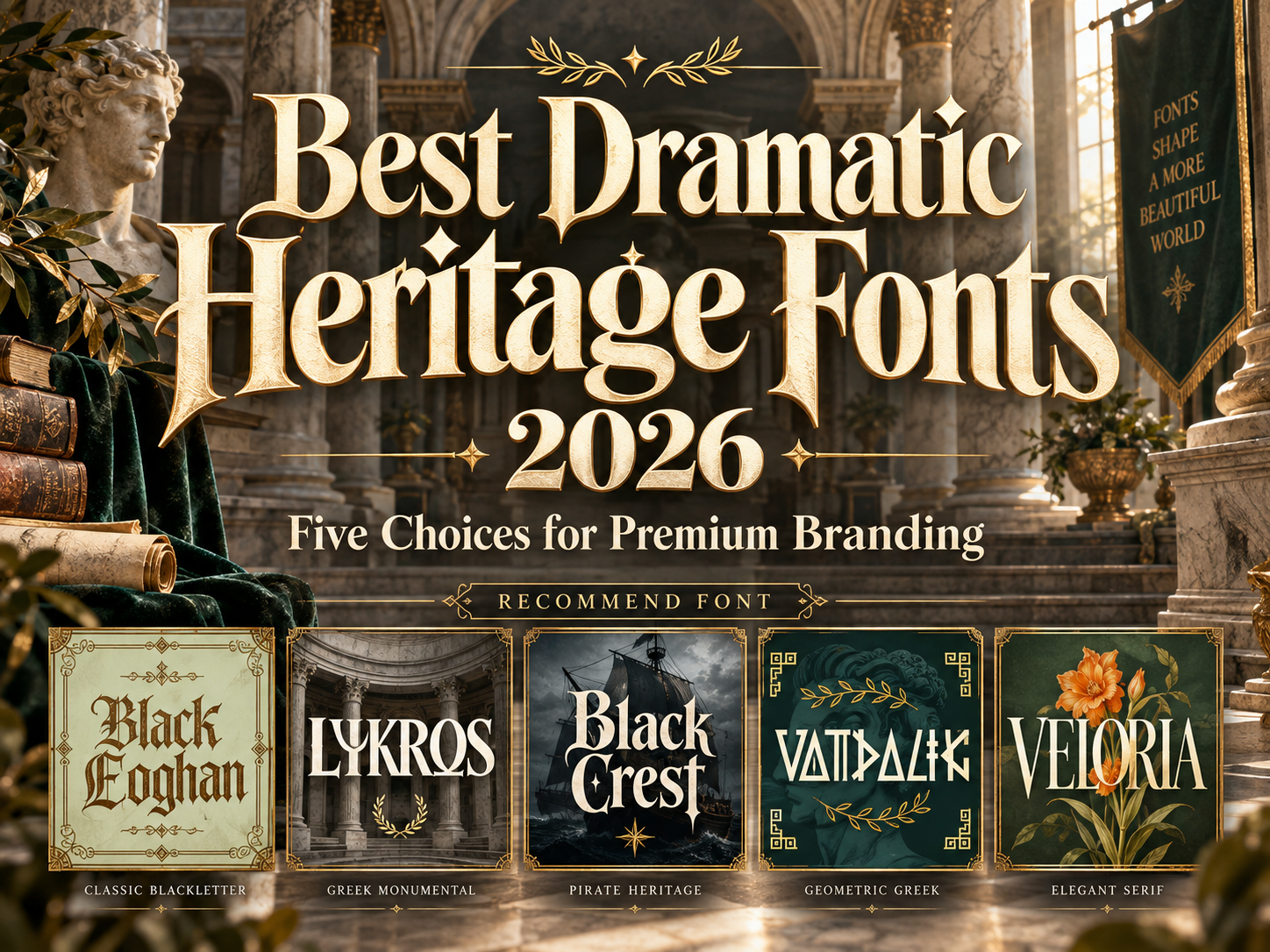
Best Dramatic Heritage Fonts 2026: Tradition With Presence
Choose the Story Before the Style
The best dramatic heritage fonts for 2026 should reflect a specific story, not simply make a brand look older. Begin with the business’s place, craftsmanship, audience, and documented history.
For an established company, identify lettering details worth preserving. For a new business, describe the identity as heritage-inspired rather than inventing a prestigious past. Treat these contemporary display fonts as creative interpretations, not archival reproductions.
Use expressive lettering for names, collection titles, and major headlines. Keep practical information in a readable companion family.
What to Test Before Choosing
Create three samples: a package, an entrance sign, and a mobile header. Test the actual name, longest product title, numerals, and punctuation.
Begin in monochrome so texture and metallic effects cannot hide weak spacing. For architectural projects, compare the proposed lettering with existing materials and archival references. Ask the fabricator to test fine details before specifying engraving, foil, or raised lettering.
Jump to Recommended Fonts
1. Black Eoghan Blackletter Font
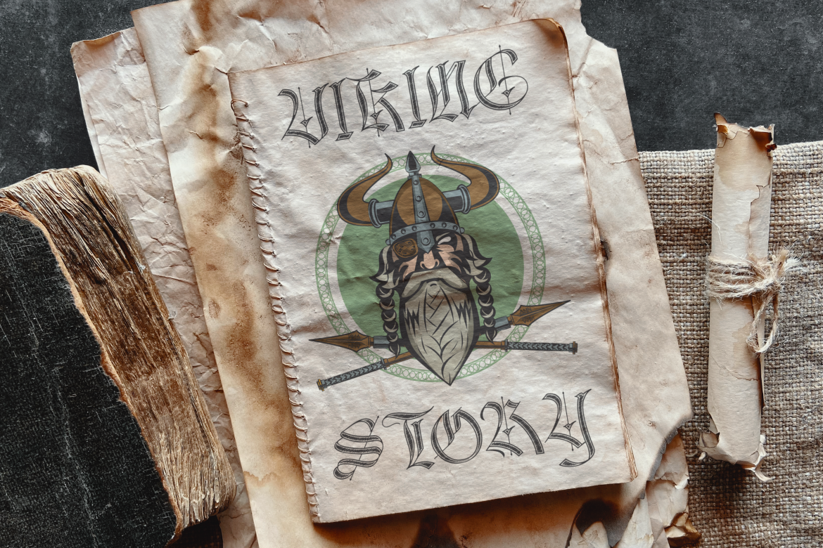
Black Eoghan combines angular serifs, pronounced stroke contrast, and ornamental internal lines within a Gothic structure. Its intricate rhythm offers a dramatic direction for artisan identities that need more character than a conventional luxury serif. Try it on a fragrance collection name, leaving the surrounding layout restrained so the decorative letterforms become the main feature.
PROS: Ornamental depth, angular character, distinctive blackletter rhythm.
BEST FOR: Artisan packaging, jewelry campaigns, book covers, and boutique wordmarks.
2. Lyros Greek Font
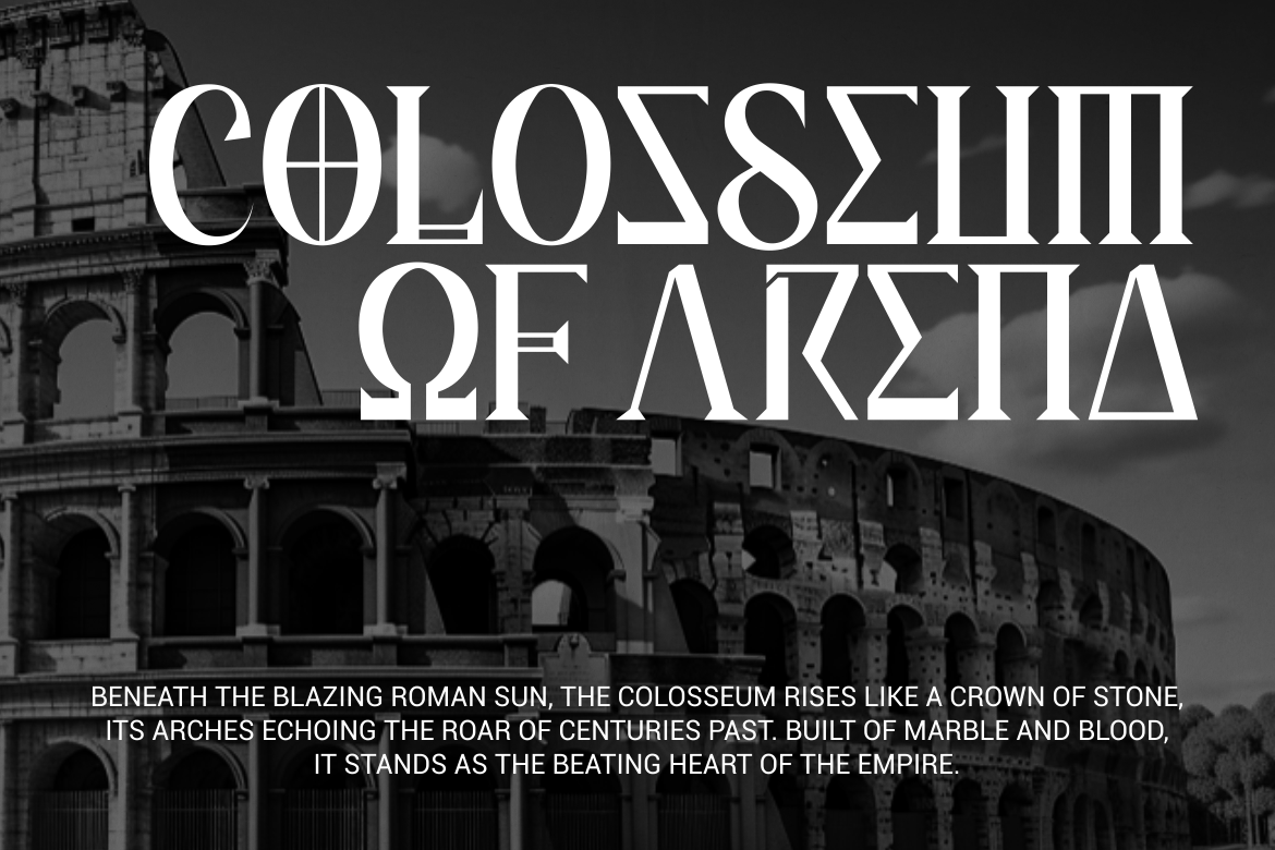
Lyros uses tall proportions, solid strokes, and sharply cut terminals inspired by Greek lettering and carved inscriptions. Its disciplined geometry gives short titles a monumental quality without relying on elaborate ornament. For an architecture exhibition, pair the headline with stone-texture photography and generous space, allowing the typography to suggest permanence while the content explains the actual history.
PROS: Monumental proportions, structured geometry, confident display presence.
BEST FOR: Cultural exhibitions, premium packaging, architectural presentations, and mythology publishing.
3. Black Crest Pirates Font

Black Crest combines slightly condensed blackletter forms with pointed serifs, curved strokes, and strong thick-to-thin contrast. Its distinctive advantage is maritime storytelling: the design suggests adventure and mystery rather than quiet institutional formality. Consider it for a coastal boutique hotel’s campaign title or an illustrated adventure cover, balancing the theatrical lettering with straightforward supporting information.
PROS: Maritime atmosphere, dramatic contrast, compact Gothic silhouette.
BEST FOR: Coastal hospitality concepts, adventure publishing, film titles, and themed packaging.
4. Vandalik 2 Type Greek Font

Vandalik features narrow geometric letters, triangular details, angled cuts, and subtle handcrafted irregularities, with two styles available. Its Greek-inspired construction gives wordmarks an assertive, symbolic character. Try it for a mythological book series or exhibition identity, repeating the same headline treatment across posters and digital promotions while keeping descriptions in an uncomplicated text family.
PROS: Two styles, compact geometry, memorable angular detailing.
BEST FOR: Mythology campaigns, exhibition posters, book series, and statement product names.
5. Veloria Palace Classic Serif Font
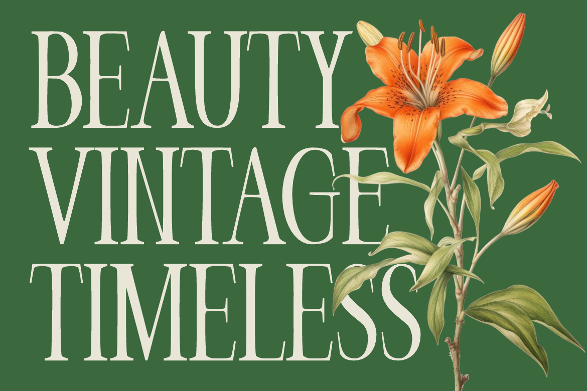
Veloria Palace offers tall, condensed proportions, graceful curves, and pronounced contrast in a classic serif structure. It is the restrained choice here for brands seeking heritage atmosphere without overtly theatrical decoration. For a premium hotel identity, test the name across stationery, packaging, and website headings, using generous spacing rather than additional ornamental borders.
PROS: Space-efficient proportions, graceful contrast, refined editorial character.
BEST FOR: Luxury hotels, cosmetics, premium services, stationery, and editorial branding.
Comparison
Use these directions to shortlist fonts by storytelling role, not historical period.
| Font | Suggested Direction | First Application to Test |
|---|---|---|
| Black Eoghan | Ornamental craftsmanship | Fragrance label |
| Lyros | Monumental classical identity | Exhibition title |
| Black Crest | Maritime adventure | Boutique hospitality campaign |
| Vandalik | Geometric mythological storytelling | Book-series identity |
| Veloria Palace | Restrained premium elegance | Hotel stationery |
Common Mistakes
The first mistake is treating European heritage as one interchangeable style. Research the relevant place, period, and craft instead of combining unrelated motifs. For restoration work, prioritize archival evidence. For Greek-language content, verify native characters, accents, and typesetting requirements rather than assuming a Greek-inspired product name guarantees language support.
Another mistake is using dramatic display typography everywhere. Reserve intricate lettering for identity moments and keep navigation, directions, and long descriptions clear. Test responsive layouts and motion titles at normal viewing size. Preserve an editable master so refinements remain consistent across printed and digital applications.
The final mistake is overlooking usage rights. PutraCetol’s license selector distinguishes print production, webfont embedding, registered-logo coverage, digital advertising, and other applications. Select coverage for the complete brand system before launch rather than assuming one static packaging design authorizes every future use.
Conclusion
The best dramatic heritage fonts 2026 connect memorable visual character with an honest brand story. Choose the tone first, protect practical readability, and use modern production tools to test rather than exaggerate the historical atmosphere.
Explore these five PutraCetol Studio fonts with your actual name or collection title. Strong heritage branding should honor its references while remaining distinctive, usable, and relevant today.
Explore these fonts and many more at PutraCetol.com to build a business identity that looks professional, trustworthy, and memorable.
Additionally, if you want to explore some free typography options, you can check out Putracetol Studio on Dafont. Happy reading and designing!