
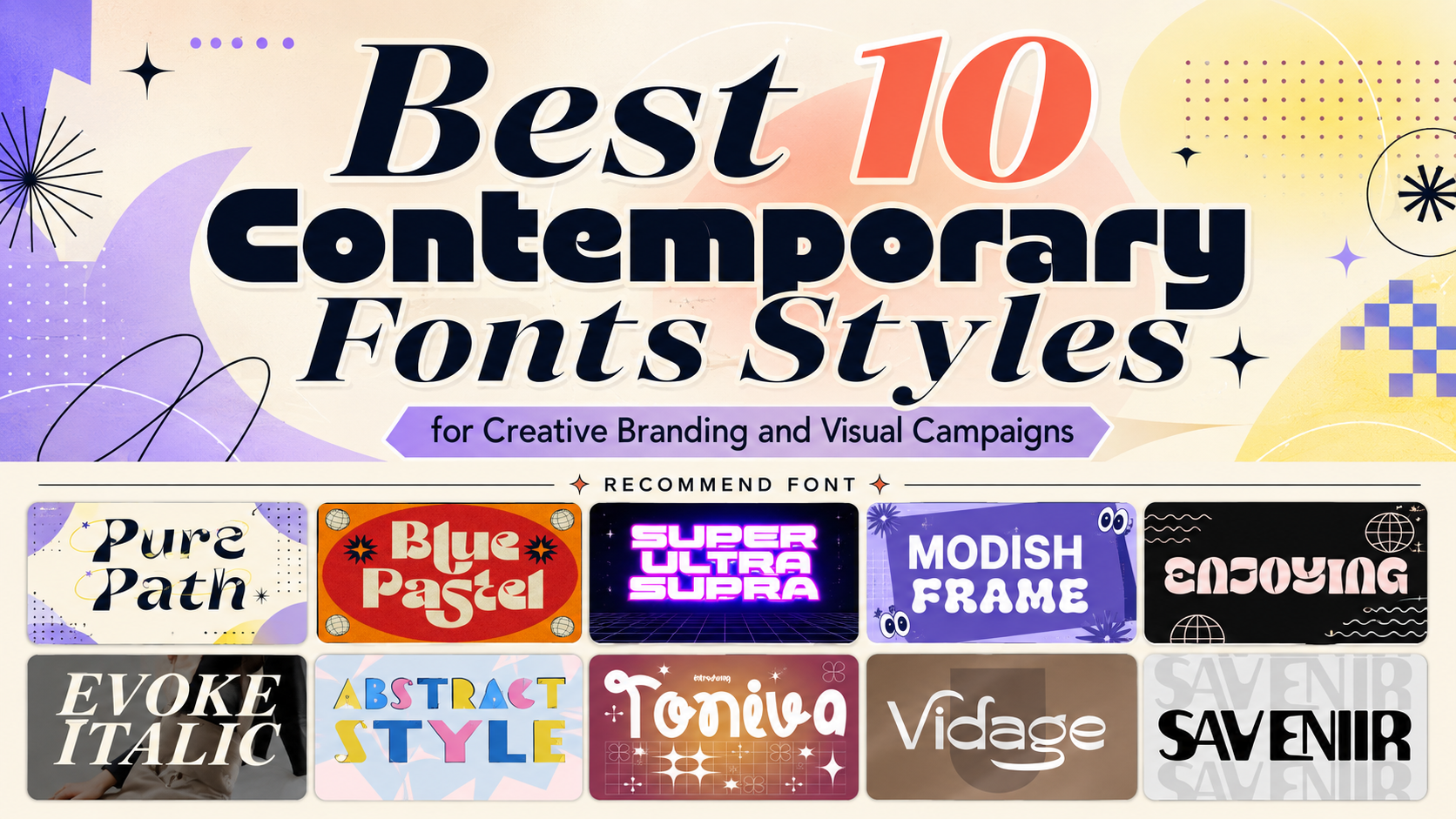
The best contemporary fonts are not defined by one visual formula. Contemporary typography can be geometric and futuristic, irregular and experimental, elegant and editorial, or strongly influenced by vintage graphic design.
What connects these styles is their ability to reinterpret familiar typographic structures for current visual culture.
Before selecting a font, decide what kind of freedom the design should communicate. A music festival might need unrestricted energy and strange letterforms. A fashion campaign could use cleaner experimental typography with controlled negative space. A limited-edition product may benefit from a bold retro revival, while a technology event can use rigid futuristic geometry.
A useful creative brief might define the typography through three qualities:
- Bold, energetic, and futuristic
- Festive, playful, and unconventional
- Elegant, editorial, and expressive
- Retro, nostalgic, and modernized
- Abstract, artistic, and rebellious
Once the personality is clear, the font can become an intentional part of the identity instead of simply an unusual decoration.
What Are Contemporary Fonts?
Contemporary fonts are typefaces designed or used in ways that reflect current visual culture. They often combine established typographic principles with newer experimentation in geometry, proportions, ligatures, negative space, distortion, texture, and movement.
Unlike strictly minimalist typography, contemporary design does not necessarily avoid decoration. It may celebrate unusual shapes, oversized headlines, expressive details, and visual tension.
Common characteristics include:
- Bold display proportions
- Experimental geometry
- Unexpected curves and cuts
- Decorative ligatures
- Abstract letter construction
- Modernized vintage influences
- Retro-futuristic forms
- Wide or condensed silhouettes
- Strong movement and rhythm
- High-impact headline performance
The category is broad because contemporary design itself is diverse. A clean geometric sans serif and an irregular abstract display font can both feel contemporary when they respond to current branding needs and visual expectations.
Why Contemporary Typography Works for Creative Branding
It Creates Immediate Recognition
Brands increasingly compete across fast-moving environments such as social media feeds, ecommerce marketplaces, event promotions, music platforms, and digital advertising. A distinctive headline can become a recognizable visual signal before the viewer has processed the complete message.
Contemporary display fonts are useful because their silhouettes often carry more personality than neutral body typefaces.
An unusual terminal, wide geometric structure, decorative ligature, or abstract counter can make a short name easier to distinguish from competitors.
It Allows Brands to Feel Less Corporate
Clean sans serif typography is highly functional, but excessive dependence on neutral fonts can make unrelated brands look similar.
An expressive contemporary typeface can introduce character without requiring an elaborate logo symbol. The letters themselves can provide the visual identity.
This works particularly well for:
- Creative studios
- Fashion brands
- Music and entertainment
- Lifestyle products
- Restaurants and beverages
- Events and festivals
- Beauty brands
- Technology campaigns
- Independent magazines
- Social-first businesses
It Can Connect Modern and Vintage Aesthetics
Contemporary design frequently revisits typography from earlier decades without reproducing it literally.
Retro serifs, groovy curves, Art Deco references, bold 1970s proportions, and vintage advertising forms can be rebuilt with cleaner spacing, sharper production, and modern layouts.
This creates nostalgia without making the design feel trapped in the past.
It Supports More Expressive Brand Systems
A strong contemporary typeface can influence more than the logo.
Its shapes can inspire:
- Graphic patterns
- Illustration details
- Icon geometry
- Packaging windows
- Social templates
- Motion graphics
- Poster compositions
- Photography framing
- Website section dividers
The result is a visual system in which typography becomes part of the broader design language.
Major Contemporary Font Directions
Experimental Geometric Fonts
Experimental fonts often begin with recognizable geometric construction and then break selected rules.
A designer might encounter unusual cuts, distorted curves, fragmented counters, asymmetrical terminals, or unexpected connections between letters.
These fonts are useful when a project should feel innovative, unconventional, or culturally progressive.
They work especially well for creative technology, music, fashion, architecture, exhibitions, and experimental packaging.
Bold Pop Typography
Pop-oriented contemporary fonts use large shapes, strong colors, playful proportions, and immediate visual impact.
They suit projects where communication needs to feel optimistic, expressive, festive, or youthful.
A bold pop font can dominate a poster or packaging panel while the supporting type remains extremely simple.
Retro-Modern Display Fonts
Retro-modern typography revisits historical design while adjusting the forms for contemporary use.
Groovy serif structures, bold vintage proportions, classic advertising shapes, and nostalgic rhythm can feel fresh when paired with modern photography and cleaner layouts.
This direction is particularly strong for fashion, food, music, hospitality, lifestyle products, and limited-edition packaging.
Futuristic Display Typography
Futuristic fonts often use rigid geometry, mechanical forms, sharp cuts, modular details, and unusual ligatures.
They are natural choices for:
- Technology
- Gaming
- Sports
- Automotive branding
- Digital events
- Science fiction
- Electronic music
- Innovation campaigns
Futuristic does not need to mean complicated. One unusual geometric feature repeated consistently can feel more sophisticated than several unrelated cyber effects.
Contemporary Elegant Serifs
Serifs remain highly relevant to modern branding.
Contemporary serif fonts can combine classical proportions with cleaner lines, stronger display weights, unusual alternatives, or editorial spacing.
They offer a useful contrast to experimental sans serif typography and work especially well for fashion, beauty, luxury packaging, weddings, publishing, and premium lifestyle brands.
Expressive Italics
Italic typography naturally creates directional movement.
A contemporary italic can make a headline feel faster, more elegant, more emotional, or more fashionable depending on its weight and structure.
Rather than using italics only for emphasis inside paragraphs, designers can make them the primary visual language for posters, editorial covers, fashion campaigns, or event promotions.
Abstract Typography
Abstract fonts treat letters almost like graphic objects.
The forms may be fragmented, irregular, sharp, messy, layered, or deliberately unconventional. The audience still needs enough recognizable structure to read the word, but the typography becomes closer to illustration.
This direction is effective for experimental art, creative events, underground culture, album covers, posters, and fashion campaigns.
How to Use Contemporary Fonts Effectively
Give the Display Typeface One Primary Role
The more distinctive the typeface, the more focused its role should be.
Use it for:
- Brand names
- Poster titles
- Event headlines
- Product collections
- Packaging focal points
- Reel or carousel covers
- Album titles
- Campaign statements
Use a quieter supporting font for addresses, prices, dates, descriptions, instructions, and long content.
This makes the expressive font feel more important.
Build the Wordmark Before Adding Effects
Start in black and white.
Type the real brand name and examine:
- Overall silhouette
- Letter spacing
- Repeated characters
- Counters
- Capital letters
- Ligatures
- Alternative glyphs
- Line breaks
Only after the typography works structurally should you add gradients, outlines, shadows, textures, or dimensional effects.
Use Color to Reinforce the Personality
Contemporary fonts can work with very different palettes.
A futuristic font may use black, silver, electric blue, or neon green. A groovy serif could use orange, purple, cream, or brown. An elegant contemporary serif can work with ivory, burgundy, dark green, or monochrome black.
The palette should support the same emotional direction as the typography.
Let White Space Balance Expressive Forms
Bold typography does not require a crowded composition.
In fact, unusual fonts often become more impressive when surrounded by generous negative space. The viewer receives enough room to appreciate the letter construction instead of processing several competing graphics.
This is particularly valuable for fashion campaigns, posters, premium packaging, and editorial layouts.
Test the Typography at Real Sizes
A complicated letter may be attractive at 100 points but difficult to distinguish on a product label or mobile thumbnail.
Test the design on:
- Smartphones
- Posters
- Packaging
- Social posts
- Invitations
- Merchandise
- Website banners
- Print samples
Prepare simplified versions where needed.
Contemporary Fonts for Posters and Events
Posters give expressive type room to perform.
A concert, festival, exhibition, or celebration can use one oversized word as the central visual element rather than relying on several illustrations.
A practical poster hierarchy might be:
Primary: Event name in the contemporary display font
Secondary: Theme or headline in a simpler supporting style
Functional: Date, location, ticket information, and sponsors in a readable sans serif
The display font establishes emotion. The supporting typography makes the event usable.
For festive designs, combine expressive lettering with controlled color blocks, gradients, patterns, or abstract shapes. Avoid making every element equally decorative.
Contemporary Fonts for Packaging
Packaging needs immediate recognition and practical clarity.
Use contemporary display typography for:
- Brand name
- Product name
- Flavor or collection
- Special edition
- Short campaign statement
Use functional typography for:
- Ingredients
- Quantity
- Instructions
- Warnings
- Contact information
Experimental typography is particularly useful for limited editions because it can create a visual break from the brand’s standard packaging while preserving the primary identity.
For example, a beverage company might retain its normal logo but introduce a highly experimental display font for a festival collaboration.
Contemporary Fonts for Social Media
Social content benefits from short, high-impact typography.
Use contemporary fonts for:
- Reel covers
- Carousel hooks
- Story announcements
- Product drops
- Event countdowns
- Promotional quotes
- Campaign hashtags
Keep the main text short. A headline such as CREATE WITHOUT RULES can support an expressive experimental font much better than a complete paragraph.
Typography should remain visible at thumbnail size and avoid the interface areas where platform controls may overlap the content.
Contemporary Fonts for Fashion and Lifestyle Branding
Fashion provides one of the strongest environments for contemporary typography because the typeface can work almost like an art direction element.
Combine expressive type with:
- Full-bleed photography
- Strong cropping
- Asymmetrical grids
- Monochrome palettes
- Unexpected color accents
- Oversized headlines
- Wide negative space
A vintage-inspired display font can feel highly contemporary when paired with modern photography and restrained composition.
Conversely, a futuristic geometric font can feel more human when paired with tactile materials, natural light, and editorial imagery.
Jump to Recommended Fonts
Pure Path | Blue Pastel | Super Ultra Supra | Modish Frame | Enjoying Typeface | Evoke Italic | Abstract Style | Toniva | Vidage | Savenir
1. Pure Path Contemporary Font
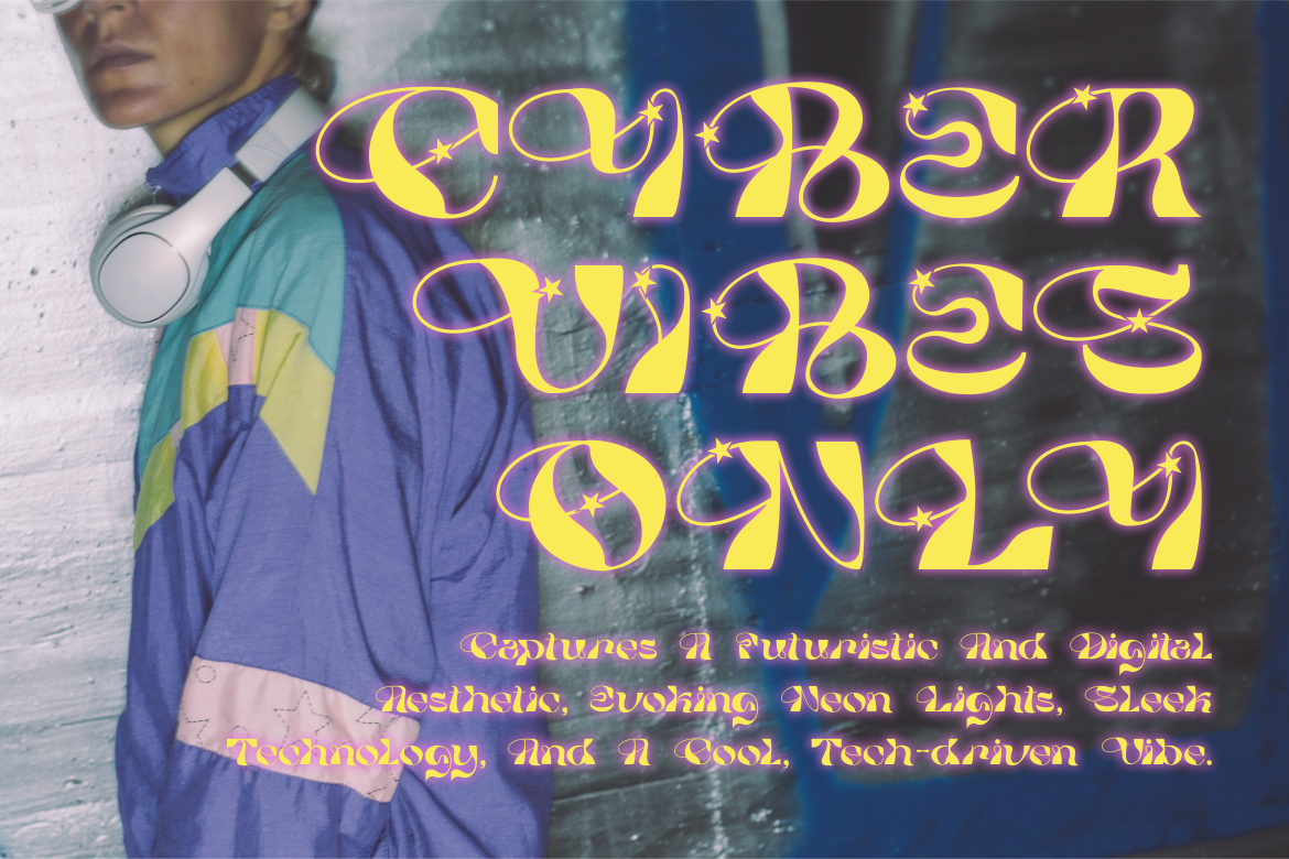
Pure Path is a bold experimental display font that combines sharp geometric cuts with flowing curves, giving each character a distinctive rhythm. Decorative star swashes add a playful accent, while its mixture of retro-futuristic and digital influences makes the font feel energetic rather than rigidly technological. It works especially well when designers want contemporary typography that feels artistic, unusual, and highly visible without completely sacrificing legibility.
PROS: Experimental geometry, flowing shapes, decorative star swashes, retro-futuristic character, and strong visual identity.
BEST FOR: Fashion branding, music covers, posters, digital campaigns, creative studios, logos, and youth-oriented social graphics.
2. Blue Pastel Display Font

Blue Pastel is a bold display serif with a clear retro influence and a groovy personality. Its substantial forms give headlines immediate visual strength, while the nostalgic construction allows designers to create vintage-inspired work that still fits contemporary branding. This makes it particularly useful when a campaign should feel cheerful, expressive, and familiar without becoming an exact reproduction of historical typography.
PROS: Bold visibility, groovy retro personality, strong nostalgia, distinctive serif forms, and modern-vintage versatility.
BEST FOR: Retro posters, fashion campaigns, food packaging, event graphics, lifestyle brands, logos, and promotional titles.
3. Super Ultra Supra Futuristic Font
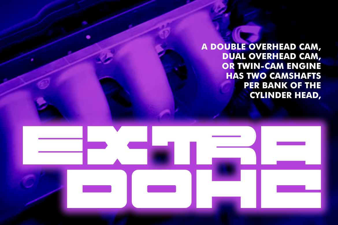
Super Ultra Supra uses bold, rigid, and thick letterforms to create a powerful sci-fi and futuristic presence. The family provides three font versions plus ligatures, giving designers more room to build related visual treatments without moving outside the same typographic personality. Its substantial structure is particularly effective when a project needs technological strength, athletic energy, or a confident modern headline.
PROS: Three coordinated versions, bold construction, futuristic personality, useful ligatures, and high-impact visibility.
BEST FOR: Technology events, sports branding, gaming, automotive campaigns, magazine titles, posters, futuristic packaging, and digital products.
4. Modish Frame Contemporary Font
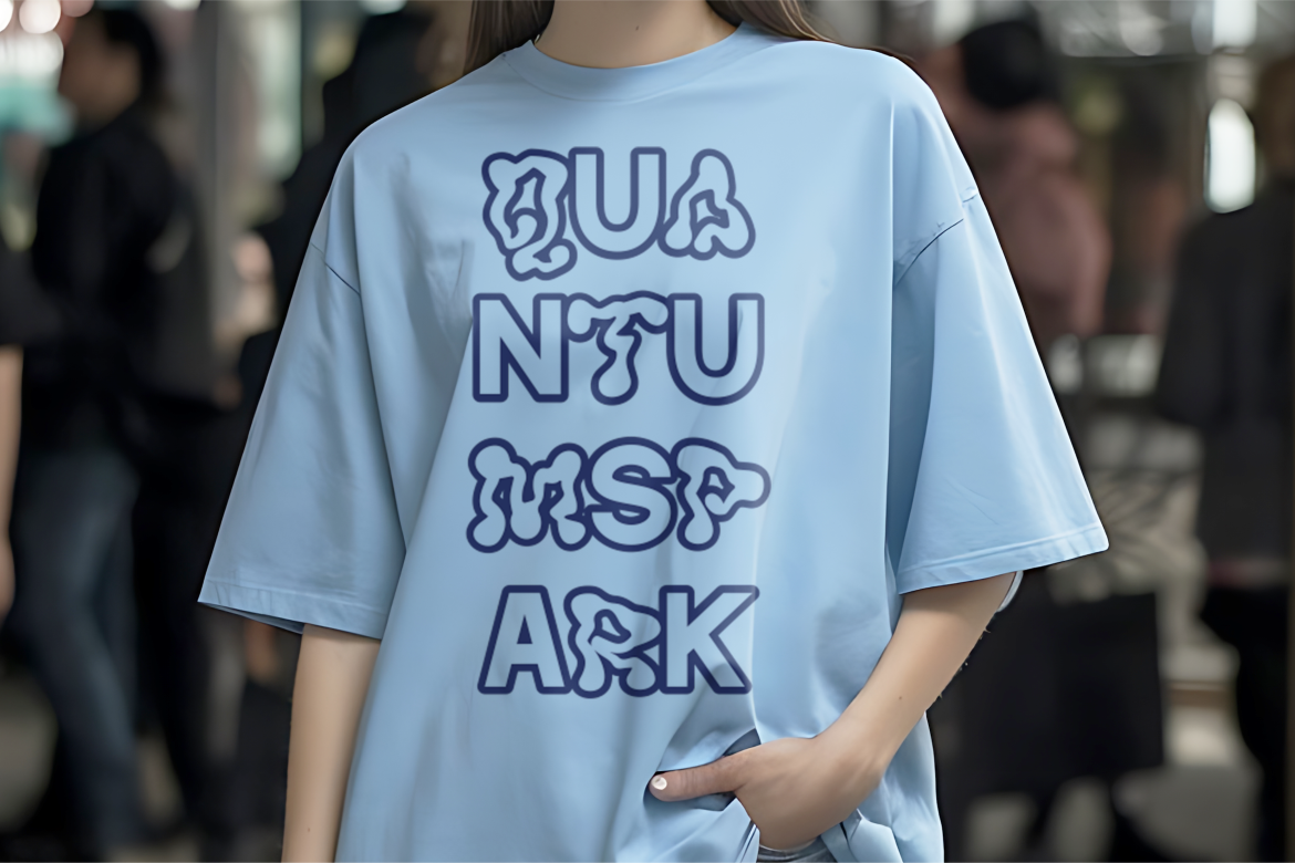
Modish Frame pushes contemporary typography toward fluid abstraction through organic letterforms that resemble melting pixels or soft plastic changing shape. Its unusual anatomy challenges predictable display typography while retaining enough recognizable structure for branding and major headlines. The result is particularly effective for designers who want fashion, youth, or creative campaigns to feel progressive and visually unconventional.
PROS: Fluid abstract shapes, futuristic experimentation, organic geometry, strong differentiation, and expressive visual rhythm.
BEST FOR: Trend-focused packaging, fashion campaigns, youth brands, creative events, posters, experimental logos, and art direction.
5. Enjoying Typeface Modern Display Font

Enjoying Typeface combines clean contemporary design with a more confident display personality. PutraCetol describes it across its editorial content as vivid and modern, with bold lines and sharper construction that can create a strong visual statement in advertising, covers, fashion branding, and identity design. Its ability to look polished while still attracting attention makes it useful for projects that need modern sophistication without becoming visually quiet.
PROS: Clean contemporary character, bold headline presence, versatile branding use, and polished modern energy.
BEST FOR: Fashion editorials, advertisements, magazine covers, modern logos, premium packaging, social campaigns, and creative startups.
6. Evoke Italic
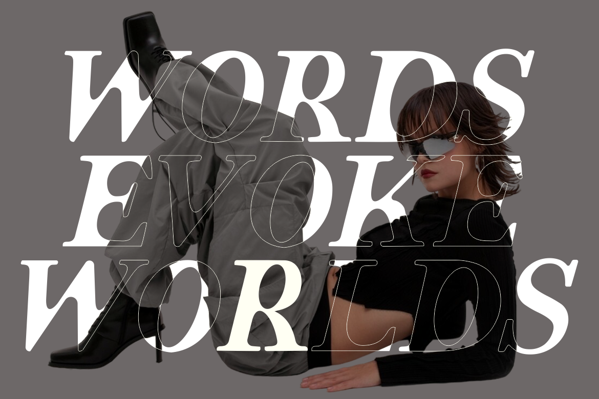
Evoke Italic combines modern serif elegance with a slanted structure that naturally introduces movement. Its balanced proportions and premium editorial character make it effective for projects where sophistication should feel expressive rather than static. Because of its italic personality, it is strongest in titles, short statements, logos, and fashion-led compositions rather than long passages of body copy.
PROS: Elegant italic movement, premium serif personality, strong editorial mood, and sophisticated visual identity.
BEST FOR: Fashion, luxury photography, beauty branding, editorial covers, wedding projects, premium invitations, and artistic campaigns.
7. Abstract Style

Abstract Style takes contemporary display typography into a more irregular and artistic direction. Its abstract forms, sharp corners, and deliberately messy shapes make the letters behave almost like graphic illustrations, creating a strong sense of freedom and experimentation. The product is presented as a four-part abstract display collection, making it particularly useful when designers want several related but unconventional typographic expressions within one creative direction.
PROS: Abstract construction, irregular character, sharp visual details, experimental energy, and multi-style creative potential.
BEST FOR: Art exhibitions, album artwork, fashion posters, underground events, experimental campaigns, editorial graphics, and creative branding.
8. Toniva Headline Font
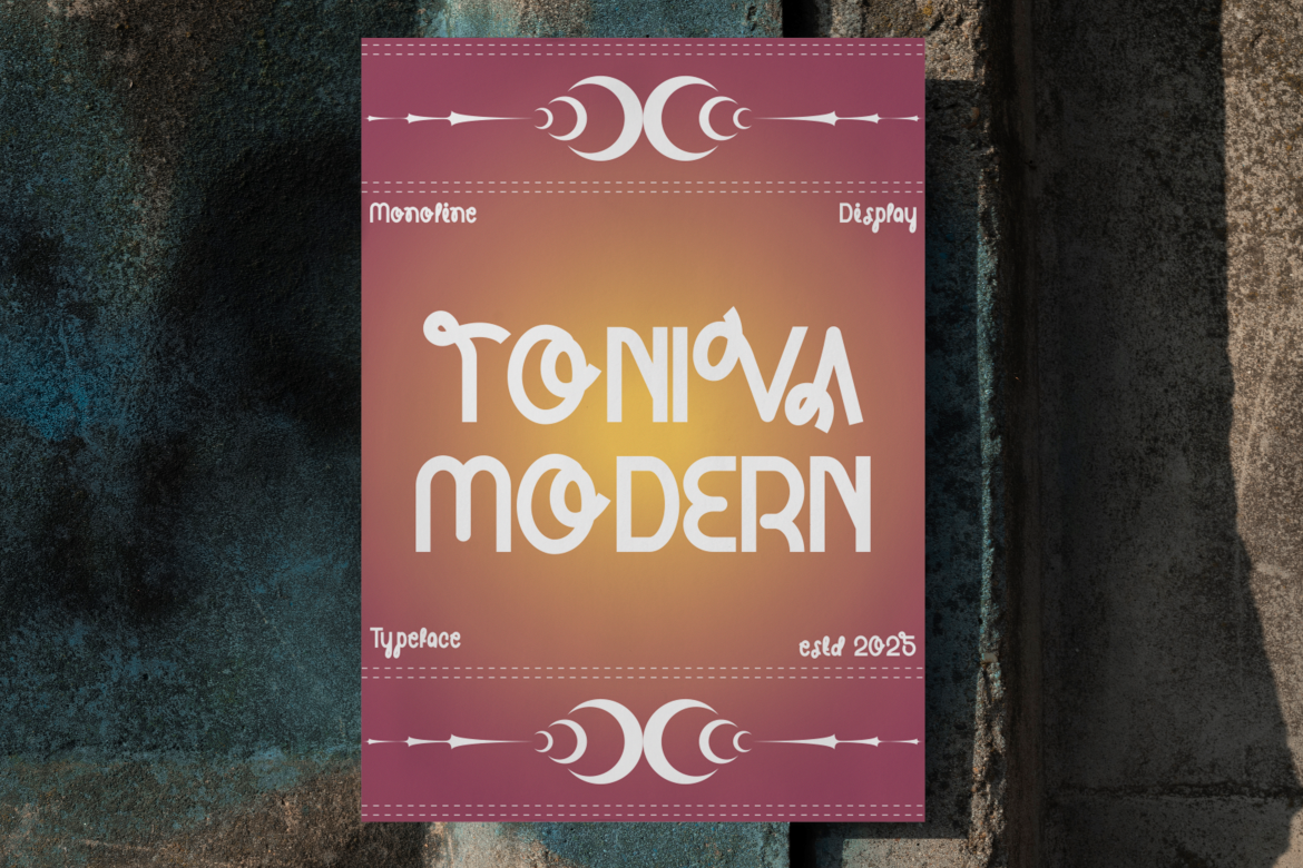
Toniva combines a modern monoline structure with nostalgic visual cues, using consistent stroke thickness, wide proportions, geometric shapes, and softened rounded edges. Its regular and oblique treatments give designers options for both stable and more directional headlines while keeping one coherent identity. The balance between playful geometry and professional structure makes it especially useful for contemporary brands that need a retro-modern voice.
PROS: Regular and oblique styles, consistent monoline construction, wide geometry, rounded character, and retro-modern flexibility.
BEST FOR: Lifestyle brands, posters, logos, fashion, packaging, magazines, creative studios, and modern event identities.
9. Vidage Elegant Serif Typeface
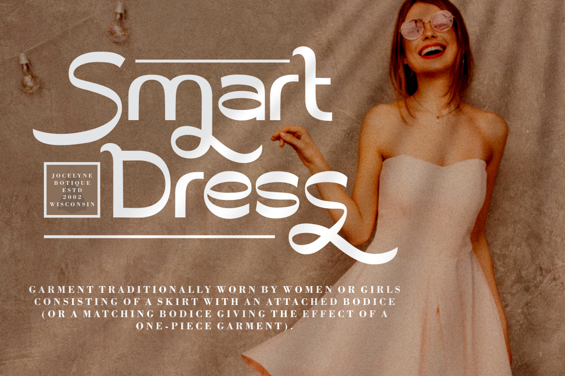
Vidage combines display-font impact with an elegant contemporary serif structure. Clean modern lines, bold proportions, and alternative characters allow designers to create refined typography that still has enough presence for logos and packaging. It is a strong choice when a contemporary project needs elegance and timelessness rather than the louder experimental personality of futuristic or abstract fonts.
PROS: Elegant serif construction, alternative characters, bold display presence, modern clarity, and timeless versatility.
BEST FOR: Luxury branding, product packaging, fashion, weddings, premium invitations, editorial titles, and sophisticated logos.
10. Savenir Unique Display Font
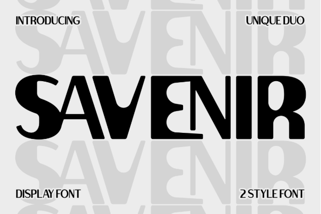
Savenir is a modern bold sans serif display font built around clean geometric shapes and a sleek professional appearance. Its strong weight provides immediate headline visibility, while the controlled geometry allows it to fit both expressive creative work and more organized contemporary branding. This versatility makes Savenir especially useful when the design needs to feel current and distinctive without becoming highly decorative.
PROS: Clean geometric structure, bold visibility, contemporary sans serif personality, versatility, and professional clarity.
BEST FOR: Logos, startup branding, posters, packaging, movie titles, magazines, invitations, business cards, and digital campaigns.
Comparison
| Font | Main Style | Personality | Strongest Application | Overall Direction |
|---|---|---|---|---|
| Pure Path | Experimental display | Artistic and retro-futuristic | Music, fashion, and posters | Playful contemporary |
| Blue Pastel | Retro display serif | Groovy and nostalgic | Packaging and event graphics | Modern vintage |
| Super Ultra Supra | Futuristic display | Powerful and technical | Gaming, sports, and technology | Futuristic contemporary |
| Modish Frame | Abstract display | Fluid and unconventional | Fashion and youth campaigns | Experimental |
| Enjoying Typeface | Modern display | Confident and polished | Editorial and advertising | Modern creative |
| Evoke Italic | Elegant italic serif | Refined and expressive | Fashion and luxury | Editorial contemporary |
| Abstract Style | Abstract display | Irregular and rebellious | Art and underground campaigns | Artistic freedom |
| Toniva | Monoline display | Playful and sophisticated | Lifestyle and posters | Retro-modern |
| Vidage | Elegant serif | Premium and timeless | Luxury and packaging | Refined contemporary |
| Savenir | Geometric sans display | Clean and confident | Branding and digital design | Modern professional |
Common Mistakes When Using Contemporary Fonts
The first mistake is assuming that “contemporary” means combining every current visual trend in one composition. Experimental letters, gradients, chrome effects, vintage colors, distorted photography, and asymmetrical layouts may all be relevant individually, but using them simultaneously can remove the hierarchy that makes expressive typography effective. Choose one dominant typographic idea and let supporting photography, color, and layout strengthen it. Contemporary design feels confident when unusual choices appear intentional rather than accidental.
Another mistake is using a highly expressive display font for long text or essential information. Modish Frame, Pure Path, Abstract Style, or Super Ultra Supra can create memorable headlines, but paragraphs, prices, addresses, event schedules, and product details usually need simpler supporting typography. The more unusual the display face becomes, the greater the need for contrast between expressive and functional text. Test every design at actual output size, especially for social media thumbnails, packaging, invitations, and mobile campaigns.
The final mistake is choosing a font because it looks unique without checking whether its emotional character matches the brand. A sci-fi typeface can make a handmade beauty brand feel disconnected, while an elegant serif may weaken a rebellious music event that needs more visual tension. Begin with the audience, message, and desired perception, then choose the contemporary style that supports them. Before commercial production, also confirm the correct font coverage for the intended logo, packaging, social media, advertising, website, merchandise, or editable-template use.
Conclusion
Contemporary fonts represent freedom in typography because they are not restricted to one historical style or visual rule. They can be futuristic, groovy, elegant, abstract, geometric, festive, or deliberately influenced by vintage design.
Pure Path offers experimental retro-futuristic energy, while Blue Pastel creates a groovy modern-vintage personality. Super Ultra Supra delivers technological strength, and Modish Frame pushes typography toward fluid abstraction. Enjoying Typeface provides confident modern display character, while Evoke Italic introduces elegant movement.
Abstract Style supports more radical visual experimentation, Toniva balances monoline precision with nostalgic charm, Vidage brings contemporary elegance, and Savenir provides a clean geometric alternative for brands that need boldness with greater restraint.
Fonts from PutraCetol Studio give designers, event organizers, content creators, and creative businesses multiple ways to build distinctive visual identities across posters, invitations, packaging, social content, and promotional campaigns.
The strongest contemporary typography is not simply unusual. It is expressive for a reason. When the font, color, layout, and brand story communicate the same personality, typography becomes more than text. It becomes the visual voice of the entire campaign.
Explore these fonts and many more at PutraCetol.com to build a business identity that looks professional, trustworthy, and memorable.
Additionally, if you want to explore some free typography options, you can check out Putracetol Studio on Dafont. Happy reading and designing!