
In today’s digital landscape, users expect interfaces that feel natural from the moment they arrive. Whether they’re navigating a mobile app, a game, a software dashboard, or a website, they want predictable interactions and visual harmony that reassure them they’re in control. This is where consistency in UI design becomes a powerful advantage.
Consistency is not about limiting creativity or forcing every screen to look the same. Instead, it’s about establishing recognizable patterns that guide users smoothly through an experience. When design elements behave reliably, users can focus on their goals instead of figuring out how the interface works. This clarity reduces frustration, strengthens trust, and helps products stand out in a crowded digital world.
In this article, we’ll explore why UI consistency matters, how it shows up in real-world examples, and what designers can do to maintain it. We’ll also highlight several creative resources, including display and decorative fonts from Putracetol.com, which can support brand cohesion across digital interfaces.
Every interface requires a small amount of mental effort, but inconsistent interfaces multiply that effort. When users must relearn patterns on every screen, the experience becomes tiring. Consistency removes that burden. Familiar structures, repeated layouts, and predictable visual signals help users act quickly without hesitation. In other words, consistency makes an interface feel easy.
People interact with digital products in many different ways and with a wide range of abilities. Consistency helps everyone. When buttons, icons, labels, and navigation behave predictably, users with cognitive or visual challenges spend less time guessing what something does. Consistent spacing, color contrast, and typography also support readability and clarity, key elements in accessible design.
Consistency benefits not only users but designers and developers as well. Reusing colors, spacing rules, layout grids, and typography accelerates production and reduces errors. It also ensures that new features match the existing interface. Design systems, style guides, and reusable components help teams scale faster while maintaining a unified visual identity.

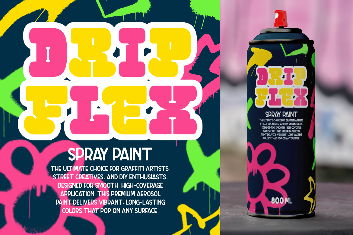
And if your project uses creative typefaces, consistency becomes even more important. Fonts such as Cyber alien, Mecha Bold, and Strip Deco from Putracetol.com can bring strong personality to a design, but using them consistently across headings, labels, and brand visuals reinforces the identity rather than diluting it.
When an interface feels familiar, users feel more comfortable. That comfort encourages exploration and deeper engagement. A consistent UI sends a message: this product is thoughtful, organized, and built with care. Over time, this emotional connection strengthens loyalty and keeps users coming back.
UI consistency appears across all types of digital experiences, from games to productivity apps. Below are recognizable examples that illustrate why users adapt more quickly when patterns stay stable.
This puzzle game keeps its visual identity strong through consistent pixel art, a cohesive color palette, and clear iconography. Every unpacked object feels like part of the same world. Even subtle similarities, like shading and line thickness, reinforce that sense of coherence.
Massively multiplayer games are known for their dense interfaces, yet their consistency is what keeps them manageable. The chat box, mini-map, spell bar, and inventory often appear in the same locations across different games. Because of this, players can dive right in, regardless of the title. Familiar placement reduces onboarding time and keeps the focus on gameplay, not navigation.
Classic arcade titles understood UI consistency long before modern UX strategies existed. In Bubble Bobble, the score, lives, and timer remain at the top of the screen in every level. This stability keeps players informed without distracting them.
This game uses a tight palette of red, yellow, and white. The controlled color system creates a bold, cohesive look and helps players interpret hazards and interactions instantly.
Its commitment to the 1930s animation style is legendary. Everything from its menus to visual effects sticks to the same vintage cartoon aesthetic. Because the style never breaks, the world feels complete, immersive, and authentic.
The game’s inventory screen is a great example of UI uniformity. It features balanced spacing, predictable element sizes, and consistent radius and framing. As players move through the system, they can find what they need quickly because the structure remains stable.
Maintaining consistency doesn’t happen by accident. It requires intention, documentation, and reliable tools. These practices help designers build interfaces that remain uniform even as they grow.
A defined palette ensures that all visual elements work together. Limiting the number of colors makes it easier to communicate hierarchy, highlight interactive items, and maintain brand identity. Using the same accent color for calls-to-action, for example, trains users to identify clickable elements immediately.
Shadows, radius values, spacing, filters, and typography should follow the same logic across the entire interface. For branding-heavy projects, decorative fonts like Cyber Blade, Tronix, or Dexvor from Putracetol.com can unify the look, as long as they are applied consistently across titles, labels, or UI headers.

Users rely on established conventions. Start/escape opening the quit menu is one example. Placing the logo in the upper-left corner or the shopping cart in the upper-right is another. You don’t need to reinvent familiar patterns; you only need to use them wisely.

In UI development, global values for spacing, colors, radius, and typography ensure every component behaves predictably. When the entire system pulls from a single source of truth, updates become easier and the interface remains consistent over time.
Consistency in UI design isn’t about rigid uniformity. It’s about creating an experience that feels intuitive, familiar, and enjoyable. When interfaces stay consistent in structure, color, typography, spacing, and behavior, users gain confidence faster. They spend less time thinking about how to navigate and more time engaging with the content or gameplay.
The real challenge lies in balancing creative expression with predictable patterns. With a solid design system and a commitment to visual unity, you can deliver digital experiences that look polished and feel trustworthy.
For more UI guidance or inspiration, including unique and expressive typefaces, visit Putracetol.com.
Thank you for taking the time to read this article. If you are looking for more great articles, feel free to visit Putracetol Blog
Additionally, if you want to explore some free typography options, you can check out Putracetol Studio on Dafont. Happy reading and designing!
