

The most effective way to apply the Cloud Dancer 2026 design trend is to treat soft white as part of a functional design system, not simply as a fashionable background color.
Pantone selected PANTONE 11-4201 Cloud Dancer as its Color of the Year for 2026, describing it as a bright, light, soft, and clear white associated with calm, reflection, and creative possibility. Pantone also positions the color as a structural foundation that can support other hues rather than competing with them.
Before applying it to a website, application, or brand identity, decide what the soft white needs to accomplish. It might separate sections, reduce visual competition, place more focus on content, support accessible text contrast, or make a flexible accent-color system easier to manage.
A successful Cloud Dancer interface should never feel unfinished. It should feel intentional, calm, and easy to navigate.
What Is the Cloud Dancer 2026 Design Trend?
The Cloud Dancer 2026 design trend uses a warm, softened white as the visual foundation for branding, interfaces, packaging, editorial layouts, and digital products. Unlike a stark white background, a soft white introduces a small amount of warmth and visual depth.
The trend is closely connected to a wider preference for calmer digital experiences. It responds to interfaces filled with notifications, gradients, competing cards, decorative motion, and excessive color by giving important content more room to be understood.
However, Cloud Dancer should not be reduced to “minimalism.” A product can use this soft white alongside expressive typography, bold photography, colorful illustrations, data visualizations, or strong brand accents. Its purpose is to create a stable foundation around those elements.
Soft White Is a Color, While White Space Is Structure
Cloud Dancer and white space are related, but they are not the same thing.
Cloud Dancer is a visual color choice. White space refers to the deliberate gaps around text, controls, images, charts, and content groups. A page can have a soft white background and still feel crowded if its elements are tightly packed.
W3C guidance recommends using clear space around objects and text so sections are easier to distinguish. Thoughtful spacing can support navigation, reading, and content comprehension, particularly for people with cognitive or learning disabilities.
The best results come from combining the soft white palette with a structured spacing system.
Why Soft White Works for Digital Products
It Reduces Competition Between Interface Elements
A soft neutral background allows headings, controls, charts, product images, and important notifications to receive attention according to their function.
This is useful in products where users must compare information quickly. A financial dashboard, for example, may contain balances, transactions, charts, warnings, and action buttons. When every module uses a different saturated background, the interface becomes harder to scan.
Cloud Dancer can serve as a quiet canvas while darker typography, restrained borders, and carefully assigned accent colors establish the hierarchy.
It Creates Tonal Depth Without Heavy Decoration
A pure white page often relies on borders and shadows to separate sections. Soft white gives designers another option.
A Cloud Dancer-inspired canvas can sit behind brighter white cards, pale neutral panels, or lightly tinted information boxes. The differences are subtle, but they can establish layers without making every module feel enclosed.
A practical tonal system might include:
- Soft white for the page canvas
- Clear white for primary cards
- Warm grey for secondary surfaces
- Dark charcoal for text
- One brand color for actions
- Separate colors for success, warning, and error states
This gives the interface dimension while preserving a calm overall appearance.
It Supports Flexible Brand Systems
Soft white can work with corporate blue, healthcare teal, educational indigo, luxury burgundy, warm brown, vivid orange, or experimental neon.
That flexibility helps brands build product families without redesigning the entire visual system. The core background and typography can remain stable while accent colors change according to product, customer segment, plan level, or campaign.
A SaaS company could use one accent for analytics, another for automation, and a third for collaboration tools. The shared soft white foundation would preserve recognition across every product area.
How to Apply Cloud Dancer in UI and Brand Design
1. Use Tonal Layers Instead of Filling Every Card With Color
Begin with a soft white canvas and assign brighter white to the most important interactive surfaces. Secondary information can sit on a slightly darker neutral.
For example:
- Main page background: soft warm white
- Form or dashboard card: clear white
- Disabled field: pale warm grey
- Information panel: lightly tinted brand color
- Primary text: near-black or dark navy
- Secondary text: medium-dark grey
Avoid differences that are so subtle that users cannot recognize boundaries. Important controls and graphical elements should remain visually distinct from surrounding surfaces.
2. Let Typography Establish the Main Hierarchy
Cloud Dancer creates room for typography to carry more of the visual identity. Instead of relying on a different background color for every section, use size, weight, spacing, and typeface contrast to separate content.
A practical digital hierarchy might use:
- Expressive display font for the homepage hero
- Strong sans serif for page headings
- Neutral, readable typeface for interface text
- Semibold weight for buttons and labels
- Tabular numerals for financial or analytical data
Decorative typography should remain concentrated in major brand moments. Forms, tables, instructions, and navigation need simpler letterforms that can be read quickly.
3. Assign Accent Colors According to Function
A calm background makes accent colors more noticeable, so each color should have a defined purpose.
The primary brand color can identify calls to action. Green can communicate success, red can identify errors, and amber can indicate a warning. Informational blue may support guidance or educational content.
Do not use the primary accent on every icon, link, border, heading, and chart. When one color appears everywhere, it loses its ability to direct attention.
4. Protect Text Contrast
Soft white does not automatically make a design accessible. Light grey text, pale controls, and low-contrast borders can become difficult to see against a Cloud Dancer-style background.
WCAG 2.2 requires a minimum contrast ratio of 4.5:1 for normal text and 3:1 for qualifying large text. Meaningful non-text elements, including control boundaries and important graphical information, generally need a contrast ratio of at least 3:1 against adjacent colors.
Use dark charcoal, navy, deep green, or another sufficiently dark brand color for essential text. Reserve pale grey for decorative or genuinely secondary elements, not instructions, labels, or financial information.
5. Keep Interactive States Visible
Hover, selected, active, disabled, error, and keyboard-focus states should remain obvious on a light interface.
A button should not change from soft white to another nearly identical white when hovered. A selected navigation item needs more than a faint background tint. A keyboard focus indicator should be clearly visible against both the component and surrounding surface.
W3C guidance for focus appearance recommends a clear visual change, with greater contrast making the active focus position easier to identify.
A strong implementation might combine a background change, dark outline, icon, and text label rather than depending on one subtle color difference.
6. Use Color and Labels Together in Data Visualization
Fintech, SaaS, healthcare, and educational products frequently use charts. Cloud Dancer can create an excellent chart background, but very pale data colors may disappear against it.
Use sufficiently distinct chart colors and reinforce meaning with:
- Direct labels
- Different line patterns
- Data-point markers
- Icons
- Clear legends
- Text summaries
- Accessible data tables
A user should not need to distinguish two similar pastel shades to understand which line represents revenue and which represents expenses.
7. Add Texture Carefully
Soft white can feel flat when every surface uses the same color and finish. Subtle texture can introduce a more physical or human quality.
Possible treatments include:
- Fine paper grain
- Soft radial lighting
- Low-opacity gradients
- Frosted glass effects
- Gentle shadows
- Warm photographic backgrounds
- Thin geometric patterns
Texture should support depth without reducing readability. Keep it away from long text, form fields, charts, and other information-heavy areas.
Cloud Dancer Applications by Industry
Fintech
Fintech products need to communicate trust, control, and accuracy. A soft white canvas can reduce the visual pressure of transaction tables, account summaries, charts, and compliance information.
Use dark navy or charcoal for primary text, blue for important actions, and clearly separated colors for gains, losses, warnings, and account status. Avoid using pale grey for balances or transaction descriptions.
SaaS
SaaS platforms can use Cloud Dancer to create modular interfaces in which tools, settings, and analytics feel connected without appearing crowded.
Bright white cards can contain the primary workflow, while warm grey surfaces hold secondary settings. A strong brand accent should identify the main task rather than decorate every component.
Healthcare
Healthcare interfaces benefit from a sense of calm, but clarity must remain the priority. Soft white can make appointment information, medical instructions, and patient records feel less visually intimidating.
Use strong text contrast, clearly labeled status messages, and direct error explanations. Do not rely on pale pastel colors alone to distinguish urgent, completed, delayed, or unavailable information.
Education
Educational platforms can use Cloud Dancer to separate lessons, instructions, exercises, and progress information without overwhelming learners.
Clear spacing between content blocks can make lessons easier to follow. Important actions such as “Continue,” “Submit,” or “Review Answer” should remain visually prominent and consistent throughout the learning experience.
Cloud Dancer-Inspired Digital Color Palettes
The following hexadecimal values are practical digital starting points, not official replacements for Pantone production specifications.
| Industry | Soft White Base | Primary Text | Main Accent | Supporting Surface |
|---|---|---|---|---|
| Fintech | #F5F4EF | #172033 | #315FEA | #E7EBF2 |
| SaaS | #F7F6F1 | #20242B | #6856E8 | #ECEAF8 |
| Healthcare | #F6F5F0 | #183331 | #13736D | #E5F0EC |
| Education | #F8F7F2 | #242744 | #3F5CC7 | #EAEAF5 |
These combinations provide a strong starting contrast between the base and primary colors. Final implementations should still be tested according to the actual font weight, size, component state, screen, and background treatment.
Jump to Recommended Fonts
White Capel Modern Display Font | White Raven Modern Sans Serif | Bright Bride | Neon Whirl Colorful Font | Aristiq Signature Luxury Script Font
1. White Capel Modern Display Font

White Capel uses bold, soft, rounded letterforms to create a contemporary display personality that feels confident without becoming aggressive. Its recognizable silhouette can give a Cloud Dancer layout a stronger focal point, particularly when the surrounding interface uses restrained colors and generous spacing. Apply it to short headlines, product names, campaign titles, and identity graphics rather than long functional text.
PROS: Bold visibility, rounded personality, distinctive silhouette, and contemporary branding appeal.
BEST FOR: SaaS landing pages, creative startups, product campaigns, posters, logos, and modern business names.
2. White Raven Modern Sans Serif

White Raven combines modern sans serif construction with influences from vintage editorial lettering. Its OpenType alternates, ligatures, and ending swashes allow designers to develop customized wordmarks while maintaining a polished and recognizable structure. Against a soft white foundation, it can create an elegant visual identity without requiring excessive color or decoration.
PROS: Customizable ligatures, alternate characters, elegant personality, and strong logotype potential.
BEST FOR: Brand identities, premium SaaS products, editorial websites, packaging, portfolio headers, and modern campaign design.
3. Bright Bride Beautiful Script Font
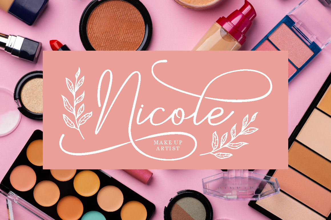
Bright Bride uses flowing curves, delicate strokes, and graceful calligraphic details to introduce romance and sophistication. OpenType alternates and ligatures help designers personalize selected letters, making the font useful for signature-style branding and elegant campaign messages. It pairs especially well with Cloud Dancer when the design needs warmth, femininity, and a human touch.
PROS: Elegant flow, romantic personality, OpenType features, and versatile digital and print use.
BEST FOR: Beauty, wellness, wedding platforms, personal brands, invitations, social campaigns, and premium lifestyle products.
4. Neon Whirl Colorful Font

Neon Whirl provides a deliberate contrast to the quiet Cloud Dancer foundation through layered neon-style lines, bold geometry, and colorful retro-futuristic energy. Its vivid construction can become the main visual event in an otherwise restrained layout, helping a launch, event, or digital campaign attract attention immediately. Use it in short display phrases so its multiple layers remain clear and impactful.
PROS: High visual impact, layered color system, futuristic geometry, and memorable campaign energy.
BEST FOR: Technology events, gaming, youth campaigns, creative SaaS launches, digital entertainment, posters, and experimental branding.
5. Aristiq Signature Luxury Script Font

Aristiq Signature combines natural handwritten movement with thin upstrokes, stronger downstrokes, and a polished calligraphic rhythm. It communicates exclusivity while retaining a personal quality, making it useful when a soft white visual system needs a refined signature accent. Pair it with a clean sans serif and use it for logos, endorsements, founder names, or short premium messages.
PROS: Authentic signature character, refined contrast, premium positioning, and graceful visual rhythm.
BEST FOR: Luxury services, personal branding, fashion, beauty, editorial titles, boutique packaging, and premium invitations.
Comparison
| Font | Visual Personality | Strongest Cloud Dancer Role | Ideal Brand Direction | Recommended Use |
|---|---|---|---|---|
| White Capel | Bold, rounded, and contemporary | Main visual anchor | Friendly modern business | Hero headlines and logos |
| White Raven | Elegant, editorial, and customizable | Refined identity layer | Premium digital brand | Wordmarks and campaign titles |
| Bright Bride | Romantic, graceful, and feminine | Human emotional accent | Beauty and wellness | Logos and short messages |
| Neon Whirl | Colorful, futuristic, and energetic | High-contrast focal point | Technology and entertainment | Launch graphics and event titles |
| Aristiq Signature | Personal, polished, and luxurious | Signature brand detail | Premium personal identity | Founder marks and luxury accents |
Common Mistakes
The first common mistake is interpreting the Cloud Dancer 2026 design trend as permission to make every interface element pale. Soft white backgrounds, light grey labels, low-contrast borders, and pastel buttons can combine into an interface that looks calm in a mockup but becomes difficult to use. Essential text, controls, chart data, and status messages still need clear contrast. Treat Cloud Dancer as the foundation and bring darker colors forward wherever users need to read, compare, decide, or act.
Another mistake is confusing empty space with meaningful hierarchy. Excessive gaps can make related information feel disconnected, increase unnecessary scrolling, and hide the relationship between a label and its control. Spacing should group related content and separate different tasks. Use a consistent scale for gaps, padding, section margins, and card layouts rather than adding large empty areas simply to make the page appear minimalist.
The final mistake is allowing the trend or display typography to overpower the product’s existing identity. A fintech platform should not suddenly resemble a wedding brand because both use soft white, and an educational product should not sacrifice clarity for decorative scripts or multicolored headlines. Use expressive fonts for logos, heroes, and campaign moments, then support them with functional typography for navigation, data, forms, and instructions. Test the visual system across mobile screens, accessibility settings, print applications, and real content before launch, and confirm that the font license covers the intended logo, website, advertising, or digital-product use.
Conclusion
The Cloud Dancer 2026 design trend is more useful when understood as a strategy for structure, focus, and flexibility rather than another minimalist aesthetic.
Soft white can create breathing room around complex information, support clearer visual hierarchy, and provide a stable canvas for changing brand colors. For fintech, SaaS, healthcare, and education, this approach can make dense digital experiences feel calmer without hiding important information.
The key is contrast. Pair the soft foundation with dark readable text, visible control states, functional accent colors, and deliberate spacing. Use brighter white, warm neutrals, and subtle tints to create depth instead of leaving every surface identical.
Typography from PutraCetol Studio can give this restrained visual system a distinctive voice. White Capel brings contemporary confidence, White Raven offers editorial refinement, Bright Bride adds romantic warmth, Neon Whirl creates a vivid focal point, and Aristiq Signature introduces personal luxury.
When color, spacing, typography, and accessibility work together, Cloud Dancer becomes more than a soft white background. It becomes a flexible framework for digital experiences that feel focused, professional, and recognizably human.
Explore these fonts and many more at PutraCetol.com to build a business identity that looks professional, trustworthy, and memorable.
Additionally, if you want to explore some free typography options, you can check out Putracetol Studio on Dafont. Happy reading and designing!