
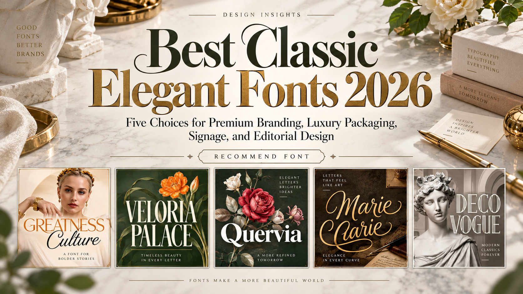
Best Classic Elegant Fonts 2026: Traditional Character, Modern Purpose
Choose the Brand’s Voice Before the Typeface
The best classic elegant fonts for 2026 should support a specific identity, not simply make a project look expensive. Decide whether the brand should feel authoritative, personal, understated, or theatrical.
A boutique hotel, artisan skincare label, and interior-design studio need different typography systems. Start with their audiences and applications.
Treat these recommendations as contemporary branding choices, not historical reproductions. Reserve expressive lettering for names and headlines, and test a simpler companion for directions, descriptions, and extended reading.
What to Test Before Choosing
Set the actual brand name, longest collection title, numerals, and required language characters. Compare a storefront mockup, a printed label, and a mobile header.
Begin in monochrome. Inspect spacing, thin strokes, and decorative details before adding foil or texture. For interior signage, review lettering at its intended viewing distance. Do not assume a beautiful screen preview guarantees successful production.
Jump to Recommended Fonts
1. Greatness Culture Stylish Duo Font
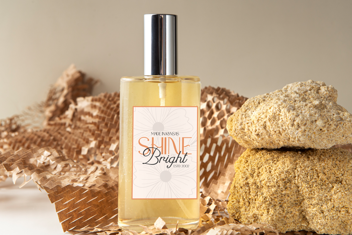
Greatness Culture pairs a clean sans serif with a flowing script, offering structured and personal voices within one coordinated package. Its ligatures provide additional choices for distinctive names and headline treatments. For a premium interior studio, use the sans serif for the main identity and reserve the script for a collection name or brief editorial accent.
PROS: Coordinated pairing, useful ligatures, contrasting visual voices.
BEST FOR: Interior studios, lifestyle brands, premium packaging, and hospitality campaigns.
2. Veloria Palace Classic Serif Font
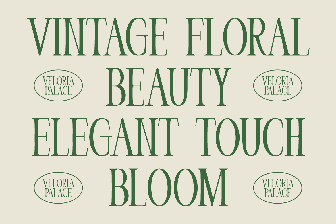
Veloria Palace combines tall, condensed proportions with pronounced stroke contrast and graceful curves. Its narrow construction offers substantial title presence without the width of an expanded display face. For a boutique hotel, test a carefully spaced wordmark on stationery, entrance branding, and website headers, letting the serif details provide character rather than surrounding them with elaborate ornament.
PROS: Condensed proportions, refined contrast, distinctive editorial character.
BEST FOR: Boutique hotels, luxury services, beauty packaging, and publication covers.
3. Quervia Elegant Serif Font
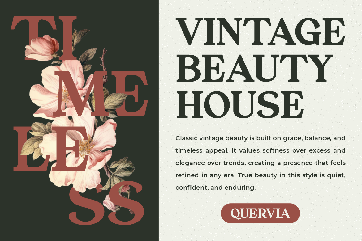
Quervia uses balanced proportions, medium stroke contrast, sharp serif terminals, and controlled curves. Distinctive inner cuts introduce personality while retaining a composed classical structure. Try it for a jewelry collection or heritage-inspired skincare label, using a short title and generous margins so the sculpted letterforms remain the focus.
PROS: Balanced structure, distinctive serif details, restrained vintage character.
BEST FOR: Jewelry, skincare, cultural campaigns, premium labels, and editorial titles.
4. Marie Clarie Monoline Script Font
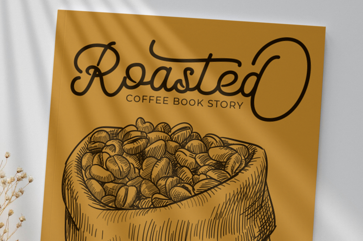
Marie Clarie uses thin, consistent monoline strokes with classic script lettering and vintage undertones. Its lighter construction offers an intimate alternative to commanding serif titles, bringing a handwritten character to short names. For an artisan café, try it on a signature product label or invitation, keeping prices and practical details in a straightforward supporting font.
PROS: Consistent stroke weight, personal script character, vintage warmth.
BEST FOR: Artisan cafés, invitations, stationery, personal brands, and gift packaging.
5. Deco Vogue Art Deco Line Font
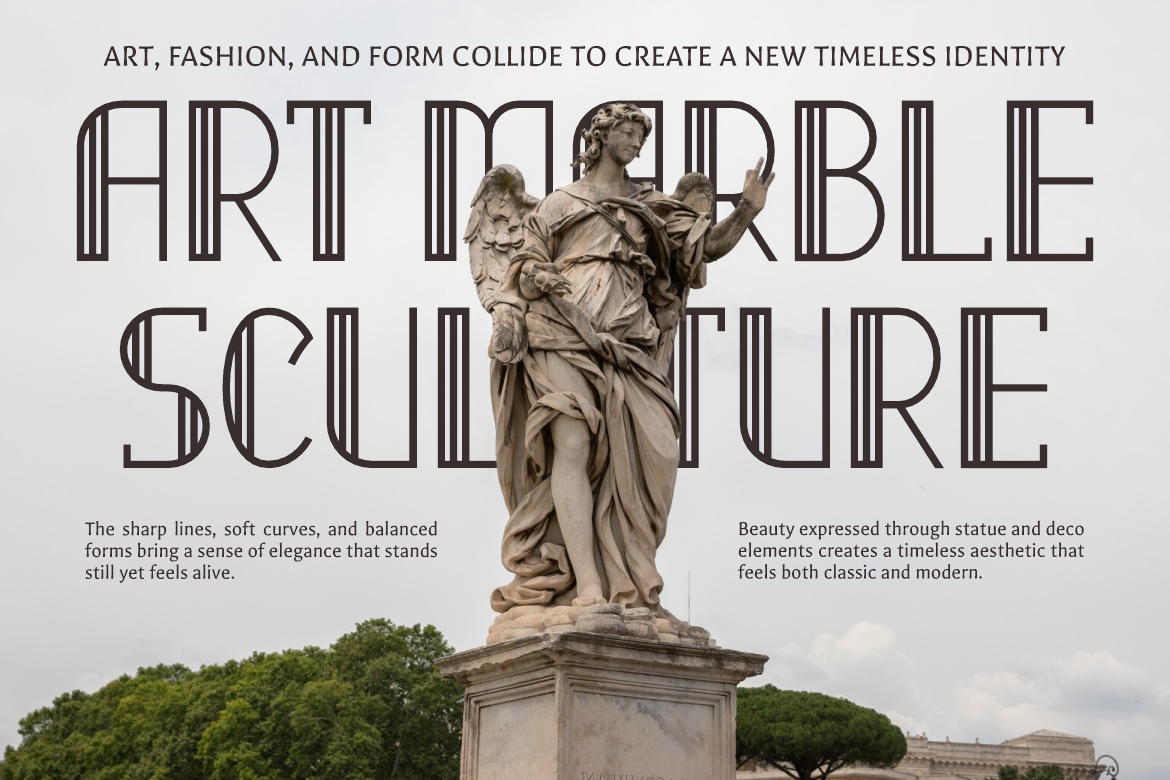
Deco Vogue builds tall, elongated letters from thin lines, smooth curves, and defined terminals inspired by Art Deco geometry. Its linear construction creates a light architectural character rather than dense ornament. Consider it for an exhibition title or premium venue identity, using a simple background and ample scale to preserve the line detailing.
PROS: Linear geometry, elongated proportions, distinctive decorative structure.
BEST FOR: Exhibition graphics, fashion campaigns, boutique venues, and premium invitations.
Comparison
Use these suggested applications to shortlist fonts by the project’s purpose.
| Font | Suggested Brand Direction | First Application to Test |
|---|---|---|
| Greatness Culture | Polished with personal accents | Interior-studio presentation |
| Veloria Palace | Formal premium identity | Boutique-hotel wordmark |
| Quervia | Restrained heritage inspiration | Jewelry collection label |
| Marie Clarie | Intimate artisan branding | Café signature packaging |
| Deco Vogue | Architectural glamour | Exhibition campaign |
Common Mistakes
The first mistake is assuming classic elegance requires pale colors, tiny text, and decorative borders. Establish hierarchy and contrast before styling the surface. Keep essential directions and contact information readable, even when the main identity uses delicate lettering.
Another mistake is inventing heritage through typography. For established businesses, research existing wordmarks and retain meaningful details. For newer brands, describe the aesthetic as classically inspired rather than implying an undocumented history. Apply the chosen typography consistently instead of redesigning the identity with every campaign.
The final mistake is overlooking production and licensing. Test engraving, foil, or textured printing with suppliers, and review responsive layouts separately. PutraCetol’s licensing options distinguish printed production, website embedding, advertising, and trademark-related uses. Confirm coverage for the complete project before launch.
Conclusion
The best classic elegant fonts 2026 bring different forms of refinement to contemporary projects. Choose a clear visual voice, protect practical readability, and test the design where people will actually encounter it.
Explore these five PutraCetol Studio fonts with your real brand name or collection title. Lasting elegance comes from consistent, purposeful application, not simply making a new identity look old.
Explore these fonts and many more at PutraCetol.com to build a business identity that looks professional, trustworthy, and memorable.
Additionally, if you want to explore some free typography options, you can check out Putracetol Studio on Dafont. Happy reading and designing!