
In business, communication is everything. Whether you’re pitching to investors, presenting quarterly results, or training your team, the quality of your presentation affects how your message is received. While many people focus on content and visuals, one crucial yet often overlooked element is typography. Choosing the right font can dramatically improve how your presentation looks, feels, and communicates.
Fonts do more than add visual appeal they influence professionalism, readability, trustworthiness, and audience engagement. This article explores why choosing the right font for business presentations is essential, what factors to consider, and how professional fonts from Putracetol.com can enhance presentation quality.
Typography isn’t just design decoration. It is a communication tool that shapes first impressions and delivers content more effectively.
The right font immediately signals that the presenter takes their work seriously. Clean, professional typefaces build trust and make presentations look polished. Poor font choices, on the other hand, can make even high-quality content appear amateur.
A great presentation must be easy to read from a distance whether viewed in a meeting room, classroom, or shared through a screen. Readable fonts help audiences absorb information quickly and stay focused on the message.
Businesses often have established branding guidelines. Using fonts that reflect or match the company’s identity reinforces consistency across all communication materials from presentations to marketing assets.
Typography sets the tone before a single word is spoken. A well-selected font draws attention, establishes a mood, and prepares the audience to engage with the content.
Selecting the right font requires thoughtful consideration not guessing. Here are the most important factors presenters should evaluate.
A good presentation font must stay clear on large screens, small screens, and printed handouts. Look for:
Avoid overly decorative or textured fonts in body text. Instead, use readable fonts for main content and reserve more expressive fonts for headings.
Match the typography style to the presentation purpose:
Typography should complement the message not overshadow it.
Using too many fonts can make a presentation look cluttered. Stick to one or two fonts throughout the slides to maintain a cohesive and organized appearance. Consistent typography improves readability and visual harmony.
Great presentation fonts must work across different platforms:
Choose fonts that display correctly across devices and software to avoid formatting issues.
Putracetol.com offers a wide range of professional fonts suitable for business presentations. Here are standout choices that combine readability, style, and branding versatility:

Luxerna Display offers a premium look perfect for upscale corporate presentations, luxury brands, and professional reports. Its clean shapes add authority and elegance.
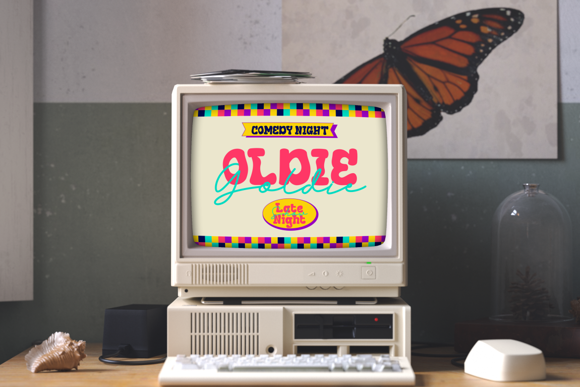
Faded Glory adds a subtle nostalgic tone while staying modern and readable. Great for storytelling presentations or creative industries.

This font balances friendliness and professionalism, making it suitable for lifestyle topics, brand storytelling, or educational content.
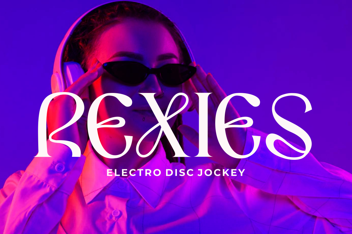
Violense offers a unique stylistic presence that suits innovative industries, creative agencies, and design showcases.

Perfect for high-energy or forward-thinking presentations. Redfire brings bold shapes and visual impact while maintaining structure.

Rounded, clean, and modern ideal for youth-focused presentations, digital products, and casual business settings.
A bold and structured font that gives presentations a serious, dependable tone. Perfect for corporate reports, proposals, and investor decks.
Typography affects not only the visual quality of presentations but also how audiences understand and interpret information.
Different font weights and sizes help guide the audience through each slide. Clear hierarchy makes complex information easier to follow.
Readable fonts reduce eye strain, keeping audiences engaged longer. Poor readability causes distraction and reduces comprehension.
Professional fonts create a cohesive experience. When typography is consistent across slides, it strengthens the presenter’s credibility.
Fonts carry emotional character:
Choosing the right emotional tone improves the clarity of your message.
Here are practical guidelines to help ensure your typography choices support clear, effective communication:
Sans-serif fonts are generally easier to read on screens due to their clean structure.
If using decorative or expressive fonts (like Redfire or Violense), apply them only to titles or section headers.
Light text on dark backgrounds or dark text on light backgrounds improves readability.
Preview your presentation on different screens to ensure consistent clarity.
Bold for headings, medium for subheadings, regular for body text. This helps structure information clearly.
Stick to two weights at most regular and bold to maintain a clean, professional layout.
In a world of remote meetings, digital presentations, and online pitch decks, typography has taken on even greater importance. Virtual audiences rely heavily on visuals to understand and stay engaged. Clean, consistent fonts help transform presentations into powerful communication tools.
Professionals who pay attention to these details demonstrate expertise, organization, and thoughtful communication qualities valued in every industry.
Choosing the right font for business presentations is much more than a design preference it’s a strategic communication decision. Typography influences clarity, professionalism, credibility, and brand alignment. When presenters use well-chosen fonts, their ideas become easier to understand and more convincing.
With the curated font collection from Putracetol.com including Luxerna Display, Faded Glory, Happy Groov, Violense, Redfire, Mega Boldy, and Bloxine professionals can elevate their presentations and deliver messages that truly resonate.
Explore more presentation-friendly typography at Putracetol.com and take your next business presentation to a new level of clarity and professionalism.
Thank you for taking the time to read this article. If you are looking for more great articles, feel free to visit Putracetol Blog
Additionally, if you want to explore some free typography options, you can check out Putracetol Studio on Dafont. Happy reading and designing!
