

The best cute bubble fonts do not need to appear across every part of a design. Their strongest role is usually to attract attention through a logo, product name, campaign headline, poster title, or social media hook.
Bubble typography already carries a strong personality. Its rounded shapes, inflated proportions, and soft edges can make a brand feel cheerful, friendly, youthful, or nostalgic before the audience reads the complete message. When the same style is used for paragraphs, prices, instructions, buttons, and product details, that personality can become visual noise.
Begin by assigning three typographic roles:
- Bubble display font: Brand name, product title, campaign headline, or cover text
- Supporting font: Descriptions, product information, dates, prices, and calls to action
- Optional accent style: A layered effect, outline, texture, or contrasting color used for selected words
This simple system allows the bubble font to remain memorable while keeping functional information easy to understand.
What Are Cute Bubble Fonts?
Cute bubble fonts are display typefaces built around rounded, puffy, or inflated letterforms. Their shapes may resemble balloons, jelly candy, soft toys, clouds, foam, stickers, or hand-drawn cartoon lettering.
Common features include:
- Thick and rounded strokes
- Wide counters and soft corners
- Playful proportions
- Bouncy baselines
- Puffy or inflated silhouettes
- Retro or psychedelic curves
- Layered outlines and shadows
- Irregular but friendly letter shapes
- Bold visibility at display sizes
Although these fonts are often associated with children’s products, they can support a much wider range of creative identities. Bubble lettering can feel nostalgic in a retro fashion campaign, energetic on an album cover, delicious on snack packaging, or highly expressive in youth-focused digital content.
The surrounding color, imagery, layout, and supporting typography determine whether a bubble font feels childish, fashionable, psychedelic, sweet, or contemporary.
Why Bubble Typography Attracts Attention
Rounded Shapes Create a Friendly Visual Tone
Sharp corners and narrow structures can feel technical, formal, or aggressive. Rounded letters usually create a softer visual relationship with the audience.
This makes bubble typography useful for brands that want to appear welcoming and approachable. A children’s store, dessert company, beauty accessory brand, or creative community can use rounded type to reduce formality while maintaining a strong visual identity.
The result does not need to look childish. A controlled color palette, spacious layout, and modern photography can make puffy lettering feel stylish and intentional.
Thick Letterforms Build a Recognizable Silhouette
Bubble fonts often use substantial weight and broad proportions. These qualities help short names remain visible on packaging, posters, merchandise, and social media thumbnails.
The audience may recognize the shape of the wordmark before consciously reading every letter. This creates useful branding potential, especially when the same typography appears consistently across product variants and campaigns.
Bubble Fonts Communicate Texture
Typography can suggest how a product might feel.
Soft rounded lettering can resemble marshmallows, whipped cream, gummies, foam, balloons, or plush materials. Wavy psychedelic forms may suggest movement, music, or liquid. Layered bubble letters can resemble stickers, printed signs, and retro packaging.
This visual connection makes bubble fonts especially effective for products and experiences where texture, flavor, play, or physical comfort matters.
They Work Well With Color
Bubble letters provide enough surface area for bright fills, gradients, patterns, highlights, and outlines.
A designer can create depth by combining:
- Solid fill and dark outline
- Two-tone layered characters
- Soft gradients
- Offset shadows
- Glossy highlights
- Alternating character colors
- Patterned interiors
- Contrasting inline details
These treatments should be used deliberately. The typeface should remain recognizable before additional effects are applied.
Five Main Directions in Bubble Typography
1. Soft and Puffy Bubble Fonts
Soft bubble fonts use smooth edges, rounded serifs, wide counters, and gentle curves. They feel comforting, cheerful, and highly approachable.
This direction works well for:
- Kids’ products
- Plush toys
- Candy and desserts
- Beauty accessories
- Greeting cards
- Lifestyle products
- Friendly service brands
Use pastel colors for a softer mood or stronger contrasting colors when the design needs greater shelf impact.
2. Psychedelic Bubble Fonts
Psychedelic bubble fonts introduce exaggerated curves, unusual connections, wavy baselines, and broad retro shapes. They often reference graphic design from the 1960s and 1970s.
This style can support:
- Music festivals
- Fashion campaigns
- Album covers
- Beverage branding
- Entertainment
- Creative events
- Retro merchandise
The typography already has substantial movement, so the surrounding layout should remain controlled enough for the title to stay readable.
3. Cartoon and Jelly Fonts
Cartoon bubble fonts may resemble balloons, gummies, jelly candy, or inflated toys. Their proportions are usually bold and expressive, but the best examples preserve open counters and clear differences between letters.
They are particularly effective for:
- Snack packaging
- Children’s books
- Toy brands
- Party supplies
- Stickers
- Educational products
- Cheerful mobile content
A clean supporting font can prevent the wider identity from becoming too visually busy.
4. Layered Retro Bubble Fonts
Layered fonts contain coordinated versions that can be placed on top of one another to create outlines, shadows, inlines, or dimensional effects.
This gives designers more control over color and depth without rebuilding each title manually. Layered bubble typography works well for retro posters, apparel, food packaging, editorial covers, and event campaigns.
A successful layered composition should remain understandable in one color. The additional styles should enhance the title rather than become necessary for basic recognition.
5. Moody or Experimental Bubble Fonts
Not every bubble typeface needs to feel sugary or innocent. Darker colors, irregular proportions, unusual cuts, or exaggerated geometry can create a more artistic and fashion-oriented personality.
This approach can work for:
- Streetwear
- Alternative beauty
- Lifestyle branding
- Creative studios
- Experimental packaging
- Youth culture
- Independent publications
The soft silhouette creates friendliness, while darker visual choices add tension and individuality.
How to Choose the Right Bubble Font
Define the Emotional Direction
Choose three words that describe the desired personality.
Examples include:
- Sweet, soft, and comforting
- Bold, funny, and energetic
- Retro, colorful, and expressive
- Fashionable, playful, and confident
- Youthful, creative, and friendly
A font should be selected according to these qualities rather than its category name alone. Two bubble fonts may have similarly rounded shapes while communicating very different moods.
Test the Real Brand or Product Name
Font specimens are designed to show attractive letter combinations. Your brand name may contain repeated characters, narrow letters, long words, or difficult capitals.
Type the complete name and examine:
- Initial and final letters
- Spacing between rounded characters
- Similar-looking forms
- Repeated letters
- Punctuation
- Numerals
- Uppercase and lowercase options
A short name can support wider and more exaggerated characters. A longer name may require tighter proportions or a stacked composition.
Start in Black and White
Before adding pink, yellow, gradients, shadows, or glossy effects, test the title using one color.
Check whether:
- Every letter is recognizable
- The word has a balanced silhouette
- The spacing feels deliberate
- Counters remain open
- The title works at small sizes
- The personality is clear without decoration
A strong bubble font should not depend entirely on color to communicate its character.
Select a Readable Companion Font
Pair the bubble font with a cleaner typeface for supporting content.
Useful combinations include:
| Bubble Font Personality | Supporting Font Direction |
|---|---|
| Soft and cute | Rounded sans serif |
| Psychedelic and retro | Neutral geometric sans serif |
| Chunky and cartoon-like | Simple humanist sans serif |
| Layered and dimensional | Clean grotesque |
| Experimental and fashionable | Restrained modern serif or sans serif |
The supporting typeface should create contrast without making the design feel disconnected.
Consider the Production Method
Bubble lettering may be printed, embroidered, cut from vinyl, displayed on a phone, or applied to packaging.
Test whether:
- Small internal spaces remain open
- Layered styles align correctly
- Thin outlines survive printing
- Details remain clear in embroidery
- The title works on curved packaging
- Colors reproduce accurately
- The font remains legible in social thumbnails
Prepare a simplified version for applications where layered or detailed treatments cannot survive.
Using Cute Bubble Fonts in Branding
Kids’ and Family Brands
Bubble typography fits naturally with toys, learning materials, children’s fashion, party products, and family entertainment.
Use bright but controlled colors and keep practical information organized. Parents and other adults may be the people making the purchase, so ingredients, safety information, sizes, and instructions should still look credible and easy to read.
A playful logo can sit inside a structured packaging system. Fun and professionalism are not opposites.
Candy, Snack, and Dessert Packaging
Rounded fonts can suggest sweetness, softness, and indulgence before customers see the product itself.
Possible visual pairings include:
- Pink and cream for marshmallows
- Red and yellow for gummies
- Brown and mint for chocolate
- Purple and orange for sour candy
- Blue and white for frozen desserts
Give the main product name strong visibility, then use a simpler companion for flavor, weight, ingredients, and nutritional information.
Fashion and Beauty Branding
Bubble fonts can give fashion and beauty brands a youthful alternative to predictable luxury serifs.
Use the lettering with editorial photography, neutral backgrounds, and deliberate spacing to create a modern visual tension. A puffy font in black and white can feel more fashion-focused than the same font in a rainbow palette.
This direction suits accessories, cosmetics, nail products, streetwear, haircare, and social-first lifestyle brands.
Music, Cover Art, and Events
Psychedelic and layered bubble fonts bring movement to album covers, festival titles, concert posters, and creative events.
The letterforms can become the main artwork when combined with gradients, warped shapes, grain, or retro photography. Keep dates, venues, ticket details, and performer lists in a simpler font.
The event title should create atmosphere, while the supporting typography helps people attend it.
Social Media and Content Creation
Bubble fonts can make Reel covers, carousel hooks, Story announcements, and video thumbnails easier to recognize.
Use short headlines such as:
- Sweet New Drop
- Design It Bold
- Weekend Party
- Cute Packaging Tips
- New Bubble Collection
Keep the words large and leave enough space around them. Avoid forcing a full caption into the artwork.
Stickers and Merchandise
Thick, rounded letters work well for stickers, T-shirts, tote bags, notebooks, mugs, and phone cases because their silhouettes can remain recognizable from a distance.
Check the smallest internal spaces before production. Very tight details may fill during printing or embroidery.
Building a Bubble Font Color System
Soft Pastel Palette
Use light pink, cream, lavender, mint, and pale blue for beauty, kids’ products, stationery, and soft lifestyle brands.
A dark text outline can prevent pale fills from disappearing against light backgrounds.
Bright Candy Palette
Use saturated red, yellow, orange, green, purple, and blue for sweets, events, toys, and playful retail.
Assign colors intentionally rather than making every character different without a system.
Retro Palette
Combine mustard, warm orange, avocado green, dusty pink, brown, and cream for a nostalgic 1970s mood.
Add light grain or offset shadows to support the historical direction.
Modern Monochrome Palette
Black, white, charcoal, and one bright accent can make bubble typography feel more contemporary and fashion-oriented.
This is useful when the brand wants playfulness without looking overly childish.
Dark Creative Palette
Deep purple, midnight blue, dark burgundy, charcoal, and electric accents can give rounded typography a more experimental or nightlife-focused character.
The letterforms remain friendly, but the color system introduces greater intensity.
Keep Bubble Typography Readable
Cute bubble fonts are usually designed for display applications. Use them for short words and major visual moments rather than long paragraphs.
For functional digital content, provide enough contrast between text and its background. WCAG 2.2 sets a minimum contrast ratio of 4.5:1 for normal text and 3:1 for qualifying large text. Thin, unusual, or highly stylized characters may require stronger contrast in practice.
Also consider:
- Avoiding detailed photographs behind text
- Increasing spacing when rounded letters feel crowded
- Keeping important counters open
- Using clear supporting typography for CTAs
- Testing the design on an actual phone
- Repeating essential information in captions or body text
- Creating a simplified logo for very small applications
A cute font should make the message more inviting, not harder to understand.
Jump to Recommended Fonts
Floofy Bubble | Groovy Bubble | Jelly Boogie | Tango Groove | Glooma
1. Floofy Bubble
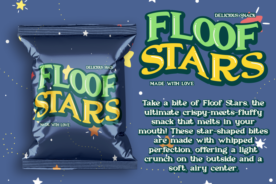
Floofy Bubble is a playful display font built around soft, rounded serif forms and a charming inflated silhouette. Its puffy structure can make short names feel friendly and tactile, which is especially useful when the typography needs to resemble clouds, foam, plush materials, or sweet treats. The font creates a cute focal point without needing complicated illustrations around it.
PROS: Soft rounded forms, friendly serif details, clear bubble personality, and strong logo potential.
BEST FOR: Kids’ branding, candy packaging, plush products, beauty accessories, stationery, cheerful logos, stickers, and lifestyle campaigns.
2. Groovy Bubble Bold Psychedelic Display Font

Groovy Bubble combines chunky bubble-like letters with smooth rounded edges, thick strokes, whimsical curves, and a clear retro psychedelic personality. Its visual direction references the colorful energy associated with 1960s and 1970s graphics, making it particularly effective when a project needs both playful charm and nostalgic movement. The family includes uppercase, lowercase, numerals, punctuation, and multilingual Latin support for broader campaign flexibility.
PROS: Bold psychedelic rhythm, multilingual support, high headline visibility, strong vintage character, and expressive curves.
BEST FOR: Music festivals, retro packaging, apparel, posters, album covers, entertainment, invitations, stickers, and playful brand identities.
3. Jelly Boogie Bubble Font

Jelly Boogie uses bold, rounded characters with soft edges that resemble balloons, gummies, or squishy jelly candy. Its cohesive letterforms preserve readability while giving logos and titles a lively childhood-inspired personality. The font includes uppercase, lowercase, numbers, punctuation, and multilingual characters, making it practical for a wide range of digital and printed projects.
PROS: Smooth bubbly construction, friendly readability, comprehensive character support, and strong child-friendly appeal.
BEST FOR: Children’s products, candy, party branding, book covers, greeting cards, invitations, educational graphics, packaging, and vibrant logos.
4. Tango Groove Layered Retro Bubble Font
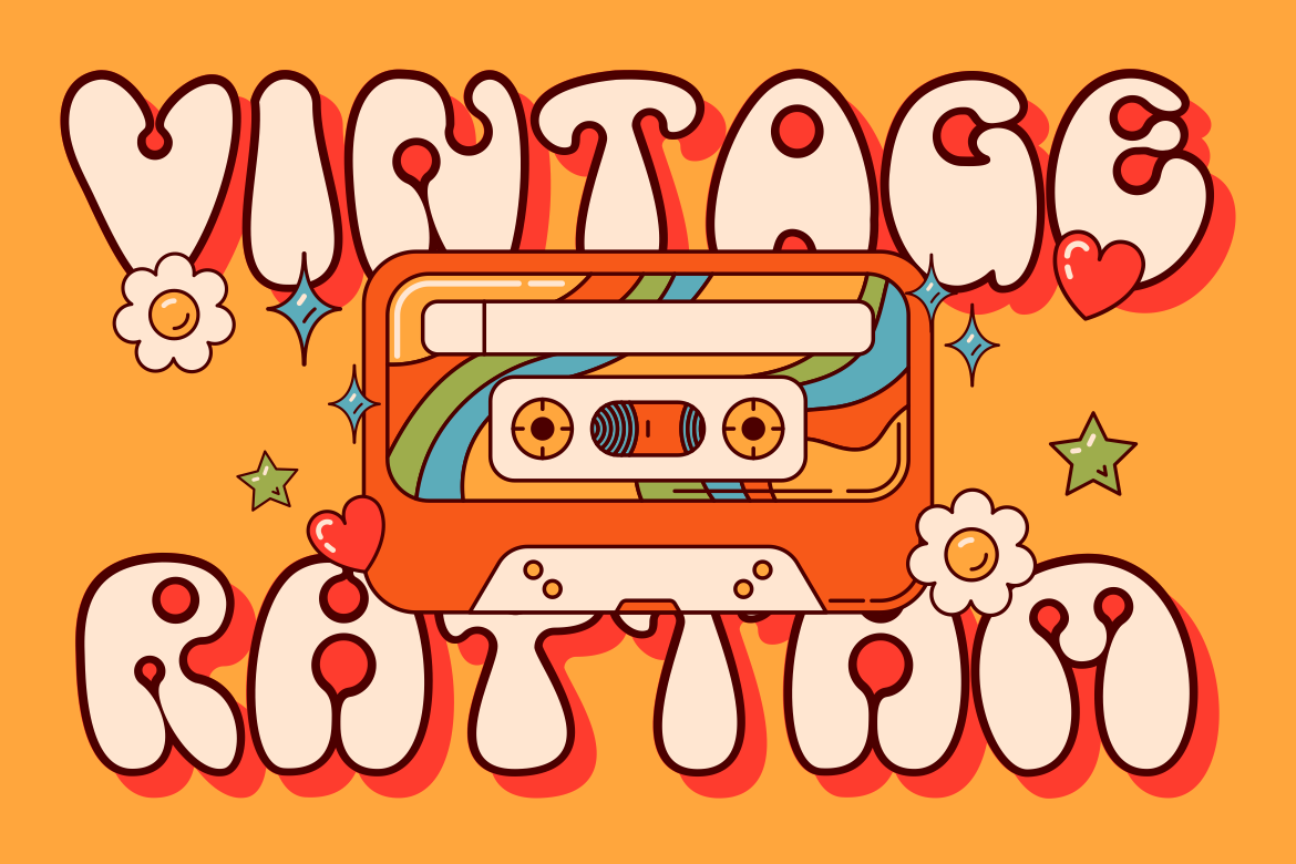
Tango Groove brings a joyful, free-spirited retro personality to bubble typography through a coordinated layered family. Its three styles can be combined to build color separation, dimensional effects, outlines, or contrasting visual depth without manually redrawing the letters. This makes it especially useful for designers who want a flexible poster or packaging system rather than one fixed title treatment.
PROS: Three coordinated styles, layered design flexibility, retro personality, dimensional potential, and strong campaign versatility.
BEST FOR: Retro posters, food packaging, fashion merchandise, festivals, album art, editorial covers, stickers, and colorful event branding.
5. Glooma Display Bubble Font
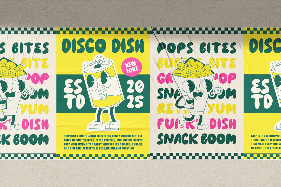
Glooma is positioned as a bubbly, cartoon-like display font with a playful retro-inspired direction. Its friendly visual weight makes it useful for products and campaigns that need immediate warmth, particularly snack branding, event posters, beverages, ice cream labels, and youthful lifestyle graphics. The style can carry a product name strongly while allowing the rest of the packaging to remain simple.
PROS: Strong cartoon appeal, retro character, friendly display weight, and clear food-and-lifestyle branding potential.
BEST FOR: Soda, fruit drinks, ice cream, snack products, lifestyle campaigns, event graphics, cheerful packaging, and youth-focused logos.
Comparison
| Font | Main Personality | Distinctive Feature | Strongest Application | Ideal Audience |
| Floofy Bubble | Soft, sweet, and comforting | Rounded serif bubble forms | Logos, stationery, and cute packaging | Kids, beauty, and lifestyle customers |
| Groovy Bubble | Psychedelic, bold, and nostalgic | Large retro curves and expressive rhythm | Festivals, posters, and album covers | Music, fashion, and creative communities |
| Jelly Boogie | Cheerful, cartoon-like, and friendly | Balloon and jelly-inspired shapes | Kids’ products and candy packaging | Children and family audiences |
| Tango Groove | Retro, colorful, and dimensional | Three coordinated layered styles | Posters, merchandise, and packaging | Youth, entertainment, and retro brands |
| Glooma | Bubbly, playful, and food-friendly | Cartoonish weight with retro influence | Drinks, snacks, and lifestyle products | Young consumers and playful brands |
Common Mistakes
The first mistake is using a bubble font for every part of the identity. A rounded display face may create an excellent logo, but it can become tiring in product descriptions, captions, website navigation, prices, or legal information. Give the bubble font a specific role, then support it with a simpler typeface. This creates hierarchy and allows the playful lettering to remain special rather than becoming constant visual noise.
Another mistake is adding too many effects before fixing the typography itself. Multiple outlines, shadows, gradients, gloss, patterns, and alternating character colors can make a title look exciting at full size while hiding weak spacing or unclear letters. Build the wordmark in one color first, correct the kerning, and test it at thumbnail size. Add only the effects that improve the intended mood. A layered font such as Tango Groove provides useful flexibility, but the layers should still support a recognizable base word.
The final mistake is assuming that cute design does not require professional testing. Puffy counters can close during embroidery, pastel text can disappear against a light package, and detailed lettering may become unreadable on mobile screens. Test real production sizes, backgrounds, materials, and color contrast before approval. Also confirm that the chosen license covers the intended logo, packaging, social media, advertising, merchandise, website, or editable-product application.
Conclusion
The most effective cute bubble fonts combine friendly emotion with strong visual recognition. Their rounded shapes can communicate sweetness, joy, creativity, nostalgia, or youthful confidence depending on how they are styled.
Floofy Bubble brings soft and comforting charm. Groovy Bubble adds bold psychedelic movement, while Jelly Boogie captures the playful feeling of balloons and jelly candy. Tango Groove provides a flexible layered system for retro compositions, and Glooma offers cartoon-like energy for snacks, beverages, events, and lifestyle branding.
Choose the font according to the audience and emotional direction, not simply because it looks cute. Test the actual brand name, begin in black and white, pair the display font with readable supporting typography, and create simplified versions for smaller applications.
Fonts from PutraCetol Studio can help designers, content creators, and creative businesses build logos, packaging, posters, cover art, merchandise, and campaigns that feel cheerful without becoming generic. When playful typography is supported by a clear visual system, bubble letters become more than decoration. They become a recognizable part of the brand’s personality.
Explore these fonts and many more at PutraCetol.com to build a business identity that looks professional, trustworthy, and memorable.
Additionally, if you want to explore some free typography options, you can check out Putracetol Studio on Dafont. Happy reading and designing!