
The best Brutalist fonts are not chosen simply because they look damaged, aggressive, or difficult to read. They work when the visual roughness expresses a clear position.
An underground record label may reject polished commercial music branding. A streetwear collection might challenge the controlled elegance of luxury fashion. An experimental art event may want to expose the artificial perfection created by templates, filters, and automated design tools.
Before choosing a typeface, complete this sentence:
This design should feel raw because the project rejects ________.
Possible answers include:
- Corporate perfection
- Predictable genre branding
- Luxury minimalism
- Algorithm-friendly content
- Sanitized commercial culture
- Traditional ideas of beauty
- Passive and comfortable communication
This gives the rough typography a reason to exist. Without that reason, glitch effects, broken grids, and distressed letters become decoration rather than a visual argument.
What Are Brutalist Fonts?
Brutalist fonts are typefaces used to create forceful, exposed, and intentionally uncomfortable visual communication. They often feature dense structures, sharp extensions, rough edges, compressed spacing, irregular proportions, or visible damage.
Common characteristics include:
- Heavy and compact letterforms
- Jagged or torn outlines
- Sharp spikes and thorn-like details
- Cracked or eroded surfaces
- Distressed brush texture
- Dense blackletter construction
- Narrow counters
- Aggressive vertical rhythm
- Deliberately awkward proportions
- Letters that approach abstraction
The category is not limited to one traditional type classification. A blackletter font can feel brutalist, but so can a damaged grotesque, dry-brush display font, fragmented serif, or distorted geometric sans serif.
What connects them is the refusal to disappear quietly into the layout.
Brutalist Typography Is Controlled Disorder
Brutalist design often appears chaotic, but effective compositions are rarely random.
The designer still decides:
- Which element should dominate
- Where the eye should move next
- Which information must remain readable
- How texture is repeated
- Where the composition becomes dense
- Where visual silence is needed
- Which rules are broken
- Which rules remain intact
This distinction matters.
Random disorder gives every element equal visual noise. Controlled disorder creates tension between readable structure and deliberate disruption.
A poster might use an almost unreadable band logo at the top, but the date, venue, and ticket link can remain perfectly organized below it. The contrast between those two layers creates a stronger brutalist result than making everything equally difficult to understand.
Brutalism, Grunge, Blackletter, and Anti-Design
These styles often overlap, but they are not interchangeable.
Brutalist Typography
Brutalist typography emphasizes visual mass, exposed structure, hard contrast, and direct impact. It may feel architectural, confrontational, or deliberately unfinished.
Grunge Typography
Grunge relies more heavily on wear, dirt, scratches, torn surfaces, faded ink, and distressed reproduction.
A grunge font can feel old and decayed without being particularly brutalist.
Blackletter Typography
Blackletter comes from a historical lettering tradition with dense strokes, pointed forms, and compressed rhythm.
Modern designers can transform blackletter into brutalist typography by exaggerating its weight, spikes, irregularity, or visual aggression.
Anti-Design
Anti-design intentionally rejects conventional hierarchy, harmony, alignment, or visual beauty.
A design can be anti-aesthetic without using a distressed font. It might use generic system typography in an intentionally uncomfortable composition.
Death-Metal Typography
Death-metal lettering often pushes characters toward symbolic or abstract forms. Spikes, roots, thorns, mirrored structures, and tangled silhouettes can make the logo function almost like an emblem.
It is one of the most extreme branches of brutalist display typography.
The Visual Grammar of Brutalist Fonts
Visual Mass
Brutalist typography often relies on heavy black shapes that occupy substantial visual space.
Mass creates authority and pressure. A short word set in dense lettering can feel louder than a long headline in a lighter typeface.
Use visual mass for:
- Band names
- Collection titles
- Festival identities
- Fashion graphics
- Horror titles
- Campaign statements
Avoid using the same weight for every supporting element. Heavy typography becomes more effective when lighter information surrounds it.
Compression
Tight spacing and condensed proportions create urgency.
Letters may appear trapped, stacked, or pushed together. This can communicate tension, speed, crowding, or emotional pressure.
Compression works particularly well for posters and apparel, where a wordmark needs to create a compact silhouette.
However, narrow counters and tight spacing become difficult to reproduce at small sizes. Prepare a more open version for thumbnails, labels, and digital navigation.
Fracture
Cracks, cuts, tears, and broken contours can suggest:
- Physical damage
- Digital corruption
- Social instability
- Violence
- Decay
- Transformation
- Resistance
Fracture should follow one visual logic. Randomly adding different crack styles to every letter usually weakens the wordmark.
Spikes and Extensions
Sharp terminals can create a hostile or dangerous identity. They may resemble thorns, flames, blades, roots, wires, or fractured metal.
Long extensions are especially useful for turning a word into an emblem. They can create a memorable outer silhouette even when the internal letterforms are complex.
The trade-off is space. Spiked letters need generous margins to avoid accidental cropping or collisions.
Texture
Texture can make digital typography feel physically produced.
Useful textures include:
- Dry brush
- Photocopy grain
- Scratched metal
- Concrete
- Ink bleed
- Torn paper
- Scanner noise
- Corroded surfaces
- Pixel damage
Apply one primary texture language consistently. A coherent distressed system feels more intentional than combining dirt, glitch, fire, grain, and torn paper without hierarchy.
Irregular Rhythm
Brutalist fonts frequently reject smooth, predictable rhythm. Characters may vary in width, height, angle, or terminal length.
This irregularity adds energy, but the complete word still needs a recognizable silhouette.
The goal is not perfect consistency. It is enough internal logic for the audience to believe that every unusual decision belongs to the same visual language.
How to Choose a Brutalist Font
Match the Font to the Type of Aggression
Not every brutalist font communicates the same emotion.
| Font Direction | Emotional Impression |
|---|---|
| Heavy geometric | Industrial, physical, and authoritative |
| Thorn-like death metal | Chaotic, ritualistic, and extreme |
| Gothic blackletter | Historical, rebellious, and ceremonial |
| Rough brush | Immediate, handmade, and confrontational |
| Cracked display | Damaged, unstable, and distressed |
| Glitch typography | Digital, corrupted, and technological |
A hardcore event may need rough and direct lettering. A Gothic fashion label might benefit from more controlled blackletter. An experimental technology campaign could use digital distortion rather than traditional metal imagery.
Test the Real Name
Never choose the font from its specimen headline alone.
Type the actual:
- Band name
- Product name
- Collection title
- Event name
- Campaign phrase
- Brand initials
Pay attention to repeated letters, difficult capitals, punctuation, and long words.
A font may create a powerful five-letter title but become visually tangled when used for a fourteen-character brand name.
Evaluate the Outer Silhouette
Reduce the wordmark until the internal details become less visible.
Does the overall shape remain distinctive?
Strong brutalist identities often work because their outer silhouette can be recognized before each letter is read individually.
This is especially important for band logos, clothing graphics, stickers, patches, and streaming thumbnails.
Start in One Color
Set the wordmark in solid black against white.
Do not begin with fire, chrome, gradients, glow, or glitch.
A one-color test reveals whether:
- The letters are recognizable
- The spacing is balanced
- The word has a clear shape
- The texture is doing too much
- Counters remain open
- Spikes create unwanted collisions
Effects should strengthen an already effective wordmark.
Building a Brutalist Typographic System
Primary Display Font
Use the most aggressive typeface for high-recognition moments:
- Logo
- Artist name
- Collection name
- Main poster title
- Album title
- Campaign phrase
- Merchandise graphic
Keep these phrases relatively short so the letterforms have room to perform.
Functional Supporting Font
Use a neutral grotesque, condensed sans serif, or monospace family for practical information:
- Event date
- Venue
- Product details
- Track listing
- Prices
- Website navigation
- Contact information
- Credits
- Legal text
The supporting font does not weaken the brutalist identity. It creates the structure that allows the display lettering to feel more extreme.
Secondary Texture Style
Instead of introducing another decorative font, create a secondary treatment from the main typeface.
Possible variations include:
- Outline
- Photocopy
- Halftone
- Blur
- Expanded tracking
- Horizontal stretch
- Cropped letter fragments
- Repeated word patterns
This preserves one visual voice while giving the campaign more flexibility.
Brutalist Fonts for Underground Music
Underground music is one of the most natural environments for brutalist typography because sound and lettering can share the same emotional qualities.
A dense, thorn-like font may suggest sonic pressure. Rough brush lettering can communicate live performance and DIY production. Blackletter introduces history, ritual, or darkness.
Useful applications include:
- Album covers
- Band logos
- Concert posters
- Festival branding
- Tour merchandise
- Vinyl packaging
- Streaming thumbnails
- Lyric videos
- Record-label identities
The typography should reflect the specific music rather than a broad category.
A hardcore band may need compact and direct lettering. Black metal can support colder, more organic shapes. Brutal death metal may use highly tangled forms that approach abstraction.
Brutalist Typography for Streetwear
Streetwear can combine an aggressive wordmark with clean product presentation.
This creates tension between the garment and the graphic identity.
Useful supporting elements include:
- Product codes
- Coordinates
- Industrial labels
- Barcodes
- Oversized numbers
- Utility symbols
- Registration marks
- Scanned textures
- Cropped photography
A permanent label should still have one reliable core wordmark. Individual collections can then experiment with heavier distress, alternative layouts, or different color systems.
Brutalist Fonts for Posters
Posters give experimental typography enough physical space to remain expressive.
A practical hierarchy could be:
Primary layer: Event or artist name in the brutalist font
Secondary layer: Theme or supporting statement
Functional layer: Date, location, lineup, and ticket information
The primary title can overlap imagery, run vertically, or extend beyond the page. The functional layer should remain easy to locate.
This separation allows the poster to feel rebellious without failing as communication.
Brutalist Typography for Social Media
Small screens create a different challenge.
A detailed blackletter or death-metal font may lose internal structure when reduced to a profile grid. Instead of shrinking a long title, consider:
- Using one word
- Enlarging one initial
- Cropping part of the logo
- Creating a simplified monogram
- Using the full logo only on the second slide
- Pairing the logo with a clean caption
For Reels and Stories, keep essential information away from interface controls and use strong light-dark contrast.
W3C specifies a minimum contrast ratio of 4.5:1 for normal text and 3:1 for qualifying large text. It also notes that unusual typefaces can appear fainter in practice, making stronger contrast a sensible choice for functional information.
The logo itself may be intentionally difficult, but prices, dates, links, and instructions should not be.
Color Systems for Brutalist Fonts
Black, White, and Blood Red
This combination is direct, urgent, and highly recognizable.
Use red as a controlled accent rather than filling the entire composition.
Concrete Grey and Acid Green
This palette feels industrial and digitally hostile. It works well for electronic music, streetwear, experimental technology, and nightlife.
Dirty Cream and Black
Off-white paper tones and crushed black create a convincing photocopy or underground-zine atmosphere.
Deep Burgundy and Metallic Grey
This produces a darker premium direction suitable for Gothic fashion, tattoo studios, alternative beverages, and luxury streetwear.
Pure Monochrome
Black and white may provide enough intensity on their own.
When the typeface is already highly detailed, avoiding additional colors can make the composition feel more confident.
Combining Brutalist Fonts With Glitch Backgrounds
A glitch background should not compete equally with the typography.
Choose one relationship:
Typography Dominates
Keep the background glitch subtle and let the wordmark remain the darkest or brightest element.
Image Dominates
Use the font as a compact stamp or label over a heavily corrupted image.
Typography Becomes the Glitch
Distort copies of the letters while keeping one clean version visible.
Background and Type Merge
Use letterforms as masks for noise, image fragments, or pixel displacement.
The strongest compositions normally preserve at least one stable reference point. When every layer is corrupted, the viewer has nothing against which to perceive the distortion.
Pairing Brutalist Fonts With Photography
High-Contrast Portraits
Crush the shadows, remove midtones, and crop the image aggressively.
This works well for musicians, fashion campaigns, and cultural posters.
Documentary Photography
Unpolished venue, street, rehearsal, and workshop photographs can make the typography feel connected to a real environment.
Product Photography
Place a heavily styled wordmark beside clean clothing or packaging photography. The contrast can make both elements feel more deliberate.
Abstract Images
Smoke, concrete, metal, roots, wires, and blurred motion can support brutalist typography without creating a literal narrative.
Avoid placing complex lettering over the most detailed part of the photograph.
Jump to Recommended Fonts
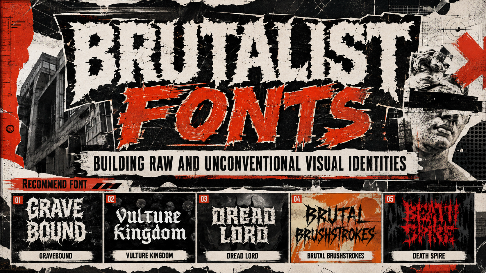
Gravebound Hardcore Font | Vulture Kingdom Hardcore Blackletter Font | Dread Lord Death Metal Font | Brutal Brushstrokes Metal Font | Death Spire Brutal Deathmetal Font
1. Gravebound Hardcore Font

Gravebound combines thick visual mass with jagged edges, sharp spikes, torn contours, and rough texture. Its dense construction creates immediate impact in short names, while irregular cuts add the chaotic rhythm associated with hardcore, black metal, horror, and underground street graphics. The font is especially useful when the wordmark needs to feel hostile and loud while maintaining a strong outer silhouette.
PROS: Heavy weight, sharp spikes, torn texture, powerful silhouette, and immediate underground character.
BEST FOR: Hardcore bands, black-metal projects, festival identities, horror media, club flyers, gaming covers, stickers, and dark merchandise.
2. Vulture Kingdom Hardcore Blackletter Font
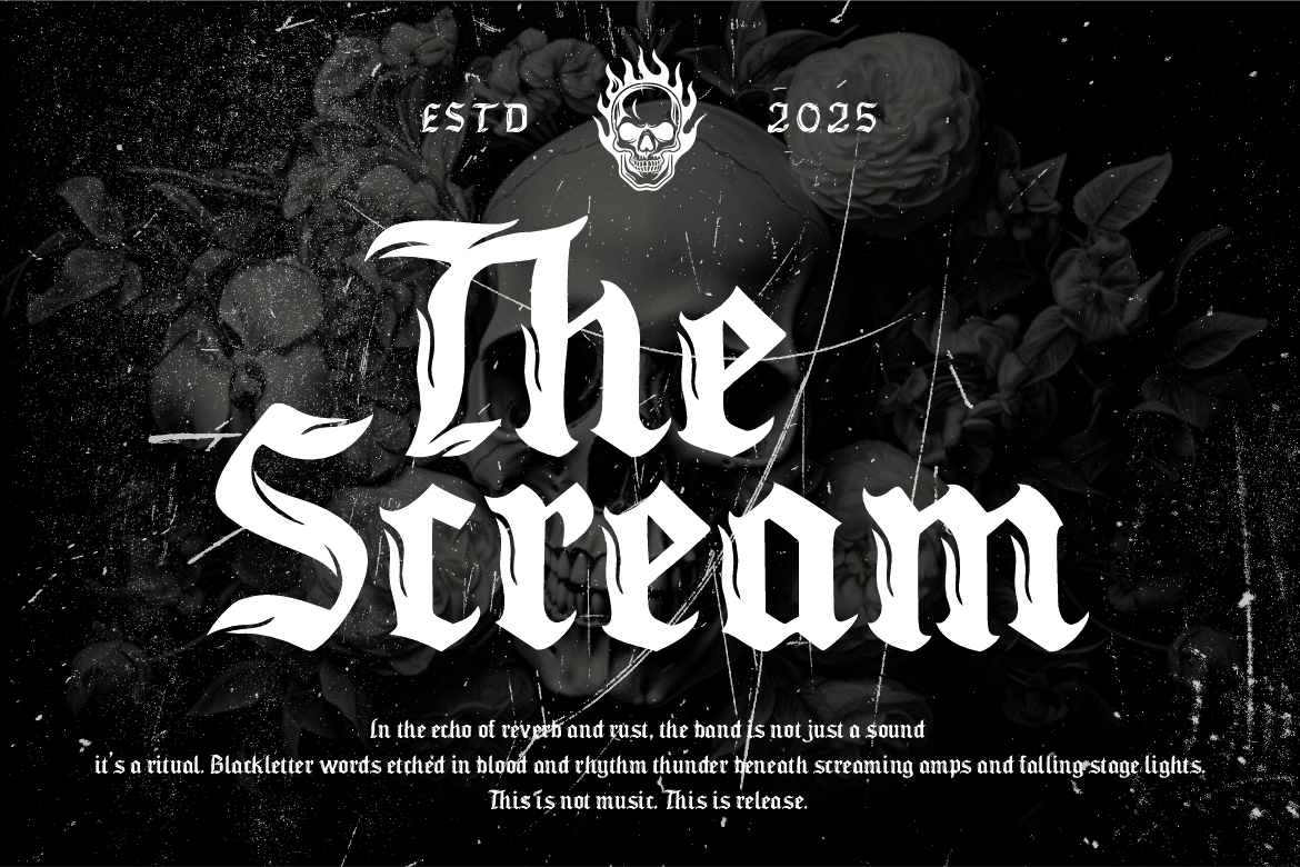
Vulture Kingdom combines traditional blackletter authority with razor-sharp curves, aggressive edges, and flame-like details. The result feels medieval and rebellious at the same time, making the font useful for identities that need historical darkness without appearing like a conventional heritage typeface. Its prominent Gothic silhouette performs strongly in artist names, labels, packaging, and fashion graphics.
PROS: Bold Gothic structure, flame-inspired ornament, sharp curves, historical authority, and commanding brand presence.
BEST FOR: Metal bands, underground zines, streetwear, tattoo studios, occult packaging, horror titles, apparel, and Gothic campaigns.
3. Dread Lord Death Metal Font
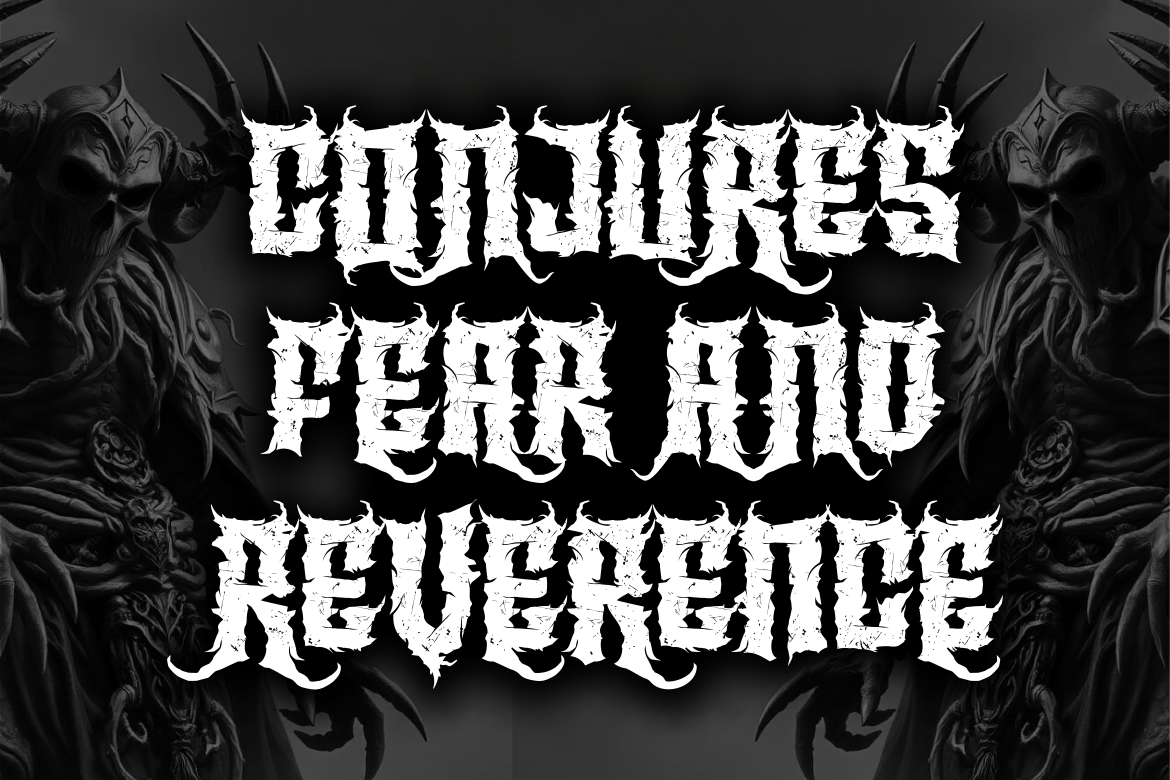
Dread Lord uses jagged irregular edges, cracked surfaces, sharp extensions, and distressed detailing to create a sinister death-metal personality. The underlying letters retain enough weight for prominent titles, while the damaged contours communicate chaos, rebellion, and physical decay. It works particularly well in monochrome artwork where the font’s fractures can become part of the wider texture system.
PROS: Cracked texture, aggressive extensions, irregular construction, strong dark atmosphere, and recognizable extreme-metal character.
BEST FOR: Death metal, black metal, album covers, horror posters, dark-fantasy projects, game titles, concert campaigns, and underground merchandise.
4. Brutal Brushstrokes Metal Font
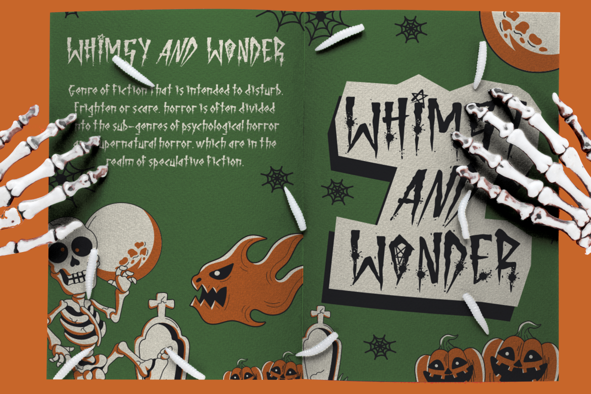
Brutal Brushstrokes brings rough, hand-painted energy into metal-inspired typography. Its distressed surfaces and gestural forms make designs feel immediate and physically produced, while seven coordinated styles provide several related treatments for one campaign or identity system. It is a strong alternative to geometric or medieval brutality when the project needs DIY motion, handmade imperfection, and expressive impact.
PROS: Seven styles, rough brush texture, handmade movement, broad display flexibility, and energetic visual character.
BEST FOR: Punk, metal, hardcore, Halloween campaigns, independent events, edgy packaging, invitations, apparel, stickers, and DIY posters.
5. Death Spire Brutal Deathmetal Font
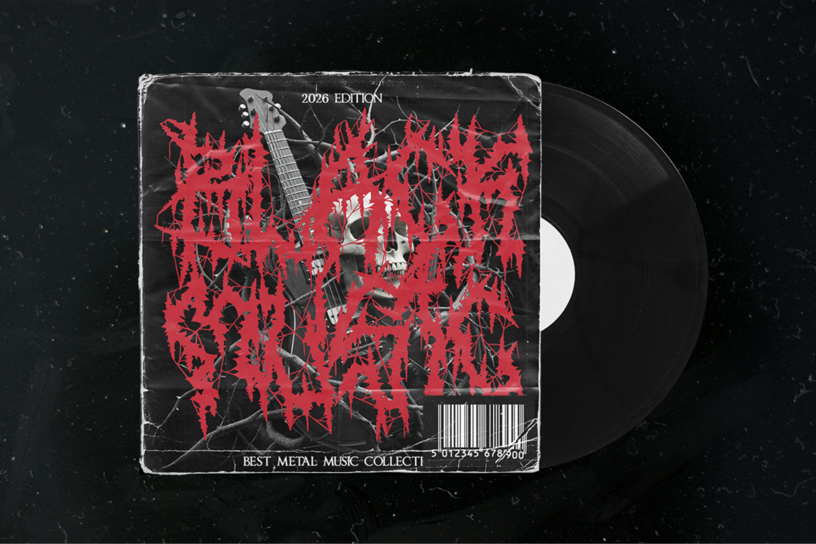
Death Spire pushes brutal typography toward dense, emblem-like abstraction through chaotic letterforms, thorn-like extensions, branch-shaped fractures, and needle-sharp terminals. Its tightly packed counters and tangled silhouettes create intense visual pressure, making the font most effective at large sizes where the internal structures have enough space to remain visible. It is designed for extreme projects that need ritualistic darkness and an uncompromising identity rather than conventional readability.
PROS: Thorn-like extensions, dense silhouettes, organic fractures, extreme visual intensity, and strong emblem potential.
BEST FOR: Brutal death metal, grindcore, black metal, extreme band logos, record labels, horror media, festival posters, film titles, and dark-art collectives.
Comparison
| Font | Main Direction | Visual Density | Strongest Use | Recommended Companion |
| Gravebound | Hardcore and black-metal display | High | Bold band names and festival branding | Neutral grotesque |
| Vulture Kingdom | Aggressive blackletter | Medium to high | Streetwear, Gothic packaging, and metal identity | Clean sans serif |
| Dread Lord | Cracked death-metal display | High | Album covers and horror campaigns | Monospace or condensed sans |
| Brutal Brushstrokes | Rough brush metal | Medium | DIY posters, punk graphics, and merchandise | Simple geometric sans |
| Death Spire | Extreme brutal death-metal lettering | Very high | Emblem-like logos and large titles | Minimal functional sans serif |
Best for Immediate Readability
Brutal Brushstrokes is the most suitable choice when the design needs raw personality without the extreme density of death-metal lettering.
Best for Gothic Streetwear
Vulture Kingdom combines historical blackletter character with a sharper contemporary attitude.
Best for Hardcore Impact
Gravebound offers heavy mass and hostile details while maintaining a strong silhouette in short words.
Best for Damaged Texture
Dread Lord creates a convincing fractured and distressed atmosphere.
Best for Extreme Visual Identity
Death Spire is the strongest option when the wordmark should approach a symbol or ritualistic emblem.
Common Mistakes
The first mistake is treating illegibility as proof that a design is brutalist. Complexity can support an extreme identity, but it should be applied according to context. A band logo may intentionally require closer inspection, while a festival date, product price, or ticket link should remain immediately understandable. Build two typographic layers: one for expression and one for information. The tension between them creates a stronger result than making every line equally hostile.
Another mistake is combining too many unrelated forms of damage. Jagged blackletter, dry-brush lettering, cracked concrete, RGB glitch, photocopy grain, torn paper, chrome effects, and handwritten marks can all belong to anti-aesthetic design, but using them simultaneously often creates anonymous visual noise. Select one primary typeface and one distortion language. Repeat their shapes, textures, and rhythms consistently so the campaign becomes recognizable rather than merely chaotic.
The final mistake is applying brutalist typography to a brand that has no relationship with rebellion, underground culture, darkness, physical intensity, or creative resistance. A strong font cannot create authenticity by itself. The typeface should align with the music, product, community, message, and wider customer experience. Test the real name at several sizes, prepare simplified versions where necessary, and confirm that the selected license covers the intended logo, merchandise, packaging, advertising, website, or commercial campaign.
Conclusion
Brutalist fonts transform typography from a quiet communication tool into a visible act of resistance.
Their torn contours, heavy structures, sharp spikes, distressed surfaces, brush marks, and dense blackletter rhythms reject the smooth neutrality associated with mainstream branding. This makes them highly effective for underground music, streetwear, horror, alternative fashion, tattoo culture, experimental publishing, and anti-aesthetic campaigns.
Gravebound brings dense hardcore aggression, while Vulture Kingdom combines Gothic history with contemporary rebellion. Dread Lord creates fractured death-metal tension, and Brutal Brushstrokes introduces human movement through rough painted forms. Death Spire pushes the category toward complex, thorn-like visual emblems.
Fonts from PutraCetol Studio give designers several different forms of brutality rather than one repetitive metal aesthetic.
The strongest result comes from selecting the typeface that matches the project’s specific form of resistance, then supporting it with a disciplined hierarchy, controlled texture, and readable functional typography.
A brutalist identity should look as though it could collapse at any moment while still revealing that every collision, fracture, and irregularity was placed deliberately.
Explore these fonts and many more at PutraCetol.com to build a business identity that looks professional, trustworthy, and memorable.
Additionally, if you want to explore some free typography options, you can check out Putracetol Studio on Dafont. Happy reading and designing!