
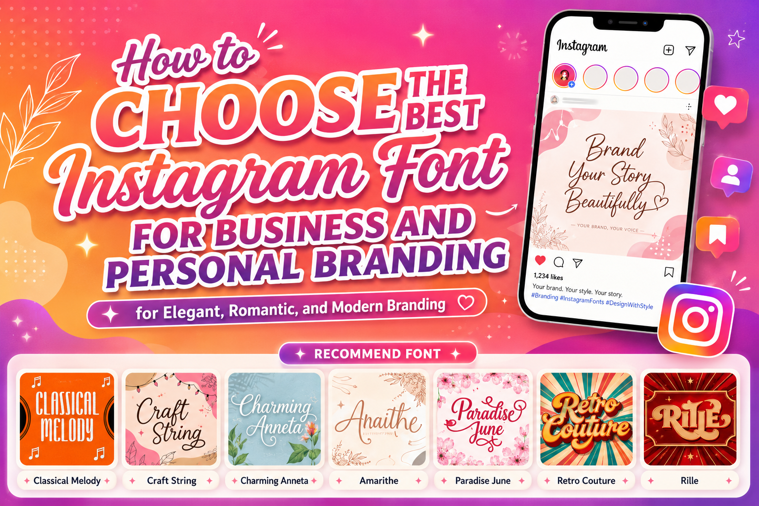
The best Instagram font is not one universal typeface that works for every account. It is the font that communicates the right personality, remains readable on a small screen, and can be applied consistently across your content.
A beauty brand may need a refined script or elegant serif. A handmade business could benefit from warmer, more personal lettering. A fashion account may use bold vintage typography, while a content creator might prefer an expressive display font that makes each Reel cover immediately recognizable.
Before designing a post, define three qualities your Instagram account should communicate. These could be:
- Elegant, premium, and feminine
- Bold, nostalgic, and fashionable
- Personal, warm, and handcrafted
- Playful, approachable, and creative
- Editorial, artistic, and sophisticated
Use those qualities to select a small typography system. A practical system contains one distinctive display font, one readable supporting font, and an optional accent style used only for selected words.
This approach creates variety without making every post look like it belongs to a different account.
What Makes a Good Instagram Font?
It Matches the Brand Personality
Typography creates an impression before people finish reading the message. A flowing script may communicate intimacy and elegance. A tall vintage display font can feel nostalgic and artistic, while a bold retro typeface may appear confident, fashionable, or entertaining.
The font should support the actual product, audience, and customer experience. A highly romantic script may suit a bridal business but feel inappropriate for a technical consulting company. A playful handwritten font can work for crafts or children’s products but may weaken the authority expected from a financial service.
The goal is not to select the most decorative font. It is to choose the visual voice that represents the brand most accurately.
It Remains Readable on Mobile Screens
Most people encounter Instagram content on relatively small screens and often scroll quickly. A font that looks impressive on a large desktop canvas may become difficult to understand when reduced to a Reel cover or Story slide.
Test the real headline at the size it will appear on Instagram. Pay particular attention to:
- Small counters inside letters
- Very thin strokes
- Tight connections in script fonts
- Decorative swashes
- Narrow letter spacing
- Similar-looking characters
- Text placed over detailed photographs
A useful test is to reduce the design to thumbnail size. When the main message is still understandable without zooming, the typography is performing effectively.
It Creates a Clear Hierarchy
A strong Instagram design tells viewers what to read first, second, and third.
The main headline should receive the greatest visual weight. A short explanation can appear in a simpler style, while the account name, category, or CTA can occupy a smaller supporting position.
A practical hierarchy might use:
- Display font for the hook
- Clean sans serif for the explanation
- Semibold supporting font for the CTA
- One accent style for a keyword or emotional phrase
Do not give every line the same size and weight. When everything appears equally important, nothing leads the viewer through the message.
It Works Across Several Content Formats
An Instagram account may publish static posts, carousels, Stories, Reels, announcements, testimonials, product launches, educational tips, and interactive content. The typography should adapt without losing its identity.
The display font does not need to be used identically in every format. It may appear large on a carousel cover, smaller on a Story, and as one recognizable word on a Reel cover. What matters is preserving the same typographic personality.
Build a Three-Role Instagram Typography System
1. The Display Font
The display font provides the account’s most recognizable visual character. Use it for:
- Reel covers
- Carousel hooks
- Campaign headlines
- Product names
- Collection titles
- Promotional announcements
- Short quotations
The display font should be distinctive enough to create recognition but clear enough to communicate a short message quickly.
2. The Supporting Font
The supporting font handles practical information. A clean sans serif is often the safest option because it can balance a decorative script, serif, or vintage display font.
Use it for:
- Explanations
- Tips and numbered steps
- Dates and prices
- CTAs
- Product details
- Captions inside graphics
- Contact information
The supporting typeface should not compete with the display font. Its role is to make the content easier to understand.
3. The Accent Font or Alternate Style
An accent style can highlight one word, add a signature, or create emotional contrast. It may be an italic, script, textured version, outline, or alternate character treatment.
Use it sparingly. Applying an accent to every line removes the contrast that made it effective.
How to Use Fonts in Instagram Posts and Carousels
Make the First Slide Immediately Understandable
A carousel cover should communicate one useful promise. Keep the headline concise and give it enough space to become the dominant element.
Examples include:
- 5 Packaging Mistakes to Avoid
- How to Choose a Logo Font
- Before You Redesign Your Brand
- 7 Fonts for Beauty Branding
- Why Your Posts Look Inconsistent
Avoid placing a full paragraph on the first slide. The opening design should earn attention, while the following slides provide depth.
Maintain a Repeatable Slide Structure
A consistent carousel structure helps people understand the content more quickly. You could use:
- A bold cover
- A short introduction
- Several educational slides
- An example or comparison
- A conclusion
- A final CTA
Keep headings in the same position and use consistent margins, alignment, numbering, and font sizes. The colors and photographs may change, but the underlying system should remain recognizable.
Use the Display Font Selectively
A decorative font can work well for the cover and major section headings. Use a simpler companion for the explanatory slides.
This allows the account to look distinctive without forcing viewers to read long paragraphs in a complicated typeface.
How to Use Fonts in Instagram Stories
Instagram provides in-app text controls, including font selection, size adjustments, and alignment options for supported text styles. Custom brand typography can also be prepared in a design application and uploaded as finished Story artwork.
Keep Story Text Brief
Story viewers move quickly, so each frame should communicate one idea. Break a longer message into several slides instead of shrinking the text.
A simple sequence might use:
Story 1: Introduce the problem
Story 2: Explain one insight
Story 3: Show an example
Story 4: Present the CTA
Use the expressive font for the central phrase and a simpler style for instructions or additional context.
Leave Space for Interactive Elements
Polls, questions, countdowns, links, and other stickers need visual space. Do not place important typography where interactive controls will overlap it.
Create the layout around the action. When the goal is to generate responses, the question and interactive sticker should be more prominent than decorative elements.
Turn Highlights Into Branded Navigation
Use one consistent typography style for Highlight covers and organize them into recognizable categories such as:
- Start Here
- Products
- Services
- Tutorials
- Reviews
- FAQs
- New Releases
The labels should remain easy to understand. A beautiful cover is less useful when visitors cannot identify what the Highlight contains.
How to Use Fonts in Instagram Reels
Design the Reel Cover Before Publishing
Instagram currently recommends a 420 × 654 pixel cover image, or a 1:1.55 ratio, and states that the cover cannot be edited after the Reel has been uploaded. This makes typography testing before publication especially important.
Keep the cover headline short, ideally one clear subject rather than a complete caption.
Examples include:
- Logo Font Mistakes
- New Vintage Collection
- Packaging Makeover
- Instagram Design Tips
- Before and After
Check how the cover appears in the profile grid and other placements. Important words should not sit too close to the edges.
Use Brand Typography for Hooks, Not Every Subtitle
A distinctive font can strengthen the opening hook or major transition. Long subtitles should use a simpler style with strong contrast.
This separation allows the brand font to remain memorable while keeping spoken information accessible. Instagram also provides controls for managing captions on Reels and videos, so subtitles should complement rather than replace the visual branding.
Keep Text Visible Long Enough
A beautiful phrase has little value when it disappears before the viewer can read it. Match the amount of text to the time available.
Short headlines can move quickly. Longer explanations need more screen time, fewer animations, and a calmer supporting typeface.
Use Typography to Strengthen the Instagram Grid
A consistent grid does not require every post to use the same template. It requires shared visual rules.
These rules might include:
- One display font family
- One supporting typeface
- A fixed headline scale
- Consistent margins
- Two or three primary colors
- A recurring text position
- One photography treatment
- A recognizable cover style
For example, educational posts could use a cream background and dark serif headline, while product launches use photography with the same headline font. The posts look different, but they remain connected.
Typography often creates stronger continuity than repeating the same background on every post.
Choose Fonts According to the Content Goal
For Product Sales
Use a font with strong recognition and enough weight to remain visible over product photography. Make the product name or main benefit prominent, then use a simpler typeface for price, variation, and CTA.
For Personal Branding
A script or handwritten font can create a more personal voice, particularly for creators, photographers, coaches, and consultants. Pair it with structured supporting typography so the account still appears professional.
For Educational Content
Prioritize readability and hierarchy. A distinctive display font can introduce the topic, while the body slides should use clean lettering that remains comfortable across several screens.
For Lead Generation
The font should support a direct value proposition. Avoid overly artistic typography that makes the offer difficult to understand.
A lead-focused Story or carousel might emphasize:
- The problem
- The result
- The free resource
- The deadline
- The CTA
For Lifestyle and Fashion Branding
Editorial serifs, elegant scripts, and vintage display fonts can help communicate taste and identity. The photography, spacing, and typography should support the same visual direction.
Improve Readability and Accessibility
Decorative typography is most effective when viewers can still understand the message comfortably.
Use sufficient contrast between the text and its immediate background. As a practical accessibility benchmark, WCAG 2.2 specifies a contrast ratio of at least 4.5:1 for normal text and 3:1 for qualifying large text, including images that contain text. Thin and unusual typefaces may appear visually lighter than expected, so they need careful testing.
When placing text over photography, consider using:
- A solid text panel
- A subtle dark or light overlay
- A controlled shadow
- A simple outline
- A blurred area behind the text
- A quieter section of the photograph
Do not depend on color alone to communicate meaning. Add labels, icons, numbers, or clear wording.
Instagram also supports automatic and manually edited alternative text for images, helping people using screen readers understand visual content. Important information contained inside a graphic should therefore also be communicated through the caption or appropriate alternative text.
Measure Whether the Typography System Is Working
A font should not be judged only by personal preference. Evaluate whether it helps the intended content perform.
Instagram Insights enables professional accounts to review audience and content-performance trends. Compare results across similar posts to understand whether a typography treatment supports stronger recognition and interaction.
Useful comparisons include:
- Two Reel covers promoting similar subjects
- Bold serif versus script carousel headlines
- Text over photography versus text on a solid background
- Short cover headline versus detailed headline
- Consistent series design versus unrelated post styles
Measure reach, interactions, profile activity, saves, shares, and business outcomes where relevant. Do not assume the most decorative treatment is automatically the strongest.
Typography is only one variable. Topic quality, timing, audience relevance, offer clarity, and the strength of the opening hook also affect performance.
Jump to Recommended Fonts
Classical Melody | Craft String | Charming Anneta | Amarithe | Paradise June | Retro Couture | Rille
1. Classical Melody Vintage Display Font
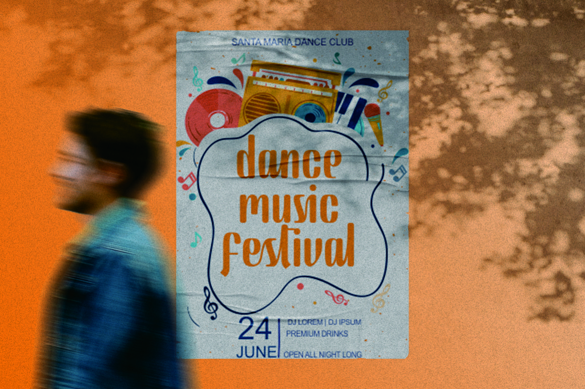
Classical Melody draws from vintage poster and music-inspired aesthetics, giving headlines a nostalgic but carefully composed personality. Its tall display character can make Reel covers, editorial graphics, event announcements, and music-related posts feel distinctive without requiring several additional decorative elements. Use it for short, prominent phrases where its vintage silhouette can remain clearly visible.
PROS: Recognizable vintage character, tall proportions, strong editorial presence, and memorable headline potential.
BEST FOR: Music accounts, cafés, retro fashion, creative studios, posters, editorial carousels, and lifestyle campaigns.
2. Craft String

Craft String is a flowing script font with an organic handwritten quality and accessible glyphs and swashes. Its smooth movement can bring warmth and personality to Instagram quotes, craft promotions, personal brands, and product announcements without feeling as formal as traditional calligraphy. It works best in short phrases paired with a clean supporting font.
PROS: Natural flow, accessible swashes, personal character, and flexible handmade appeal.
BEST FOR: Craft businesses, stationery, handmade products, creators, wedding content, greeting products, and personal branding.
3. Charming Anneta

Charming Anneta is a modern script with a feminine, warm, and slightly relaxed calligraphic rhythm. Subtle swirls and numerous alternate characters allow designers to personalize names and campaign titles, while multilingual support expands its usefulness for international content. It can add a handwritten luxury touch to Instagram graphics without making the overall design feel excessively formal.
PROS: Warm script personality, useful alternates, subtle swirls, multilingual support, and elegant branding appeal.
BEST FOR: Bridal businesses, beauty brands, florists, anniversaries, packaging, romantic campaigns, and feminine lifestyle accounts.
4. Amarithe

Amarithe uses delicate flowing strokes and graceful calligraphic forms to create a refined, romantic impression. Its light structure and artistic movement make it well suited to signature-style headlines, elegant quotes, and sophisticated campaign details. Because the strokes can be delicate, it should be used at a generous size and against a clean background.
PROS: Graceful calligraphic flow, delicate elegance, artistic character, and strong emotional appeal.
BEST FOR: Weddings, fashion, beauty, photography, invitations, luxury personal brands, and romantic Instagram content.
5. Paradise June
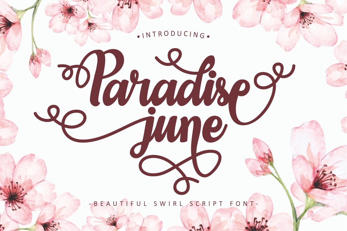
Paradise June is a decorative swirl script with a feminine, modern, and free-flowing character. Its pronounced curves and flourishes can turn a short phrase into the main visual feature of a Story, Reel cover, seasonal announcement, or lifestyle post. Use its expressive forms selectively so the swirl details remain special and the message remains readable.
PROS: Expressive swirls, graceful movement, modern romantic mood, and memorable decorative impact.
BEST FOR: Summer campaigns, wedding content, lifestyle creators, beauty launches, greeting cards, travel posts, and seasonal promotions.
6. Retro Couture Vintage Bold Font
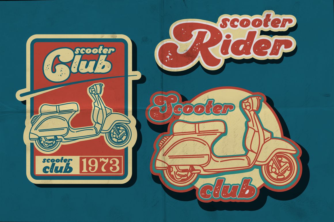
Retro Couture brings the glamour and visual confidence of 1970s and 1980s typography into a bold contemporary display style. Its substantial presence is especially valuable on fast-moving Reel covers and campaign posts where the headline must remain recognizable at a glance. It can make fashion, entertainment, and product-launch content feel nostalgic without appearing weak or overly delicate.
PROS: Bold visibility, glamorous retro personality, strong mobile impact, and confident campaign presence.
BEST FOR: Fashion accounts, beauty campaigns, vintage products, music, entertainment, promotional launches, and bold social branding.
7. Rille Vintage Display Font

Rille is a tall, narrow, handcrafted display font influenced by vintage poster design. Its condensed proportions help longer words fit into Reel covers and vertical Story layouts, while OpenType alternates, swashes, stylistic sets, contextual forms, and ligatures provide options for customized lettering. The font is particularly effective for editorial content that needs nostalgic character and efficient use of space.
PROS: Tall and space-efficient proportions, vintage poster character, extensive OpenType options, and multilingual support.
BEST FOR: Editorial carousels, fashion, home décor, travel, music, posters, branding tips, and vintage-inspired Instagram grids.
Comparison
| Font | Visual Personality | Strongest Instagram Role | Best Brand Direction |
|---|---|---|---|
| Classical Melody | Vintage and musical | Editorial carousel and Reel covers | Retro lifestyle and music |
| Craft String | Organic and personal | Quotes and handmade promotions | Crafts and creator branding |
| Charming Anneta | Warm and romantic | Beauty and wedding campaigns | Feminine luxury |
| Amarithe | Delicate and refined | Signature headlines and elegant quotes | Fashion and bridal |
| Paradise June | Decorative and flowing | Seasonal Stories and lifestyle posts | Romantic and expressive |
| Retro Couture | Bold and glamorous | High-impact Reel and launch covers | Fashion and entertainment |
| Rille | Tall and editorial | Space-efficient covers and titles | Vintage editorial branding |
Common Mistakes When Choosing an Instagram Font
The first mistake is using too many unrelated typefaces. A feed may contain a romantic script, industrial font, playful bubble style, and luxury serif simply because each one looks attractive individually. The result weakens recognition because followers cannot identify one consistent visual voice. Choose one main display direction and one functional companion, then create variety through scale, color, photography, spacing, and layout rather than constantly changing fonts.
Another mistake is prioritizing decoration over readability. Thin scripts may disappear over photographs, vintage letters can become unclear when reduced, and large swashes may collide with icons or interactive Story elements. Test the design on an actual phone, not only on the desktop canvas. Keep Reel and carousel headlines concise, give letters enough contrast and spacing, and repeat essential information in captions or subtitles when necessary.
The final mistake is using the font without matching the license to the campaign. Organic brand posts, monetized social channels, paid advertising, webfont embedding, logos, and editable templates may require different coverage. PutraCetol’s current licensing interface separates uses such as organic social media, monetized social content, digital ads, webfonts, and logo or trademark applications, so the selected coverage should reflect the real campaign rather than the visual design alone.
Conclusion
The best Instagram font is the typeface that makes a brand easier to recognize, supports the content’s emotional direction, and remains readable across posts, Stories, Reels, and interactive campaigns.
Begin with a clear brand personality, then build a three-role typography system containing one display font, one functional companion, and an optional accent. Use the distinctive typeface for hooks and major branding moments while keeping explanations, subtitles, CTAs, and practical information simple.
Classical Melody and Rille offer strong vintage editorial directions. Craft String creates a warmer handcrafted mood. Charming Anneta, Amarithe, and Paradise June support elegant and romantic branding, while Retro Couture provides the bold impact needed for fashion and promotional campaigns.
Fonts from PutraCetol Studio can help online businesses, creators, and marketing teams transform ordinary Instagram graphics into a more coherent brand experience. The strongest result comes not from applying the most decorative font to every post, but from using the right typeface consistently, strategically, and with enough restraint to let the message remain clear.
Explore these fonts and many more at PutraCetol.com to build a business identity that looks professional, trustworthy, and memorable.
Additionally, if you want to explore some free typography options, you can check out Putracetol Studio on Dafont. Happy reading and designing!