
In a design landscape dominated by grids, symmetry, and polished minimalism, there is growing interest in branding that feels raw, expressive, and human. One approach that captures this spirit is wood-themed branding. Inspired by the organic, imperfect, and unpredictable nature of wood, this design direction rejects rigid rules and instead celebrates freedom, experimentation, and individuality.
This article explores a wood-themed branding identity developed by Putracetol.com. The project is intentionally built around the idea of freedom, freedom from perfection, freedom from strict systems, and freedom to express creativity without constraints. By embracing irregular forms, expressive typography, and dynamic layouts, the brand becomes a living visual system rather than a fixed identity.
Wood is one of the most symbolic natural materials. It represents growth, time, resilience, and transformation. Unlike synthetic materials, wood is never identical. Each grain, texture, and crack tells a different story. This uniqueness makes wood a powerful metaphor for creative expression.
Wood-themed branding works because it:
For brands that value artistic freedom, experimentation, and expressive storytelling, wood-inspired design offers a compelling visual language.
The concept behind this branding project is simple yet bold: design without fear of imperfection. Instead of chasing consistency through strict rules, the identity allows variation, chaos, and spontaneity to coexist.
At the core of the concept is the idea that imperfection is not a flaw, but a strength. Just like wood, the branding avoids smooth uniformity. Irregular shapes, uneven typography, and unconventional spacing are used intentionally.
This approach communicates:
The brand feels honest, raw, and expressive, inviting audiences to connect on a more emotional level.
Freedom is not just a theme; it is a design principle. The visual system does not lock designers into strict templates. Instead, it allows room for interpretation and evolution.
This freedom:
The identity feels alive, as if it can grow and transform just like wood itself.
The branding intentionally breaks conventional design rules. Typography, color choices, and layouts are pushed beyond comfort zones to create originality.
Rather than following predictable trends, the design explores:
The result is a visual identity that feels daring, expressive, and artistically confident.
This wood-themed branding is not static. It is designed to evolve. Each application can look slightly different while still feeling part of the same family.
A living identity:
This approach is ideal for creative brands, studios, or communities that value expression over uniformity.
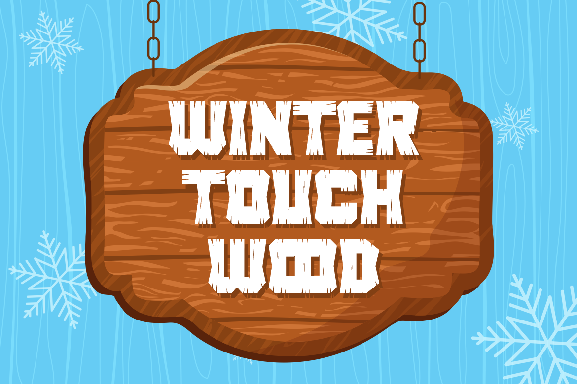
Typography is one of the strongest tools in this branding system. Fonts are chosen not for perfection, but for personality. Letterforms may feel rough, uneven, or experimental, echoing the organic quality of wood.
Expressive typography:
Text becomes more than information; it becomes an artistic element.
The color palette is intentionally bold and contrasting. Instead of subtle harmonies, the design uses strong color relationships to amplify visual energy.
Bold colors:
These colors are not meant to be safe. They are meant to be felt.
Traditional grids are replaced with dynamic compositions. Elements may overlap, shift, or appear unbalanced, creating a sense of motion and spontaneity.
Dynamic layouts:
The layout becomes part of the brand’s voice.
Supporting graphics add layers of texture and chaos. These visuals may appear rough, abstract, or intentionally unrefined, reinforcing the wood-inspired aesthetic.
They help:
Each graphic element feels handcrafted rather than digitally perfect.
Typography plays a crucial role in translating the concept into visual form. The following fonts align well with the expressive, organic, and experimental nature of wood-themed branding.

A bold, irregular typeface that feels rooted and strong. Its uneven strokes reflect natural textures and work well for headlines and expressive branding statements.
This font balances rough character with playful energy. It introduces a sense of spontaneity and creative joy, ideal for expressive layouts.
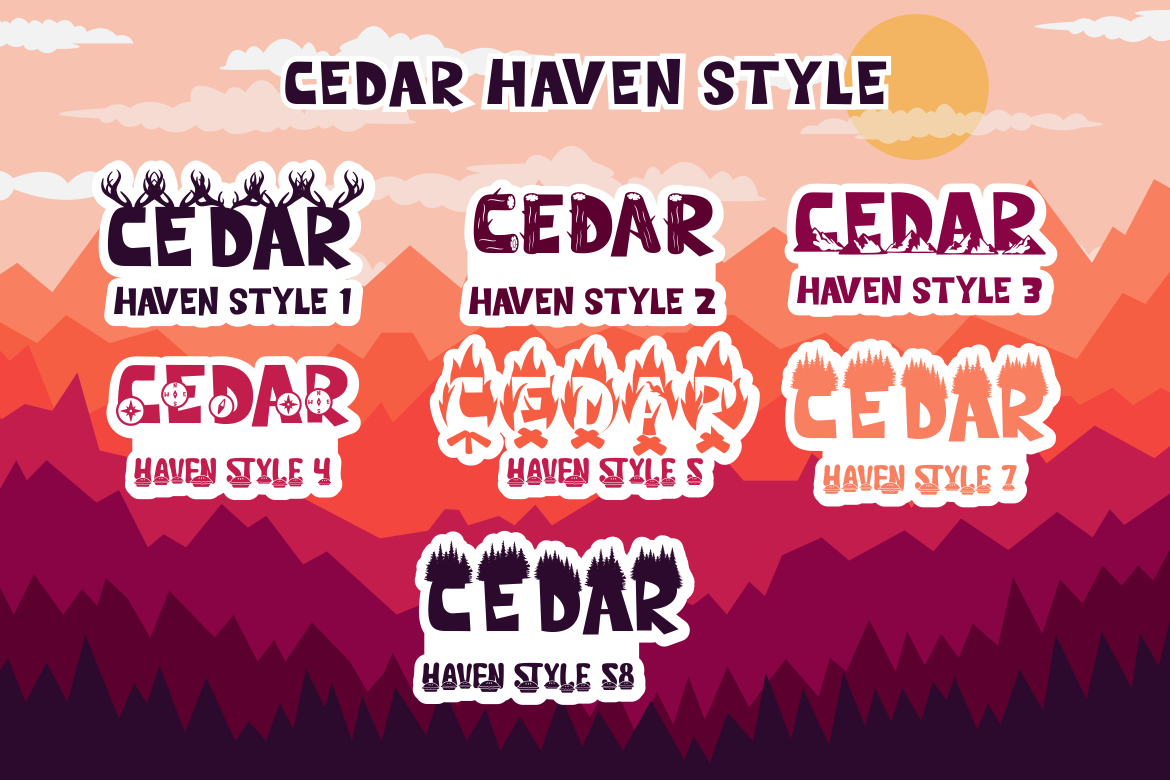
Cedar Heaven feels organic and slightly imperfect, making it suitable for brands that want to communicate warmth and authenticity.
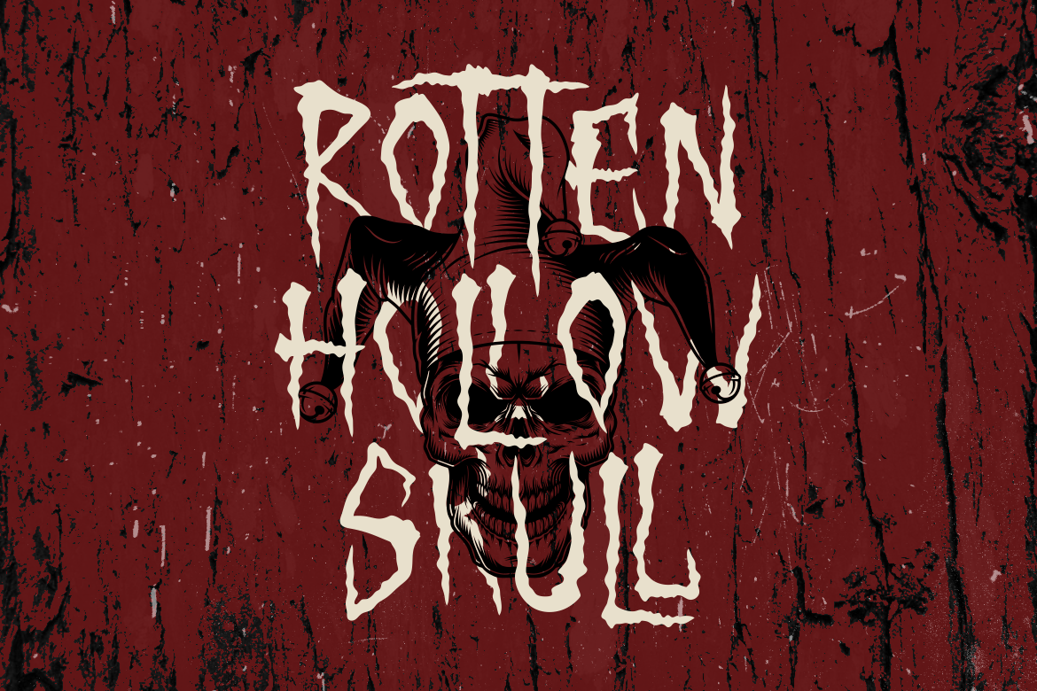
Dark, raw, and expressive, Rotten Valley embodies chaos and freedom. It works well for bold statements and rebellious brand expressions.
Using these fonts together allows designers to create typographic contrast while maintaining a cohesive wood-inspired narrative.
Wood-inspired branding is especially effective for:
It appeals to audiences who value authenticity, creativity, and emotional storytelling over mass-produced aesthetics.
Perfect design often feels distant. Imperfect design feels human. Wood-themed branding taps into this psychology by allowing visual flaws to exist.
This approach:
Audiences are increasingly drawn to brands that feel honest rather than flawless.
Because the identity is flexible, it adapts well across:
Each application can look different while still feeling part of the same creative universe.
The wood-themed branding identity from Putracetol.com proves that design does not need to be polished to be powerful. By embracing imperfection, encouraging freedom, and exploring experimental aesthetics, the brand becomes expressive, dynamic, and deeply human.
Through expressive typography, bold colors, dynamic layouts, and organic inspiration, this wood-inspired identity invites audiences to see imperfection not as a weakness, but as a vital source of creativity. It stands as a reminder that true originality often comes from breaking rules, not following them.
Thank you for taking the time to read this article. If you are looking for more great articles, feel free to visit Putracetol Blog
Additionally, if you want to explore some free typography options, you can check out Putracetol Studio on Dafont. Happy reading and designing!
