
In an era dominated by digital communication, it may seem surprising that business cards still matter. Yet in professional settings, conferences, networking events, and B2B meetings, they remain one of the most personal and tangible brand touchpoints. Handing someone a business card is not just about sharing contact information. It is a small exchange of trust, credibility, and identity.
A great business card does three things well:
When these criteria are met, the card becomes more than a paper artifact. It turns into a portable piece of brand identity.
When someone receives a business card, they form an immediate impression. Unlike digital messages that arrive in overflowing inboxes, a card carries weight literally and symbolically. People keep the ones that stand out, especially after meaningful conversations.
Business cards also bridge a psychological gap. They formalize the encounter. Shaking hands and exchanging cards makes the interaction feel intentional. And unlike a hyperlink or QR code, a card has tactile memory texture, material, design, typography, and even the way it’s handed over influence how the brand is remembered.
In short: the business card is not obsolete. It has evolved into a micro-branding platform.
At a baseline level, a business card must provide key contact details:
But beyond contact details, cards reinforce two layers of brand identity:
This is where design becomes critical.
One of the most common mistakes is overloading the card. A cluttered business card forces the recipient to work. A well-designed one removes friction by prioritizing readability and hierarchy.
Good designers ask: which details matter most?
Unnecessary elements taglines, inspirational quotes, long lists of services can be left out unless strategically relevant.
Typography on business cards is not merely aesthetic. It sets the tone of professionalism, industry, attitude, and brand personality.
Serif fonts lean toward heritage and elegance (law, finance, hospitality). Sans-serifs signal modernity and clarity (tech, digital, startups). Scripts introduce personal or artisanal tones (boutiques, independent creative professionals).
Premium typography elevates perceived brand value. Designers frequently customize or choose distinctive typefaces rather than default system fonts. From Putracetol.com, options such as Vidage, Gilded Glint, or Cozy Caps can reinforce premium or modern tone depending on the Business Card Design.
The key principle: typography should speak without speaking loudly.
Color brings emotional context. Neutral palettes convey professionalism. Bright palettes project energy. Black and white suggests confidence and timelessness. Metallic foils add luxury cues.
More important than color psychology alone is color consistency business cards should match the brand’s broader palette across website, packaging, and presentations. Consistency builds recognition.
The logo must be clear and crisply printed. Some brands choose full logo lockup on one side; others simplify to logomark only. The critical decision is scale and placement. Too small and it feels hesitant. Too large and it overwhelms information.
White space around the logo also influences perception. Brands with confidence leave room to breathe.
A business card’s material communicates value before anyone reads a single word. This is where DTC brands, consultants, and agencies often win disproportionate attention by using:
Minimal designs paired with premium materials create a tactile memory that digital interactions lack.
Choosing material is not just production it is strategy for Business Card Design. the example:
The material becomes an extension of positioning.
Business cards should not feel like a separate project. They are part of a system. When cards align with the website, pitch deck, email signature, and packaging, the brand feels coherent.
This coherence reinforces brand clarity and accelerates recognition. A recipient should be able to move from business card to website without cognitive dissonance. If typography, color, and layout are inconsistent, trust erodes quietly.
Not all industries require the same tone. Strategic context informs design choices:

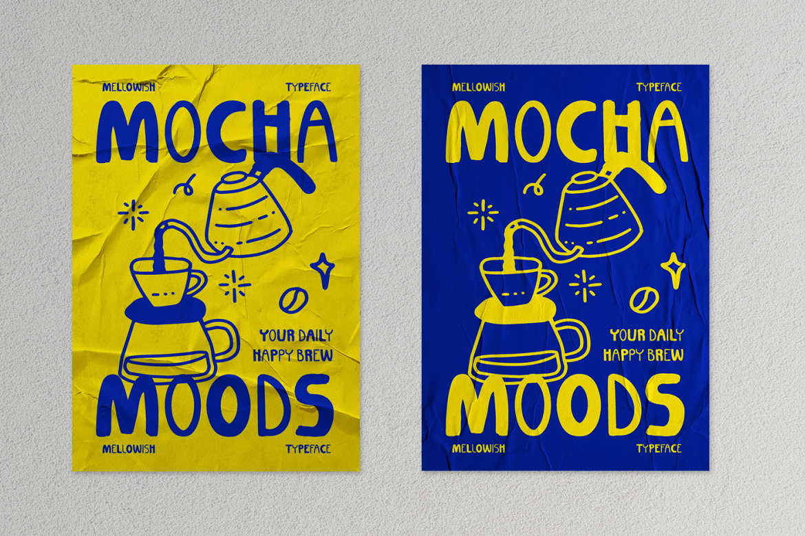
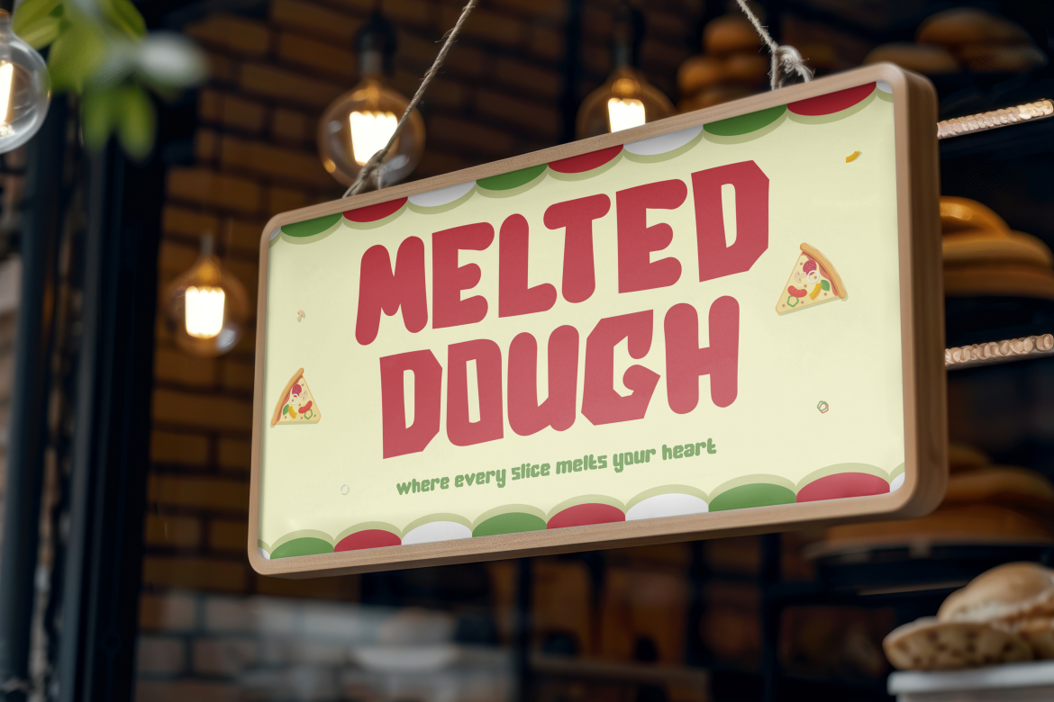
Fonts like Pizzalia, Mellowish, or Cheezy Time (from Putracetol.com) can support lifestyle, food, or hospitality Business Card Design seeking character and warmth.
Matching medium to message is part of strategic branding discipline.
Hierarchy ensures the reader can scan the card in seconds. Techniques include:
The test: if someone glances for two seconds and can identify your name, role, and company, the hierarchy works.
Business cards have evolved beyond static contact details. QR codes can link to:
The advantage is that cards can stay minimal while still providing depth. Modern networking supports hybrid communication physical introduction + digital continuation.
When executed well, business cards deliver both functional and strategic value:
In competitive categories where trust drives conversion, these details matter.
Business cards remain relevant because they combine information exchange with physical brand expression. Effective cards are not overly designed nor under-designed. They are clear, intentional, and consistent with broader brand identity.
If websites are digital storefronts, business cards are personal signatures. When treated as strategic artifacts not just print leftovers they elevate how a brand enters conversations and stays remembered afterward.
Thank you for taking the time to read this article. If you are looking for more great articles, feel free to visit Putracetol Blog
Additionally, if you want to explore some free typography options, you can check out Putracetol Studio on Dafont. Happy reading and designing!
