
Typography continues to evolve, adapting to the needs of digital communication, editorial storytelling, and brand expression. Among the new typefaces emerging from independent studios, one stands out for its strong personality and sculptural presence: Tectron Modern, a stylistic and contrast-driven typeface crafted by Putracetol Design Studio.
Rather than merely functioning as a vessel for text, Tectron Modern serves as a visual statement. It blends artistic nuances with modern design sensibilities, resulting in typography that offers both aesthetic pleasure and functional usage across diverse creative applications.
For designers seeking a typeface that can speak louder than conventional sans-serifs or minimal serifs, Tectron Modern delivers the kind of creative tension that draws attention without compromising readability.
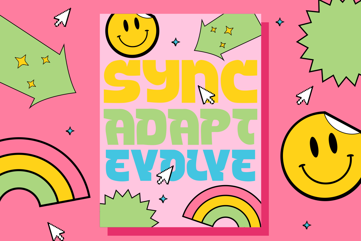
At the heart of Tectron Modern lies its core concept: dramatic thick-to-thin stroke contrast. This contrast immediately sets the typeface apart, giving letterforms sculptural depth and rhythm. The contrast also introduces an elegant yet experimental feel, allowing designers to lean into bold editorial layouts or modern brand identities.
Unlike typical serif fonts with classical modulation, Tectron Modern exaggerates contrast to highlight motion and personality. This approach positions typography closer to visual art almost as if letterforms were carved, not drawn.
The result is a typeface that feels:
It is a balance of tension and restraint, a trait that many contemporary designers seek in premium typefaces.
Tectron Modern does not settle for standard forms. Instead, each letter leans into expressive geometry. Certain terminals extend with tapered edges, while others hold bold vertical strokes for stability. This creates a dialogue between structure and style precise enough for modern layouts, but unique enough for storytelling.
This character makes the typeface ideal for environments where typography carries emotional weight, such as:
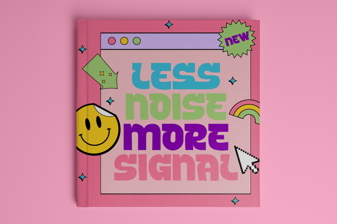
While many minimal typefaces aim to disappear to let the content speak, Tectron Modern embraces the opposite philosophy it announces itself. Designers who want typography to become a focal point rather than background will find Tectron Modern particularly compelling.
One of the strengths of Tectron Modern is its ability to transition between expressive display roles and more structured usage. Despite its stylistic details, it remains functional and adaptable across contemporary design contexts.
Its versatility shines in several applications:
This flexibility reflects a growing need within modern design: typography that can carry personality without sacrificing clarity.

The purpose behind Tectron Modern arguably goes beyond communication. It treats letterforms as artistic components within a layout. This philosophy aligns with the current shift in typography trends, especially within high-end branding, fashion, and cultural design sectors.
Many contemporary brands, especially in industries like fashion, architecture, and film use typography as a visual signature. Tectron Modern fits this approach well, as it enables typography to become a central part of the identity system.
Typography becomes not just text, but visual art.
While Tectron Modern is unique, it sits among a category of fonts that challenge traditional sans-serif dominance. For designers familiar with Putracetol Design Studio, several other expressive typefaces also explore stylistic detailing, including:
These typefaces share a commitment to visual storytelling. Tectron Modern fills the niche between elegance and experimental flair, making it useful across various industries that require a modern yet artistic typographic voice.
From a practical perspective, Tectron Modern offers multiple advantages to graphic designers, typographers, and brand strategists:
Its dramatic presence makes layouts more engaging and helps designers elevate visual storytelling without relying solely on imagery.
Brands that adopt expressive typography gain stronger identity positioning, especially in crowded markets.
The typeface adapts to many creative needs, from editorial aesthetics to commercial branding.
Using a single powerful display typeface can reduce the need for added graphic elements, simplifying compositions without sacrificing richness.
These qualities are increasingly valuable in creative fields where both clarity and creativity are necessary.
Designers today blend digital and print mediums, and Tectron Modern addresses both. Its strong contrast and identifiable shapes maintain clarity on screens and physical surfaces.
Suitable usage contexts include:
The typeface pairs well with cleaner geometric sans-serif companions, creating hierarchy and rhythm within layouts.
Tectron Modern stands as one of Putracetol Design Studio’s bold and expressive contributions to contemporary typography. Built with dramatic contrast, unconventional geometry, and modern stylistic flair, it bridges the gap between artistic experimentation and functional communication.
For designers, it opens space for visual storytelling. For brands, it offers differentiation and cultural sophistication. And for typography enthusiasts, it exemplifies how letterforms can become visual sculptures capable of shaping emotion and identity in a single glance.
As the creative industry continues to embrace expressive typography, typefaces like Tectron Modern prove that the future of design is not minimal or maximal, but intentional.
Thank you for taking the time to read this article. If you are looking for more great articles, feel free to visit Putracetol Blog
Additionally, if you want to explore some free typography options, you can check out Putracetol Studio on Dafont. Happy reading and designing!
