
Typography shapes how we read, process, and connect with digital and print content. Beyond aesthetics, font choice can also influence environmental sustainability. By selecting lightweight, ink-efficient, or energy-conscious typefaces, designers can actively contribute to lowering carbon footprints in both web and print media. This article explores the role of sustainable fonts, their strengths and limitations, and highlights examples from putracetol.com.
Sustainable fonts are designed to be visually appealing while using fewer resources. In digital environments, compact and optimized fonts reduce website loading times, requiring less bandwidth and lowering overall energy consumption. In print, fonts with smart design features, such as cutouts, thin strokes, or reduced ink-heavy elements, help minimize ink usage.
For example, minimalist display fonts or stencil-inspired letterforms naturally consume less ink while still offering bold, recognizable shapes. However, one limitation is that ultra-thin fonts may sacrifice legibility at smaller sizes, making them less versatile in certain contexts.

When applied to websites, lightweight fonts improve performance. Faster-loading pages not only improve user experience but also reduce the energy load on servers and user devices. For example, Condestro Bold Condensed Font delivers impactful headings while keeping letterforms narrow, making it efficient in digital layouts. Its condensed design reduces screen space without losing visual power. A potential drawback, however, is that condensed fonts can sometimes feel too rigid or crowded if overused in long paragraphs.

Another option is Stencil Style Fonts, which feature cutouts in their strokes. These gaps make the typeface ideal for ink-saving printing while giving a rugged, utilitarian look. While stencil fonts shine in posters or branding, their decorative cuts may reduce readability in smaller body text.
For eco-conscious print design, fonts that minimize ink usage can make a measurable difference. Fonts with decorative line breaks or hollow structures can save significant amounts of ink without compromising aesthetics.

The First Atmo Mexican Font stands out with bold yet decorative shapes that balance thickness and negative space. This balance makes it efficient for headings on packaging or posters. Its limitation lies in being too stylistic for corporate or minimal brand identities.
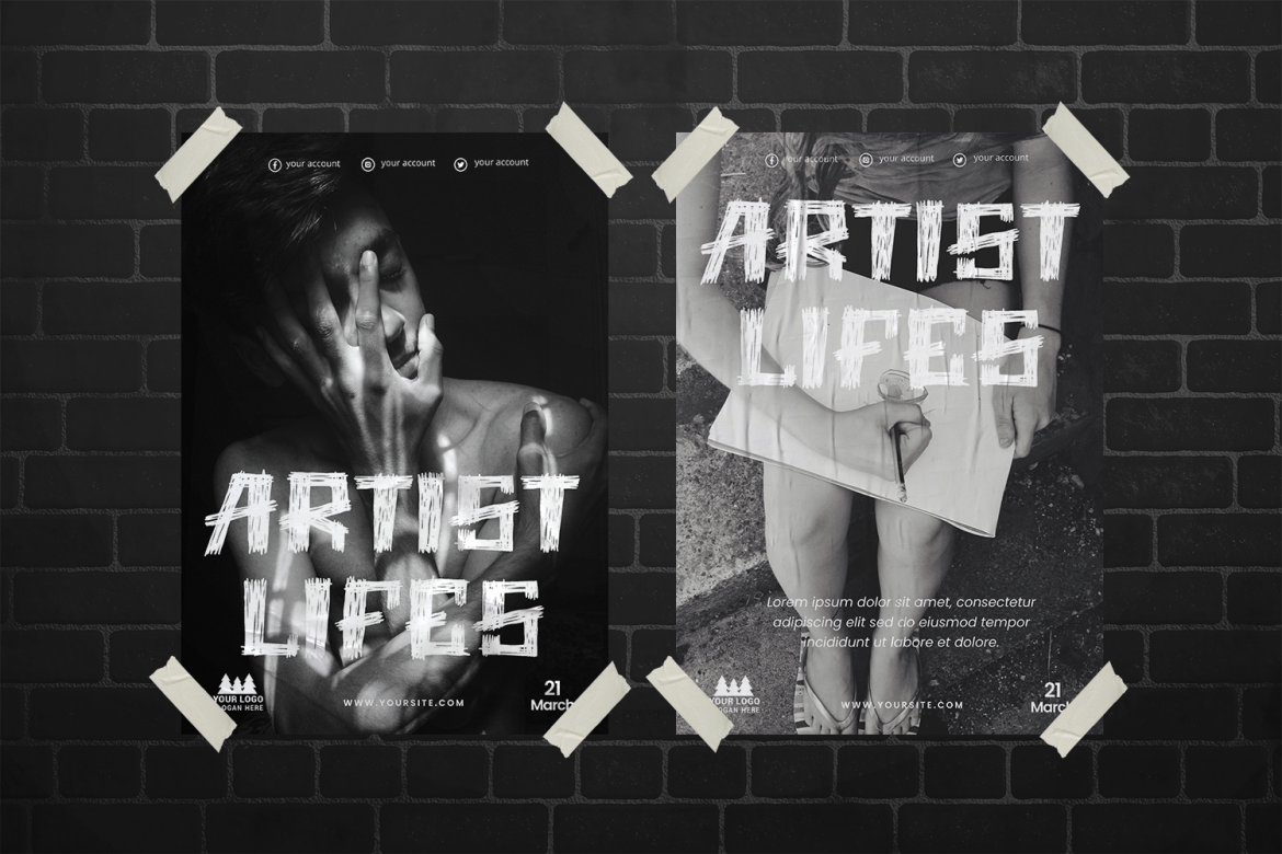
On the other hand, the Pencil Trace Scribble Font mimics hand-drawn lines with textured strokes, which naturally use less ink than solid fills. Its playful appearance works well for children’s books or eco-themed projects but may lack the formal tone needed in professional branding.
Sustainable fonts find their best applications in eco-conscious branding campaigns, educational content, NGO publications, and digital platforms that prioritize speed and accessibility. Brands that want to position themselves as environmentally responsible can adopt these typefaces to signal their values.
For instance, Smoky Glare Smoke Font uses semi-transparent, smoky textures that reduce heavy ink blocks while maintaining an atmospheric aesthetic. It’s visually striking for posters or campaigns about climate awareness, though it may not fit well in small-scale print like business cards.
Meanwhile, the Retro Romance Retro Love Font balances decorative appeal with lighter strokes, making it suitable for digital eco-initiatives or themed eco-products. Its retro feel adds personality, though it risks looking too stylized for modern minimalist campaigns.
Choosing sustainable fonts isn’t just a stylistic decision, it’s an act of design responsibility. Every kilobyte saved in digital typography reduces energy consumption, and every drop of ink conserved contributes to greener printing practices.
While some eco-fonts may have limitations in legibility or stylistic flexibility, their benefits outweigh the compromises when used thoughtfully. Designers who care about sustainability can integrate these fonts into campaigns that align aesthetics with ecological values.
The first step is exploring typefaces with technical efficiency in mind. Putracetol.com offers a range of creative display fonts that can be applied to eco-conscious projects. Experiment with condensed, stencil, textured, or lightweight scripts in your digital and print designs.
By combining strong design with ecological responsibility, designers can create work that not only communicates visually but also contributes to sustainability.
Thank you for taking the time to read this article. If you are looking for more great articles, feel free to visit Putracetol Blog
Additionally, if you want to explore some free typography options, you can check out Putracetol Studio on Dafont. Happy reading and designing!
