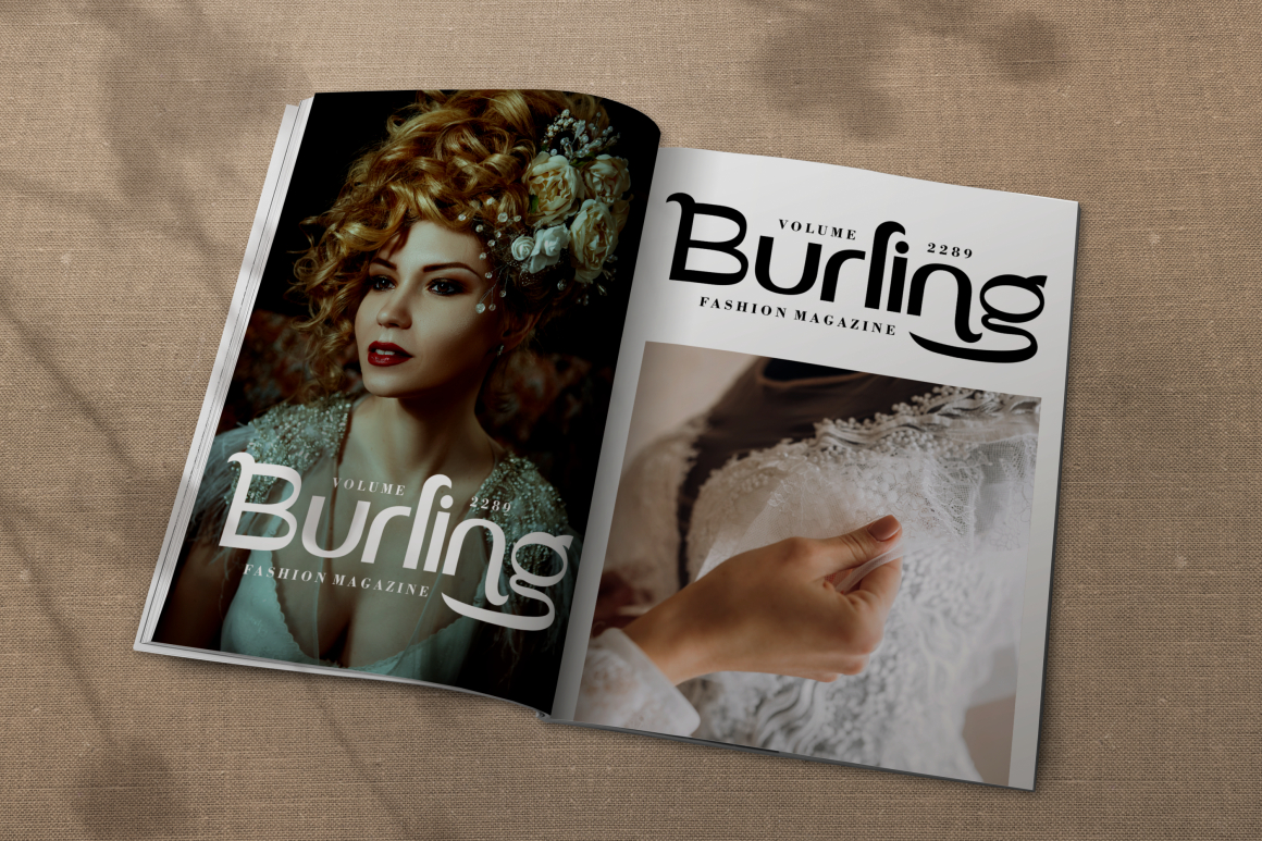
Typography has always been one of the most influential tools in visual communication. Whether you’re reading a novel, scrolling through a website, or choosing signage for a brand, the choice of font directly affects readability, mood, and perception. One of the most fundamental distinctions in typography lies between serif fonts and sans-serif fonts. Though seemingly simple, the differences carry deep implications for brand identity, user experience, and communication strategy.
While serif fonts are often praised for their elegance and print readability, sans-serif fonts dominate digital screens due to their clean and modern look. Understanding when and why to use each category is essential for designers, marketers, and brand strategists who want to communicate with clarity and purpose.
The distinction is right in the name. Serif fonts include the small “tails” or strokes at the edges of letters, while sans-serif fonts (from the French sans, meaning “without”) remove these finishing strokes entirely.
Serifs are the decorative extensions at the ends of letter strokes. Historically, serif typefaces originated from Roman inscriptions carved into stone, which required finishing strokes to complete the form. Because of this, serif fonts inherit a sense of heritage and classical order.
Common serif examples include:
Serifs help guide the eye in long-form reading, which is why they remain popular for books, newspapers, and printed editorial content.
Sans-serifs appeared much later, in the 19th–20th century, as industrialization and modernism demanded simpler forms. These fonts remove decorative strokes entirely, resulting in geometric, minimal, and highly legible shapes on screens and signage.
Common sans-serif examples include:
Sans-serifs communicate modernity, clarity, and efficiency, perfect for digital platforms, UI, and branding systems demanding visual simplicity.
Typography is not only a technical choice but it’s emotional.
That’s why banks, publishing houses, universities, and heritage brands often rely on serif typography. Serif fonts evoke seriousness and credibility, making them suitable for brands that want to feel established.
They feel more contemporary and approachable, which is why tech companies, startups, and lifestyle brands often favor sans-serif typography.
Think about Apple, Google, and Spotify, all built on sans-serif visual identities.
Legibility is where the serif–sans debate becomes contextual.
Studies show serif fonts help create horizontal visual flow, guiding the eye from letter to letter. This makes them well-suited for long reading sessions in:
Print’s higher resolution also preserves the fine details of serif strokes.
Screens have historically struggled with small decorative detail. Even as resolution improves, sans-serif fonts remain more comfortable for:
Their simplified geometry ensures clarity across various screen sizes and pixel densities.
Branding isn’t just about visuals but it’s about perception.
A serif-driven brand tends to look:
A sans-serif driven brand tends to look:
For example:
Serif branding suits:
Sans-serif branding suits:
The best brands often combine both, creating a complementary typographic system.
To illustrate real-world usage, here are several fonts from Putracetol’s catalog that capture both categories:

Luxerna Display
Modern minimalist serif with elegant proportions.

Arash Serif
Retro serif with expressive curves and historical flair.

Astra Goldie
Classic-modern serif with premium typography details.
These fonts are ideal for premium branding, packaging, and editorial environments.

Marseilazi
Bold sans-serif suited for attention-grabbing displays.

Votrag
Clean modern sans-serif, ideal for digital interfaces.

Vidage
Natural and elegant sans form, flexible across print and web.
Sans-serifs like these support clarity in UI, signage, navigation, and branding.
Typography acts like tone-of-voice in written form. Designers often use serif and sans-serif to construct hierarchy:
Or vice versa, depending on desired mood.
Below is a quick comparison table summarizing common use cases:
| Context | Best Choice | Reason |
|---|---|---|
| novels & books | Serif | long-form readability |
| luxury packaging | Serif | elegance & premium cues |
| mobile UI | Sans-Serif | better screen clarity |
| brand logo | Either | depends on identity |
| signage | Sans-Serif | visibility from distance |
| newspapers | Serif | traditional editorial |
| tech branding | Sans-Serif | modern, efficient |
| financial reports | Serif | trust & professionalism |
| Aspect | Serif | Sans-Serif |
|---|---|---|
| Appearance | Elegant, formal | Modern, clean |
| Readability | Better in print | Better on screens |
| Visual meaning | Tradition, trust | Simplicity, innovation |
| Brand tone | Heritage | Contemporary |
| Common examples | Garamond, Times | Helvetica, Futura |
Font choice should never be arbitrary. Consider:
These criteria ensure typography supports communication instead of distracting from it.
The choice between serif and sans-serif fonts goes beyond aesthetics. Serif fonts bring elegance, history, and structure, particularly valuable in print and premium branding. Sans-serif fonts offer clarity, efficiency, and modernity, thriving in digital environments and contemporary brand identities.
There is no universal “best” category but only alignment. The right font reinforces message, medium, and mood. Typography remains one of the most influential yet subtle tools for shaping communication in both physical and digital experiences.
Thank you for taking the time to read this article. If you are looking for more great articles, feel free to visit Putracetol Blog
Additionally, if you want to explore some free typography options, you can check out Putracetol Studio on Dafont. Happy reading and designing!