
Typography plays a huge role in shaping modern visual communication. As design trends shift toward cleaner and more minimal aesthetics, sans serif geometric fonts have become some of the most widely used typefaces across branding, digital interfaces, advertising, and creative work. Their structured, balanced shapes and modern appearance make them ideal for projects that require clarity, simplicity, and strong visual identity.
This article explores the five key benefits of using sans serif geometric fonts, along with practical applications and recommended font choices from Putracetol.com. Whether you’re working on branding, UI design, business presentations, or creative layouts, these fonts offer versatility and impact.
Sans serif geometric fonts are built from basic geometric shapes circles, squares, and triangles. This creates a clean, structured appearance that feels modern and timeless. Their simplicity makes them easy to read and highly adaptable, while their geometry brings visual balance to any layout.
Fonts like Polygon Block, Pyra Maze, Funky Form, Compacture, and Hexaline from Putracetol.com demonstrate how geometric principles can be turned into strong, futuristic, or minimalistic typography styles.
Geometric sans serifs naturally align with contemporary design trends. Their clean lines and symmetrical shapes create a minimalist aesthetic that feels fresh, organized, and forward-thinking.
This makes them ideal for:
Minimalism continues to dominate global design, and geometric typefaces perfectly capture that movement.
One of the strongest advantages of geometric sans serif fonts is their readability. Because the letterforms are simple and well-structured, they remain clear at almost any size whether viewed on a large billboard or a mobile app screen.
This makes them especially effective for:
Readable typography improves communication, reduces visual strain, and helps audiences understand messages quickly.
Geometric sans serif fonts are extremely flexible. They work well in digital interfaces, print layouts, branding, packaging, and motion graphics. Their adaptability allows designers to use them across entire design systems.
They are particularly effective in:
Their simplicity ensures they blend well with photography, shapes, color blocks, and illustrations.
Because geometric fonts are based on rigid shapes, they naturally maintain consistent proportions and visual rhythm. This helps create cohesive branding or layout systems that feel orderly and professional.
When used across multiple platforms such as websites, business cards, presentations, and advertisements geometric fonts create a unified identity. Consistency builds recognition and strengthens the brand’s visual presence.
Brands that want to appear innovative, modern, and tech-savvy often rely on geometric sans serif fonts. Their clean structure communicates clarity, confidence, and precision qualities associated with trustworthy and forward-thinking brands.
This style is especially favored by:
Geometric fonts help create a sharp, contemporary identity that appeals to modern audiences.
Because of their versatility, geometric sans serif fonts can elevate many design contexts.
Geometric fonts create a strong and modern visual identity. Their clean structure ensures logos remain timeless and scalable. Many successful brands use geometric typography for both wordmarks and monograms.
In user interface design, readability and structure are essential. Geometric sans serifs provide clarity and organize content visually, improving overall user experience.
Minimalistic posters often rely on bold geometric typefaces for striking visual impact. Their simple yet confident shapes draw attention quickly.
These fonts add clarity, professionalism, and visual cohesion. Using geometric typography in slides strengthens communication and enhances the presenter’s credibility.
Below are five standout geometric sans serif style fonts from Putracetol.com, each offering its own modern aesthetic:

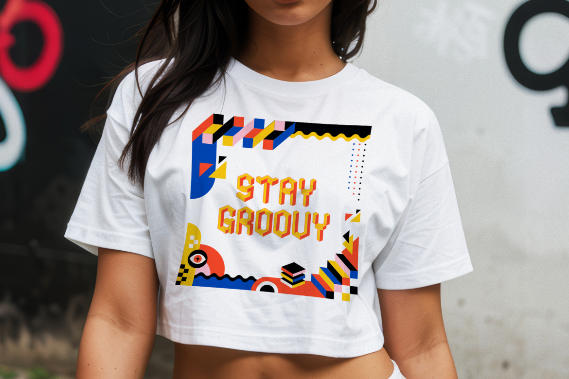
A bold, futuristic font built from polygonal structures. Ideal for tech branding, sci-fi posters, gaming visuals, and digital interfaces.
A unique geometric display font with maze-like structure. Great for logos, modern packaging, and creative advertising.
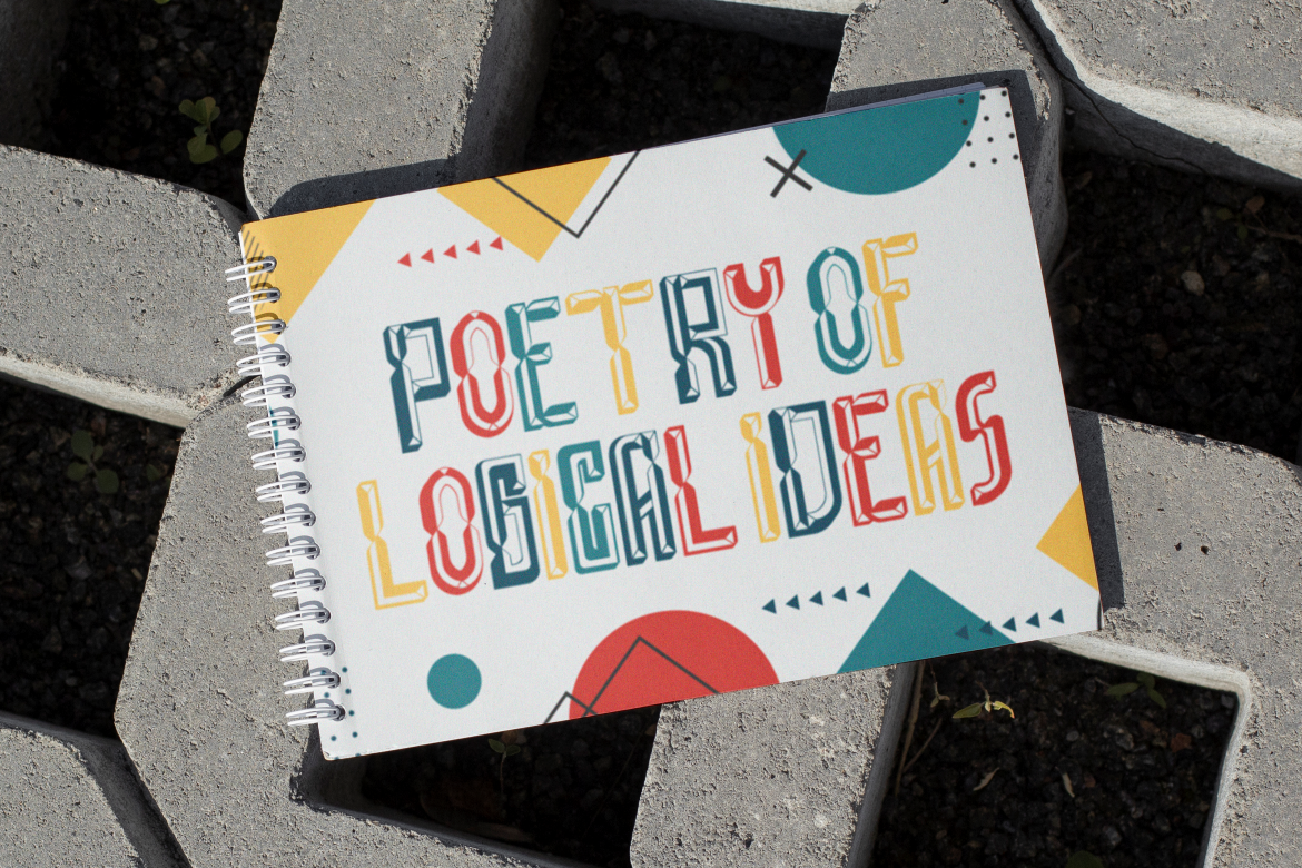
This font brings isometric depth and playful geometry together. Perfect for bold poster titles, editorial graphics, and dynamic design concepts.

A clean and condensed typeface suitable for branding, editorial layouts, and professional presentations. Its tight structure ensures strong visual impact.

A futuristic multiline geometric font that works well for cyberpunk themes, tech branding, and digital experiences.
Each font offers a different interpretation of geometric principles, giving designers multiple ways to express modernity and innovation.
To make the most of these typefaces, keep the following guidelines in mind:
Pair heavier geometric fonts for titles with lighter or simpler body text fonts for clarity.
Because geometric fonts have strong shapes, give them breathing room for maximum impact.
Minimalistic design complements geometric typography best. Use white space strategically.
Mixing geometric fonts with futuristic or tech-inspired typefaces such as Hexaline can create dynamic visual systems.
Sans serif geometric fonts have earned their place as essential tools in contemporary design. Their modern appearance, high readability, visual consistency, and strong branding impact make them ideal for today’s creative and professional projects. Whether you’re designing logos, websites, posters, or business presentations, geometric fonts bring clarity, structure, and a modern edge.
With the curated geometric font collection from Putracetol.com including Polygon Block, Pyra Maze, Funky Form, Compacture, and Hexaline designers can build visual identities that feel fresh, relevant, and aligned with today’s design standards.
Explore more geometric fonts at Putracetol.com and elevate your next project with modern, clean typography.
Thank you for taking the time to read this article. If you are looking for more great articles, feel free to visit Putracetol Blog
Additionally, if you want to explore some free typography options, you can check out Putracetol Studio on Dafont. Happy reading and designing!
