
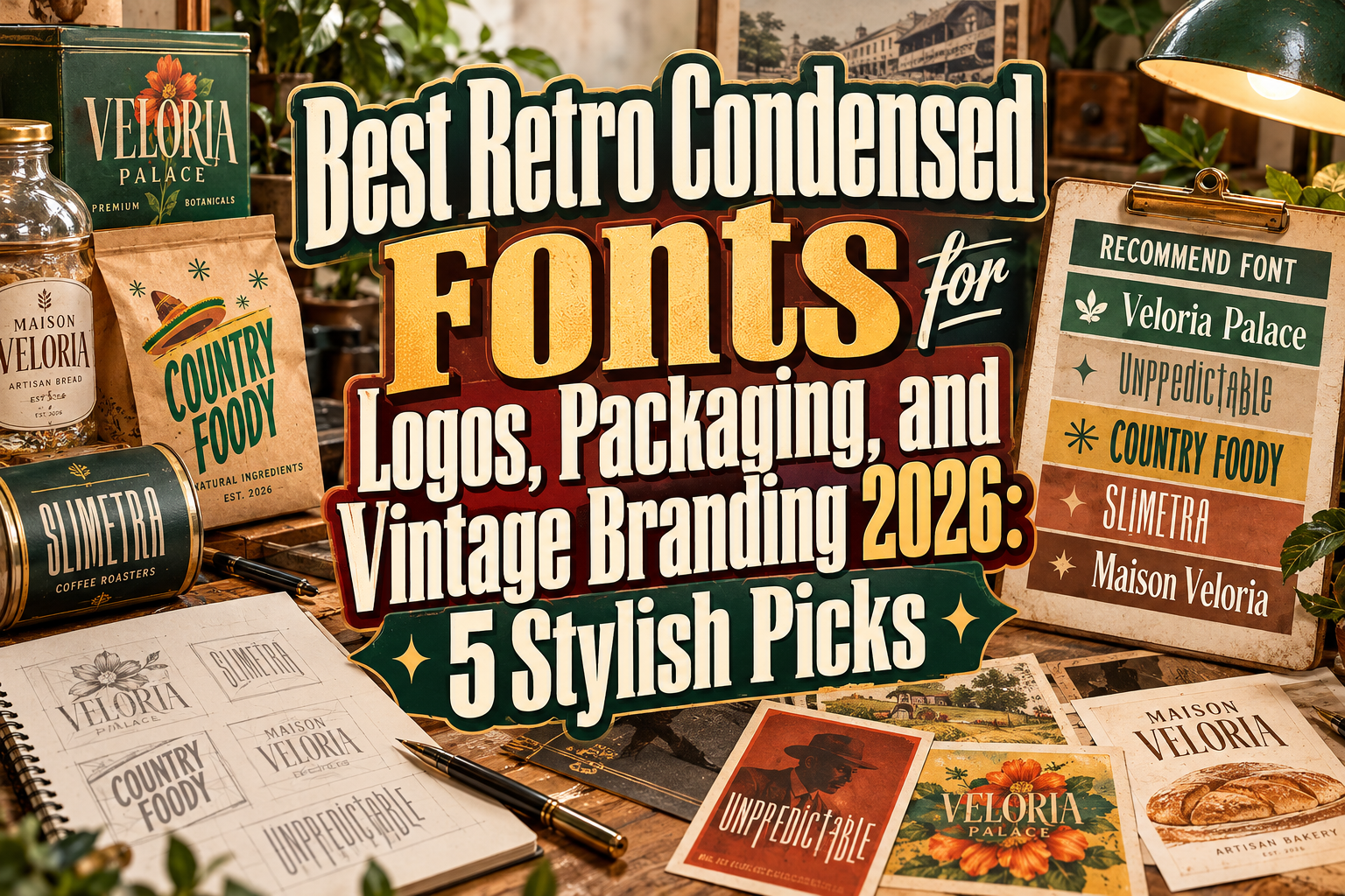
Best Retro Condensed Fonts for Vintage Branding 2026
Retro branding works best when it borrows the character of the past without looking trapped there.
One typography category particularly suited to this approach is the condensed font. Tall, narrow letterforms can create strong visual impact while using less horizontal space, making them useful for logos, packaging, signs, posters, labels, editorial covers, and product names.
The best retro condensed fonts for vintage branding 2026 combine these economical proportions with details associated with classic advertising, old packaging, editorial typography, handcrafted businesses, and mid-century visual culture.
However, “retro condensed” is not a single aesthetic. Some typefaces feel elegant and luxurious, others rustic and weathered, while contemporary condensed fonts can provide only a subtle vintage reference.
The following five PutraCetol options demonstrate how varied this category can be.
Initial Suggestion: Match the Era to the Brand
Before selecting a retro font, decide what kind of nostalgia your brand actually needs.
A perfume company may want narrow high-contrast serif lettering inspired by classic editorial design. A BBQ restaurant could benefit from weathered country typography, while a contemporary fashion label might use a tall condensed display face with only a hint of vintage character.
Do not add retro texture simply because the project is described as vintage.
Typography, color, photography, illustration, packaging materials, and layout should support the same historical mood. One convincing reference is usually more effective than combining every vintage cliché in the same identity.
Jump to Recommended Retro Condensed Fonts
1. Veloria Palace Classic Serif Font
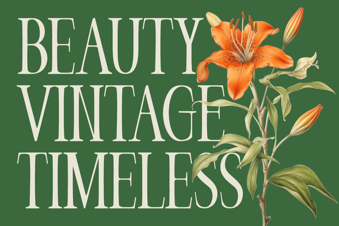
Veloria Palace is a tall, condensed serif with a refined rather than rustic approach to nostalgia. Its slim vertical rhythm, noticeable stroke contrast, sharp details, and softer curves create an elegant editorial appearance that works particularly well for beauty, boutique, floral, hospitality, perfume, and premium lifestyle branding. The narrow proportions also let longer brand names retain presence without occupying excessive horizontal space. PutraCetol Studio
Its strongest advantage is the ability to reference traditional luxury typography while remaining clean enough for contemporary visual systems.
PROS: Elegant condensed proportions, sophisticated serif details, strong editorial personality, good space efficiency.
BEST FOR: Beauty brands, perfume packaging, boutique logos, hotels, magazines, wedding identities.
2. Unpredictable Display Sans Font
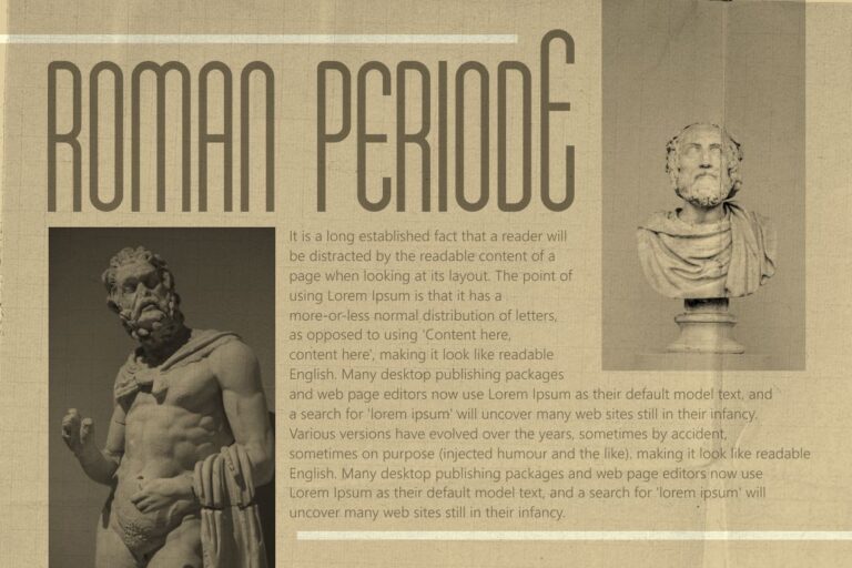
Unpredictable is the most experimental option in this selection. Rather than using one consistent height and baseline, it offers letter variations at normal, low, and high positions, allowing designers to construct irregular wordmarks with a deliberately handmade rhythm. It includes uppercase and lowercase characters, alternates, numerals, punctuation, and multilingual support. PutraCetol Studio
It is not a traditional condensed retro face in the strictest sense, but it can work effectively in vintage-inspired branding where quirky composition and custom-looking lettering matter more than historical accuracy.
PROS: Variable heights and baselines, alternates, unconventional word shapes, playful character.
BEST FOR: Creative logos, apparel, merchandise, quirky packaging, posters, experimental vintage branding.
3. Country Foody Condensed Retro Font
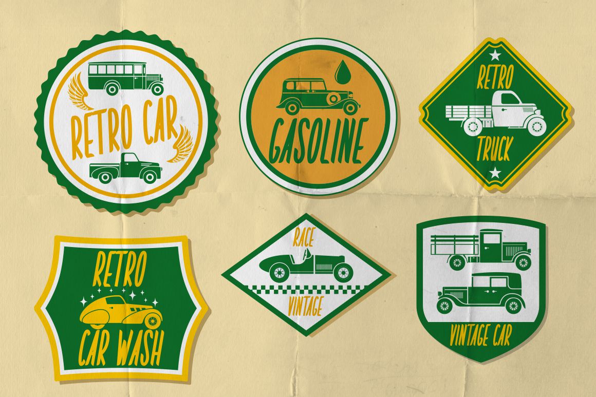
Country Foody is the most directly retro-condensed option here. It uses tall and narrow letterforms with subtle curves and serif details, then reinforces the vintage feeling through a worn, textured appearance. The family also includes alternates, ligatures, swashes, and bonus vintage graphics such as badges and labels, giving designers useful ingredients for building a complete identity rather than only a headline. PutraCetol Studio
Its country influence makes it particularly convincing for brands that want to feel established, handmade, or connected with traditional food and hospitality culture.
PROS: Authentic condensed proportions, vintage texture, alternates and swashes, bonus graphics.
BEST FOR: BBQ restaurants, food brands, cafés, labels, retro events, rustic packaging.
4. Slimetra Condensed Font

Slimetra balances vintage references with more contemporary geometry. Its tall elongated construction, sharp verticals, geometric edges, and selective rounded cuts give it a distinctive silhouette that feels sophisticated without becoming overly ornamental. Its condensed width is specifically designed to create strong headline impact while fitting efficiently into narrow spaces. PutraCetol Studio
That makes Slimetra useful for designers who want nostalgic character but still need the finished branding to appear modern and controlled.
PROS: Bold narrow structure, strong legibility at display sizes, retro-modern balance, efficient proportions.
BEST FOR: Fashion branding, editorial covers, logos, music artwork, posters, product packaging.
5. Maison Veloria Condensed Font

Maison Veloria takes the softer, artisanal route. It features tall narrow characters, smooth strokes, balanced proportions, curved details, and a restrained vintage quality. PutraCetol positions it particularly well for bakery brands, cafés, bread houses, coffee roasters, gourmet food businesses, labels, signs, packaging, menus, and editorial applications. PutraCetol Studio
The condensed structure allows longer names to remain neat on labels and storefront graphics, while its warmer personality prevents the typography from feeling too corporate.
PROS: Tall proportions, warm vintage character, elegant spacing, excellent use of limited horizontal space.
BEST FOR: Bakeries, coffee brands, artisan food, restaurants, packaging, boutique businesses.
Comparison: Which Retro Condensed Font Fits Your Brand?
| Font | Visual Character | Best Branding Direction |
|---|---|---|
| Veloria Palace | Elegant, classic | Luxury and beauty |
| Unpredictable | Quirky, experimental | Creative lifestyle |
| Country Foody | Rustic, weathered | Food and heritage |
| Slimetra | Bold, retro-modern | Fashion and editorial |
| Maison Veloria | Warm, artisanal | Café and food branding |
For traditional vintage character, Country Foody is the clearest choice. Veloria Palace works better for sophisticated nostalgia, Slimetra for contemporary branding, Maison Veloria for handcrafted businesses, and Unpredictable when the design needs more irregular personality.
Why Condensed Typography Works So Well for Branding
Condensed fonts create visual height without requiring excessive width.
This is valuable for vertical labels, narrow packaging, storefront signs, posters, bottle designs, magazine covers, and logos containing longer names.
Their proportions can also evoke historical advertising because tall display lettering appeared frequently across posters, packaging, newspapers, storefronts, and commercial signage.
For contemporary work, combine a condensed headline font with generous whitespace and a simpler supporting typeface. The contrast prevents the branding from becoming overly nostalgic.
A modern cream-and-black package using Country Foody, for example, can feel completely different from the same font surrounded by distressed illustrations and faded colors.
Common Mistakes
A common mistake is believing that any narrow font automatically feels vintage. Condensed describes proportion, not historical style. Geometry, serifs, stroke contrast, texture, spacing, and decorative details determine whether the result appears Art Deco, Victorian, mid-century, rustic, contemporary, or industrial. Choose based on the complete personality rather than width alone.
Another mistake is overusing condensed typography. Narrow letters can create dramatic logos and headlines but become tiring when used for long paragraphs. Reserve the distinctive typeface for brand names, titles, labels, or short promotional messages, then pair it with a more comfortable reading face for supporting information.
Finally, avoid building a brand entirely from default typed text. Test the actual company name and refine kerning, alternates, ligatures, or selected characters where appropriate. If the font becomes part of a commercial logo, packaging system, website, merchandise, or other expanded usage, choose the relevant license coverage through PutraCetol’s flexible license builder.
Conclusion
The best retro condensed fonts for vintage branding 2026 show that nostalgia can take several forms.
Veloria Palace creates refined heritage, Unpredictable adds experimental personality, Country Foody delivers authentic rustic retro character, Slimetra merges vintage proportions with contemporary structure, and Maison Veloria brings warmth to artisanal branding.
Explore these fonts at PutraCetol Studio and build the rest of the identity around the era and emotion you want customers to recognize. With thoughtful spacing, color, imagery, and hierarchy, condensed retro typography can deliver vintage personality without making a modern brand feel outdated.
Explore these fonts and many more at PutraCetol.com to build a business identity that looks professional, trustworthy, and memorable.
Additionally, if you want to explore some free typography options, you can check out Putracetol Studio on Dafont. Happy reading and designing!