
Packaging plays a critical role in how creative works are perceived. For music albums, films, and merchandise, packaging is not merely functional. It is part of the storytelling. It sets the mood, signals genre, and builds emotional anticipation before the content is even experienced. One design direction that continues to resonate strongly in creative industries is psychedelic-inspired packaging design.
Rooted in the bold visual culture of European psychedelic posters from the 1960s and 1970s, this design approach is expressive, daring, and deeply artistic. This article explores a packaging design project developed by Putracetol.com that draws inspiration from classic European psychedelic aesthetics while integrating modern design sensibilities. The result is a visual identity that feels retro yet refined, bold yet elegant, and nostalgic yet relevant.
Psychedelic design is often associated with freedom, experimentation, and counterculture. In European poster history, especially in music and cinema promotion, psychedelic visuals were used to challenge conventions and attract attention through unconventional typography, intense color contrasts, and decorative illustration.
Today, psychedelic-inspired packaging remains relevant because it:
When handled with intention and balance, psychedelic design can feel sophisticated rather than chaotic.
The packaging concept developed by Putracetol.com is built on respect for classic psychedelic visuals while refining them for modern audiences. Rather than copying vintage posters directly, the design translates their essence into a contemporary framework.
The visual language draws from European psychedelic posters known for their flowing typography, ornamental forms, and striking color combinations. These references inform the mood and structure of the design without overwhelming it.
The inspiration is visible in:
This foundation gives the packaging its distinctive character.
Despite its bold roots, the packaging avoids visual chaos. Elegance is achieved through careful composition, symmetry, and proportion. The result feels timeless rather than trendy.
This classic approach:
The packaging feels intentional, not excessive.
To ensure relevance, modern design principles are subtly integrated. Clean spacing, controlled hierarchy, and refined color balance prevent the design from feeling dated.
Modern touches include:
These elements ensure the packaging works across both physical and digital platforms.
Packaging becomes a storytelling medium rather than a wrapper. Each visual element contributes to the narrative of the music album, film, or merchandise line.
This storytelling approach:
The packaging speaks before the content does.
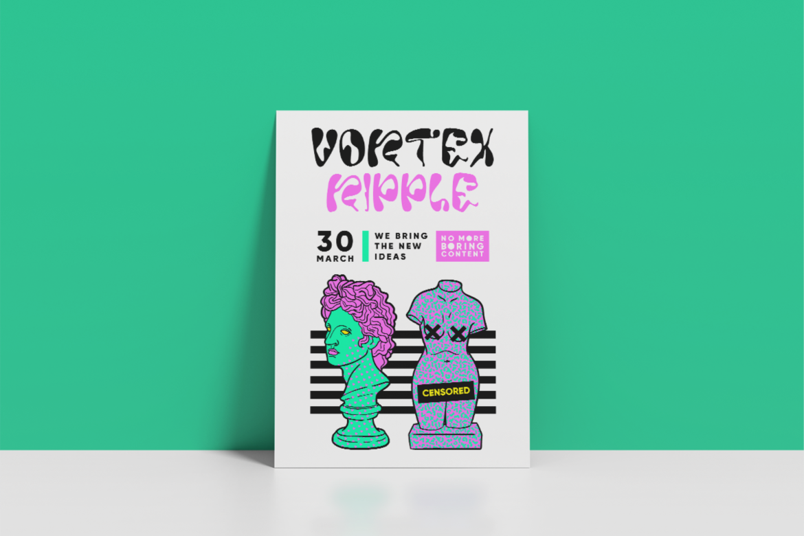
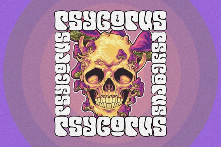
Typography is central to psychedelic-inspired packaging design. Fonts are chosen for their character, movement, and visual weight. Inspired by vintage European posters, the typography feels expressive and iconic.
Bold typography:
Text becomes part of the artwork, not just information.
Color is one of the most powerful tools in psychedelic design. Bright, daring combinations are used to create visual tension and excitement.
Contrasting colors:
Despite the boldness, color usage is controlled to maintain elegance.
Illustrations add depth and atmosphere to the packaging. Inspired by classic poster art, these graphics feel ornamental and symbolic rather than literal.
Decorative illustrations:
They reward audiences who spend time exploring the design.
To balance the expressive elements, symmetry is used as a stabilizing force. This structure provides clarity and professionalism.
Symmetrical layouts:
The contrast between expressive elements and structured layouts is key to the design’s success.
Typography choices greatly influence the tone of psychedelic-inspired packaging. The following fonts from Putracetol.com align well with this aesthetic.

A bold and fluid font that captures the essence of psychedelic movement. Ideal for album titles and main branding elements.

Popdash brings retro charm with modern clarity. It works well for supporting text and secondary information.
This font leans heavily into nostalgic character, making it suitable for storytelling elements and decorative headlines.

Neon Daze reflects vibrant energy and modern reinterpretation of retro aesthetics. Perfect for film or music-related packaging.
Expressive and imaginative, Mind Explorer supports conceptual themes and experimental branding.
Used together, these fonts create a layered typography system that balances expression and structure.
Psychedelic-inspired packaging works particularly well across:
Its strong visual identity makes it ideal for products that aim to be memorable and collectible.
Beyond aesthetics, psychedelic packaging triggers emotional responses. It invites curiosity, nostalgia, and excitement. Audiences often associate such visuals with creativity, freedom, and artistic authenticity.
This emotional impact:
Packaging becomes part of the creative experience itself.
The key challenge in psychedelic-inspired packaging is balance. Too much nostalgia can feel outdated, while too much modern restraint can dilute character.
Successful balance is achieved by:
This approach ensures longevity and relevance.
The psychedelic-inspired packaging design project from Putracetol.com demonstrates how European psychedelic poster aesthetics can be reimagined for modern music, film, and merchandise packaging. By combining bold typography, daring colors, decorative illustrations, and structured layouts, the packaging achieves a rare balance between retro character and contemporary elegance.
More than a container, this packaging becomes a storytelling medium that enhances emotional connection and strengthens brand identity. It proves that when past inspiration is handled with care and modern insight, psychedelic design remains powerful, relevant, and timeless.
Thank you for taking the time to read this article. If you are looking for more great articles, feel free to visit Putracetol Blog
Additionally, if you want to explore some free typography options, you can check out Putracetol Studio on Dafont. Happy reading and designing!
