
Among the vast spectrum of typographic styles, few evoke such emotion, intensity, and history as Gothic fonts. Recognized for their sharp edges, narrow proportions, and ornamental flourishes, these typefaces are more than just aesthetic choices — they are visual storytellers, carrying centuries of artistic tradition and cultural symbolism.
Originally developed during the Middle Ages, Gothic typography was used in illuminated manuscripts and religious texts. Its intricate structure mirrored the architectural splendor of Gothic cathedrals grand, intricate, and designed to inspire awe.
Today, Gothic fonts continue to command attention across diverse creative fields, from music and film branding to fashion, gaming, and editorial design. Their unmistakable character makes them the go-to choice for projects that need to communicate drama, depth, and authority.
Visually, Gothic fonts are defined by bold and deliberate strokes that emphasize verticality and contrast. Unlike modern sans-serif or serif fonts, Gothic typefaces often combine both rigidity and ornamentation, resulting in designs that feel simultaneously ancient and powerful.
These traits create a majestic yet intimidating presence, which explains their popularity in genres like metal music, gothic fashion, fantasy art, and horror design.
💡 Design Insight: The key to using Gothic fonts effectively lies in balance, pairing them with minimal layouts or contrasting modern elements enhances their visual power.
Gothic typography evolved over centuries, leading to several distinct styles. Each carries unique characteristics suited to different applications and moods.
Let’s explore the four principal categories of Gothic fonts and their defining traits.
The earliest and most iconic Gothic style, Textualis was widely used during the 14th and 15th centuries. Known for its extremely narrow, calligraphic letterforms, it features sharp vertical strokes and tight spacing.
Textura fonts were used in religious manuscripts, evoking solemnity and reverence. Their intricate design remains a hallmark of Gothic artistry.
💡 Modern Use: Ideal for logo design, tattoos, or book covers that aim to capture an antique or sacred tone.
Emerging in 15th-century Germany, Fraktur introduced a more readable and rhythmic version of Gothic writing. It retained sharpness but incorporated rounded curves and fluid connections between letters.
This style became a standard across Germanic countries and was even used in printed texts until the early 20th century.
💡 Modern Use: Works beautifully for vintage branding, heritage products, and editorial headlines.
Schwabacher, developed around the same period, features softer and rounder shapes than Fraktur, offering greater legibility without losing the Gothic feel.
It experienced a revival in the late 1900s, especially in retro-inspired designs and branding that sought to merge old-world charm with modern readability.
💡 Modern Use: Perfect for labels, signage, or typographic posters with a historical yet accessible tone.
The Italian variant of Textualis, Rotunda features broader forms and smoother lowercase letters, creating a lighter and more decorative effect. Its semi-circular design made it a favorite in artistic and cultural manuscripts of the Renaissance period.
💡 Modern Use: Great for art magazines, fashion branding, and creative logotypes seeking elegance with historical nuance.
While Gothic fonts are rooted in medieval calligraphy, their visual drama ensures they remain highly relevant today. In the age of digital design, they bridge tradition and rebellion, offering a distinctive contrast to minimalist modern aesthetics.
Because Gothic fonts are dense and ornamental, readability can be a concern, especially at smaller sizes. Designers must balance contrast, spacing, and context carefully. Yet, this complexity also presents creative opportunities to pair Gothic fonts with minimalist design for striking visual tension.
💡 Pro Tip: Use Gothic fonts for titles, headlines, or logos rather than body text, this preserves both clarity and impact.
For designers looking to explore authentic and modern Gothic styles, Putracetol.com offers a curated collection of high-quality fonts that balance tradition with modern usability.
Here are five standout Gothic fonts that bring historical richness and artistic flair to contemporary projects:

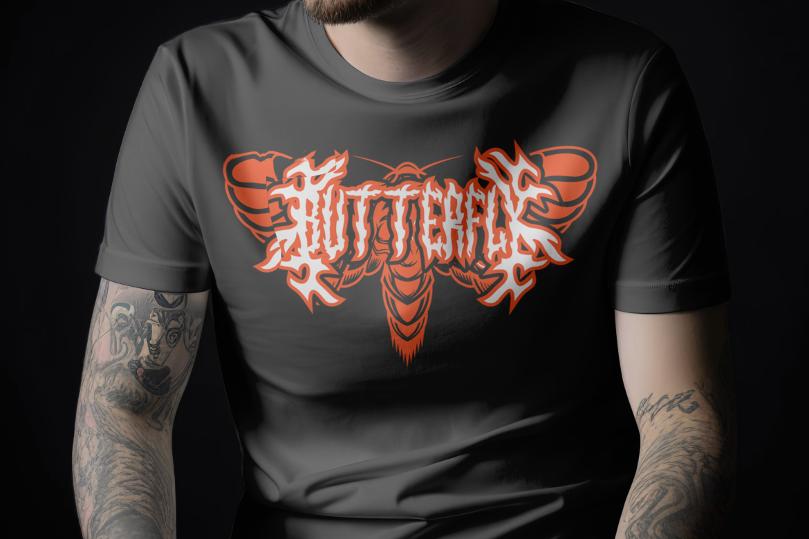
Bold and assertive, this font features thick strokes and edgy terminals, ideal for metal music branding, gaming logos, or dark poster art.
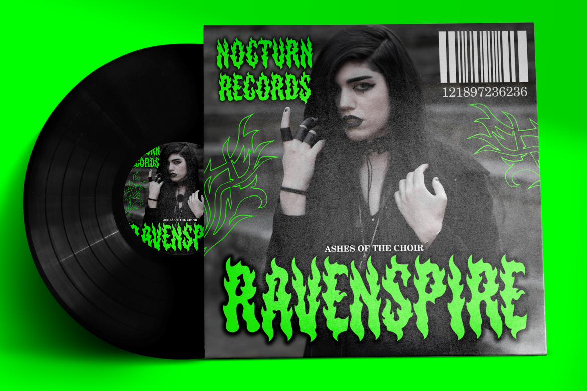
Combining Gothic and fire-inspired motifs, this typeface exudes aggression and power, perfect for album covers or cinematic titles.

A refined, luxurious take on Gothic design, featuring ornamental elegance suitable for fashion, editorial, or branding projects.
This hybrid typeface merges flame textures with medieval letterforms, an excellent choice for fantasy themes or modern gothic reinterpretations.
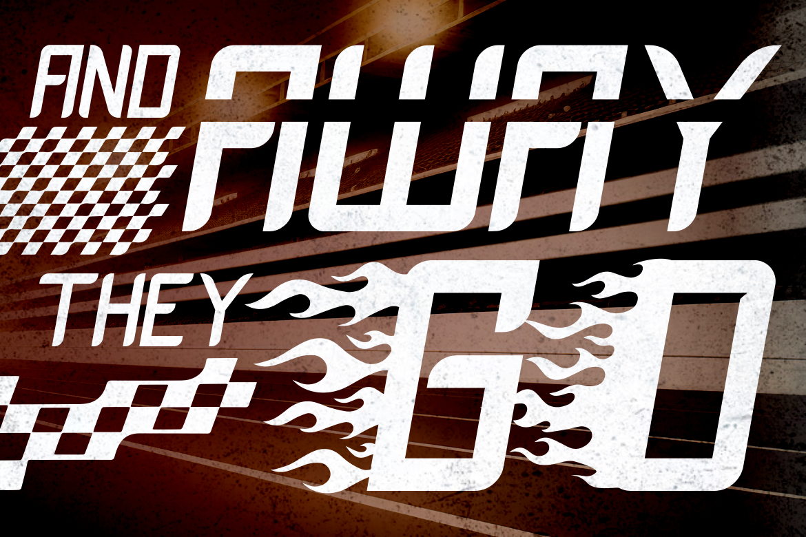
Combining Gothic energy with modern dynamism, Inferno Racers delivers a bold and racing aesthetic that suits gaming, sports, or branding seeking intensity.
What sets Gothic fonts apart is their emotional and psychological resonance. Their architectural structure and historical weight evoke a sense of mystery, reverence, and rebellion.
Whether used subtly or dramatically, Gothic fonts turn ordinary compositions into visual statements, steeped in both heritage and attitude.
💡 Insight: When combined with minimalist design or modern color palettes, Gothic typography becomes even more striking, symbolizing strength meeting sophistication.
To maximize the impact of Gothic fonts, follow these practical guidelines:
💡 Example: Combining Royal Display with muted gold tones can create a luxurious medieval aesthetic suitable for branding or print design.
Even in today’s digital-first world, Gothic fonts endure because they represent a bridge between past and present. Their blend of artistic craftsmanship and bold modern utility gives designers a rare tool for expressing both history and innovation.
From ancient calligraphy to digital motion graphics, Gothic typography continues to adapt proving that true design power lies in reinvention.
When paired with modern color schemes and contemporary composition, these fonts embody timeless rebellion and refined artistry.
Gothic fonts are not relics of the past they’re living symbols of artistic evolution. With their intricate beauty and emotional gravity, they continue to inspire generations of designers, from medieval scribes to modern typographers.
By understanding their historical roots and stylistic variations, from Textura to Fraktur designers can apply Gothic fonts in ways that feel both classic and fresh.
Whether for a metal band logo, fantasy novel cover, or luxury brand identity, Gothic typography offers an unmatched combination of drama, elegance, and storytelling power.
To explore more Gothic fonts that fuse tradition with innovation, visit Putracetol’s Gothic Font Collection where history meets modern design.
Thank you for taking the time to read this article. If you are looking for more great articles, feel free to visit Putracetol Blog
Additionally, if you want to explore some free typography options, you can check out Putracetol Studio on Dafont. Happy reading and designing!
