In the competitive world of food and beverage branding, first impressions happen long before a product is tasted, they begin on the shelf. Food and Beverage packaging design is often the first connection between a brand and its consumers. Among the many design elements that influence purchase decisions, typography plays one of the most crucial roles.
A carefully chosen font doesn’t just decorate packaging; it tells a story. It communicates flavor, texture, and emotion. Whether it’s a playful candy font or an elegant serif for a premium beverage, the right typography can instantly define a product’s personality and create a lasting memory in the consumer’s mind.
Typography in packaging is more than a decorative choice. it’s a branding strategy. The right font:
Attracts attention among dozens of products on a crowded shelf.
Communicates product type (sweet, spicy, fresh, artisanal, or fun).
Builds emotional connection through visual cues like nostalgia or luxury.
Enhances brand memorability by creating consistent visual identity.
For example, a snack brand using a bubbly, rounded typeface immediately feels approachable and cheerful, while a sleek serif suggests sophistication and craftsmanship.
Each font below includes a link, design description, and suggested usage:
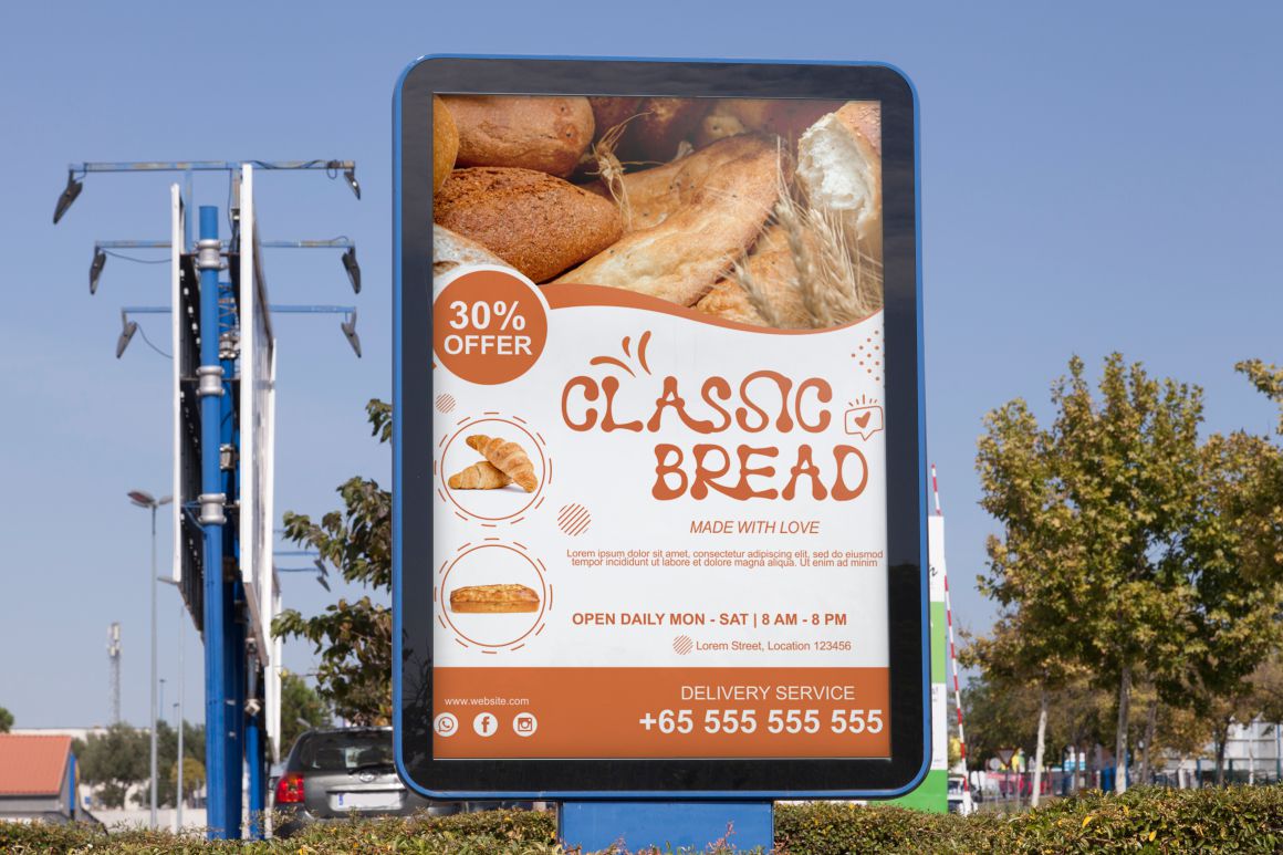
Rumbloon – A chubby, soft display font perfect for candy, cookies, and kids’ snacks. Its rounded shapes exude playfulness and warmth. Best for: fun snack logos, dessert packaging.
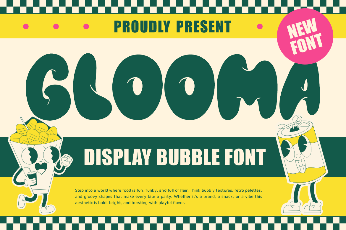
Glooma – A bubbly, cartoonish display font ideal for beverages and soda cans that target younger audiences. Best for: soda, fruit drinks, ice cream labels.
Crunchy Cookies – As its name suggests, this font radiates sweet, crumbly texture — perfect for cookie boxes and confectionery branding. Best for: baked goods, cookies, and biscuit brands.
Chubzy Funk – Bold, funky, and full of energy. This font brings a 70s-style groove into modern snack branding. Best for: candy bars, retro drink labels.
Bloxine Rough – With rugged edges and bold geometry, this typeface feels artisanal and handcrafted. Best for: organic snacks, granola, or eco-friendly packaging.
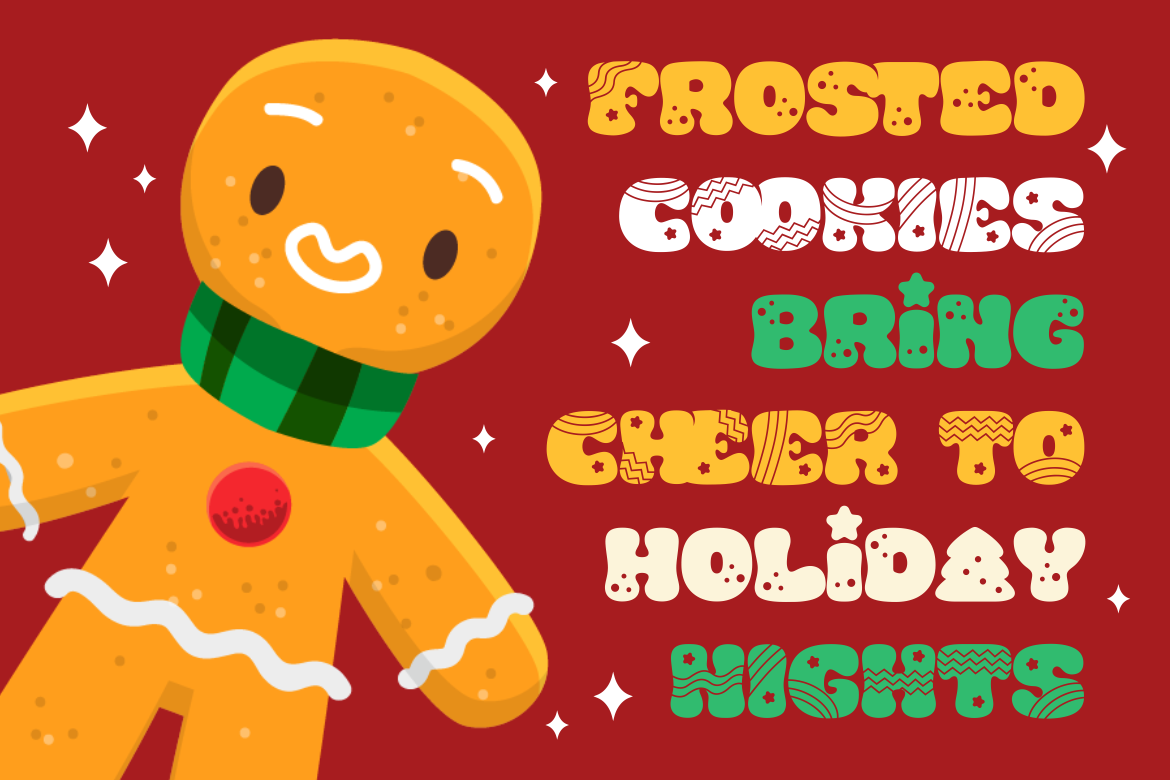
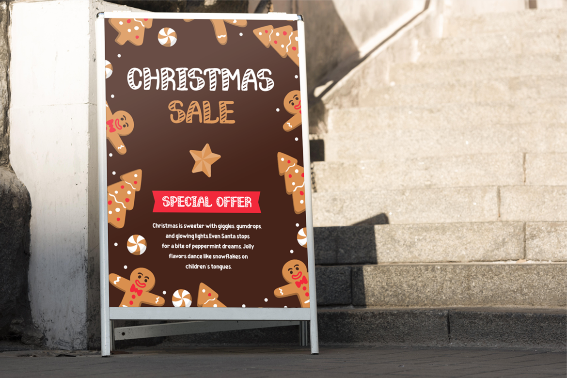
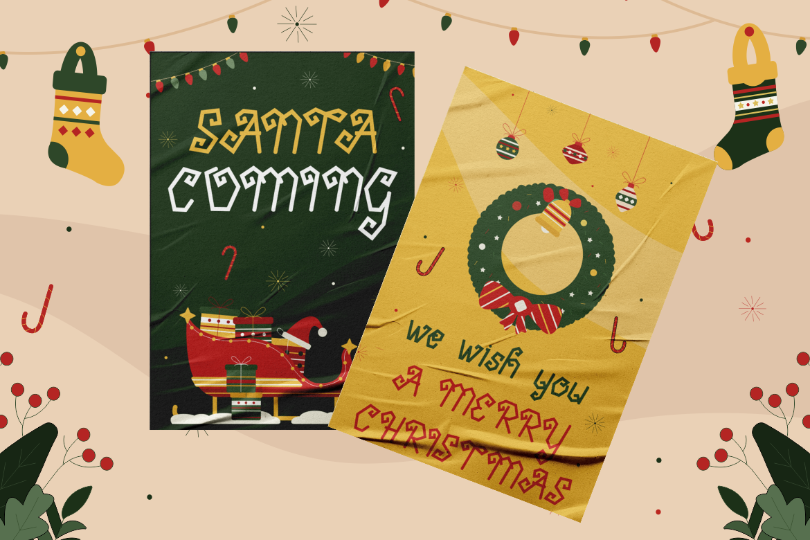
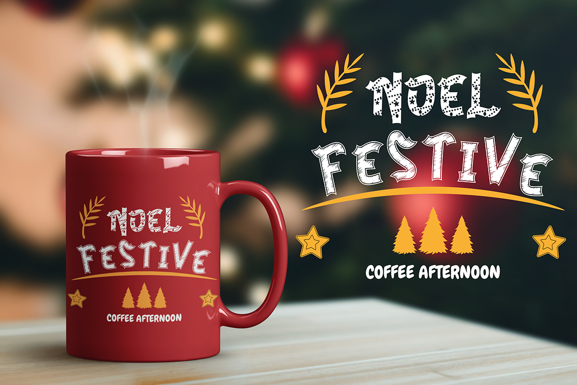
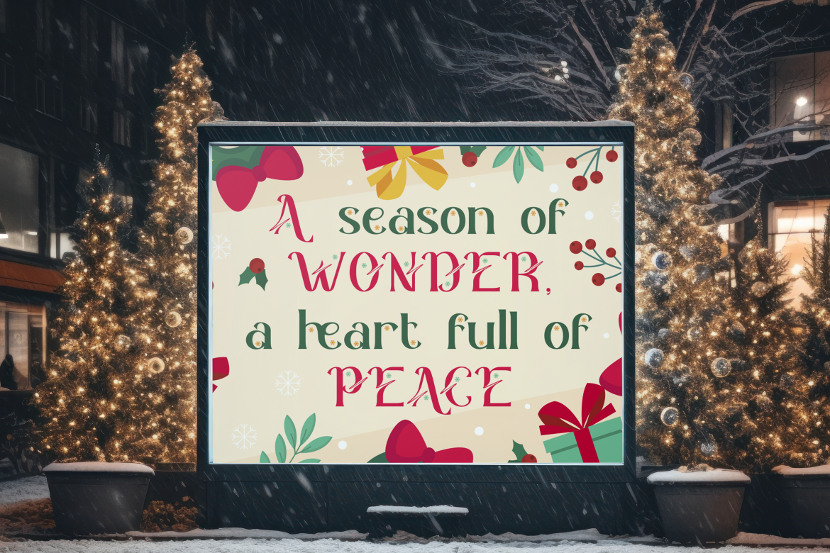
Christmas Grooves – A festive, decorative font that adds holiday cheer to seasonal treats. Best for: Christmas candies, limited-edition packaging.
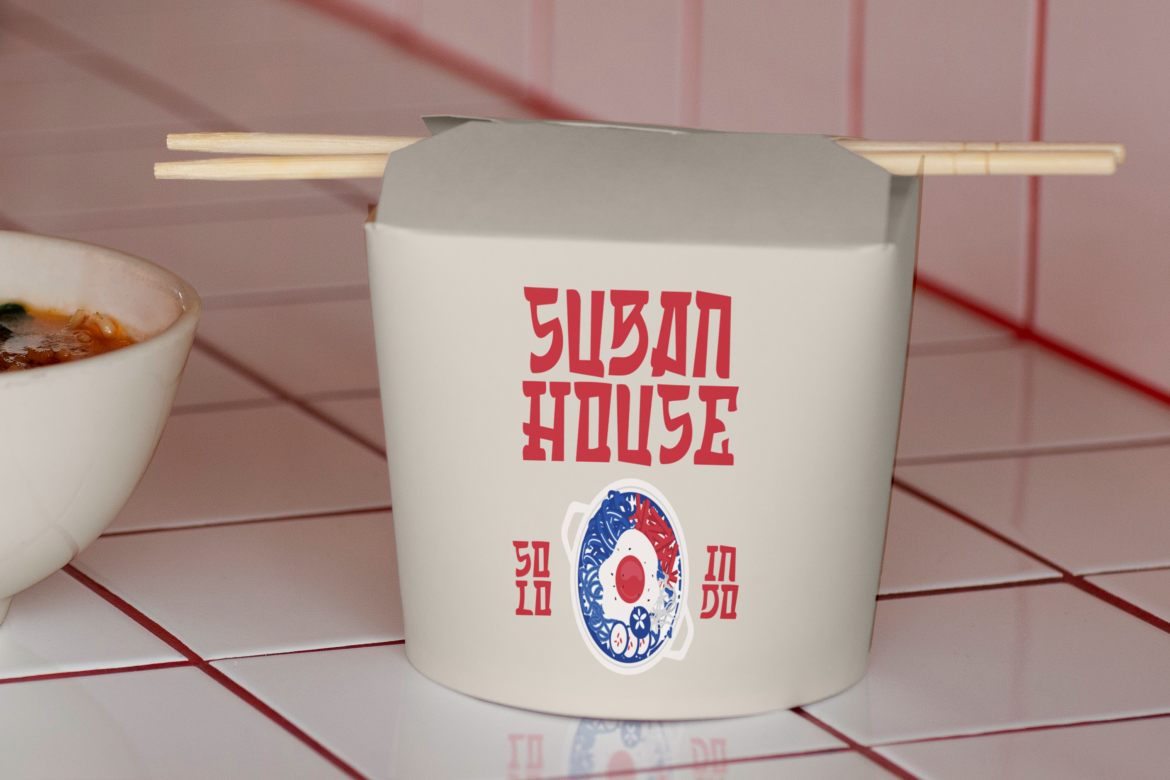
Amai Haze – Blending Asian cultural influences with contemporary design, this font fits perfectly for exotic or fusion food brands. Best for: sauces, noodles, or bubble tea packaging.
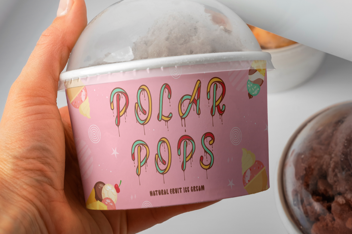
Cold Snowflake – Cool, quirky, and frosty — this font looks delicious on ice cream tubs and frozen desserts. Best for: ice cream, popsicles, chilled beverages.
Tuncho Plonko – A bold handwritten font that brings personality and authenticity to casual food brands. Best for: handmade snacks, artisan beverages.
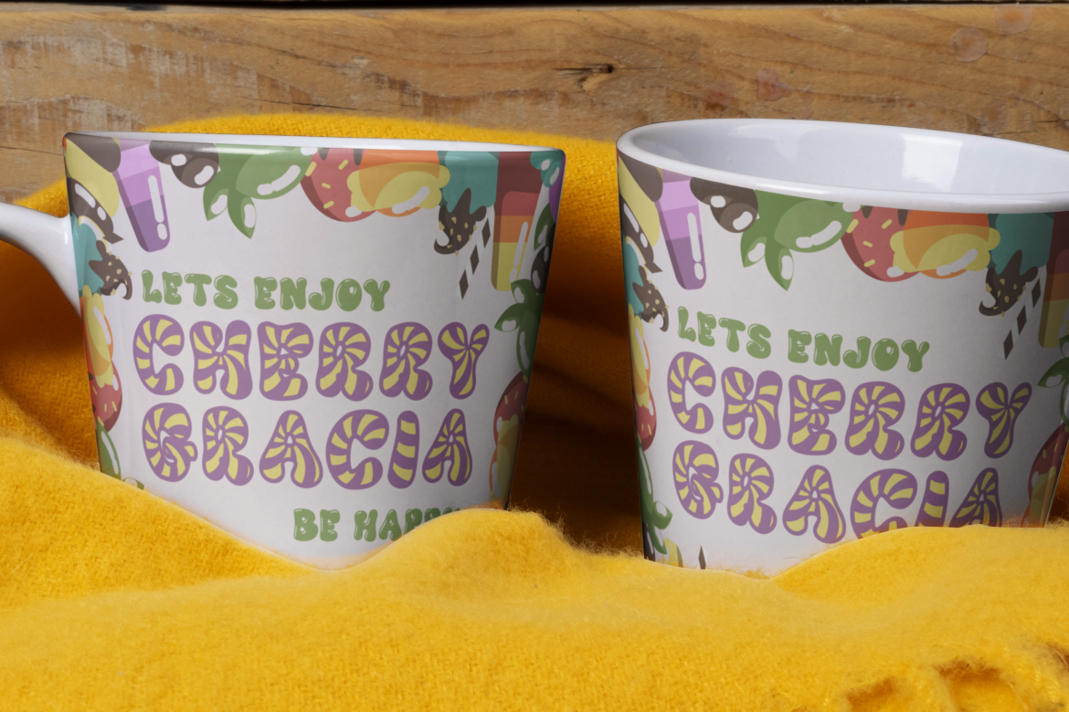
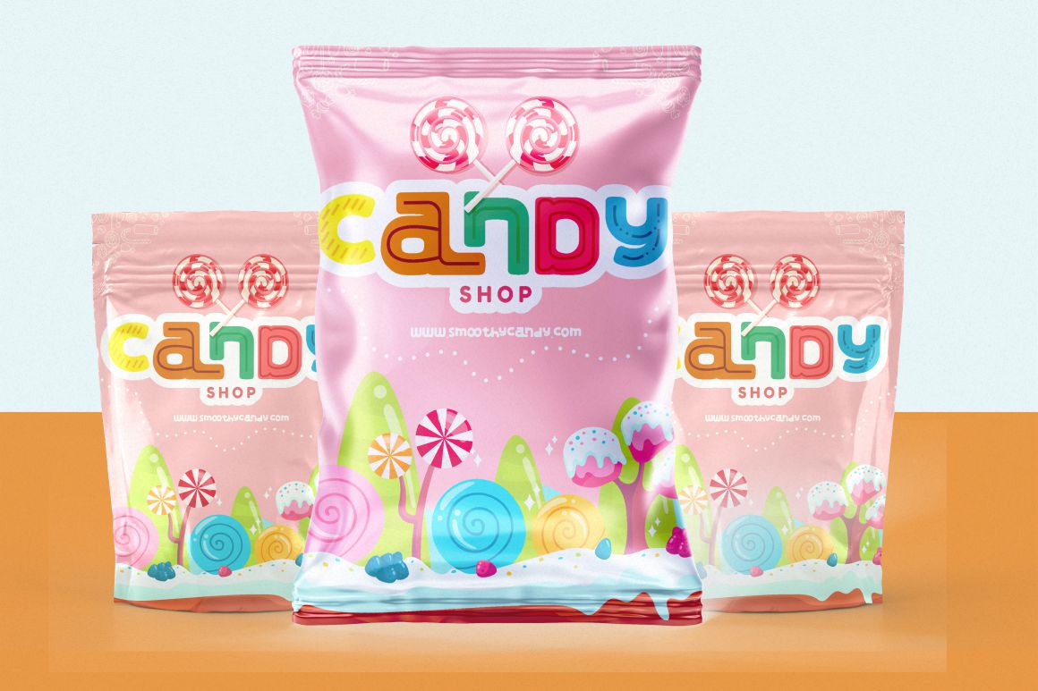
Colorful Candy – Bright and youthful, this playful font captures the fun spirit of sweets and confections. Best for: candy packaging, gum, or chocolate.
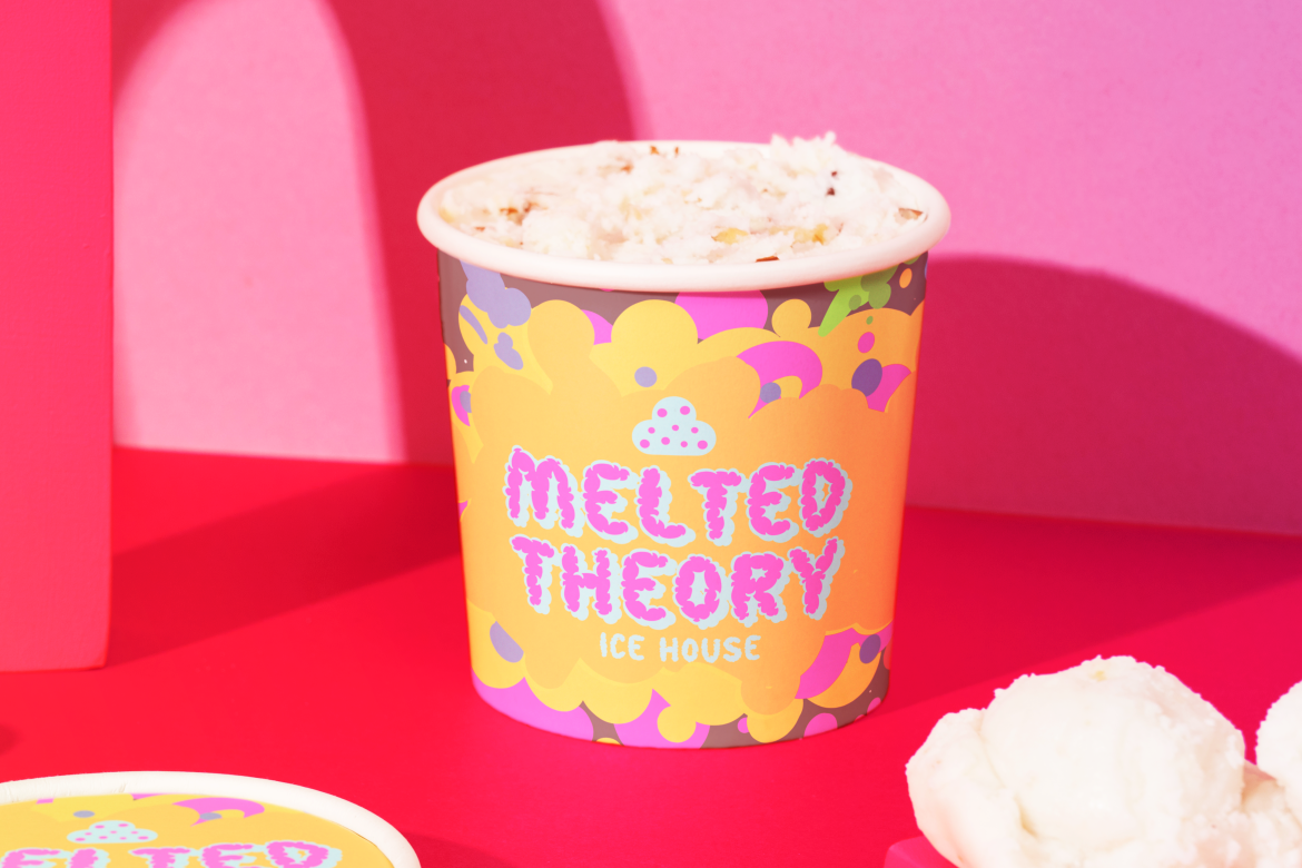
Melting Dessert – Smooth and dripping, this font mimics melting chocolate or ice cream. Best for: dessert shops, frozen treats, cake packaging.
Sugarpop Jingle – Whimsical and sweet, this candy-inspired font adds charm to festive snack packaging. Best for: lollipops, seasonal chocolates.
Country Foody – Rustic and retro, this condensed typeface gives a nostalgic farm-fresh vibe. Best for: organic food, jams, or beverage labels.
Glitch Sleigh – A quirky, modern display font with a holiday twist. Best for: energy drinks, themed snack boxes.
Snick Twirl – A charming, decorative typeface for brands that want a magical and joyful touch. Best for: cookies, chocolate packaging.
Coral Cascade – With fluid lines and organic movement, this font works well for beverage brands emphasizing freshness. Best for: fruit juices, flavored water, or smoothies.
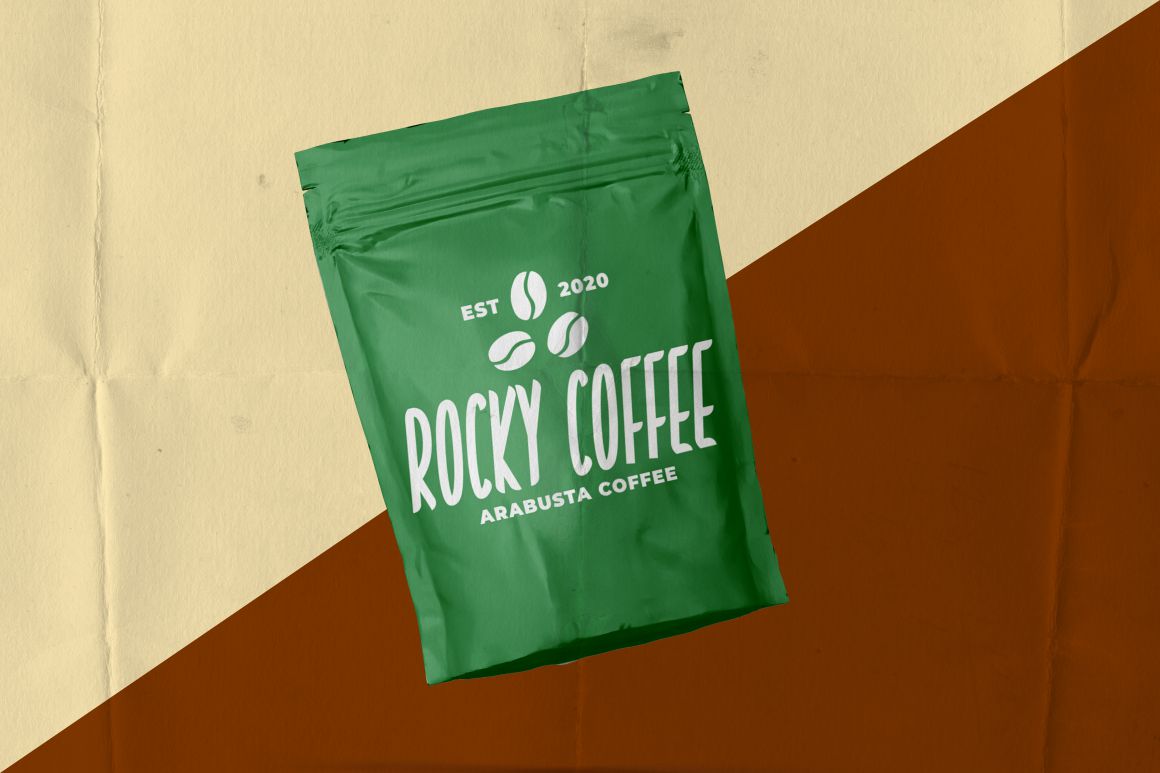
Smoky Glare – Adds a mysterious and premium feel—ideal for dark chocolate, coffee, or roasted snacks. Best for: coffee beans, BBQ sauce, or dark packaging.
Modern Bauble Bliss – A whimsical yet polished font suited for limited-edition products. Best for: gift boxes, confectionery packaging.
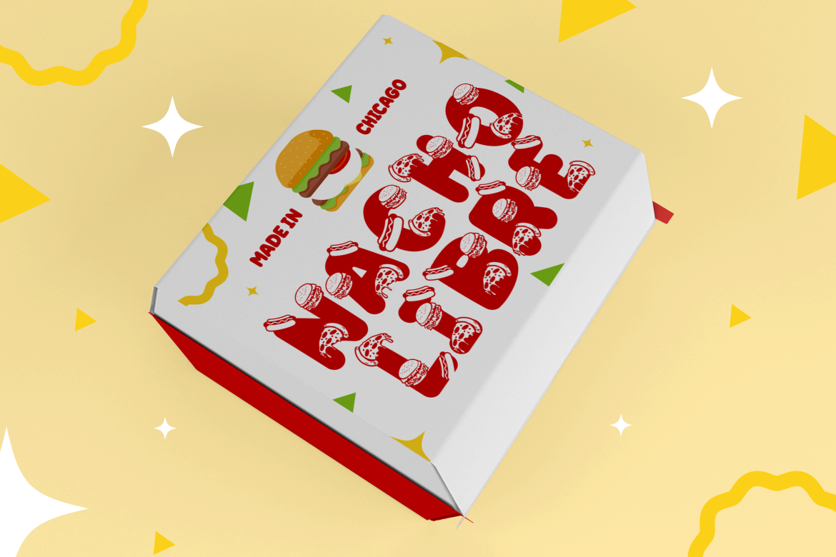
Smoky Maple – A bold, textured font inspired by diner and grill culture. Best for: burger boxes, sauces, or street food packaging.
Spark Jingle – Playful and lively, this font brings festive excitement to branding. Best for: candy bars, promotional holiday snacks.
🎨 Tips for Choosing the Right Font for Food Packaging
Match Font Personality to the Product Playful fonts like Rumbloon or Colorful Candy work beautifully for fun snacks, while elegant options like Gilded Glint (from Putracetol Studio) elevate gourmet or luxury products.
Prioritize Readability Always ensure that product names, ingredients, and taglines remain clear especially in small print areas.
Consider Emotional Impact Fonts can express joy, nostalgia, freshness, or indulgence. A bubbly font can make snacks look exciting; a clean sans serif creates trust and modern appeal.
Think About Shelf Competition On a crowded shelf, your font choice must help the packaging stand out instantly while maintaining brand harmony.
Adapt to Cultural and Regional Preferences Food is emotional and cultural choose fonts that resonate with local audiences. For example, Amai Haze reflects Asian elegance, while Country Foody fits Western rustic charm.
Beyond Aesthetics: Functionality and Brand Consistency
A great font not only catches the eye but also supports brand consistency. Using the same typography across packaging, ads, and social media reinforces recognition. Moreover, combining fonts strategically such as pairing a bold display font with a simple sans-serif for body text, creates hierarchy and readability.
Also, consider how fonts interact with color palettes and materials. Bright fonts on matte paper feel different from metallic fonts on glossy surfaces. Harmony between typography and packaging texture makes the design feel intentional and premium.
The Psychology of Font Choices in Food Packaging
Rounded fonts (like Rumbloon or Glooma) evoke comfort, approachability, and sweetness.
Condensed fonts (like Country Foody) give an impression of tradition and craftsmanship.
Bold, heavy fonts (like Smoky Maple) suggest strength and flavor intensity.
Decorative fonts (like Snick Twirl or Sugarpop Jingle) trigger emotional warmth and excitement.
Understanding these visual cues allows brands to align their fonts with the flavor narrative, for example, soft lettering for creamy desserts or sharp angles for spicy snacks.
Conclusion: Designing Flavor Through Fonts
Typography is one of the most powerful storytelling tools in food packaging design. A thoughtfully chosen font transforms packaging from ordinary to unforgettable, reflecting the product’s essence, whether fun and youthful, rustic and organic, or elegant and premium.
By exploring the 20 curated fonts above from Putracetol Studio, designers can find the perfect match for any category from candy to coffee, from burgers to beverages. When combined with strong visuals and consistent branding, the right typeface doesn’t just decorate, it defines the flavor, personality, and success of the product.
So, the next time you design a package, remember: people taste with their eyes first and your font is the flavor that starts it all.
Thank you for taking the time to read this article. If you are looking for more great articles, feel free to visit Putracetol Blog Additionally, if you want to explore some free typography options, you can check out Putracetol Studio on Dafont. Happy reading and designing!


