
The power of a great T-shirt design lies not only in illustration but also in typography. Fonts play a central role in shaping a shirt’s personality, tone, and overall appeal. The best fonts for T-shirt design go beyond aesthetics, they help communicate lifestyle, emotion, and brand identity. Whether you’re crafting a streetwear drop, a witty quote tee, or a birthday shirt for a toddler, your font choice is what ties the entire design together.
A well-selected font must remain legible on fabric, scale well across shirt sizes, and hold visual impact even from a distance. With that in mind, we explore standout typefaces from Putracetol Studio that deliver the versatility, expression, and punch you need to create unforgettable tees.

For bold, energetic designs that need to stand out in crowded visuals, few fonts beat the impact of Mega Boldy. With its thick curves and confident form, this typeface is a go-to for streetwear, motivational quotes, or sports-themed merchandise. It prints beautifully on both light and dark shirts, but it may overpower more delicate graphic elements if not balanced properly with whitespace.
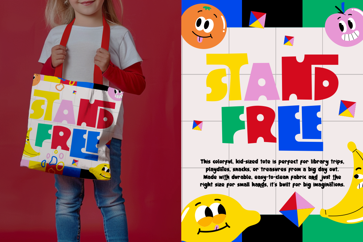
In contrast, Fun Art Friends adds a touch of playfulness perfect for family tees or kids’ apparel. Its handwritten feel offers warmth and approachability, great for back-to-school shirts or parent-child matching designs. However, its casual style may not be suited for professional or minimalist themes.
Retro typefaces are making a comeback in both high fashion and independent apparel. Typo Tingle is perfect for this aesthetic, with quirky, bubble-like shapes that throw back to comic books and 90s design. It’s ideal for pop culture shirts, vintage logos, or playful quotes.
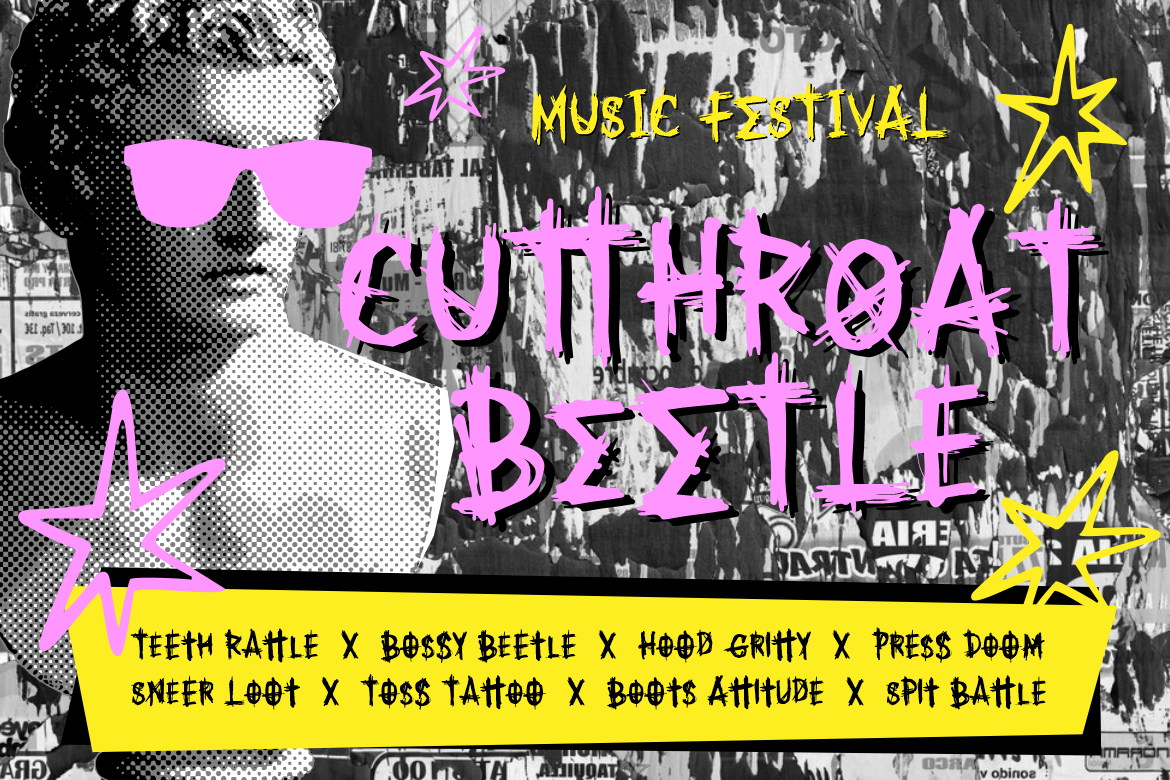
For an edgier take on retro, Spooky Punk combines punk energy with an old-school graffiti vibe. Great for youth-centric fashion, it’s bold and rough, but may require careful placement due to its sharp shapes and lower readability in small sizes.
If you’re targeting music lovers or nostalgic shoppers, pair Typo Tingle with a minimal sans-serif like Firanza to balance fun with formality. This combination adds structure to otherwise eccentric designs.

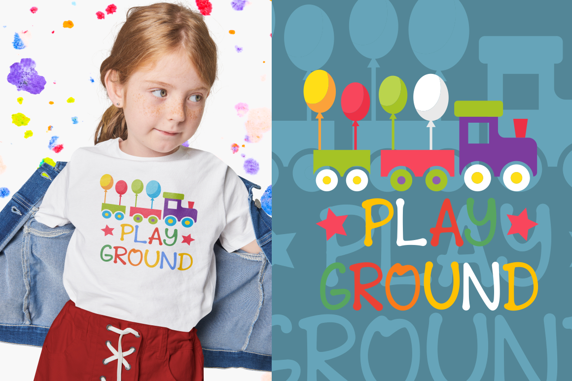
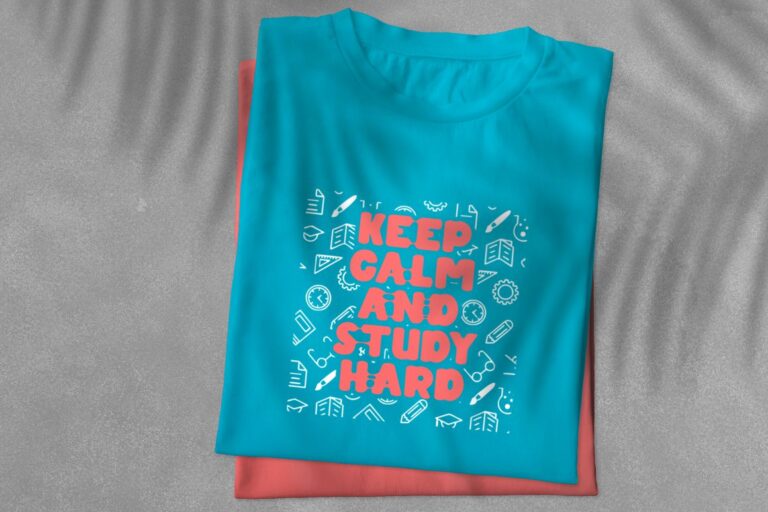
When designing for children, the best fonts for T-shirt design must be cheerful, bold, and easily readable. Chubby Elephant checks all the boxes with its rounded, bouncy shapes and friendly tone. It looks fantastic on colorful fabrics and holds its shape after printing. Perfect for birthday tees, playgroup uniforms, or daycare branding.
Another excellent option is Sticky Glue, which mimics a playful cartoon style with exaggerated strokes. While it shines in fun-themed merchandise or partywear, it’s better suited to one-word designs or short phrases due to its unpredictable flow.
Pairing these fonts with clean graphics or small illustrations helps create engaging shirt designs for kids without overcrowding the space.
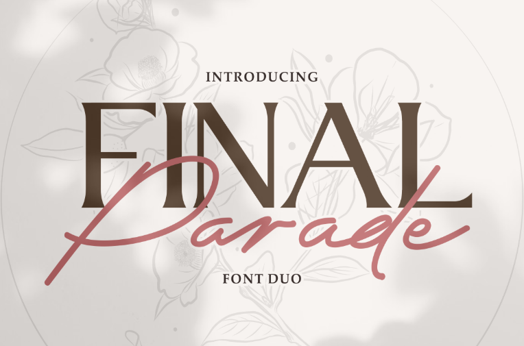
For wedding parties, anniversaries, or Valentine’s Day releases, soft and romantic fonts bring emotional value to T-shirt designs. Final Parade is an elegant script paired with a modern sans serif, perfect for couple shirts or bridal squad themes. It creates a luxurious tone while remaining versatile.
Its soft curves and delicate lines are ideal for white or pastel-colored T-shirts but may not stand out as much on highly textured or dark fabrics. For added clarity, it can be paired with a bold font like Mega Boldy to highlight names or keywords in a matching design.
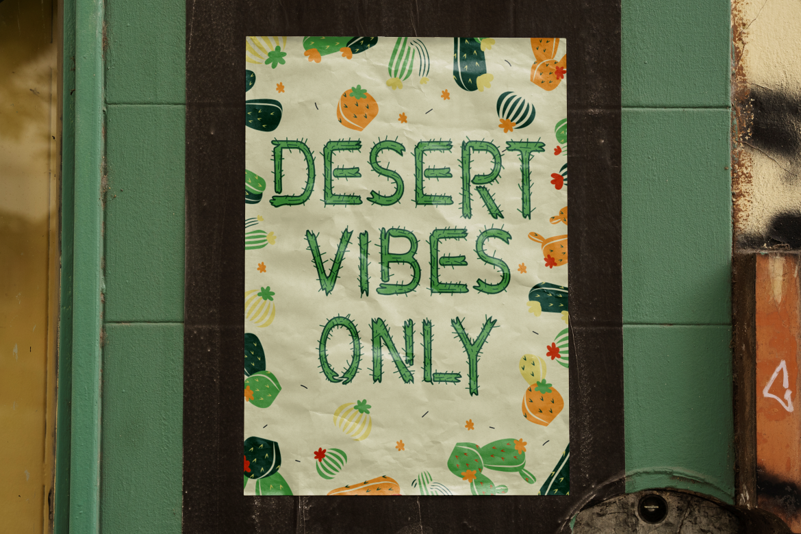
Designs that draw from natural or fantastical elements like music festivals, eco-friendly campaigns, or book merch, benefit from organic fonts that feel rooted and magical. Rumble Thorns brings just that with its botanical texture and rugged charm. It works beautifully for camping gear, cottagecore themes, or cactus-loving gift shops.
While this font adds visual interest, it’s not the most versatile across all genres. Use it as a headline font for short phrases or titles rather than body text or dense compositions.
Dark-themed shirts from gothic fashion to Halloween collections call for fonts that evoke mystery, rebellion, or fear. Shaky Halloween and Black Eoghan each bring different aesthetics to the table.
Shaky Halloween feels fun and spooky, suited for haunted house events or horror movie-inspired designs. Its irregular baseline creates a dynamic rhythm but may be harder to read on small shirts or busy patterns.
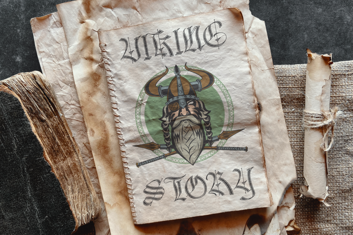
Black Eoghan is more formal and medieval, best used for heavy metal bands, fantasy fandoms, or historical-themed shirts. Its blackletter structure demands attention, but only when used sparingly due to legibility limits in long words or stacked text.
Pairing fonts adds visual contrast and structure to your design. A great example is combining Final Parade with Tectron Modern for a balance between romance and edge perfect for couples who like matching outfits with a twist.
Another strong pair is Fun Art Friends with Sticky Glue for children’s clothing that’s fun, friendly, and visually animated.
When mixing fonts, make sure there’s enough contrast in weight and style to avoid visual tension. Also, test your layout on mockup shirts to ensure it prints well and maintains readability from various distances.
Font selection in T-shirt design goes far beyond decoration, it’s how your message is felt, seen, and remembered. From bold statements to subtle love notes, from kawaii creations to punk declarations, the best fonts for T-shirt design help tell your story without saying a word.
By choosing from well-crafted typefaces like those from Putracetol Studio, you ensure your work remains sharp, readable, and emotionally engaging across different shirt types and fabric colors. Experiment with font pairings, test your prints, and always design with clarity and purpose.
Because in fashion, a good shirt starts with a great font.
Thank you for taking the time to read this article. If you are looking for more great articles, feel free to visit Putracetol Blog
Additionally, if you want to explore some free typography options, you can check out Putracetol Studio on Dafont. Happy reading and designing!
