
Packaging is more than a container. It is often the first physical interaction a customer has with a brand, and that moment matters. For brands that want to project strength, confidence, and heritage, Western-inspired packaging design offers a powerful visual language. Rooted in classic Americana, cowboy culture, and frontier aesthetics, Western design brings bold typography, rugged textures, and iconic symbolism into modern branding.
This article explores a western-inspired packaging design project developed by Putracetol.com. The concept blends the unmistakable strength of Western culture with contemporary design principles, resulting in packaging that feels bold, masculine, iconic, and still relevant in today’s market.
Western culture carries strong visual associations. It speaks of independence, craftsmanship, resilience, and authenticity. These values translate exceptionally well into packaging design, especially for products that want to feel confident, premium, and character-driven.
Western-inspired packaging appeals to audiences because it:
When combined with modern layout systems and clean composition, Western aesthetics become a powerful branding tool rather than a nostalgic reference.
The foundation of this project lies in respecting Western tradition while adapting it for modern consumers. The design does not simply replicate old-style visuals. Instead, it reinterprets them with intention and clarity.
Western inspiration is visible through:
These elements evoke authenticity and toughness without feeling outdated.
Strength is one of the defining characteristics of Western-inspired packaging. The visual system emphasizes masculinity, confidence, and authority. This makes it especially effective for products such as:
Bold typography and high-contrast layouts ensure the packaging commands attention instantly.
While rooted in tradition, the packaging remains modern through:
This balance prevents the design from feeling cluttered or overly nostalgic. Instead, it feels refined and intentional.
Consistency is key in successful packaging systems. Western-inspired visuals are paired with clean design logic to ensure the packaging works across:
The result is a cohesive brand identity that feels strong and professional.
Typography is the backbone of Western-inspired packaging. Thick strokes, sharp serifs, and condensed proportions help create a commanding presence. These fonts communicate strength, tradition, and reliability.
Bold typography ensures:
Illustrations play a supporting role in reinforcing the theme. Inspired by classic engravings and Western signage, these visuals add depth and storytelling value.
They often include:
Used sparingly, they enrich the design without overwhelming it.
Color choices are grounded in nature and tradition. Browns, creams, blacks, and muted reds dominate the palette. These tones:
Earthy colors also help convey quality and durability.
Decorative elements such as borders, badges, and dividers enhance the Western aesthetic. These details echo old-school labels and packaging while maintaining visual structure.
The key is restraint. Decoration supports the story without distracting from the product.
Typography plays a central role in achieving a successful Western-inspired look. Below are curated font recommendations from Putracetol Studio that align perfectly with this packaging style.

A rugged, expressive font that feels handcrafted and authentic. Ideal for logos and product titles with a strong Western identity.
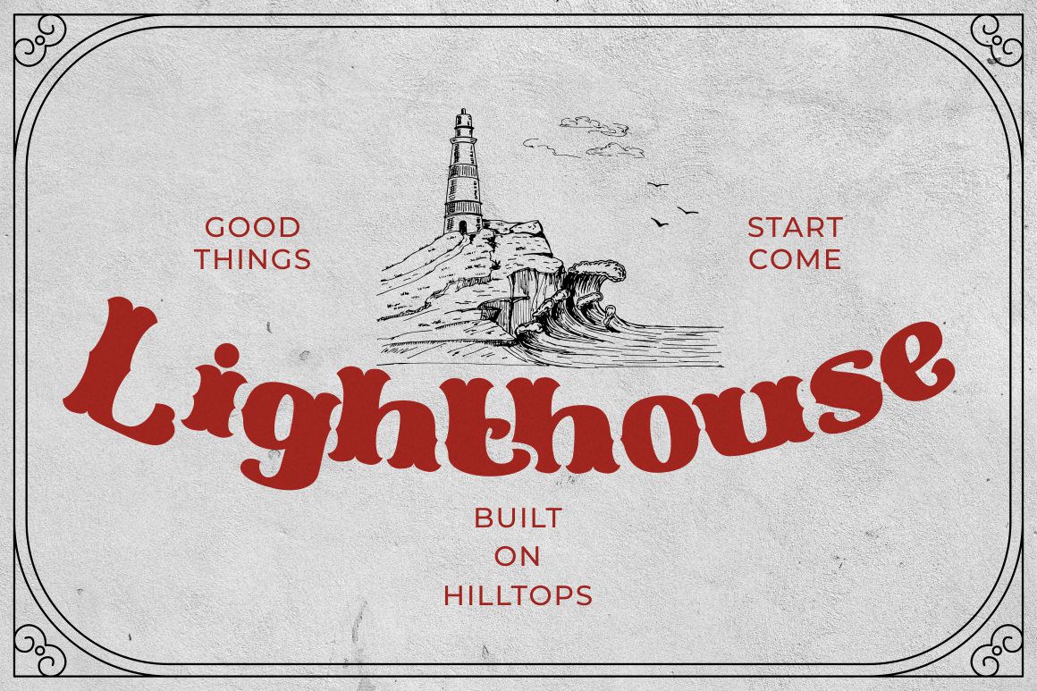
Bold and unmistakably Western. This font works well for headline text and branding elements that need instant impact.
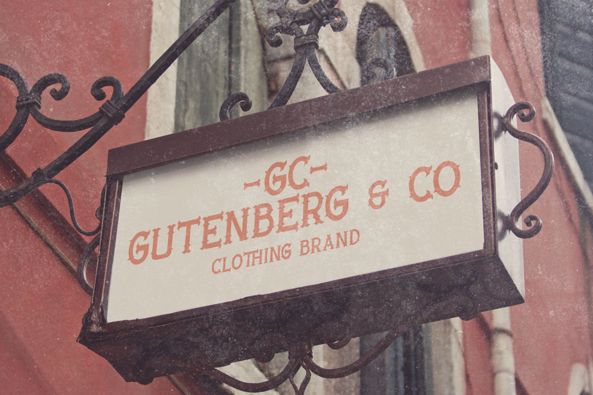
Inspired by traditional engraving techniques, this font adds heritage and detail. Perfect for premium packaging and decorative accents.

A modern typeface that balances the heavier Western fonts. Useful for supporting text and maintaining readability.
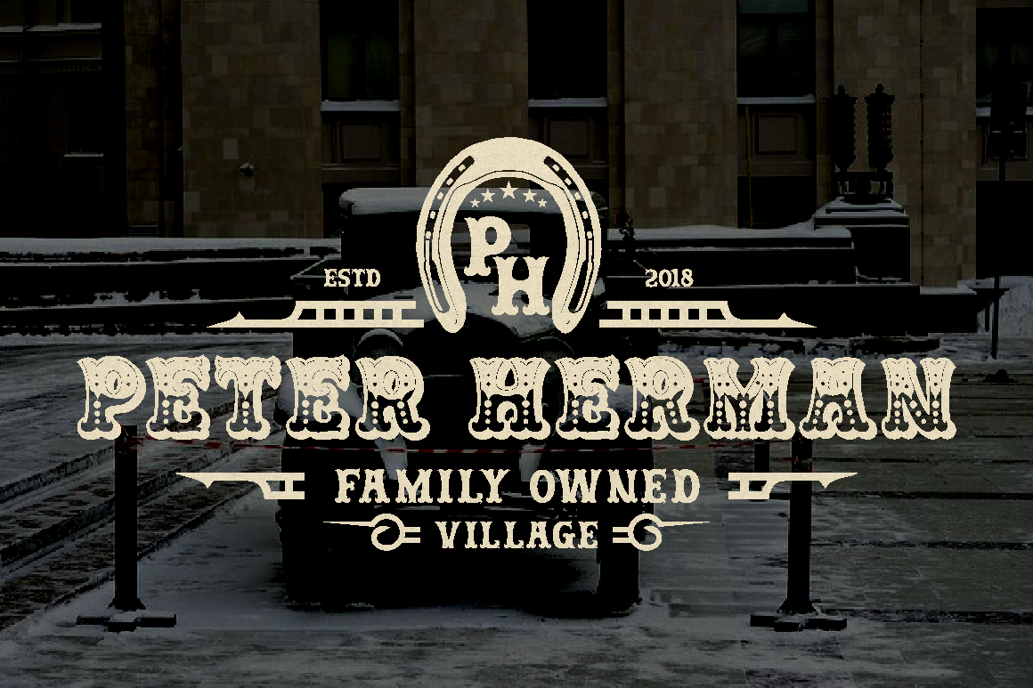
A bold display font with character and attitude. Ideal for products that want to lean into rebellious, confident branding.
Using a combination of these fonts allows designers to create hierarchy, contrast, and consistency within the packaging system.
Western-inspired packaging resonates because it taps into emotion and identity. In crowded markets, products need to communicate quickly and clearly.
This style works because it:
By blending traditional Western elements with modern design principles, brands avoid clichés and deliver something fresh yet familiar.
Western-inspired packaging is versatile and works across many industries:
Its adaptability makes it a strong choice for brands seeking differentiation.
The western-inspired packaging design from Putracetol Studio demonstrates how bold heritage aesthetics can coexist with modern visual standards. Through strong typography, earthy colors, classic illustrations, and clean layout systems, the packaging delivers a confident and iconic brand presence.
More than just a container, this packaging becomes a storytelling medium. It communicates strength, authenticity, and character while remaining polished and professional. With carefully selected fonts from Putracetol Studio, the brand achieves a visual identity that is memorable, consistent, and ready to stand out in contemporary markets.
For brands looking to express bold personality with timeless appeal, Western-inspired packaging offers a powerful design direction that continues to resonate.
Thank you for taking the time to read this article. If you are looking for more great articles, feel free to visit Putracetol Blog
Additionally, if you want to explore some free typography options, you can check out Putracetol Studio on Dafont. Happy reading and designing!
