
In today’s digital era, where visual information dominates our screens, the importance of visually engaging content has never been greater. Content quality remains crucial, but the ability to present that content in a way that captivates the eye often determines whether audiences stop scrolling or keep moving. The human brain processes visual data faster than text, making design elements the true entry point for digital communication.

People often decide within seconds whether to engage with a piece of content. High-quality images, sleek layouts, and captivating typography interrupt scrolling habits and give creators an edge. Fonts like Retro Romance – Retro Love Font embody this power. With its elegant serif curves, it’s perfect for wedding branding or luxury campaigns where timeless beauty matters. However, while highly expressive, such a font can feel overly formal in casual or tech-driven environments, reminding designers to balance style with context.
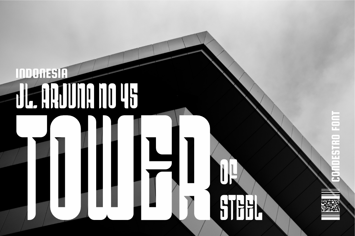
A cohesive visual style creates recognition, trust, and loyalty. Brands that consistently use colors, logos, and typography become easier to identify and more professional in the eyes of audiences. Fonts such as Condestro Bold Condensed Font support this consistency. Its strong sans-serif structure delivers clarity and modernity across digital and print platforms. The strength lies in its versatility, but the limitation is its lack of warmth, which may not suit lifestyle brands seeking emotional resonance.
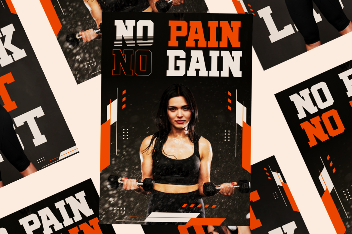
Typography does more than decorate; it communicates tone and emotion before a single word is read. A slab-serif style like Blaze Knock Sport Font projects confidence and strength, making it effective for sports branding and energetic campaigns. Its bold presence grabs attention instantly, yet its heaviness can overwhelm when used for long text passages. This duality shows why designers must choose fonts not only for their beauty but also for their function in delivering messages.
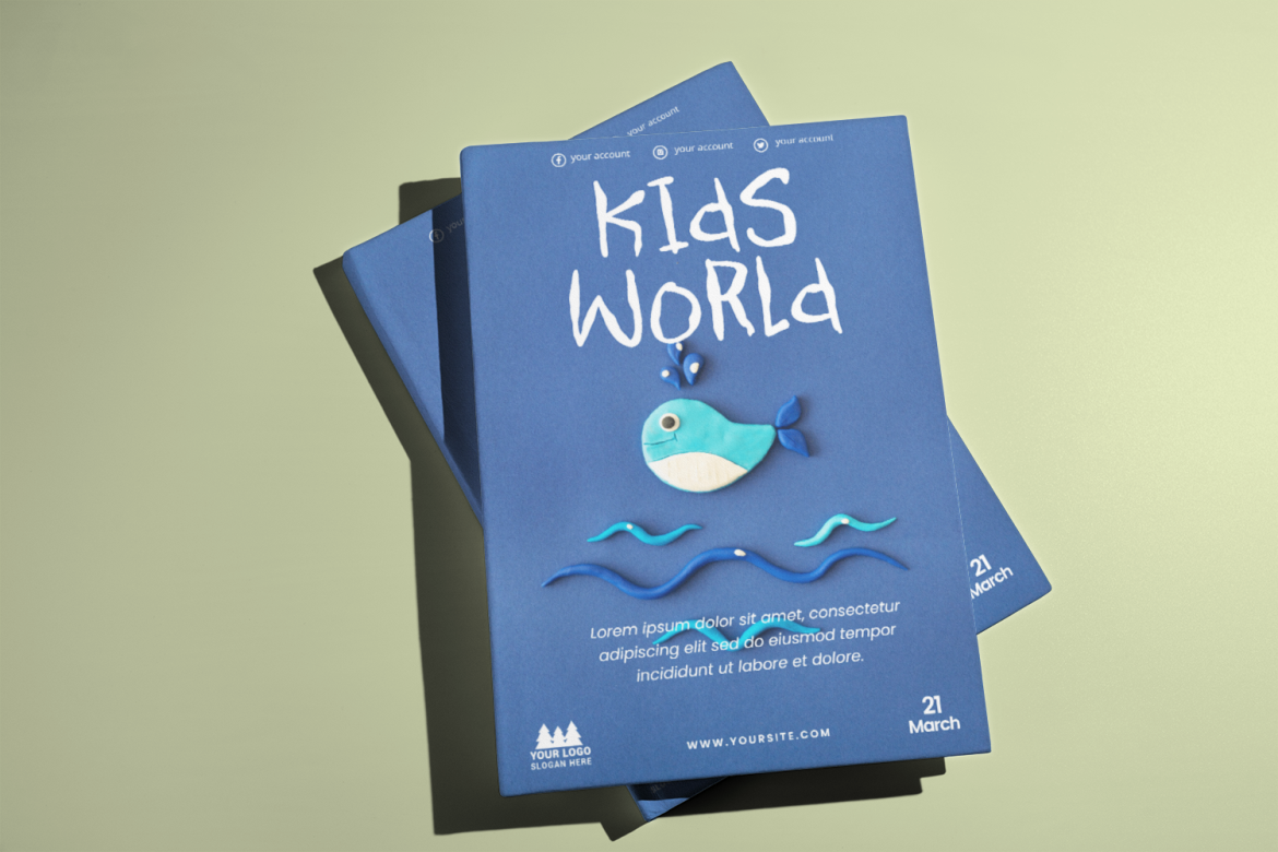
Some projects demand a personal and emotional touch. Script fonts provide this expressiveness with their handwritten quality. The Kids Sketch Handwritten Doodle Font brings playfulness and creativity, perfect for children’s branding or casual design. Its main strength is relatability it feels human. However, its weakness is readability in dense layouts, which makes it better suited for headlines or decorative phrases than for long-form text.
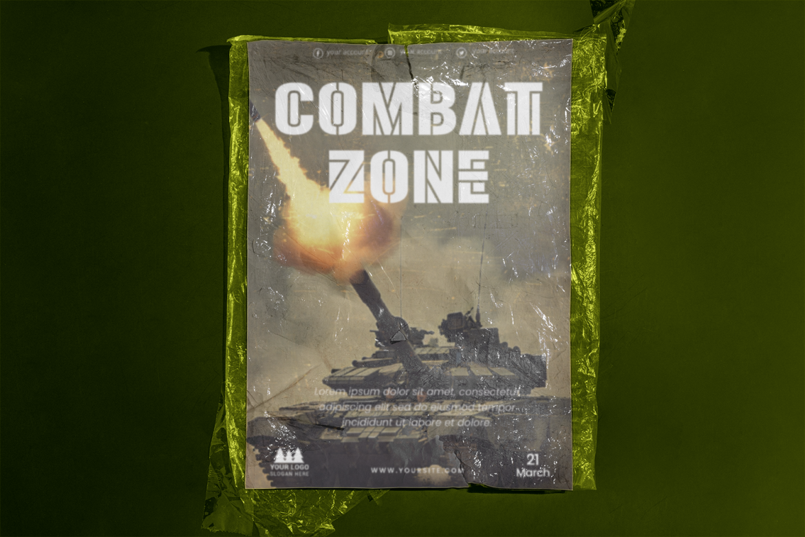
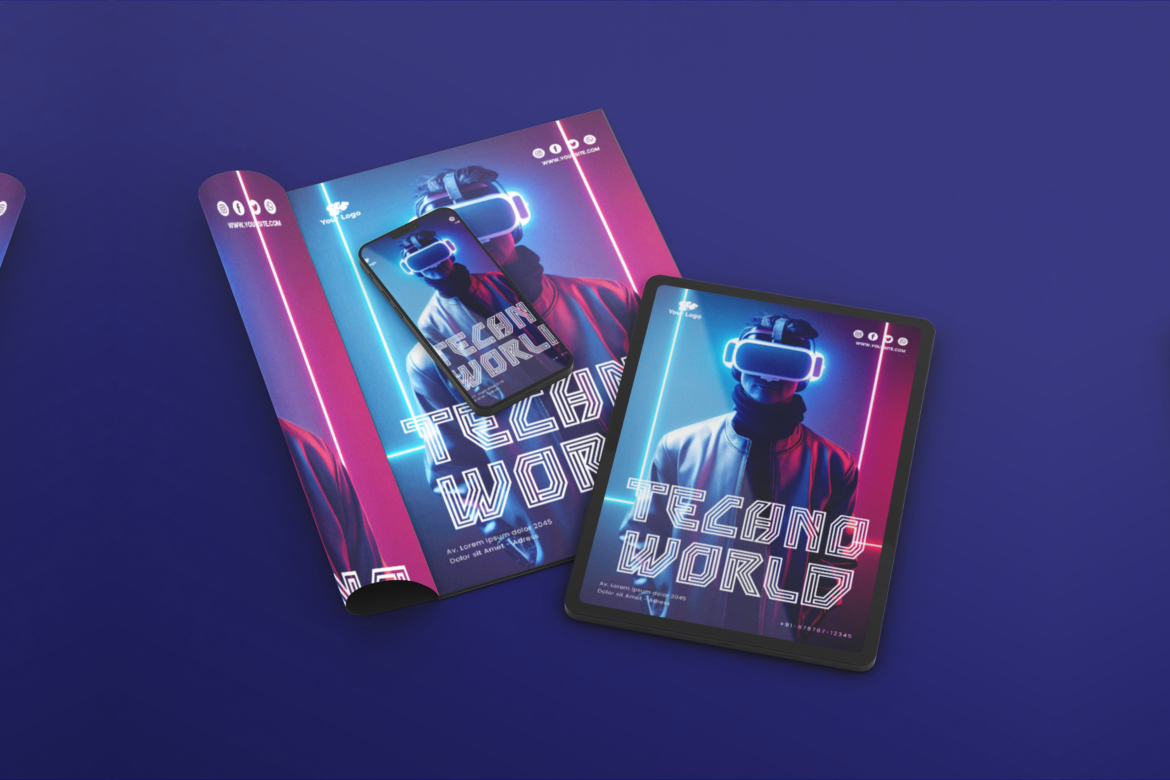
When attention is the goal, display fonts dominate. Their dramatic and decorative forms serve as visual anchors for titles and posters. The Armor Legion Display Font demonstrates this perfectly with its bold, futuristic look. It works well in gaming, entertainment, or campaigns where making a strong impression is critical. The downside is their limited application: overusing such fonts risks distracting from the message.
Each platform has its own rules. What works on Instagram Stories may not work on LinkedIn or YouTube. Designers must adapt visuals for aspect ratios, layouts, and content flow. A minimalist sans-serif font like Hexaline Multiline Tech Font might shine on tech websites with clean interfaces but could appear sterile in print advertising. This adaptability requires thoughtful planning, using the right visuals in the right place maximizes reach and engagement.
The competitive digital landscape rewards creators who prioritize design. Content is judged in an instant, and visuals often decide whether audiences consume or ignore it. Brands that understand the role of typography, color, and imagery stand out, while those that ignore visual engagement risk blending into the noise. Choosing the right fonts, like those available on putracetol.com, is part of this responsibility. Strong visuals make content not only attractive but also more shareable, more trustworthy, and more impactful.
Visually engaging content is more than aesthetic polish, it’s the first handshake between brand and audience. From serif fonts that evoke tradition, to sans-serifs that highlight modernity, to display fonts that demand attention, every typographic choice influences perception. Content creators who tailor visuals for each platform, maintain design consistency, and embrace the communicative power of typography will see greater engagement and stronger brand loyalty.
In an age defined by scrolling feeds and fleeting attention, design is no longer optional. It is the essential partner of quality content, shaping how stories are seen, remembered, and shared.
Thank you for taking the time to read this article. If you are looking for more great articles, feel free to visit Putracetol Blog
Additionally, if you want to explore some free typography options, you can check out Putracetol Studio on Dafont. Happy reading and designing!
