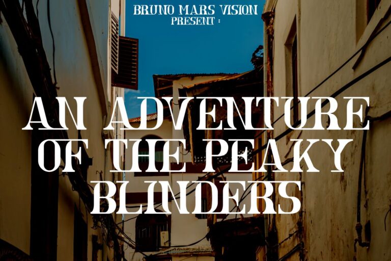
Serif fonts have been central to typography for centuries, shaping how readers experience printed and digital text. Recognized by the small strokes, or serifs, at the ends of letters, these fonts remain popular because of their readability, versatility, and aesthetic depth. Understanding the types of serif fonts helps designers select typography that aligns with brand personality, audience expectations, and visual goals.
From the pages of Renaissance books to modern web interfaces, serif fonts continue to communicate tradition, elegance, and authority. Yet not all serif fonts are the same, each type carries distinct characteristics and historical roots that influence how it is perceived in design projects.
Old Style serif fonts date back to the Renaissance era, where calligraphy and early printing techniques influenced typography. With low contrast between thick and thin strokes and organic, hand-drawn shapes, they provide a warm, humanist feel.
Designers often use Old Style fonts for books, novels, and long-form content because they remain legible even in smaller sizes. Their main strength lies in readability and classic aesthetics, though they may lack the sharp modernity some brands seek for contemporary projects.

If available on Putracetol.com, fonts like Font Vintage Victory could represent this category, combining historical authenticity with digital flexibility.
Emerging in the 18th century, Transitional Serif fonts bridge Old Style warmth and the precision of modern typography. With sharper contrast, refined serifs, and more vertical letterforms, these fonts suit formal documents, magazines, or professional branding.

Their strength is versatility, they appear authoritative yet approachable. However, in casual or playful designs, they may feel too rigid. Fonts such as Font Arash from Putracetol.com often work well for editorial layouts or luxury branding that requires sophistication without losing readability.
Also known as Egyptian Serif, Slab Serif fonts feature thick, block-like serifs that create a bold, impactful look. Popular during the 19th-century advertising boom, they now convey strength, reliability, and a retro aesthetic.

Their geometric simplicity makes them excellent for logos, posters, and packaging, though they may feel heavy in body text or minimalist designs. A font like First Atmo Mexican Font could bring this sturdy personality to branding projects seeking a vintage or industrial tone.
Characterized by extreme contrast between thick and thin strokes and flat, unbracketed serifs, Modern Serif fonts offer elegance and sophistication. Originating in the late 18th century, they often appear in fashion magazines, luxury branding, or high-end product packaging.

Their sleek appearance creates a dramatic visual effect, though at small sizes, the thin strokes can reduce readability. Fonts such as Astra Goldie on Putracetol.com may suit high-contrast editorial spreads or logos where refinement takes priority over casual legibility.
Square Serif fonts feature sturdy, square-shaped serifs that combine boldness with a clean, architectural look. Their assertive presence makes them suitable for headlines, corporate logos, or signage where clarity and authority matter most.

The strength of Square Serif lies in its modern, no-nonsense style, though it may lack the warmth or subtlety needed for literary or artistic projects. A Putracetol.com option like Font Marseilazi would work well for technology companies or brands seeking a contemporary edge.
Resembling engraved or chiseled lettering, Glyphic Serif fonts feature delicate flaring and minimal contrast, echoing classical Roman inscriptions. They provide an artistic, timeless quality ideal for museums, wedding invitations, or premium branding.

While elegant, they may feel overly decorative in corporate contexts or dense text settings. Fonts like Font Luxerna Display could enhance creative projects where historical charm and artistic flair are priorities.
Understanding the types of serif fonts helps designers match typography with brand messaging. For instance:
Choosing the right font affects hierarchy, tone, and emotional resonance, whether designing websites, print media, or product packaging.
Designers often pair serif fonts with sans-serif counterparts to create contrast between headlines and body text. Color, spacing, and size further influence readability and style. For digital platforms, testing font performance on various screen sizes ensures accessibility without losing aesthetic quality.
Limitations like reduced legibility in decorative styles or overuse in minimalist designs remind creators to balance visual personality with functional clarity.
The types of serif fonts Old Style, Transitional, Slab, Modern, Square, and Glyphic, offer distinct tools for shaping visual identity. Each carries unique strengths and limitations, from the classic warmth of Old Style to the dramatic elegance of Modern Serif or the bold impact of Slab Serif.
By understanding these differences and applying them strategically, designers can align typography with brand voice, audience expectations, and project goals, ensuring both beauty and readability in every design.
Thank you for taking the time to read this article. If you are looking for more great articles, feel free to visit Putracetol Blog
Additionally, if you want to explore some free typography options, you can check out Putracetol Studio on Dafont. Happy reading and designing!