
A logo is much more than a decorative symbol it is the visual core of a brand’s identity. It communicates values, sets the tone of personality, and serves as an instant representation of what a business stands for. The choice of logo type is not merely a design preference but a strategic decision that impacts recognition, trust, and credibility.
From tech giants to small startups, successful brands select logos that are memorable, adaptable, and aligned with their audience. Understanding the different types of logos in branding is the first step toward creating a strong visual identity that works across industries and platforms.
Wordmarks are logos built entirely from text, typically the brand’s name written in a distinctive typeface. Examples include Google, Coca-Cola, and Visa.
The strength of a wordmark lies in its typography. The font selection directly conveys personality: bold sans-serifs feel modern and confident, while elegant serifs communicate tradition and sophistication.

For creative inspiration, explore distinctive typefaces like Savenir for contemporary branding, or Gilded Glint for timeless elegance. Choosing the right font transforms simple letters into a powerful brand statement.
When to use a Wordmark:
Lettermarks use initials or abbreviations to represent a brand. Well-known examples include IBM, CNN, and HBO. By condensing long names into memorable acronyms, lettermarks improve recall and simplify brand communication.
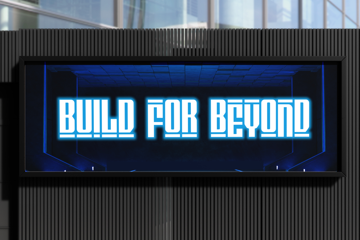
Since these logos rely heavily on typography, the font must be bold, legible, and distinctive. Geometric or futuristic display fonts, like Digitron Futures, can give lettermarks a tech-forward aesthetic, while ornamental or vintage fonts add character for heritage brands.
When to use a Lettermark:
A brandmark is a symbol-only logo without text. Famous examples include the Apple logo and Twitter’s bird. These logos rely on strong visual identity and recognition, making them effective once a brand has already established itself.
Brandmarks are powerful because they transcend language barriers. A simple, iconic image can be recognized globally, regardless of text. However, building recognition takes time, which is why many startups combine brandmarks with text until their symbol becomes iconic.
When to use a Brandmark:
Combination marks pair text with a symbol, giving the best of both worlds. Examples include Adidas, Burger King, and Lacoste.
This logo type offers flexibility brands can use the symbol alone or with the wordmark, depending on the context. For instance, a company might display the full logo on its website but use only the icon for app buttons or merchandise.
When paired with versatile fonts like Variansa, designers can achieve both impact and adaptability in branding.
When to use a Combination Mark:
Emblems are seal-style logos that integrate text within a symbol or badge. They often carry a sense of formality, tradition, and heritage. Examples include Harvard University’s crest or Starbucks’ emblematic circle design.

While emblems convey authority and prestige, they can be harder to scale down for smaller applications, making careful design crucial. Choosing bold yet detailed typefaces, such as Retro Rush, adds character while maintaining legibility.
When to use an Emblem:
Typography plays a central role across all logo types. Whether it’s a minimalist lettermark or a bold wordmark, fonts define the character of the logo. For modern brands, a geometric typeface might work best, while luxury brands often favor serif fonts.
For designers seeking premium options, platforms like Putracetol Studio offer curated fonts designed for branding. Fonts such as Savenir, Gilded Glint, Digitron Futures, Variansa, and Retro Rush provide diverse options for professional logo design.
Logos are not just design elements, they are strategic assets that influence how audiences perceive and connect with a brand. By understanding the different types of logos in branding, from wordmarks to emblems, designers and business owners can make informed choices that strengthen identity and build recognition.
Whether you are a startup defining your first brand or an established company refreshing your identity, choosing the right logo type is a foundational step toward creating trust, professionalism, and emotional resonance with your audience.
Thank you for taking the time to read this article. If you are looking for more great articles, feel free to visit Putracetol Blog
Additionally, if you want to explore some free typography options, you can check out Putracetol Studio on Dafont. Happy reading and designing!
