
In the world of graphic design, not all styles aim for clean perfection. Urban street and brutalist design thrive on rawness, unpredictability, and the deliberate rejection of conventional beauty standards. These aesthetics echo cultural rebellion, youth movements, and the energy of street art. By blending bold typography, rough textures, and experimental layouts, designers create visuals that are provocative, unpolished, and deeply human.
This article breaks down the key elements of urban street and brutalist design, from shapes and textures to visual effects and type choices. For creatives, these tools provide a roadmap to embrace imperfection while communicating authenticity and individuality.
Shapes play a foundational role in defining the urban street aesthetic. Unlike modern minimalist design that relies on grids and balance, street design embraces randomness, layering, and chaotic arrangement. Commonly used forms include:
Together, these shapes transform layouts into visual playgrounds, evoking the spirit of posters, graffiti, and underground zines.
Texture defines brutalist and street aesthetics. Instead of polished gradients, designers embrace surfaces that look messy, noisy, and tactile. Five essential textures dominate this genre:
These textures communicate imperfection as beauty, reinforcing the raw and authentic identity of brutalist visuals.
Beyond textures, effects bring urban and brutalist design to life. These techniques highlight imperfection, turning visual “errors” into stylistic strengths:
These effects add visual noise while keeping the work engaging and full of character.
Typography is one of the strongest vehicles for brutalist design. Fonts are often oversized, condensed, or distorted to dominate the visual space. The point is not harmony but expression and attitude.
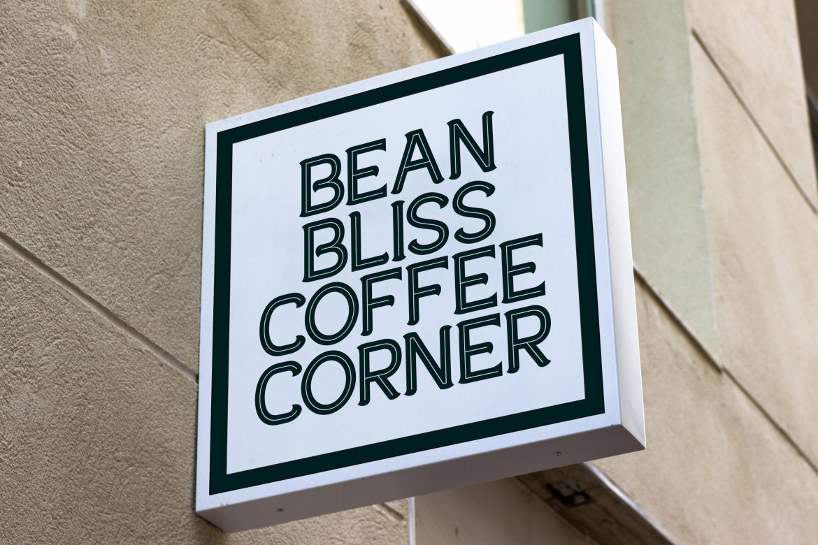
Examples of fonts that align with these aesthetics include:


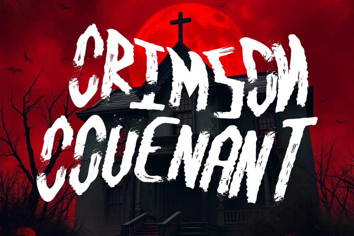
When paired with chaotic shapes and textures, these fonts push the boundaries of readability in favor of visual identity and emotional punch.
At its core, brutalist design is not about ugliness but about honesty. By leaving grids broken, colors clashing, and textures unpolished, brutalism resists corporate polish and standardized templates. It represents a desire to design without constraints, a freedom of expression that mirrors street culture.
This rejection of perfection resonates in today’s digital culture, where authenticity and individuality often matter more than sleek, cookie-cutter aesthetics.
This design movement has found a home in music, fashion, and digital subcultures. From underground club posters to Y2K-inspired album covers, brutalist and street styles speak to audiences who value individuality over conformity.
Brands tapping into youth culture, streetwear, or experimental tech often turn to this aesthetic to signal rebellion, authenticity, and creativity. It’s a visual language that says: We don’t follow the rules, we make them.
Urban street and brutalist design demonstrate that graphic design doesn’t always need to be polished or perfect. Instead, it can be raw, expressive, and deeply connected to cultural movements. By using unconventional shapes, raw textures, noisy effects, and eccentric typography, designers can create visuals that reject conformity while celebrating authenticity.
For creatives ready to explore, this style is not about breaking design, it’s about breaking free.
Thank you for taking the time to read this article. If you are looking for more great articles, feel free to visit Putracetol Blog
Additionally, if you want to explore some free typography options, you can check out Putracetol Studio on Dafont. Happy reading and designing!
