
Stencil fonts have a strong history of blending function with bold style. Originally created for industrial labeling, shipping crates, and military tools, these typefaces are defined by their gaps or bridges within letterforms. Those cuts weren’t just aesthetic they made it possible to spray, stamp, or carve the letter without losing its structure. But over time, stencil fonts evolved from practical tools to essential design assets. Today, stencil fonts are found in sports graphics, product packaging, branding, gaming posters, and even tech and startup identities.
For creators, stencil fonts are especially useful when visual power, clarity, and a structured feel are required. Below, we explore nine of the best stencil fonts from Putracetol Studio, breaking down their advantages, limitations, and where they shine.

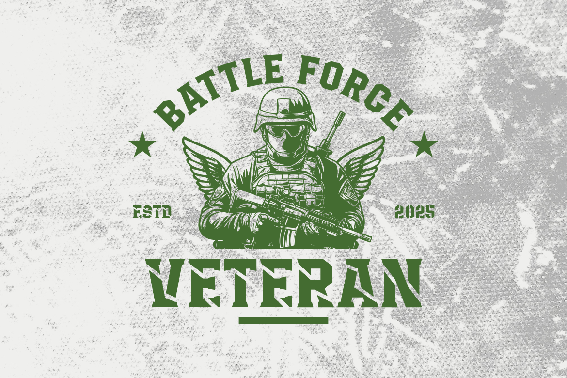
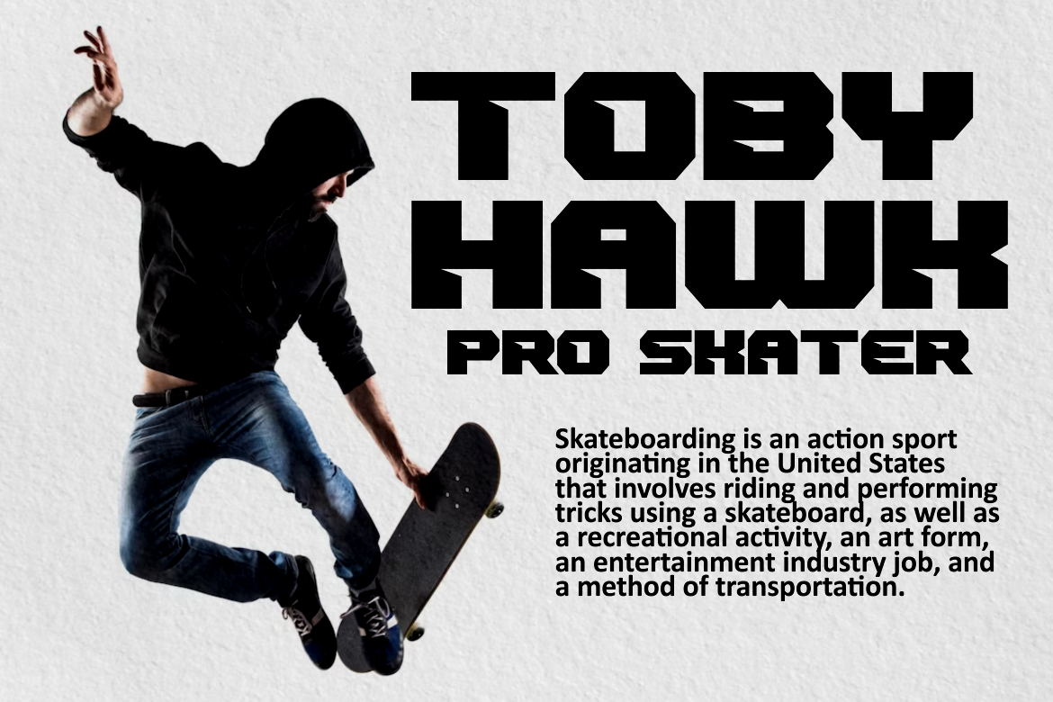
Hardline Ranger is a true embodiment of the military stencil tradition. It features sharp corners, clean breaks, and a condensed build that works beautifully on posters, tactical packaging, or logos for survival gear. Its visual strength and all-caps construction make it ideal for titles that need to command attention. The downside? It’s not very versatile for body text or delicate branding—it’s built for impact, not subtlety.
Patrol Squad offers a more refined stencil look while retaining that utilitarian backbone. The spacing and alignment make it easy to read across mediums—whether you’re designing a tech label, signage, or a YouTube thumbnail. It feels tactical yet modern. While it doesn’t stray far from traditional stencil geometry, it’s this simplicity that makes it a go-to for general use.
Panzer Blaze blurs the line between a sport font and a stencil font. It’s loud, aggressive, and sharp—perfect for motorsports, athletic branding, or game titles. The stencil influence shows up subtly in the broken glyphs, which still retain a sense of speed and momentum. On the downside, Panzer Blaze is a little too edgy for formal design or conservative clients—but if your project leans into adrenaline, it’s a win.

Armor Legion is built like armor—rigid, structured, and full of futuristic flair. It’s one of the more modern takes on stencil fonts in this roundup, with sharp, layered forms that work great in esports logos or high-tech branding. Its style isn’t meant for paragraphs or casual layouts. Instead, it performs best on bold titles and graphical elements.
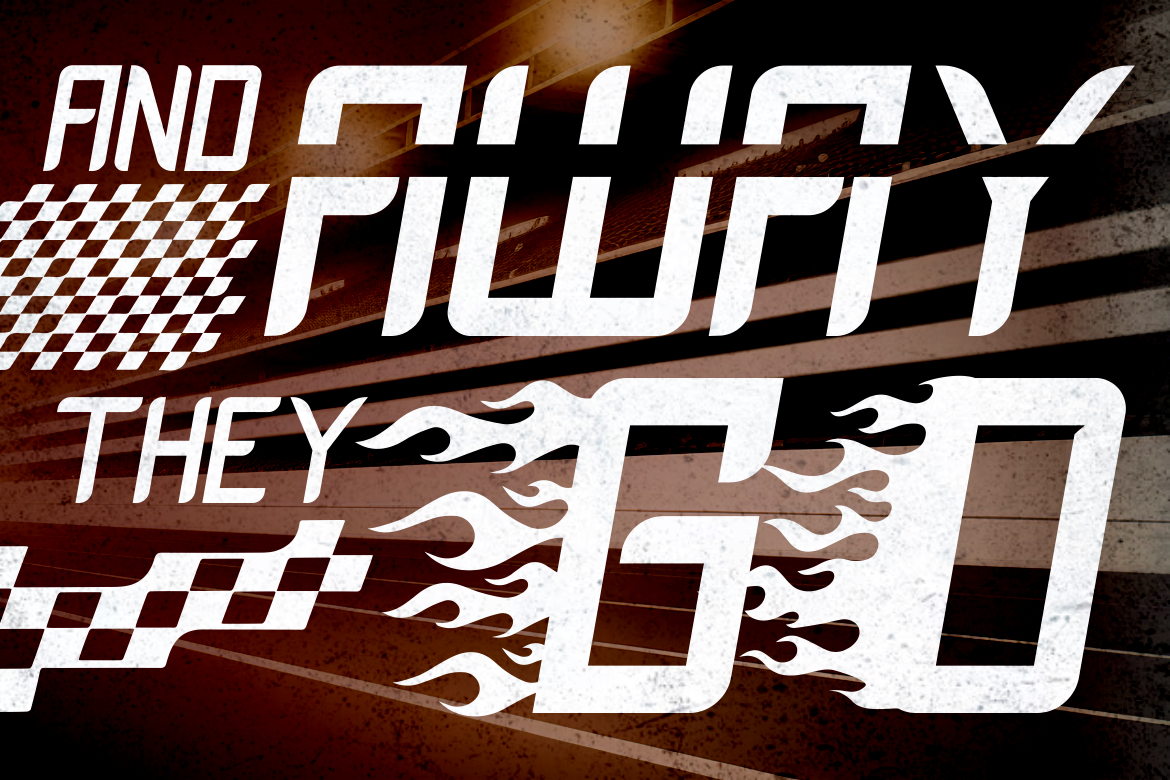
Inferno Racers is a high-octane typeface made for movement. It brings stencil cuts into a fast, angular race font design. The overall shape evokes road markings or pit-lane signage, making it ideal for automotive brands, racing events, or futuristic poster designs. However, it may be too stylized for universal branding—use it when you need something specific and punchy.
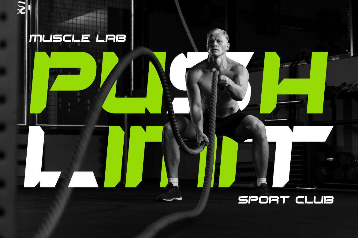
Arena Clash merges stencil breaks with collegiate and sportswear style. The bold, blocky design carries a strong athletic presence, with clear legibility for sports teams, event flyers, or product lines related to performance. While it may lack versatility for luxury or minimalist branding, it absolutely nails strength and team spirit.
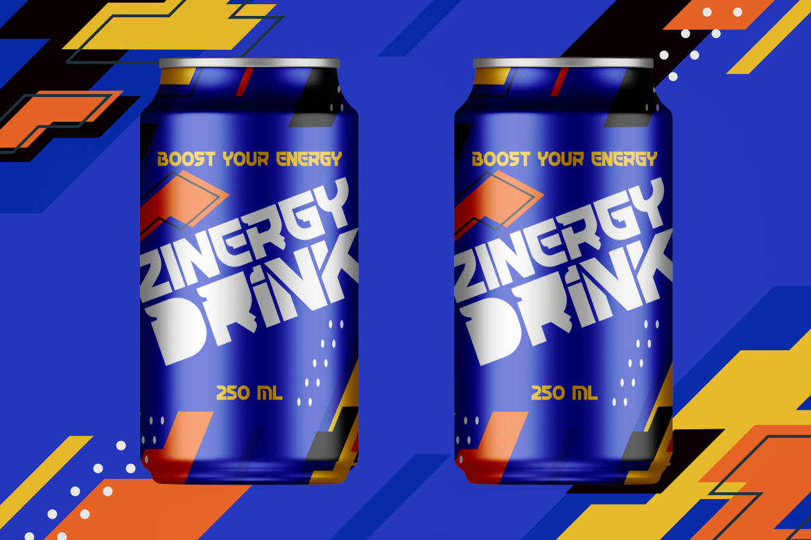
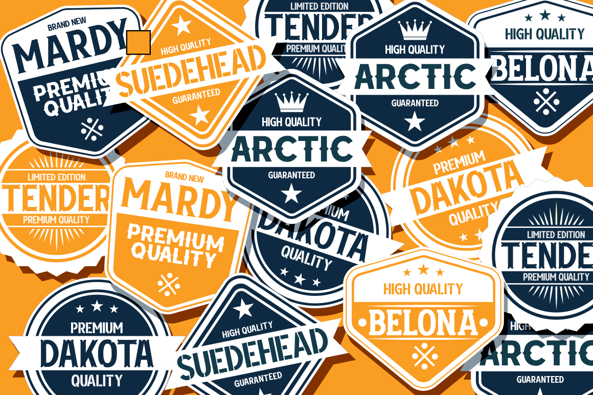
Marseilazi is a multi-style font family that includes a stencil variant among its nine strong font weights. This is a solid choice if you want design flexibility while keeping visual consistency. The stencil cut version offers power and industrial styling, suitable for design systems or varied campaigns. The only tradeoff is its generalist nature—while it does many things well, it’s not as specialized or impactful as dedicated stencil fonts.
Burgs Multiply leans into retro display style while incorporating stencil characteristics. It feels like something pulled from a mid-century shipping label—perfect for vintage-inspired logos, craft beer packaging, or storefront signage. Its playful touch gives it more character than traditional stencil fonts. However, this character might not suit ultra-modern or corporate projects.

Crafter Pieces includes a stencil option within a diverse bundle of hand-made type styles. Its rugged edges and imperfect geometry add a handmade, crafty aesthetic to any label or project. It’s especially effective for workshop brands, makers, and independent product packaging. The downside? It may look too informal for digital branding or tech products, but that’s not its intended lane.
Whether you’re branding a sports team, building an action-themed YouTube channel, designing a product label, or crafting signage that needs to look tough—stencil fonts deliver. They communicate structure, discipline, boldness, and legacy all at once. And thanks to modern interpretations, designers now have more aesthetic options than ever: from clean and traditional to urban, tech-forward, or even playful.
Choosing the right stencil font depends on your audience and application. A font like Hardline Ranger projects authority, while Inferno Racers screams action. Crafter Pieces offers warmth and grit, whereas Armor Legion feels sharp and futuristic.
Stencil fonts aren’t just relics of utilitarian print—they’re powerful tools in modern design. Their balance of form and function helps creators build visuals that stand out and communicate strength. Whether you need a font for industrial grit, sporting impact, or handcrafted style, the stencil fonts from Putracetol Studio give you options to get it right.
Explore the full collection and download the font that matches your vision—bold, clear, and unmistakably powerful.
Thank you for taking the time to read this article. If you are looking for more great articles, feel free to visit Putracetol Blog
Additionally, if you want to explore some free typography options, you can check out Putracetol Studio on Dafont. Happy reading and designing!
