
Mexico City, often referred to as CDMX, is one of the most visually expressive cities in the world. Its street culture is raw, energetic, layered, and deeply rooted in history. Murals sit beside street signs, hand-painted menus live next to industrial textures, and food culture blends artistry with everyday life. This environment creates a powerful source of inspiration for branding, especially for restaurants that want to feel authentic, bold, and connected to real urban culture.
This article explores a branding project inspired by Mexico City street culture, developed for a restaurant and bar concept that embraces CDMX’s free-spirited personality while maintaining a professional and well-crafted visual identity. The project demonstrates how street aesthetics, typography, color, and illustration can work together to create a brand that feels genuine rather than manufactured.
The core idea behind this branding project was to translate the atmosphere of Mexico City’s streets into a restaurant identity. The client envisioned a restaurant and bar that feels alive, approachable, and expressive, without losing credibility or visual clarity.
Mexico City street culture is not polished in a traditional sense. It is layered, spontaneous, and honest. That honesty became the foundation of the branding direction. The challenge was finding the balance between raw expression and professional execution.
Key goals of the project included:
The result is a branding system that feels bold and free, while still being structured and usable across real business needs.
At the heart of the identity is a hand-drawn logo. Instead of perfectly aligned lines or symmetrical shapes, the logo embraces irregularity. This choice was intentional. Street culture in Mexico City thrives on imperfection, personality, and expression.
The hand-drawn approach reflects:
The logo feels like it could belong on a wall, a chalkboard menu, or a street sign. It communicates confidence without trying too hard.
Typography plays a major role in translating street culture into a usable brand system. The type choices were inspired by industrial worker fonts often seen in signage, packaging, and utility markings throughout Mexico City.
The typography characteristics include:
This style supports menus, posters, merchandise, and digital content without overpowering the visuals. It keeps the brand grounded and functional.
The color palette avoids bright or overly polished tones. Instead, it uses down-to-earth colors inspired by the street environment:
These colors mirror walls, pavement, street signs, and weathered paint found throughout CDMX. The palette reinforces authenticity and helps the brand feel lived-in rather than staged.
One of the most distinctive elements of the project is the mascot, Chef Alfredo. This short, round cartoon character represents the soul of the restaurant.
Chef Alfredo’s design is intentionally playful:
He symbolizes the idea that great food does not require pretension. The mascot adds personality to menus, merchandise, and social media while keeping the brand approachable.
The brand’s visual language draws heavily from CDMX street life.
Dining culture in Mexico City is relaxed and social. The brand reflects this by avoiding stiffness and formality. Illustrations, layouts, and typography feel open and expressive.
Rather than chasing trends, the brand focuses on timeless street aesthetics. It feels modern but not fashionable in a disposable way.
Graphic elements are inspired by:
These references help the brand feel local and rooted in place.
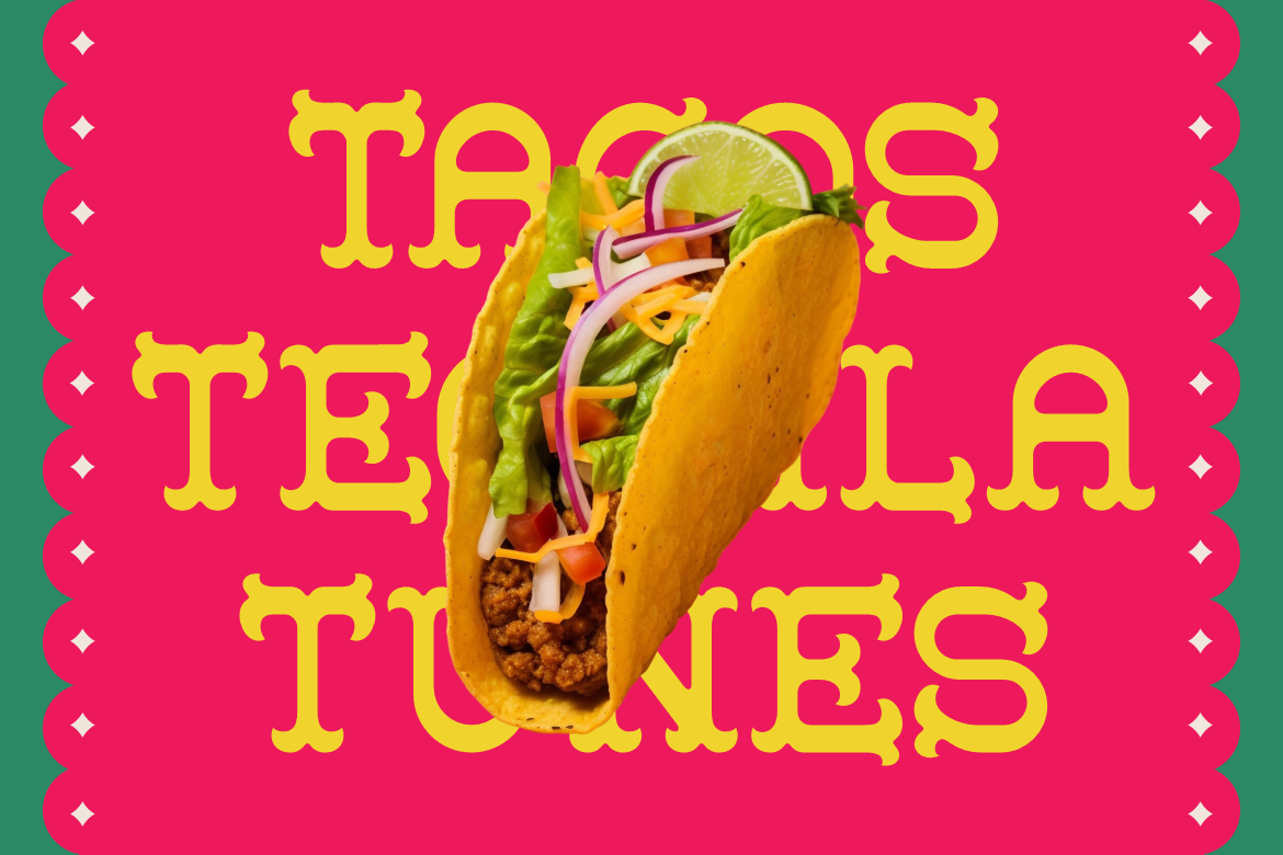
Typography is essential in reinforcing the cultural inspiration behind this project. Several fonts from Putracetol Studio align perfectly with Mexican street aesthetics and modern branding needs.

Rancho Camino captures a handcrafted Mexican spirit. Its organic strokes and expressive shapes work well for logos, headers, and signage inspired by traditional street culture.
This font reflects rural and urban Mexican influences. It feels bold, grounded, and suitable for branding that wants to communicate tradition with confidence.

First Atmo offers a more modern take while still maintaining cultural character. It works well for menus, packaging, and supporting text where clarity matters.
Klyzer Modern adds balance to the system. Its clean, contemporary structure pairs well with hand-drawn elements, ensuring the brand remains professional and versatile.
Together, these fonts allow the brand to shift between expressive and functional communication without losing consistency.
Branding inspired by real cultural environments feels more honest than generic design trends. When done thoughtfully, cultural inspiration:
Mexico City street culture offers a rich visual language, but the key is respect and understanding. This project succeeds because it translates the spirit of CDMX rather than copying surface-level visuals.
The branding system is designed to be flexible and practical.
It works across:
Each application feels consistent, reinforcing the brand identity while allowing room for creativity.
This restaurant branding project demonstrates how branding inspired by Mexico City street culture can successfully merge professionalism with raw authenticity. Through a hand-drawn logo, industrial typography, grounded color palette, and the playful mascot Chef Alfredo, the brand feels expressive, confident, and genuine.
Supported by carefully chosen fonts from Putracetol Studio, the identity balances artistic freedom with practical design needs. The result is a restaurant brand that feels alive, approachable, and deeply connected to the vibrant spirit of CDMX.
For designers and brands seeking cultural depth and visual character, this project shows that authenticity, when handled with care, is one of the strongest branding tools available.
Thank you for taking the time to read this article. If you are looking for more great articles, feel free to visit Putracetol Blog
Additionally, if you want to explore some free typography options, you can check out Putracetol Studio on Dafont. Happy reading and designing!
