
The specialty coffee industry has evolved from a product-focused market into a lifestyle and cultural space. Today’s consumers are not only buying coffee, they are buying identity, atmosphere, and community. In this environment, visual identity becomes a deciding factor in how coffee brands present themselves and how customers relate to them.
This article explores a visual identity project for a premium coffee brand that uses custom typography and distinct packaging to build a refined, community-driven experience. By combining thoughtful type design with functional branding applications, the project shows how design can elevate a coffee product into a lifestyle choice and cultural statement.
Typography plays an important role in shaping consumer perception in the coffee world. Specialty roasters and premium cafés often rely on strong design signals to communicate product quality, craftsmanship, and brand values.
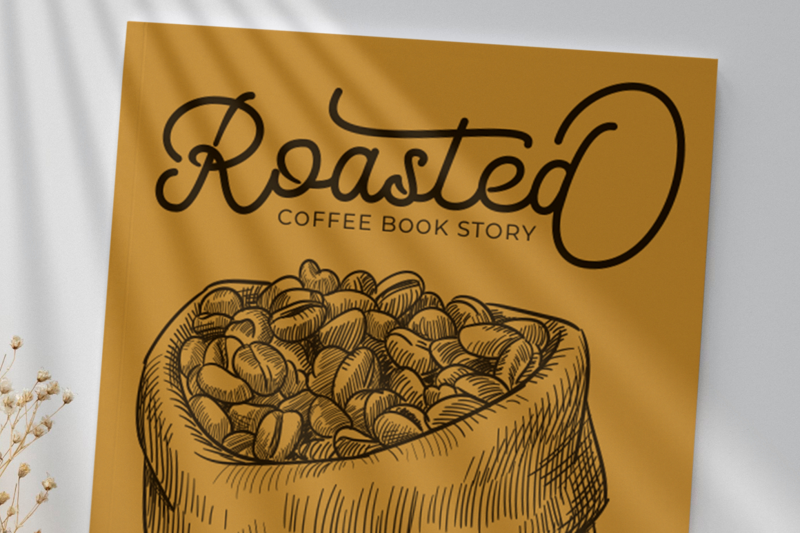
For this branding project, the creative direction placed a strong focus on custom type design. The chosen letterforms were bold, modern, and highly recognizable. Rather than acting as a neutral voice, typography became a core part of the brand’s character.
This approach aligns with recent trends in coffee culture where packaging and brand aesthetics influence:
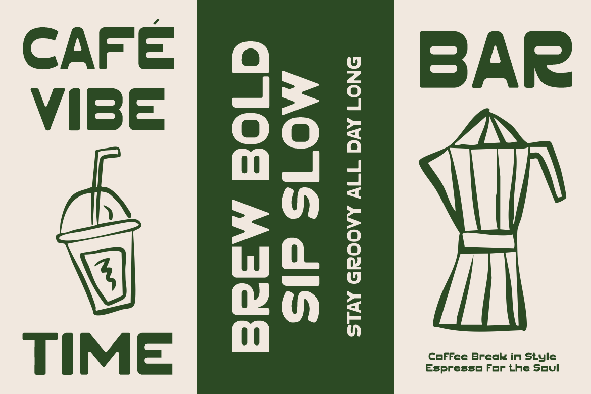
Typography moves beyond visual decoration, functioning as a storytelling tool that communicates the rhythm, warmth, and personality of the brand.

The brand’s custom letterforms were developed to serve as a signature element that consumers could easily recognize. The font expresses a modern and confident personality with strong linear forms and a refined thickness. Its visual rhythm conveys boldness without feeling aggressive, allowing it to work for both large headlines and smaller packaging details.
Custom typefaces are increasingly common in the premium coffee sector. They help brands:
A similar effect can be seen in typefaces such as:
These fonts share the ability to function as identity markers rather than just typography assets.
Packaging is one of the most direct touchpoints between the product and the customer. For premium coffee, packaging must balance functionality, aesthetics, and brand storytelling.
The packaging in this project features minimalist arrangements that highlight clarity and readability. Each packaging surface communicates essential product information such as bean variety, region, roast profile, and tasting notes. This reinforces trust and communicates transparency, a key value among specialty coffee consumers.
The visual hierarchy was intentionally designed to let typography lead, supported by subtle graphic elements. The result is packaging that feels premium, clean, and confident.
This type of packaging design benefits the brand in several ways:
Premium packaging encourages customers to treat coffee as a lifestyle product rather than a commodity purchase.

Color contributes significantly to mood and sensory perception. Here, the palette combines modern neutrals with contrasting accents. Muted backgrounds create a sense of refinement and calm, while darker tones add depth and seriousness.
Premium coffee often uses similar palettes that reflect sophistication, including:
These choices align with the growing trend of coffee as an aspirational lifestyle product connected to mindfulness, craft, and quality.
Material choices such as matte surfaces, textured paper, and minimal plastic reinforce sustainability and tactile pleasure, two values that resonate with modern consumers.

Coffee brands no longer compete only on taste or sourcing. They compete on culture. Community-based premium coffee uses storytelling to create emotional connections that translate into long-term loyalty.
This branding project embraces the idea of coffee not just as a drink, but as:
The type and packaging work together to build an experience that communicates:
Customers feel invited into a community rather than simply buying a product.
From a business standpoint, premium coffee branding supports:
Typography and packaging allow the brand to occupy a more elevated positioning consistent with boutique cafés, specialty roasters, and modern lifestyle retailers.
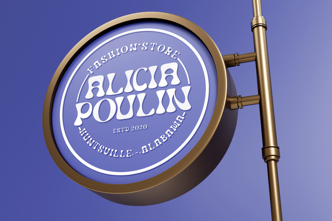
The visual identity extends beyond packaging into merchandise, signage, and digital platforms. This ensures the brand experience feels coherent across physical and digital spaces.
Applications include:
Unified design builds recognition and strengthens cultural presence, especially among younger demographics who value aesthetic coherence.
For designers, custom typography and packaging unlock more expressive and strategic possibilities. For brands, design investment contributes to competitive advantage and higher perceived value.
Key benefits include:
Premium coffee branding is no longer about displaying origin and roast information. It is about creating an experience that blends culture, design, and lifestyle. Through custom typography and elegant packaging, the coffee brand explored in this project elevates itself beyond a product and into a community-driven identity.
Design becomes a silent ambassador that communicates quality, intention, and personality. This connection is what makes premium coffee branding relevant in today’s lifestyle-driven market.
Thank you for taking the time to read this article. If you are looking for more great articles, feel free to visit Putracetol Blog
Additionally, if you want to explore some free typography options, you can check out Putracetol Studio on Dafont. Happy reading and designing!
