
In today’s culinary landscape, dining out has become more than just eating. Restaurants function as social destinations, aesthetic environments, and lifestyle symbols. This shift has pushed branding to the forefront of the restaurant business. A compelling brand identity is now as important as the quality of the food itself.
This article explores a brand identity project for a modern restaurant one designed with a visual language that blends modernist precision with quirky, playful elements. The result is a space that feels fresh, welcoming, and distinct. More than a visual upgrade, this branding approach strategically positions the restaurant as both a lifestyle destination and a competitive business entity.

The core concept behind this identity assumes one important shift: people no longer visit restaurants only to eat. They come to spend time, share stories, collaborate, celebrate, and participate. In this context, the restaurant becomes a lifestyle hub an environment that encourages curiosity, comfort, and community.
To support this shift, the brand identity communicates more than menu items. It communicates energy, personality, and a point of view. Instead of feeling clinical or purely commercial, the brand feels alive—something customers enjoy interacting with both in-person and online.
The restaurant’s visual expression relies on the fusion of two opposing, yet complementary, aesthetics:
This combination allows the identity to remain approachable without compromising professionalism. It feels at once design-conscious and human-centered, two qualities valued by contemporary consumers.
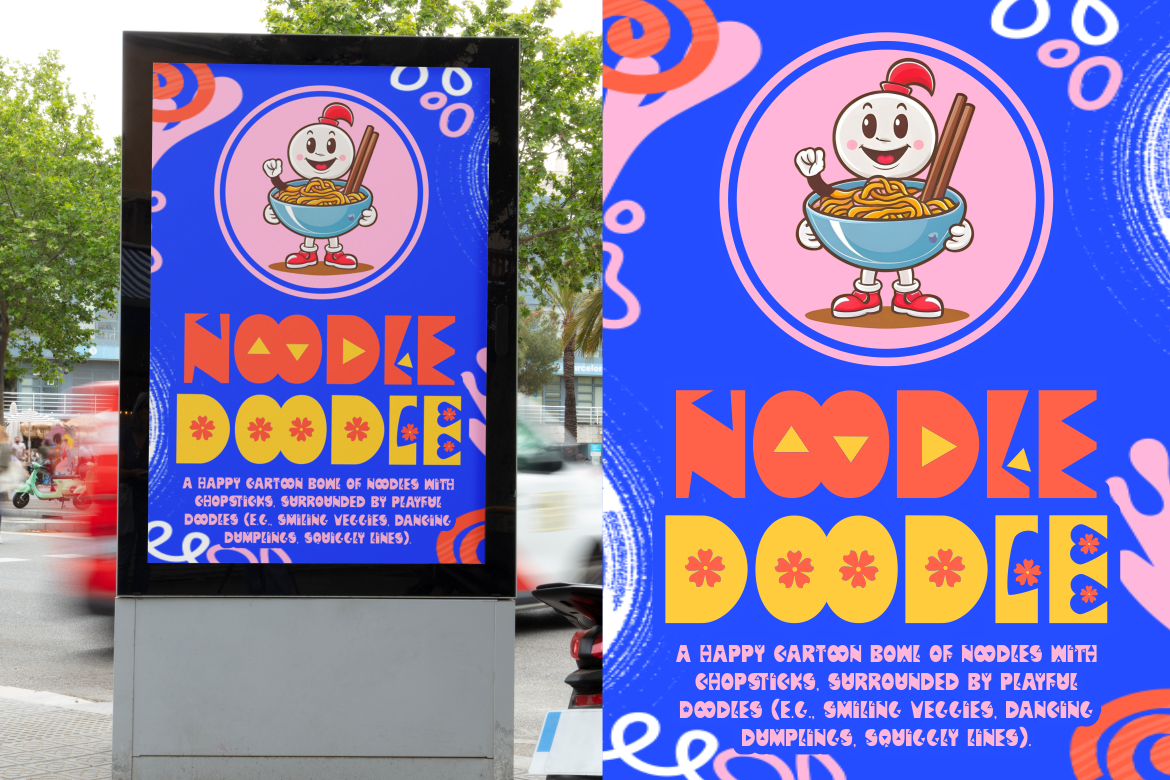
Typography plays a central role in setting the restaurant’s personality. Unlike traditional dining identities that rely on elegant serif fonts or conservative sans-serifs, this project opts for fonts with character and rhythm.
Suggested typefaces from Putracetol.com that fit this direction include:
These fonts help form a typographic voice that is energetic and recognizable. They also contribute to the “social identity” of the brand, making the restaurant feel memorable online and offline, an important detail in a world where food photography and reviews happen on social platforms.

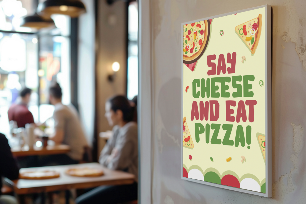
Color functions as emotional shorthand. The restaurant’s palette is intentionally bright and contrasting, signaling warmth, youthfulness, and creativity. Unlike dark, masculine palettes commonly seen in steakhouses or luxury dining, this project embraces accessibility and optimism.
Key palette themes include:
Color usage across menus, signage, merchandise, and social content reinforces consistency, ensuring the restaurant becomes instantly recognizable across touchpoints.

The branding system incorporates a minimalist yet quirky logo, supported by light illustrations and graphic inserts. This allows the identity to work across diverse applications without losing coherence.
Notable characteristics include:
Modern consumers interact with restaurants through delivery platforms, Google Maps listings, Instagram feeds, and TikTok videos so a logo that adapts fluidly across these formats is not just aesthetic, but strategic.
The communication tone is friendly, inclusive, and slightly irreverent positioning the restaurant as a place where ideas flow as freely as drinks. Social content, menu descriptions, and printed collateral all speak to the customer as if they are part of a community rather than mere buyers.
Strategically, this tone supports:
When customers feel emotionally engaged, they become brand participants. They share photos, tag content, write reviews, and extend the brand’s visibility organically a major asset for restaurants in competitive urban markets.
The branding system comes to life through tangible and digital touchpoints:
| Element | Role |
|---|---|
| Signage | Attracts customers and cues visual identity |
| Menus | Combines usability with branding |
| Packaging | Supports takeaway culture and advertising |
| Merchandise | Extends lifestyle appeal |
| Digital Media | Connects with customers beyond the table |
| Interior Graphics | Enriches the dining atmosphere |
These components transform the restaurant into a cohesive brand ecosystem rather than a simple food outlet.
A well-built identity produces measurable business advantages:
In short, branding elevates the restaurant from a transactional service to a cultural offering.
The brand identity project for this modern restaurant demonstrates how design can bridge lifestyle, community, and business strategy. Through modernist typography, playful elements, and a distinctive communication voice, the restaurant becomes an environment that encourages connection and creativity.
The result is more than an attractive dining venue. It is a place customers seek out deliberately a social touchpoint, a design destination, and a brand they are proud to share.
Thank you for taking the time to read this article. If you are looking for more great articles, feel free to visit Putracetol Blog
Additionally, if you want to explore some free typography options, you can check out Putracetol Studio on Dafont. Happy reading and designing!
