
Typography is often judged by what is visible at first glance: font style, size, weight, and spacing. However, some of the most impactful typographic details are subtle. One of these details is the ligature. Though small in form, ligatures play a major role in improving both the elegance and readability of text.
Ligatures in typography are special characters created by combining two or more letters into a single glyph. Common examples include combinations such as fi, fl, ff, or tt. These combinations may seem minor, but they significantly influence how text flows and feels. When applied thoughtfully, ligatures enhance visual harmony, reduce distractions, and elevate the overall professionalism of a design.
This article explores ligatures in typography from both historical and modern perspectives, explains their functions, and discusses how designers can apply them effectively in branding, editorial work, and digital design. Insights and font references from Putracetol.com are included to show how ligatures continue to shape contemporary typography.
Ligatures are typographic characters that merge two or more letters into a single form. Instead of displaying each letter separately, a ligature creates a unified shape that improves visual flow.
In simple terms, ligatures are:
Classic ligatures include combinations like fi and fl, where the dot of the “i” or the crossbar of the “f” might otherwise collide with neighboring letters.
Ligatures exist for both functional and aesthetic reasons. Their main purposes include:
What began as a technical solution in print has evolved into a stylistic choice in modern typography.
Ligatures date back to early handwritten manuscripts and metal type printing. In traditional typography, limited space and mechanical constraints often caused letters to overlap or appear crowded. Ligatures solved this problem by combining problematic letter pairs.
Over time, ligatures became part of typographic tradition. Today, they are embraced not only for clarity but also for their elegance and design value.
Ligatures serve multiple roles in typography. While their presence may be subtle, their impact is significant.
One of the primary functions of ligatures is improving readability. When letters collide or sit too close together, they can distract the reader or slow down comprehension.
Ligatures help by:
This is especially important in long-form text such as articles, books, and editorial layouts.
Beyond readability, ligatures add visual refinement. Text appears more polished and thoughtfully designed when ligatures are used correctly.
Aesthetic benefits include:
These qualities contribute to a sense of elegance and professionalism.
In branding and logo design, ligatures can become a distinctive visual feature. Custom ligatures often act as a signature element that differentiates a brand from competitors.
Unique ligatures can:
Many premium brands rely on subtle typographic details like ligatures to convey exclusivity.
Ligatures help maintain consistency across text. When letter spacing and connections feel natural, the typography appears unified and intentional.
Consistency is essential for:
Ligatures contribute to this consistency by smoothing visual irregularities.
Not all ligatures serve the same purpose. Modern typography typically includes different categories of ligatures.
These include common letter combinations such as fi, fl, ff, ffi, and ffl. They are usually enabled by default in professional fonts and improve basic readability.
Discretionary ligatures are more decorative. They may combine letters in creative or expressive ways and are often used for logos, headlines, or display text.
These ligatures are optional and should be applied selectively.
Contextual ligatures change depending on surrounding letters. They are commonly found in script and handwriting fonts, where letter connections vary naturally.
These ligatures enhance realism and fluidity in cursive typography.
Ligatures can be applied across many design fields. Their effectiveness depends on context and restraint.
In logos, ligatures often serve as a focal point. A carefully designed ligature can make a logo memorable and refined.

Benefits in branding include:

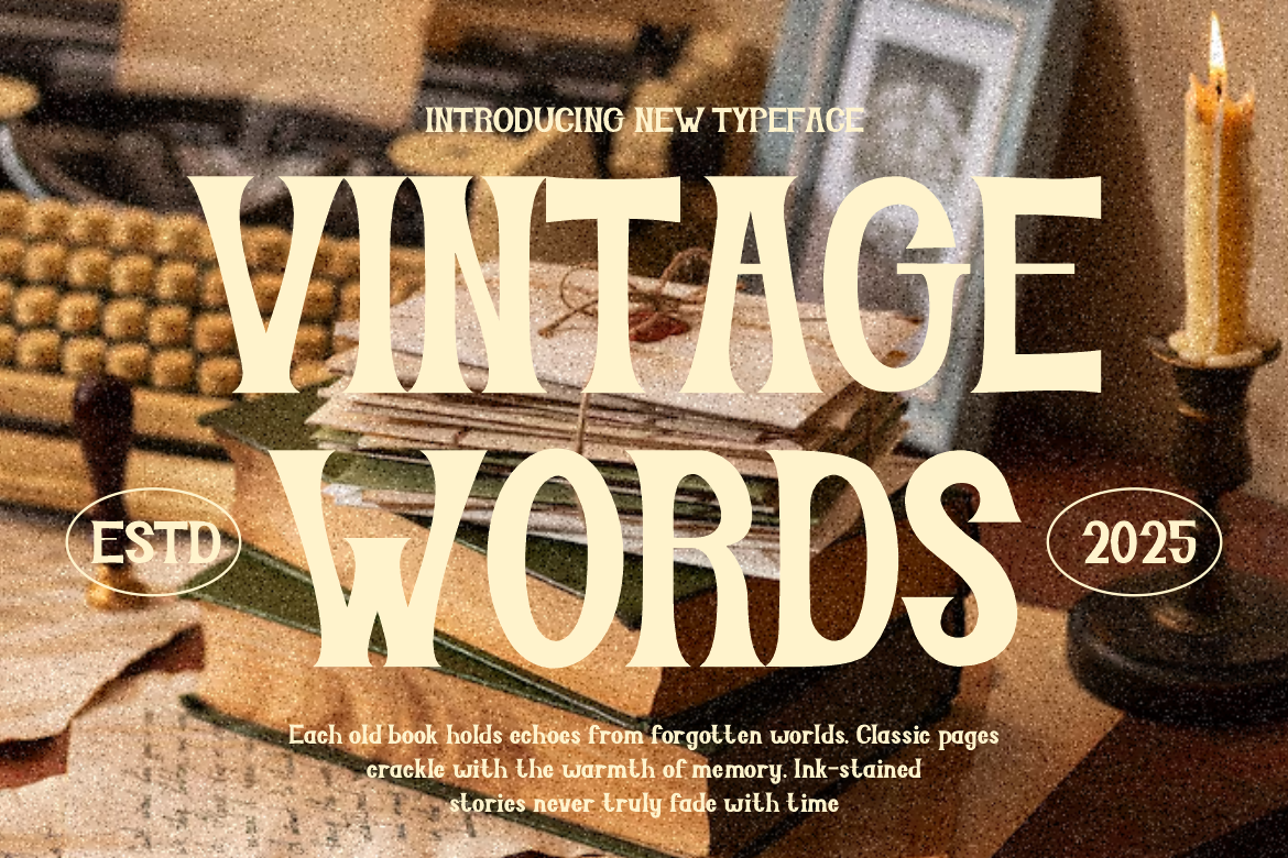
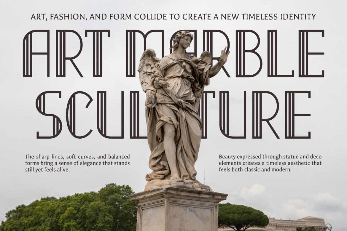
Fonts from Putracetol.com such as Luxerna Display, Greatness Culture, and Firanza feature refined letterforms that support ligature use in premium branding.
In editorial layouts, ligatures enhance long-form readability. They help maintain consistent texture across paragraphs and reduce visual noise.
Ligatures are especially valuable in:
They contribute to a comfortable reading experience without drawing attention to themselves.
Modern digital fonts often include automatic ligature support through OpenType features. When enabled properly, ligatures improve the appearance of text on screens.

In digital design, ligatures:
Fonts such as Popdash, Deco Vogue, and Luxerna Display from Putracetol.com are well-suited for digital use with ligature support.
Typography influences how audiences perceive a brand. Small details, including ligatures, contribute to emotional and psychological responses.
Brands that use ligatures effectively often appear:
Ligatures signal that a brand values detail, craftsmanship, and quality.
While ligatures offer many benefits, they should be used thoughtfully.
Recommended best practices include:
Balance is key. Ligatures should enhance, not distract.
Designers sometimes misuse ligatures by applying them too aggressively.
Common mistakes include:
Avoiding these pitfalls ensures ligatures remain effective and elegant.
Putracetol.com offers a curated selection of fonts that support modern typographic features, including ligatures. These fonts are designed for real-world use, balancing aesthetics with functionality.
By choosing fonts from Putracetol.com, designers gain access to:
This makes it easier to apply ligatures confidently and consistently.
In an era of fast content and digital consumption, attention to detail still matters. Ligatures represent a commitment to quality and thoughtful design.
They remind us that:
Ligatures continue to bridge tradition and modernity in typography.
Ligatures in typography combine elegance and readability in a way few other typographic features can. From their historical origins in print to their modern use in branding and digital design, ligatures remain a powerful tool for designers who value clarity, beauty, and professionalism.
According to Putracetol.com, ligatures are not just optional embellishments. When applied thoughtfully, they improve readability, enhance aesthetics, and strengthen visual identity. Whether used in logos, editorial layouts, or digital interfaces, ligatures help text feel more refined, balanced, and intentional.
For designers aiming to elevate their typography beyond the ordinary, ligatures offer a timeless and effective solution.
Thank you for taking the time to read this article. If you are looking for more great articles, feel free to visit Putracetol Blog
Additionally, if you want to explore some free typography options, you can check out Putracetol Studio on Dafont. Happy reading and designing!
