
Branding in the food and beverage industry has evolved far beyond logos and menu layouts. For restaurants that carry cultural heritage, design takes on a deeper role. It expresses values, sets expectations, and shapes how customers remember the experience long after the meal is over.
This case study explores a branding project for a Japanese bar and restaurant with a contemporary edge. The visual identity was crafted around Japanese cultural principles and refined to blend tradition with modern dining trends. The result is a brand that feels authentic yet current, appealing to a new generation of customers seeking both atmosphere and culinary storytelling.

The foundation of the branding draws from Japanese philosophy. Ideas such as balance, restraint, and subtle symbolism guide the creative direction. Instead of overwhelming customers with visual noise, the brand chooses calm, clarity, and intention.
This design attitude aligns with the dining concept as well. Japanese restaurants often emphasize craft. Ingredients, preparation, and presentation form a unified experience. The branding supports this viewpoint by acting as a cultural interface.
Three core ideas guided the visual system:
Together, these ideas create a visual identity that complements both food and space.
Typography plays an important role in establishing voice and tone. For this project, the design uses minimalist letterforms that are clean, unobtrusive, and modern. This approach keeps attention focused on the cultural and culinary narrative.
A monochrome palette with selective red accents supports the brand’s atmosphere. Black and white evoke clarity and structure, while red introduces cultural symbolism. In Japanese visual tradition, red is associated with celebration, life, and protection. Used sparingly, it creates strategic moments of emphasis.
Subtle traditional-style illustrations bring cultural familiarity without slipping into cliché. These graphics help the brand communicate identity even when text is absent.
The logo reflects Japanese calligraphy principles. Instead of a perfect geometric shape, it carries natural irregularities, echoing ink stroke textures. This gives the mark both character and human quality.
A calligraphy-inspired logo conveys more than authenticity. It signals respect for cultural heritage and acknowledges the value of craft. For customers, it serves as a visual cue that the dining experience is rooted in real Japanese sensibilities.
Flexibility is also crucial. The logo was designed to work across a wide range of applications including signage, uniforms, menus, sake labels, and digital screens. A symbol that remains recognizable across mediums reinforces brand consistency.

For hospitality brands, applications determine how identity feeds into customer experience. In this project, the branding system supports multiple touchpoints that shape the overall dining journey.
Key applications include:
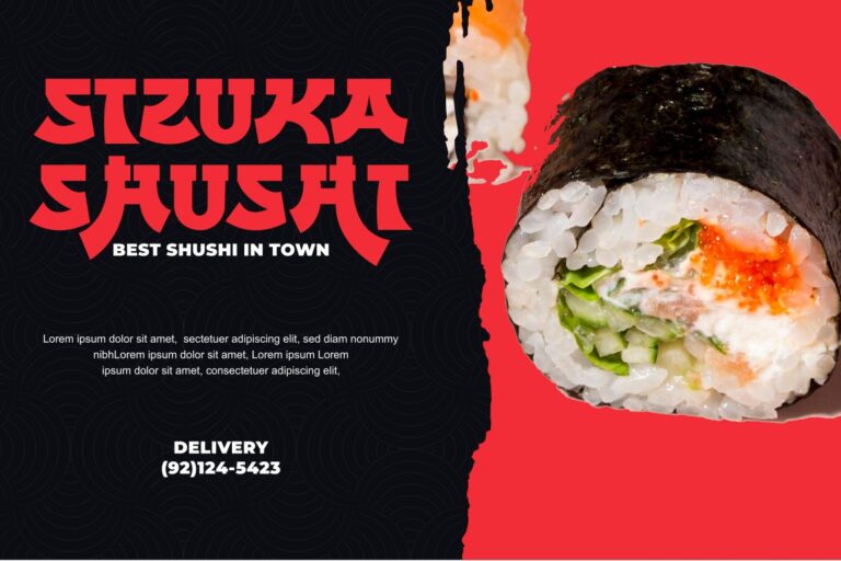
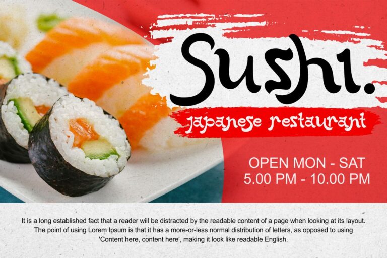
Menus are often the first brand contact guests interact with once seated. A minimalist layout with generous spacing allows dishes to breathe on the page. Typography hierarchy guides the eye without clutter.
Signage extends the restaurant’s presence to the street. Clean typography on exterior signage helps build a clear identity, while interior directional signs maintain cohesion within the space.
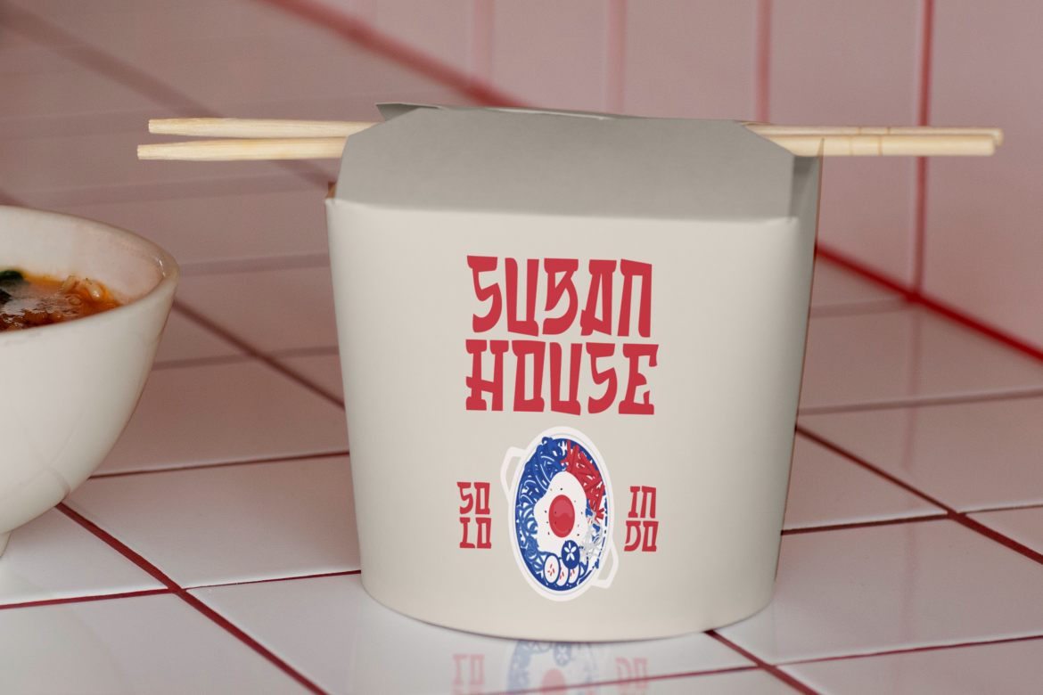
Sake packaging becomes both decorative and informative. Labels follow the same monochrome and red language, turning bottles into objects that reinforce visual identity.
Wall graphics, table signage, and subtle print pieces inside the restaurant offer cultural touchpoints without overwhelming the environment.
Social media content, promotional banners, and website interface carry the same tone. This supports marketing consistency and creates a coherent online presence.
A strong branding system gives customers a narrative thread that connects space, product, and communication.
The central goal of the visual identity is not only recognizability but emotional connection. Japanese dining culture values atmosphere. Quietness, balance, and sensory focus shape how food is experienced.
Branding supports this by:
Authenticity in this context does not mean literal imitation of traditional Japanese design. Instead, it means being culturally informed and respectful. Traditions become design components, not decorations.
This approach helps the brand appear refined, intentional, and honest.
The completed branding provides several strategic advantages for the business:
A cohesive identity elevates perception and supports premium positioning.
By using cultural design cues with intention, the brand gains credibility with guests who value authenticity.
Branding extends the culinary narrative into the visual and spatial domain, creating holistic hospitality.
As more restaurants adopt modern minimalism without substance, culturally grounded branding stands out.
Consistency across touchpoints builds strong recall, leading to loyal repeat customers.
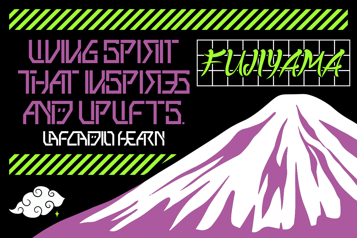
For designers working on similar cultural or hospitality projects, Putracetol offers several font options that align with Japanese design sensibilities. These typefaces blend cultural references with modern usability:

Each brings a different mood, from calligraphic to futuristic, expanding the creative possibilities for identity systems.
This branding project demonstrates how design can build bridges between culture, culinary craft, and modern aesthetics. By focusing on simplicity, balance, and a respect for tradition, the identity connects guests not only to the restaurant but to the cultural spirit behind it.
With its minimalist typography, monochrome palette, red accents, and calligraphy-inspired logo, the restaurant presents itself as both authentic and contemporary. The result is a brand that feels refined, consistent, and memorable.
For the hospitality field, Japanese restaurant branding offers a compelling example of how design becomes an active part of the dining experience, shaping perception long before the first taste.
Thank you for taking the time to read this article. If you are looking for more great articles, feel free to visit Putracetol Blog
Additionally, if you want to explore some free typography options, you can check out Putracetol Studio on Dafont. Happy reading and designing!
