Graffiti typography has moved far beyond street corners and concrete walls. Today, it is celebrated in advertising, branding, editorial layouts, digital art, and merchandise design. What once lived exclusively in subcultures now informs mainstream creative direction. Its rise reflects a broader demand for visual expression, cultural authenticity, and distinct personality in design.
Twinletter’s exploration of graffiti typography highlights this shift clearly. Graffiti fonts have evolved from improvised hand-drawn letters to structured digital typefaces that maintain the spontaneity and attitude of their origins. They give designers access to visual styles that feel raw, energetic, and culturally connected, all without sacrificing typographic functionality.
This article examines four graffiti fonts from Putracetol.com that demonstrate how diverse graffiti typography can be. Each serves a different visual purpose and emotional tone, making graffiti more versatile than many expect.
Graffiti fonts differ from traditional serif, sans-serif, or geometric typefaces in one key way: they communicate identity, not neutrality. Their role is expressive, not invisible. Rather than disappearing behind the message, they become part of the message.
Graffiti typefaces are often:
• bold rather than conservative
• stylized rather than neutral
• rhythmic rather than static
• narrative rather than formal
• emotional rather than restrained
These qualities make graffiti fonts suitable for modern visual contexts where personality carries value: youth culture, urban fashion, music promotion, festivals, gaming, and social media content.

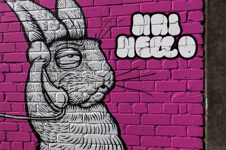
Urban Sketart represents the genre most closely associated with traditional street graffiti. Designed with complex overlapping forms and strong illustration cues, it maintains the impression of a hand-drawn marker or spray-paint style.
→ https://putracetol.com/product/urban-sketart/
• complex, illustrative letterforms
• interconnected strokes and structure
• slightly irregular rhythm for authenticity
• readable yet artistic
Urban Sketart is popular among designers who want graffiti energy without sacrificing clarity. It works well in:
• murals and street installations
• music festival campaigns
• apparel graphics
• title posters
• skateboard culture design
Its ability to feel both artistic and legible opens opportunities in a wide range of urban creative work.

The Bold Street introduces a different emotion friendliness. While graffiti often carries intensity or rebellion, this style embraces round curves and soft shapes, making it approachable and upbeat.
→ https://putracetol.com/product/the-bold-street/
• rounded and inflated letterforms
• youthful, friendly personality
• bold and consistent strokes
• high readability in small and large scale
Designers use this style when they want graffiti aesthetics without edge or aggression. It suits:
• snack brand packaging
• children’s posters
• casual F&B branding
• youth cultural events
• playful merchandise
This demonstrates how graffiti can serve fun and joyous brand narratives, not just gritty or street-oriented ones.

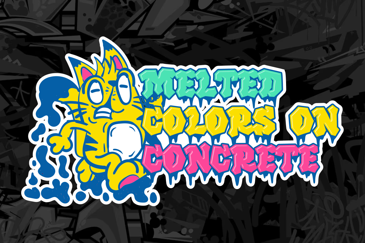
The Melting Graffiti style introduces weight, geometry, and structure. Rather than organic curves or fluid strokes, its forms are blocky and dense with a visual “drip” motif that evokes spray paint or melted ink.
→ https://putracetol.com/product/melting-graffiti-layered-graffiti-drip-font/
• compressed geometric letterforms
• strong visual mass and density
• sharp contrast and powerful impact
• highly legible in headline use
Because of its bold stance, Melting Graffiti is ideal for:
• posters and title layouts
• product packaging
• sports and gaming identities
• brand campaigns demanding attention
• album covers and event graphics
Where Bold Street feels playful, Melting Graffiti feels assertive. It gives designers a typeface capable of communicating confidence and power.

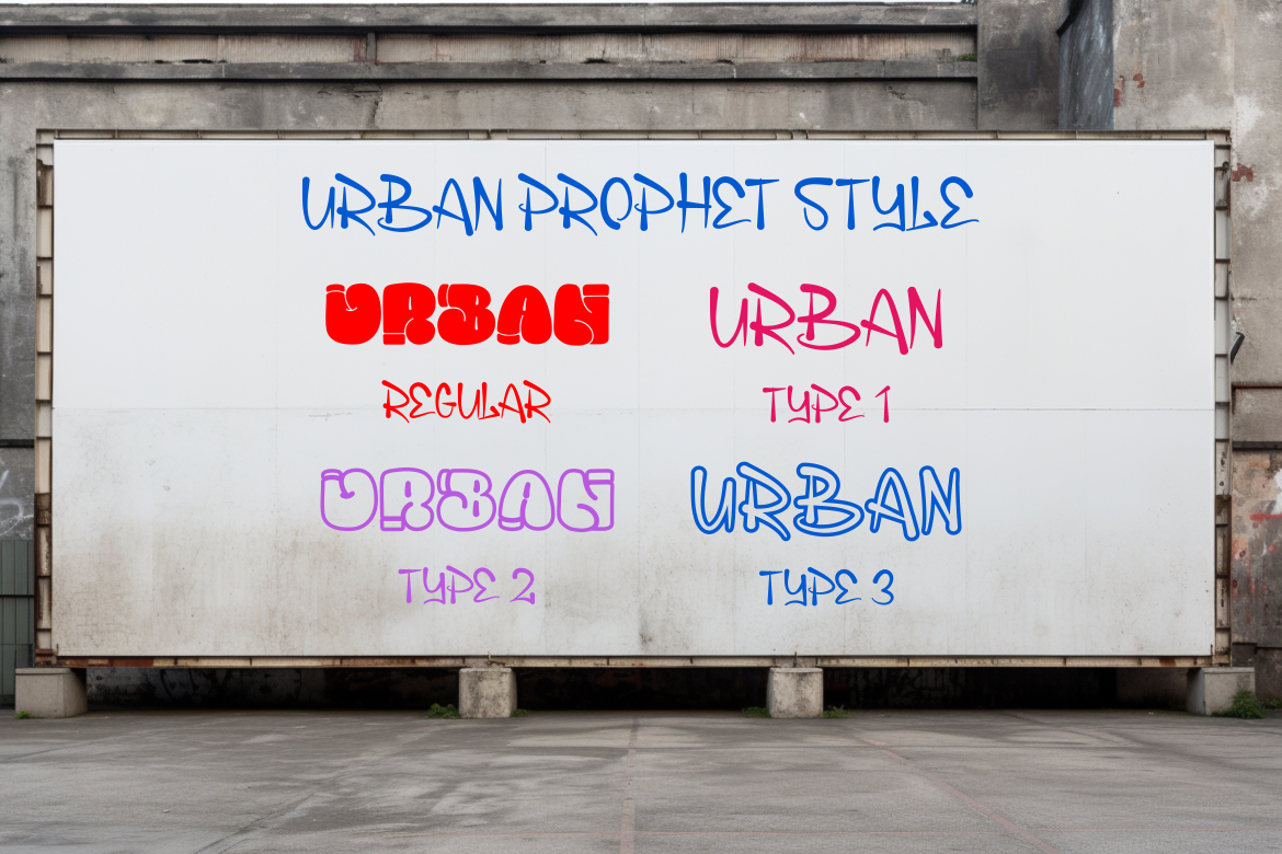
Urban Prophet takes graffiti further into artistic abstraction. Instead of replicating traditional street tagging, it blends typographic structure with illustration and conceptual alteration.
→ https://putracetol.com/product/urban-prophet-duo-graffiti-font/
• experimental letter anatomy
• expressive illustrative details
• asymmetrical proportions
• creative and unconventional forms
This style shines in conceptual design environments such as:
• experimental editorial layouts
• digital artwork
• underground music branding
• creative poster design
• youth and alternative culture projects
Urban Prophet shows how graffiti fonts can become vehicles for visual storytelling, not just decorative type.
Beyond their visual style, graffiti fonts carry cultural value. In branding and communication, fonts are signals and they influence how audiences perceive tone, intention, and identity.
Graffiti fonts communicate:
• authenticity
• creativity
• energy
• youth influence
• cultural awareness
• individuality
These traits are valuable in industries built on lifestyle and emotion, such as:
• fashion
• entertainment
• hospitality
• sports
• gaming
• music
• F&B lifestyle
As mainstream brands adopt more expressive typography, graffiti fonts become tools to differentiate rather than merely decorate.
Below is a quick comparison of the four highlighted styles:
| Font Style | Visual Impression | Common Usage |
|---|---|---|
| Urban Sketart | Artistic, complex | Murals, street art |
| The Bold Street | Playful, friendly | Posters, youth design |
| Melting Graffiti | Strong, bold | Branding, headlines |
| Urban Prophet | Avant-garde, creative | Digital art, experimental |
This diversity makes graffiti fonts adaptable for both commercial and artistic goals.
Brands increasingly leverage typography to signal lifestyle positioning. In sectors like streetwear or music, graffiti fonts act as cultural markers that connect brands to their audience.
Three strategic advantages stand out:
Graffiti connects with subcultures like skate, hip-hop, DIY street culture, which gives brands authenticity.
Graffiti fonts demand attention, aiding posters, packaging, and merchandising.
In crowded marketplaces, visual uniqueness becomes a competitive advantage.
These benefits are especially relevant in digital platforms where visual noise is high and timid typography gets ignored.
Graffiti fonts show how typography can function as both communication and expression. They challenge the assumption that type must always be neutral, corporate, or restrained. Instead, they demonstrate that typography can tell stories, reference subcultures, convey emotion, and build identity.
Whether designers choose the artistic detail of Urban Sketart, the playful friendliness of The Bold Street, the bold confidence of Melting Graffiti, or the experimental abstraction of Urban Prophet, each option expands what typography can accomplish in contemporary design.
Graffiti fonts are no longer limited to walls but they now shape brands, digital experiences, campaigns, and visual culture.
Thank you for taking the time to read this article. If you are looking for more great articles, feel free to visit Putracetol Blog
Additionally, if you want to explore some free typography options, you can check out Putracetol Studio on Dafont. Happy reading and designing!