
Typography has always been at the heart of design. The way text looks shapes how audiences perceive brands, websites, and digital products. But professional typography used to be expensive and difficult to integrate into online projects. That all changed with Google Fonts, a free, open-source resource that has transformed digital typography. With over 1,000 font families available, Google Fonts has become an essential tool for designers, web developers, and business owners who want to create appealing, readable, and professional designs without additional costs.
More than just a font library, Google Fonts supports integration through its powerful API, enabling seamless customization directly in HTML and CSS. This accessibility ensures that designers can maintain brand consistency while achieving speed, readability, and modern aesthetics across devices.
The importance of typography in branding and communication cannot be overstated. A strong, consistent font choice reinforces professionalism, trustworthiness, and brand identity. Conversely, poor typography weakens credibility and confuses the audience.
Google Fonts bridges this gap by offering a vast, curated selection of typefaces optimized for the web. Whether you need serif fonts for editorial projects, sans-serif fonts for tech brands, or playful display fonts for creative campaigns, Google Fonts provides accessible options that are compatible with most browsers and devices.
Typography is more than decoration, it’s brand communication. The right font reinforces your product’s personality, while the wrong one creates confusion. For example:
Pairing these Google Fonts with unique display fonts can elevate your design even further. For example, from Putracetol Studio, fonts like Savenir bring a modern twist to headlines, Retro Rush adds nostalgic flair, and Digitron Futures injects futuristic energy into branding projects. By combining free Google Fonts with premium creative fonts, designers achieve both accessibility and originality.
User experience relies heavily on readability. Fonts that are too heavy, decorative, or inconsistent harm the user journey. Google Fonts ensures optimized performance with clear rendering, making text accessible to all readers.
Key factors for UX design include:
For instance, a blog using Roboto or Open Sans ensures easy readability on screens, while headlines styled in Abril Fatface add expressive character. This balance creates engaging yet comfortable digital experiences.
Typography impacts SEO more than many realize. When websites use optimized fonts:
Google itself emphasizes accessibility and performance in its ranking criteria. By aligning typography with these principles, designers not only create beautiful layouts but also support better search engine visibility.

5. Stay Aligned with Brand Voice
Choose fonts that represent the brand’s personality serious, playful, modern, or nostalgic.
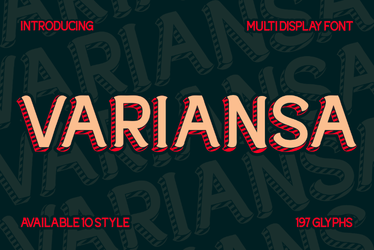
Imagine a lifestyle blog using Playfair Display for headlines and Lato for body text. This pairing feels elegant yet approachable. Adding highlights in a premium display font like Variansa can inject creative energy into social media graphics or banners. The result? A consistent brand experience across platforms thanks to the versatility of Google Fonts combined with curated design fonts.
Google Fonts is more than a free font library it’s a reliable design partner for professionals and beginners alike. By combining accessibility, brand alignment, UX performance, and SEO benefits, it empowers designers to create visually appealing, functional, and inclusive digital products.
With curated options like Bebas Neue and Playfair Display, and the ability to integrate with unique fonts from platforms like Putracetol Studio, Google Fonts ensures that your projects stand out without unnecessary costs or technical barriers.
In today’s digital-first world, typography is storytelling and Google Fonts makes sure every story is both beautiful and accessible.
Thank you for taking the time to read this article. If you are looking for more great articles, feel free to visit Putracetol Blog
Additionally, if you want to explore some free typography options, you can check out Putracetol Studio on Dafont. Happy reading and designing!
