
A poster is more than just a visual announcement, it’s a communication tool that merges text and imagery to convey a message quickly and effectively. Whether promoting an event, product, or idea, the choice of font can make or break a poster’s success.
In the fast-paced world of visual marketing, the right typography ensures that the audience not only sees your message but feels it. A well-chosen font can express emotion, build identity, and attract attention even from a distance. Conversely, poor font choices can cause confusion, clutter, or even drive viewers away.
This article explores how to choose the perfect font for different poster themes, from elegant and romantic to sporty and horror, while maintaining balance between aesthetics and legibility. It also highlights premium-quality fonts from Putracetol.com, a trusted source for professional and creative typography solutions.
Typography serves as the voice of your poster. It determines how your message feels, serious, playful, bold, or mysterious. Since posters are designed to attract attention in seconds, your font must immediately communicate the design’s tone and purpose.
Fonts are not just visual choices; they’re psychological triggers. A rounded, friendly font evokes warmth and approachability, while sharp and geometric fonts express professionalism or intensity.
💡 Tip: Keep font usage minimal. Combining two complementary fonts, one for headlines and one for body text, maintains visual harmony and prevents clutter.
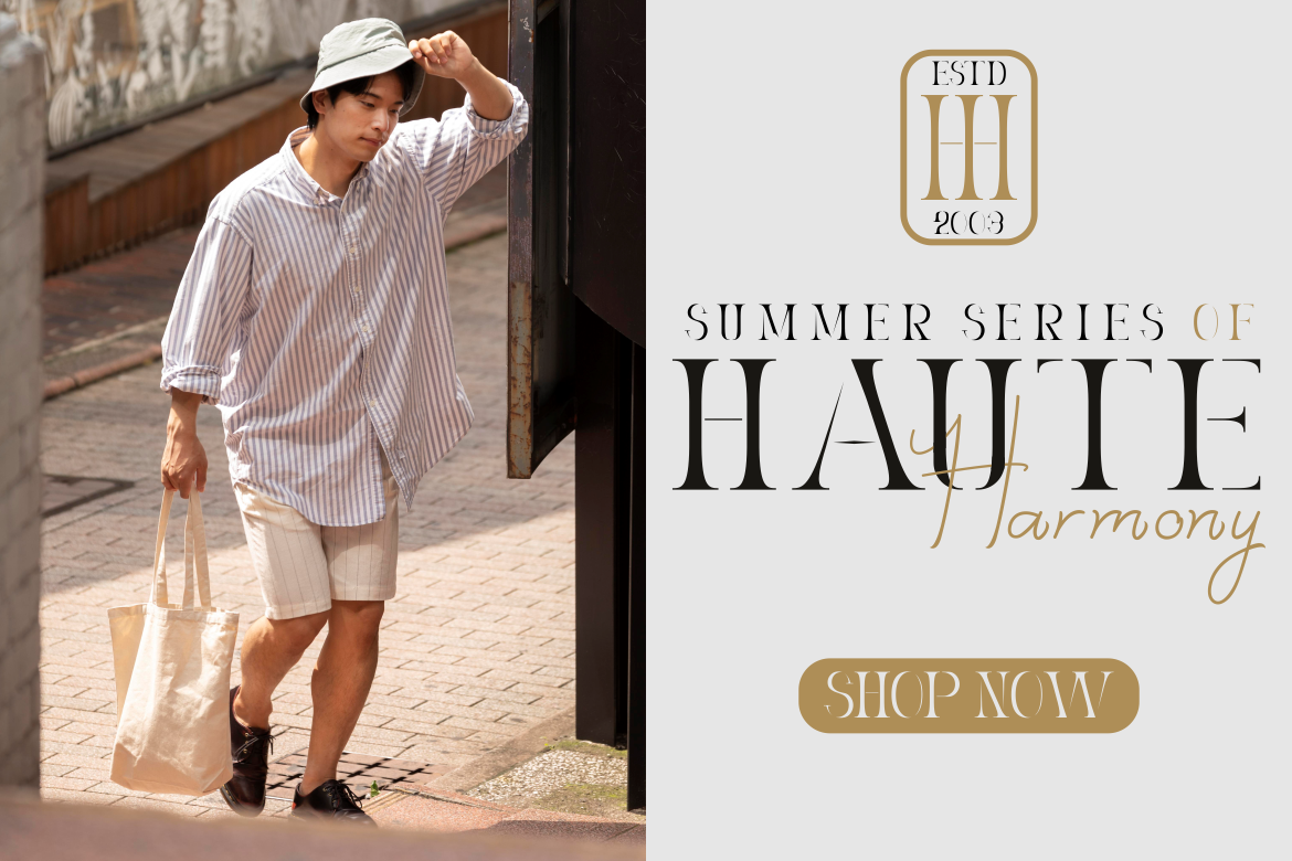
When creating posters for corporate events, exhibitions, or academic purposes, elegance and clarity are crucial. Elegant fonts feature clean lines, balanced proportions, and refined serifs that exude professionalism.
These typefaces are ideal for non-commercial or formal posters where simplicity communicates trust and authority.

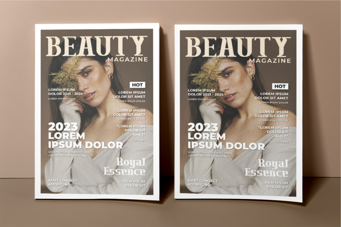
These fonts maintain clarity even in large-scale printing, ensuring your message stays polished and professional.
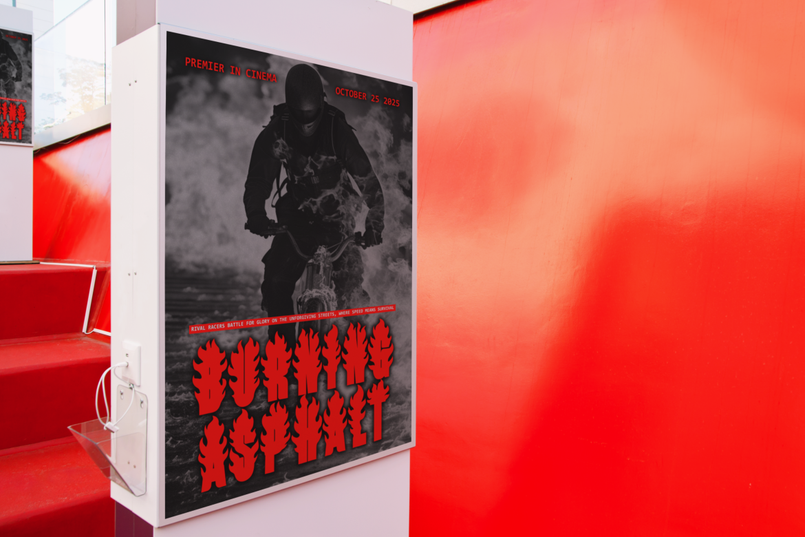
When designing horror movie posters, Halloween events, or thriller book promotions, typography must capture the audience’s curiosity and fear simultaneously. Gothic and distressed fonts are ideal for this, they convey tension, mystery, and atmosphere.
However, readability must never be sacrificed. Even the most complex horror font should remain clear enough for audiences to read at a glance.
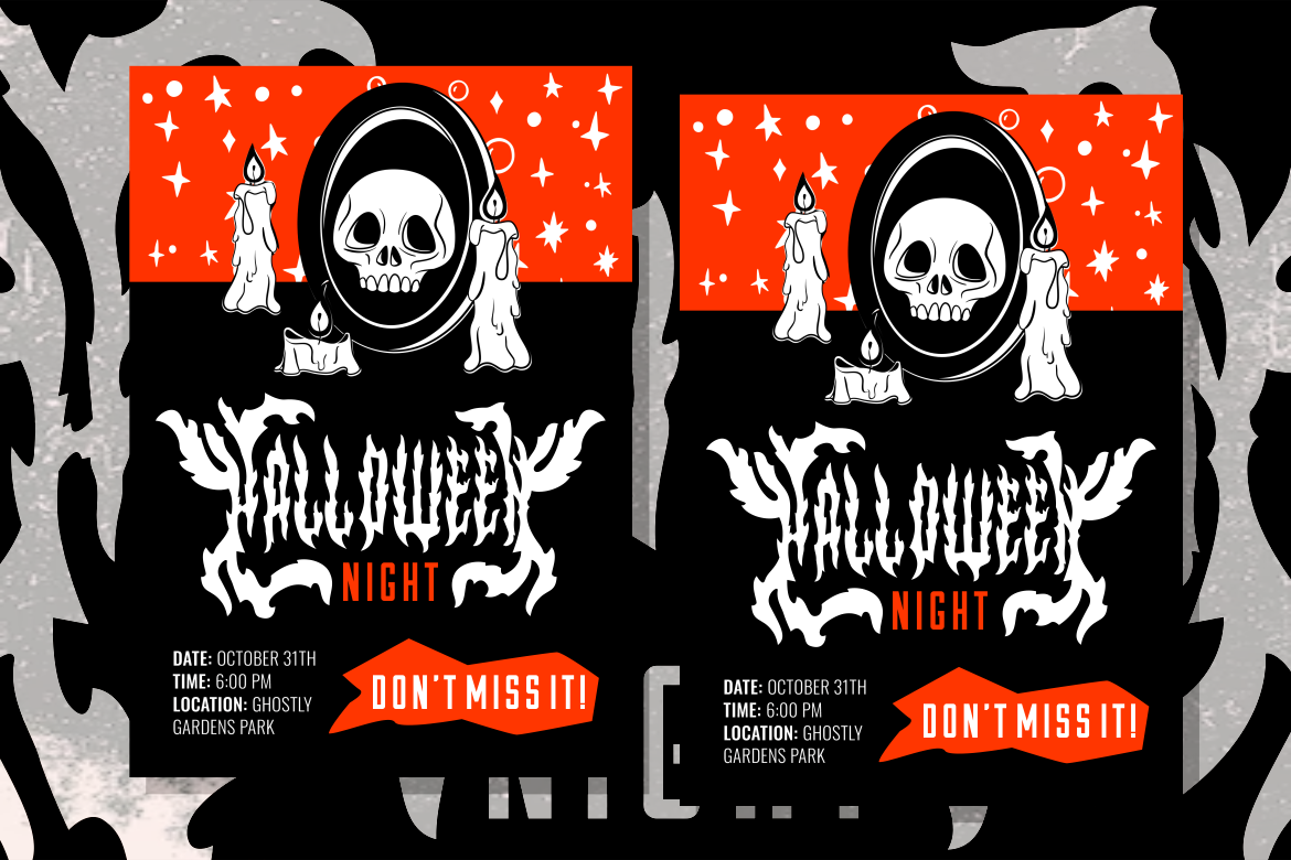
💡 Tip: Pair your gothic headline with a neutral sans-serif subtitle to improve balance and legibility.
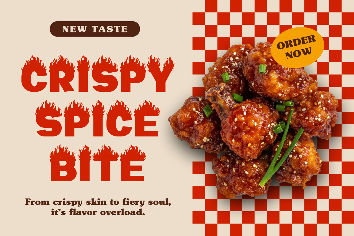
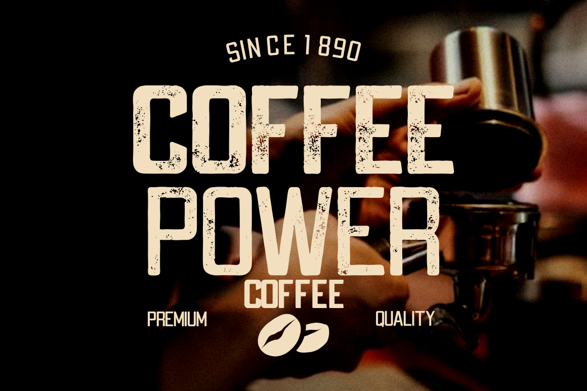
Food posters rely on visual appeal and sensory triggers, your audience should feel hungry just by looking at them. Fonts for food design should appear approachable, round, and often a little playful to stimulate curiosity and appetite.
One standout example is Rada Cenak, a typeface designed specifically for culinary themes. Its letterforms are bold yet friendly, giving off a “delicious” visual texture perfect for restaurant menus, café promotions, or food festivals.
💡 Design Trick: Use warm color palettes (red, orange, yellow) with rounded typography to reinforce appetite and friendliness.
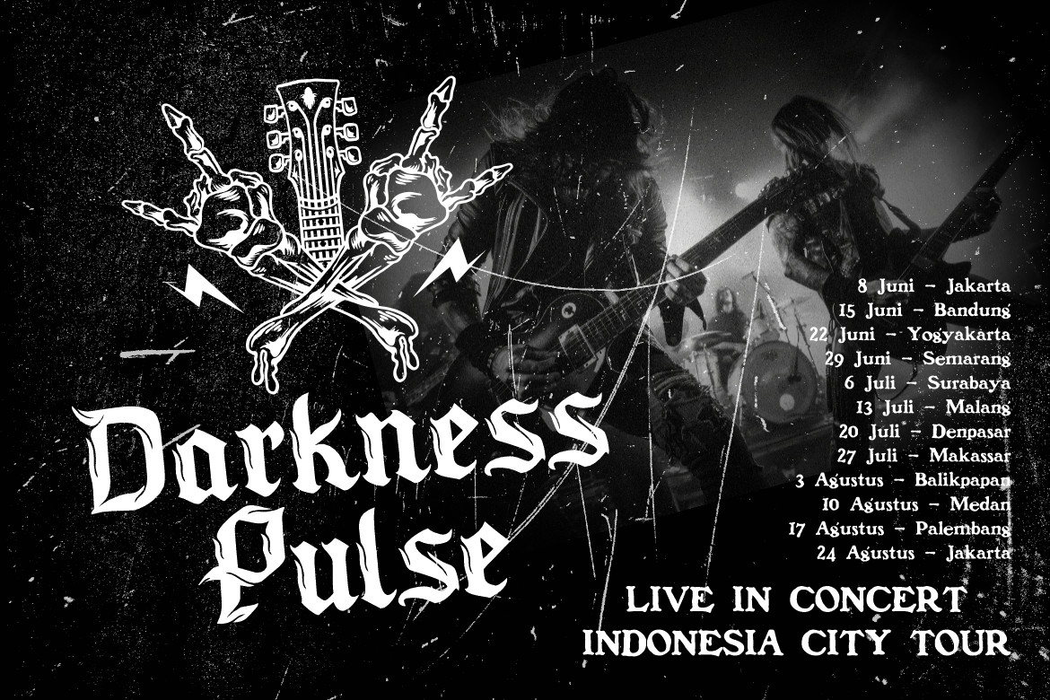
Sports posters are all about impact and movement. Whether for basketball tournaments, marathons, or e-sports events, the font should communicate speed, strength, and excitement.
These designs thrive on bold, angular typefaces that create an energetic rhythm and a sense of action.
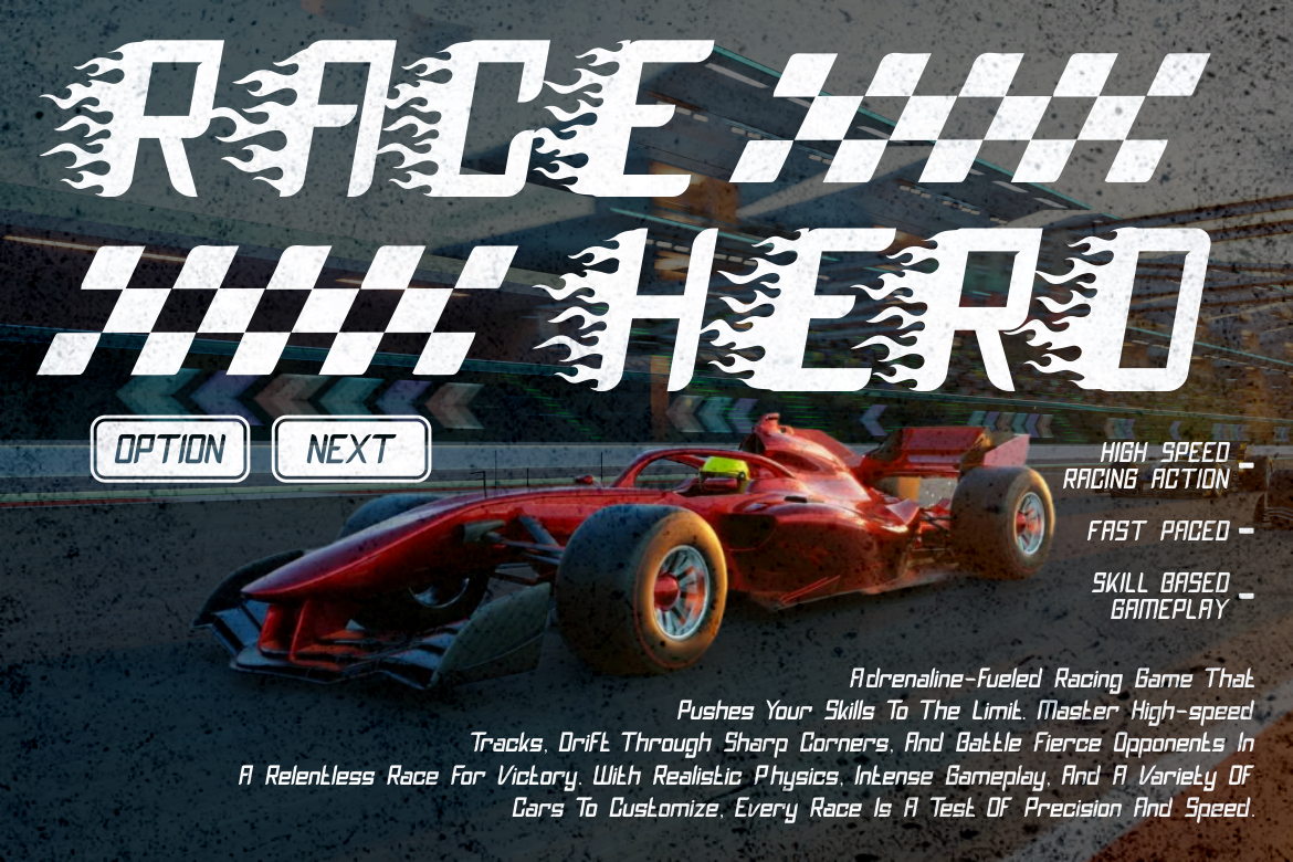
💡 Tip: Combine bold typography with slanted layouts, diagonal grids, or motion effects to amplify the sense of movement.
For Valentine’s Day events, romantic films, or wedding promotions, typography must express tenderness and emotion. Romantic fonts often include soft curves, subtle ligatures, and elegant flourishes that evoke affection and nostalgia.
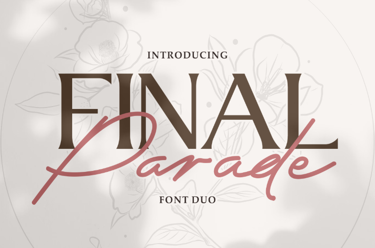

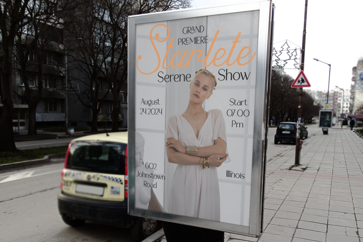
💡 Color Harmony Tip: Combine pastel hues or gradient tones with soft typefaces for a tender, emotional look.
Cultural or religious posters such as Hajj, Umrah, or local festivals, require fonts that respect heritage while maintaining visual elegance. Fonts inspired by Arabic, Sanskrit, or Eastern aesthetics offer sophistication and authenticity.
Such typefaces help communicate respect, spirituality, and community, essential qualities for designs that connect emotionally and culturally.
💡 Design Tip: Use symmetrical layouts and natural tones (gold, cream, deep blue) to create harmony and cultural authenticity.
Helvetica remains one of the world’s most used fonts, praised for its neutrality and simplicity. It’s a safe choice for corporate or formal posters where clarity is key. However, its very familiarity can make designs look generic and predictable.
For those who wish to stand out, investing in premium fonts offers a strategic advantage. Professional typefaces provide:
Premium font platforms like Putracetol.com offer curated collections for specific design needs, from luxury branding to sports events and horror film promotions, ensuring that your posters remain both beautiful and professional.
Effective poster design is a symphony of visual elements: color, imagery, layout, and typography. Each must complement the other.
Remember, good design doesn’t just look appealing; it communicates clearly and emotionally.
In the world of visual communication, typography is more than decoration, it’s storytelling. Choosing the right font sets the tone, establishes brand identity, and guides the audience’s perception.
Whether you’re designing a sleek corporate poster, a chilling horror advertisement, or a heartwarming Valentine’s promotion, the secret lies in matching font personality with purpose.
From elegant serifs like Aureline to bold displays like Rushfire, premium fonts from Putracetol.com offer designers the tools to craft posters that captivate, inform, and inspire.
Because in the end, a great poster doesn’t just speak, it resonates.
Thank you for taking the time to read this article. If you are looking for more great articles, feel free to visit Putracetol Blog
Additionally, if you want to explore some free typography options, you can check out Putracetol Studio on Dafont. Happy reading and designing!
