
Typography is one of the most powerful tools in a designer’s arsenal, a silent yet dominant element that shapes how a brand communicates. When chosen wisely, a font can ignite emotion, express personality, and define identity. This is especially true when it comes to fire-themed fonts, which blend energy, intensity, and bold visual impact.
Choosing a font is not merely a design choice; it’s a strategic branding decision. In editorial design, typography doesn’t just decorate, it directs the reader’s eye, builds rhythm, and enhances storytelling. The right fire-inspired typeface can instantly capture attention and give a brand the heat it needs to stand out in a crowded visual landscape.
This article curates seven powerful fire fonts from Putracetol Studio, each designed to bring unique character and strength to your branding, editorial, or promotional projects.
Before diving into the list, it’s important to understand why fire fonts matter in branding. Fire represents energy, transformation, and passion, three qualities every brand wants to evoke.
In visual communication, fire fonts express:
Just like flames, good typography attracts attention from afar, but only the right typeface can sustain that attention through clear readability and purposeful composition.

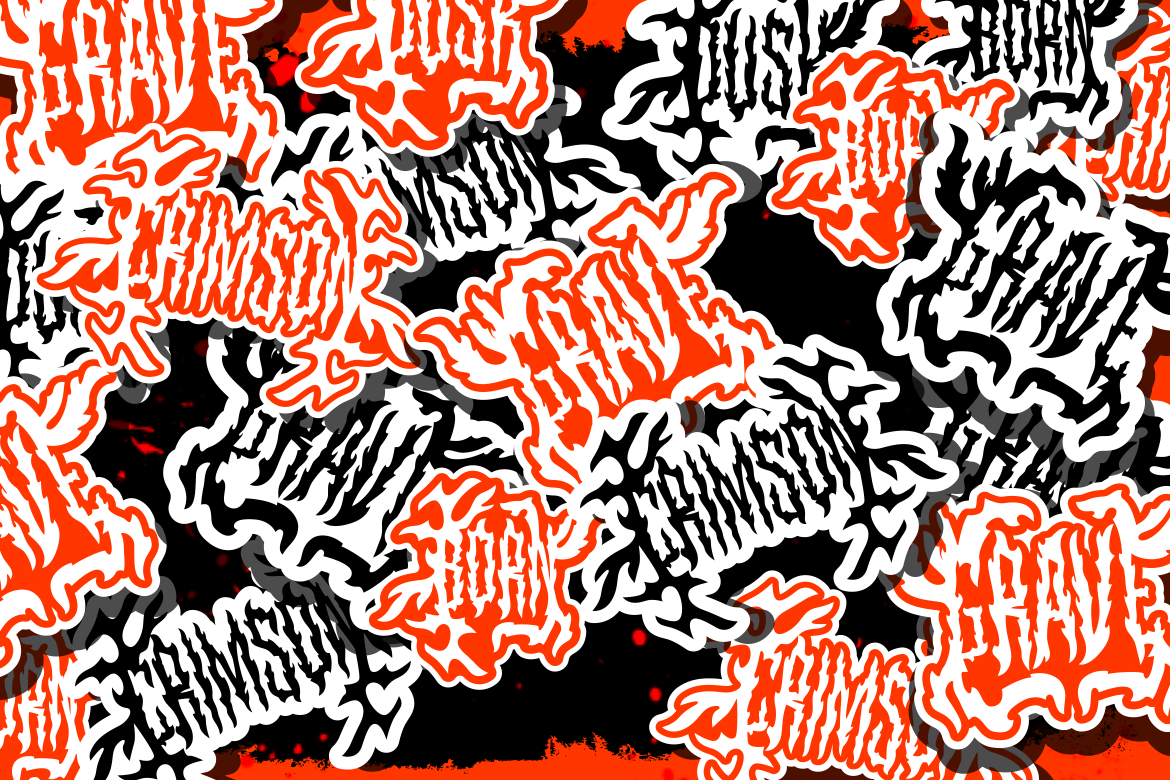
A perfect blend of gothic power and modern intensity, Vulture Kingdom captures the raw essence of flame-driven energy. With sharp edges and strong strokes, it’s ideal for music branding, gaming covers, tattoo-inspired merchandise, and heavy editorial layouts.
Its blackletter foundation gives it a regal yet rebellious feel, making it suitable for brands that want to project dominance, mystery, and attitude.
Best For: Metal bands, extreme sports branding, high-impact magazine titles.

While fire fonts often exude aggression and intensity, Mixy Missy brings a refreshing twist, a playful and dynamic energy wrapped in smooth, curvy strokes.
It captures the vibrancy of creative brands, blending warmth with personality. Perfect for lifestyle editorials, youth-oriented publications, and casual product packaging, Mixy Missy feels like a spark of joy on every design.
Best For: Creative agencies, café branding, youth magazines, fashion lookbooks.
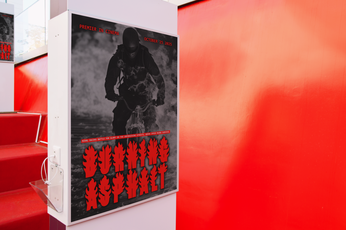
Death Fire is where grit meets grandeur. With its sharp lettering and metallic gradient potential, this typeface sets an unforgettable tone. Designed to emulate fire’s destructive and powerful beauty, it’s a must-have for designers seeking a dramatic, cinematic vibe.
This font thrives in projects that demand visual dominance, perfect for rock concerts, action movie posters, motorsport events, or fashion editorials with an edge.
Best For: Music branding, event posters, apparel design, headline typography.
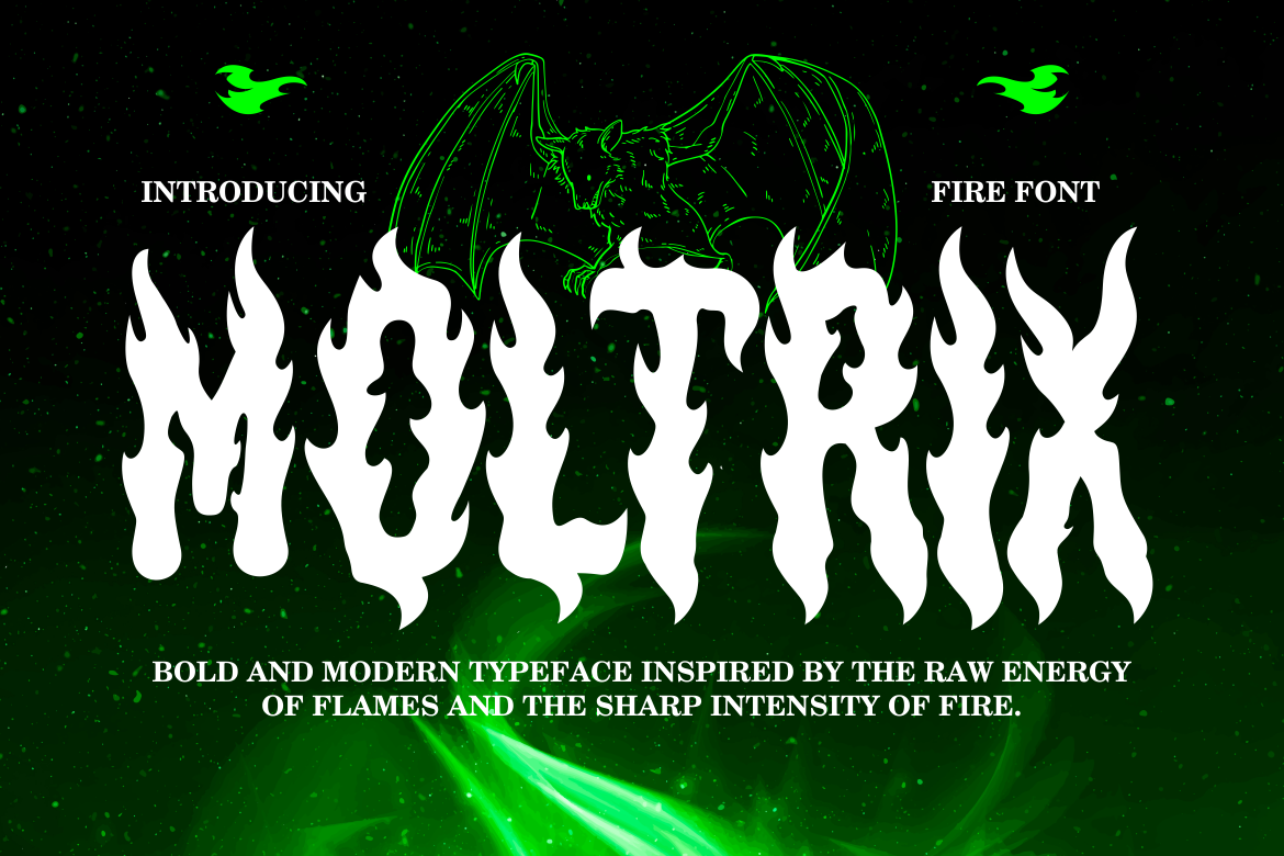
Moltrix embodies the raw heat of burning flames in a controlled and elegant way. The letters feel alive, as if glowing under pressure, giving designs a sense of movement and transformation.
This font works beautifully for branding in energy drinks, fitness gear, automotive marketing, and modern publications that want to radiate power and motivation.
Pair Moltrix with minimalist backgrounds and contrasting colors (like black, charcoal, or metallic gold) to make it truly shine.
Best For: Sports branding, editorial headlines, modern advertisements.
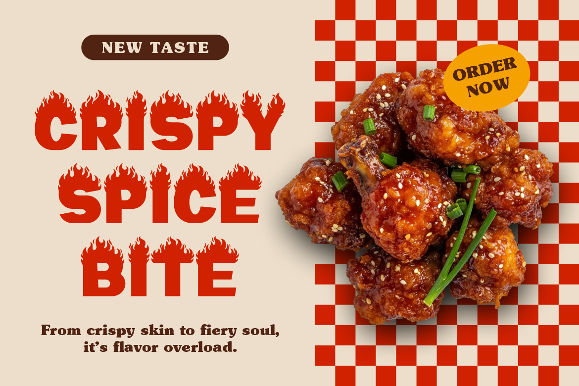
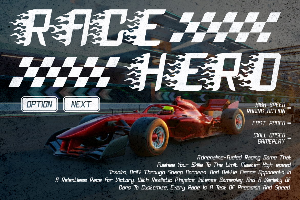
As the name suggests, Rushfire is designed for speed, passion, and adrenaline. Its sleek, condensed letterforms convey movement, making it ideal for brands or magazines centered on motorsports, gaming, or performance-based content.
Despite its aggressive visual, it maintains high readability, ensuring that editorial layouts remain clear and impactful. Rushfire captures the moment of ignition, the exact second when energy bursts into action.
Best For: Car magazines, e-sports branding, digital banners, or product packaging.
Redfire is the embodiment of heat, danger, and allure. It’s a font that makes a statement the moment it appears on the page. With a bold, decorative form and a distinctive gradient-ready structure, it’s perfect for creating luxurious or high-energy editorial covers.
Designers can use Redfire to symbolize emotion, rebellion, or transformation, especially in fashion, streetwear, or lifestyle branding. When combined with minimalist photography and warm tones, it produces a striking contrast that commands attention.
Best For: Fashion branding, digital posters, youth magazines, creative campaigns.
If your brand thrives on speed, motion, and adrenaline, Inferno Racers is the ultimate choice. Inspired by racing typography and high-octane energy, it’s made for sports branding, editorial covers, and modern advertising.
The font’s structure mirrors flames shaped by motion, giving each letter a sense of forward thrust. It captures the emotional intensity of both fire and racing, perfect for bold, masculine, or futuristic themes.
Best For: Racing brands, sportswear packaging, energy drink ads, youth promotions.
Typography in editorial design has always been about balance and hierarchy, guiding the eye without overwhelming the message. When using bold fonts like Rushfire or Vulture Kingdom, pairing them with simple, neutral supporting fonts helps maintain clarity.
A smart strategy is to use a flame-themed display font for titles or logo marks, then pair it with a modern sans-serif like Rolever or Luxerna for body text. This combination creates contrast while keeping the composition elegant and professional.
Fire fonts also work beautifully in digital branding, especially on social media campaigns and video thumbnails where boldness and emotion attract instant clicks.
When selecting a fire-themed font, consider these key points:
Typography is not just about letters, it’s about storytelling. Fire fonts naturally evoke action, emotion, and transformation. They bring depth to visual narratives by symbolizing energy, passion, and motion.
A fashion magazine might use Redfire to symbolize confidence and flair. A gaming brand might choose Inferno Racers to represent excitement and danger. A café brand promoting spicy products might find Moltrix or Rushfire the perfect match.
By aligning the typeface’s emotional energy with brand values, designers create visual harmony and stronger audience connection.
Choosing the right fire-themed font is about more than heat, it’s about crafting identity. The right typeface defines how your brand speaks, how it feels, and how it’s remembered.
Each of the seven fonts featured, Vulture Kingdom, Mixy Missy, Death Fire, Moltrix, Rushfire, Redfire, and Inferno Racers, offers a unique interpretation of fire’s energy. Whether your goal is to convey strength, warmth, creativity, or rebellion, there’s a perfect typeface waiting to set your design ablaze.
In the hands of a thoughtful designer, typography becomes more than text, it becomes flame, emotion, and movement.
So ignite your next project with purpose, passion, and the power of typography.
Thank you for taking the time to read this article. If you are looking for more great articles, feel free to visit Putracetol Blog
Additionally, if you want to explore some free typography options, you can check out Putracetol Studio on Dafont. Happy reading and designing!
