
Horror design is a genre that thrives on tension, distortion, and the unknown. For more than a century, visual creatives have crafted terrifying, surreal, and sometimes grotesquely beautiful works that evoke fear and fascination. From its early expressions in silent cinema to its current presence in digital branding and album art, horror-themed design has evolved dramatically—yet consistently retained its eerie core.
Let’s explore how horror design came to dominate film posters, album covers, and product branding—and how specific fonts have shaped its visual identity.
The history of horror in visual media dates back to the early 1900s, particularly with the release of German Expressionist films like Nosferatu (1922) and The Cabinet of Dr. Caligari (1920). These films introduced haunting compositions, surreal architecture, and heavy use of shadow—all of which became foundational elements in horror aesthetics.
Typography in early posters reflected the same emotion. Jagged, distorted serif fonts were paired with stark black-and-white visuals. These weren’t just functional design elements—they were atmospheric storytelling tools.
During the slasher film boom of the ‘70s and ‘80s, horror designs took a more visceral turn. Movie posters like Halloween, The Texas Chainsaw Massacre, and Friday the 13th used blood-dripping fonts, exaggerated perspective, and high-contrast photography to convey violence and chaos.
At the same time, metal bands like Iron Maiden, Slayer, and Black Sabbath turned to horror themes for inspiration. Their album covers used elaborate illustrations and gothic typography to embody darkness, death, and rebellion.
This was the era when blackletter fonts and heavy brush-stroke lettering started appearing in music artwork—and continue to influence horror culture today.

Black Sanctum is a chilling blackletter font with sharp, dagger-like edges. It echoes the ancient and occult-inspired design of horror novels and heavy metal albums.
Perfect for:
By the early 2000s, horror and Halloween design became deeply embedded in commercial culture. Retailers started heavily investing in seasonal packaging using thematic colors—like orange, black, and neon green—and typography that evoked ghostly or monstrous traits.
From snack packaging to greeting cards, the market embraced the quirky side of fear: friendly monsters, cute ghosts, and cartoony fonts became staples. Yet even here, the influence of dark design remained strong.

Rotten Valley combines rot and decay with a brush-style texture. It mimics the cracked, uneven lettering you’d find in zombie-themed media—visually unsettling but bold.
Great for:
Streaming platforms and social media introduced new formats for horror branding: thumbnail graphics, motion posters, digital trailers, and YouTube intros.
Albums from artists in the electronic, synthwave, and alternative rap genres began using surreal, apocalyptic imagery paired with futuristic horror fonts. Meanwhile, indie horror films relied heavily on minimalist posters and symbolic typography to generate intrigue.
Modern horror typography often mixes clean sans-serifs with sudden distortions, glitch effects, or inverted characters—suggesting disruption and unease.
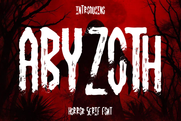
Abyzoth is a classic horror serif font featuring jagged terminals and a raw, aged texture. It pays homage to traditional horror movie titles while staying relevant in digital designs.
Ideal for:

Crimson Ritual is built for fear. Its tall, sharp characters with ritualistic visual cues make it ideal for content dealing with occult, gothic, or psychological horror.
Use it in:
Horror design has gone beyond entertainment—it now appears in beauty product packaging, apparel, lifestyle accessories, and even food branding.
Companies are tapping into horror design not just for Halloween but as a lifestyle aesthetic. Think coffin-shaped boxes, blood-red labels, and bone-inspired patterns.
Whether playful or macabre, horror visuals now serve to connect brands with a growing audience that embraces “dark aesthetics.”

The Night Lamp uses distorted shapes and uneasy curves to simulate the flickering of an old, haunted lantern. It’s perfect for creating suspense and supernatural ambiance.
Ideal for:
Horror design survives because it constantly evolves. It adapts to new technology, new mediums, and new generations—while always staying rooted in human psychology. Fear, tension, death, and the unknown are primal themes. The visual language of horror taps into that emotion through:
Whether you’re a designer working on a Halloween project, an indie filmmaker, a metal band, or a content creator, horror fonts and visual assets offer endless creative potential.
Thank you for taking the time to read this article. If you are looking for more great articles, feel free to visit Putracetol Blog
Additionally, if you want to explore some free typography options, you can check out Putracetol Studio on Dafont. Happy reading and designing!
