
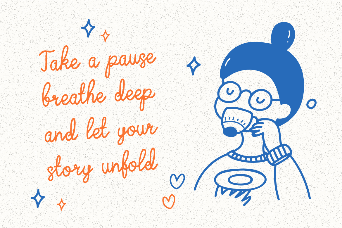
Cursive fonts have long been associated with elegance, artistry, and human touch. Their graceful, handwritten curves evoke a sense of warmth and sophistication, making them a favorite among designers in fashion, invitations, branding, and luxury packaging.
However, despite their beauty, cursive fonts can also be challenging. When overused or improperly applied, they can reduce readability and overwhelm a layout. The secret lies in understanding how to balance aesthetics with function.
This article explores five essential tips for using cursive fonts effectively in modern design, ensuring your work remains elegant, legible, and visually impactful. You’ll also find recommendations for high-quality cursive typefaces available at Putracetol.com, designed specifically for creative professionals.
One of the defining traits of cursive fonts is their organic connection between letters. Each stroke flows seamlessly into the next, creating rhythm and harmony. However, many designers make the mistake of manually adjusting kerning (the space between letters) to achieve tighter or looser spacing.
Doing so can break the natural rhythm of the script. Cursive fonts are meticulously designed so that letters align and connect at specific points. Adjusting spacing disrupts this connection, resulting in awkward overlaps or unnatural gaps.
💡 Pro Tip: Always trust the built-in spacing of the font. If adjustments are necessary, use them sparingly and consistently across the text.
For example, cursive fonts like Delicate Journal Trendy Script Font or Aureline Elegant Serif from Putracetol already have refined spacing and connections, eliminating the need for manual tweaks.
When used as intended, cursive typefaces maintain a fluid, calligraphic rhythm that adds timeless elegance to your design.
Cursive fonts naturally draw attention because of their ornamental forms. Yet this very quality can make them overwhelming when used alone. To create a balanced visual hierarchy, it’s best to pair cursive fonts with clean, bold typefaces, such as sans-serifs or geometric serifs.
The contrast between soft curves and structured lines gives your layout depth and clarity. For instance, use a cursive font for the headline or accent text, and pair it with a minimalist sans-serif like Helvetica or Montserrat for the body copy.
💡 Pro Tip: When pairing fonts, ensure they share a complementary tone, both should reflect the same personality, whether it’s modern, romantic, or vintage.
This balance prevents clutter and ensures the decorative nature of cursive type enhances the design instead of overpowering it.
While cursive fonts are beautiful, they are less readable in long-form content due to their intricate strokes. Using them for paragraphs or detailed product descriptions can quickly fatigue the reader.
Instead, use cursive type as an accent or highlight. Ideal applications include:
💡 Pro Tip: Keep cursive fonts above 18pt in size for digital use or 12pt and above in print to maintain readability.
For instance, the Delicate Journal Trendy Script Font works perfectly as an accent for a perfume label or wedding invitation, offering a soft, elegant touch without overwhelming the overall design.
One of the most common design mistakes is typing in ALL CAPS with cursive fonts. Since cursive letters are designed to connect smoothly, their uppercase forms tend to be decorative and complex. When grouped together, they lose readability and visual flow.
Instead, use title case or sentence case, where capital letters are used only at the beginning of a word or sentence. This preserves the graceful motion that defines cursive typefaces.
💡 Example:
✅ Elegant Script
❌ ELEGANT SCRIPT
A typeface like Signprint Bold Handwritten Font demonstrates this perfectly its flowing lowercase letters and delicate capitals create harmony when used naturally.
Cursive fonts are inherently expressive, but small adjustments can make them even more personalized and impactful.
Don’t hesitate to modify:
For instance, Handflair Signature Font offers stunning alternates that make each word look hand-signed perfect for personal branding or boutique businesses.
💡 Pro Tip: Always preview your font choices within the actual design context. A cursive font that looks elegant in isolation may appear heavy or illegible when combined with imagery or textures.
Cursive fonts work across many industries, especially when emotional connection and sophistication are key.
When thoughtfully used, cursive fonts transform ordinary compositions into memorable, emotionally resonant visuals.
For designers seeking premium-quality cursive typefaces, Putracetol.com offers a wide range of expressive and professionally crafted options.
Here are five standout cursive fonts that combine elegance, versatility, and readability:

Soft and organic, this font mimics authentic penmanship. Perfect for branding, greeting cards, or lifestyle blogs.
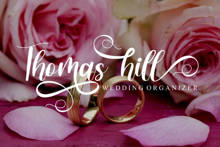
With sweeping curves and balanced rhythm, this script font brings elegance to packaging and wedding invitations.

Ideal for personal logos or luxury branding, it captures the sophistication of a handwritten signature.
Combines vintage charm with modern fluidity, perfect for magazine layouts and fashion lookbooks.

A versatile cursive font with refined details that adapt beautifully to editorial and promotional designs.
Even the most beautiful cursive fonts can lose their impact if misused. Here are key mistakes to steer clear of:
Keeping these principles in mind ensures your design remains polished, professional, and visually engaging.
Cursive fonts remain a timeless tool in design, capable of transforming ordinary visuals into expressive works of art. Their elegance lies not just in their appearance but in how thoughtfully they are used.
By allowing letters to flow naturally, pairing them with bold fonts, using them as accents, and customizing with subtle adjustments, designers can strike the perfect balance between beauty and clarity.
For inspiration, explore premium cursive fonts on Putracetol.com. Whether for branding, packaging, or personal projects, these typefaces offer the craftsmanship and emotion needed to create designs that feel elegant, modern, and unforgettable.
Thank you for taking the time to read this article. If you are looking for more great articles, feel free to visit Putracetol Blog
Additionally, if you want to explore some free typography options, you can check out Putracetol Studio on Dafont. Happy reading and designing!
