
A logo is more than a symbol, it’s the visual voice of a brand. It represents personality, values, and professionalism in a single glance. While colors and icons often capture attention first, typography plays an equally important role in shaping how audiences perceive a brand. That’s why choosing corporate fonts for logos has become a strategic decision rather than a purely aesthetic one.
Corporate fonts help companies communicate stability, confidence, and clarity. They’re clean, versatile, and intentional, making them a perfect fit for businesses that want to maintain credibility and consistency across all branding assets. This article explores why corporate fonts matter, the key factors to consider when selecting them, and how fonts from Putracetol.com can elevate your brand identity.
Corporate fonts aren’t just stylish design elements they’re essential components of brand communication. The right typeface helps shape how audiences interpret a company’s character and professionalism.
Corporate fonts project authority and reliability. They give logos a polished look that reassures customers they’re dealing with an established and trustworthy organization. Whether you’re designing for finance, technology, health care, or education, a refined font lays the foundation for brand credibility.
Typography influences everything from business cards to websites. When a company uses one consistent font family, its brand identity becomes immediately recognizable. This consistency strengthens the visual system and reinforces brand memory.
Corporate fonts are designed with clarity in mind. Their clean shapes, balanced proportions, and thoughtful spacing ensure that the logo remains readable across various sizes from small app icons to large signage.
Choosing the right font helps your brand stand out. While many companies rely on traditional typefaces, selecting a unique, well-crafted corporate font ensures your logo looks distinct and intentional. A strong typographic identity is a competitive advantage.
Not all fonts suit every brand. Selecting the perfect typeface requires understanding the company’s strategy, tone, and industry landscape.
Each industry carries its own design language.
Matching the font style to industry expectations helps the logo fit naturally into its competitive environment.
Logos appear in many different sizes and media formats. Choose a font with clear letterforms and balanced spacing to maintain legibility across:
Readability ensures your brand remains recognizable everywhere.
A corporate font should adapt easily to both printed and digital materials. This includes marketing collateral, presentations, emails, and advertising. Consistency across platforms strengthens brand alignment and prevents fragmentation.
Your typography should match your brand’s personality.
Is the brand:
The tone should guide your font selection. For example, Old Rocket suits nostalgic creative brands, while Rust Barrel communicates industrial strength and trustworthiness.
Putracetol.com provides a wide selection of professional typefaces ideal for building strong corporate identities. Here are curated examples that work well for logo design:

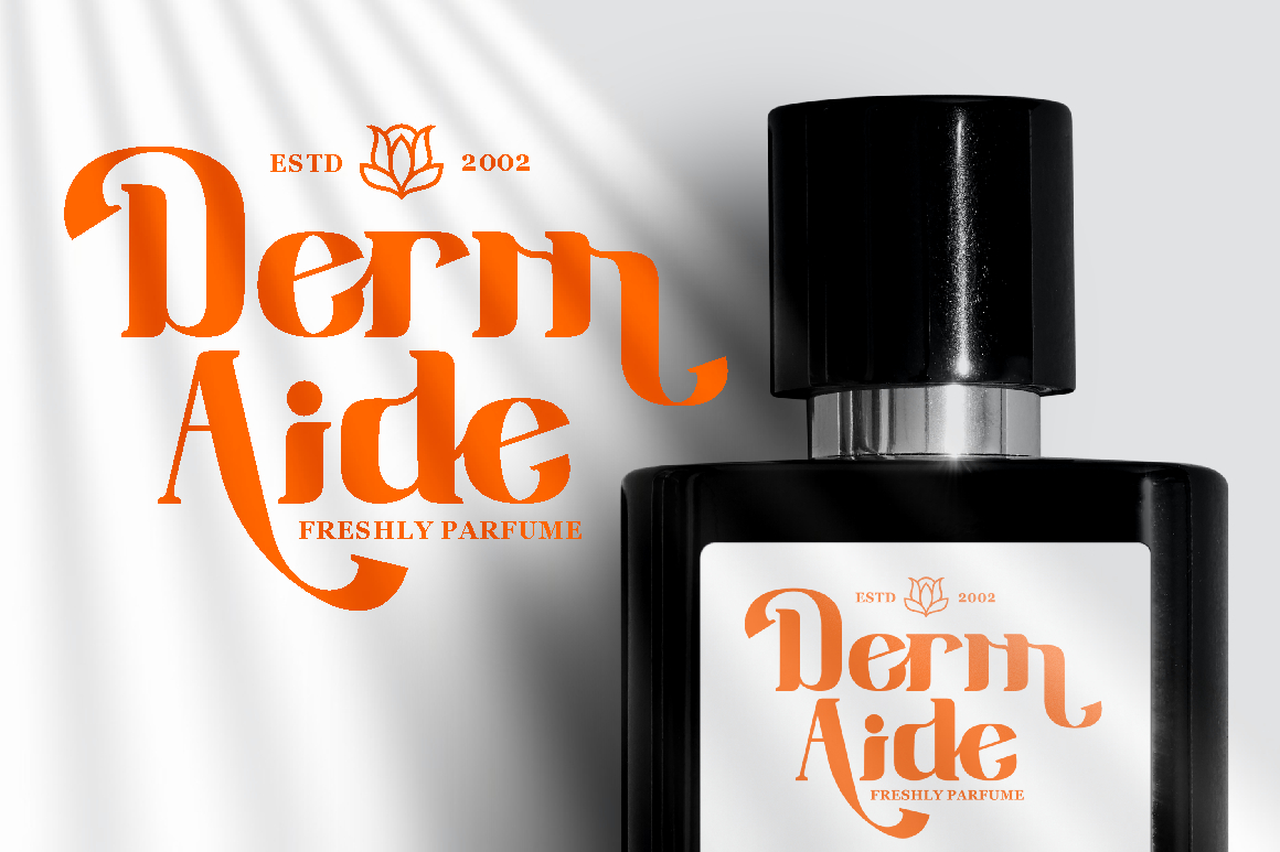
A refined and modern duo font that suits premium companies, luxury services, fashion brands, and high-end corporate identities. Its sleek lines and elegant structure make logos look polished and authoritative.
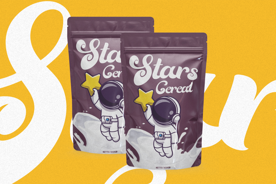
Old Rocket blends nostalgia with a modern twist. It’s perfect for companies that want a touch of vintage character without sacrificing professionalism. Its bold shapes make it quite versatile.
Sixty Niners offers a clean, retro-inspired look with a professional undertone. It’s ideal for brands wanting to express heritage combined with contemporary style.
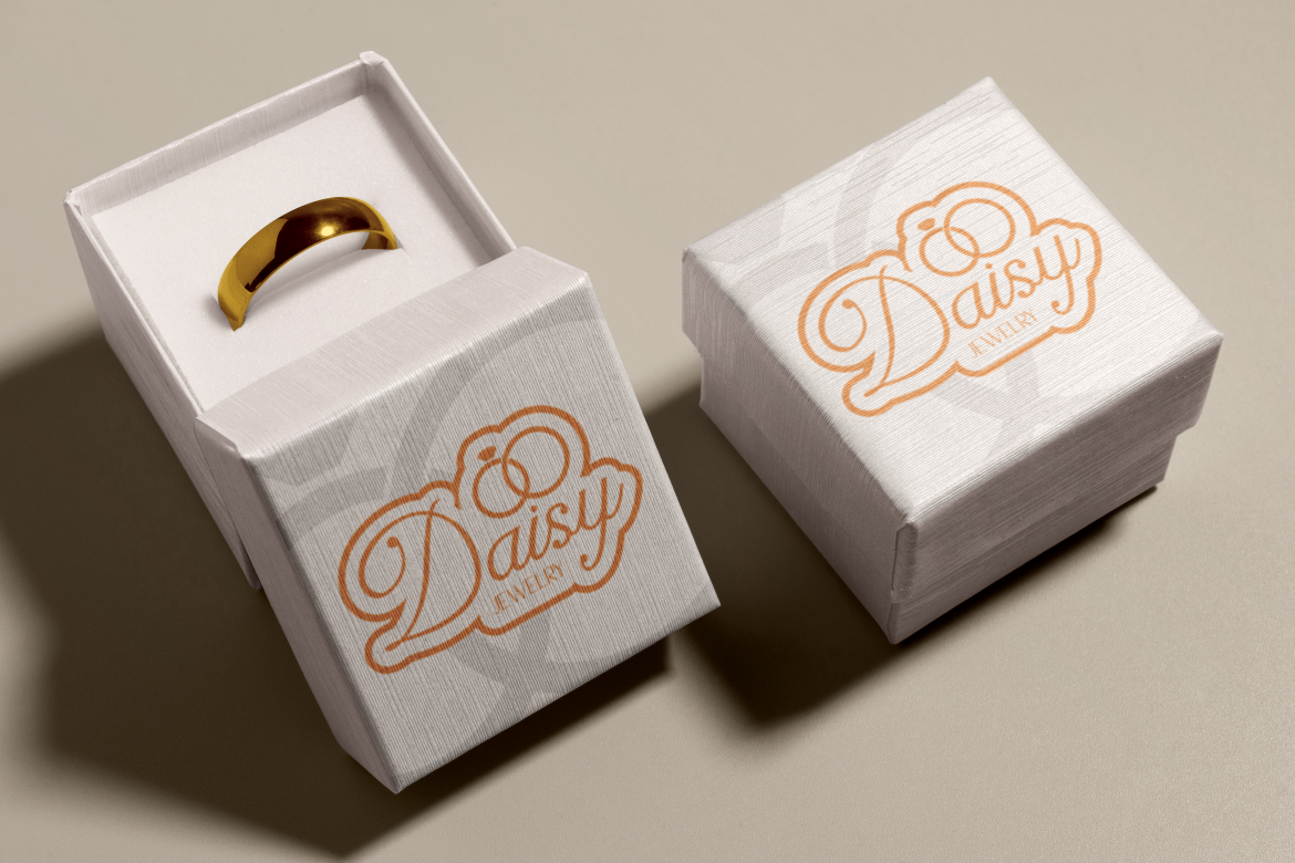
This typeface pairs modern elegance with a subtle retro vibe. It suits lifestyle brands, creative agencies, and corporate teams that want a more expressive, but still professional logo style.
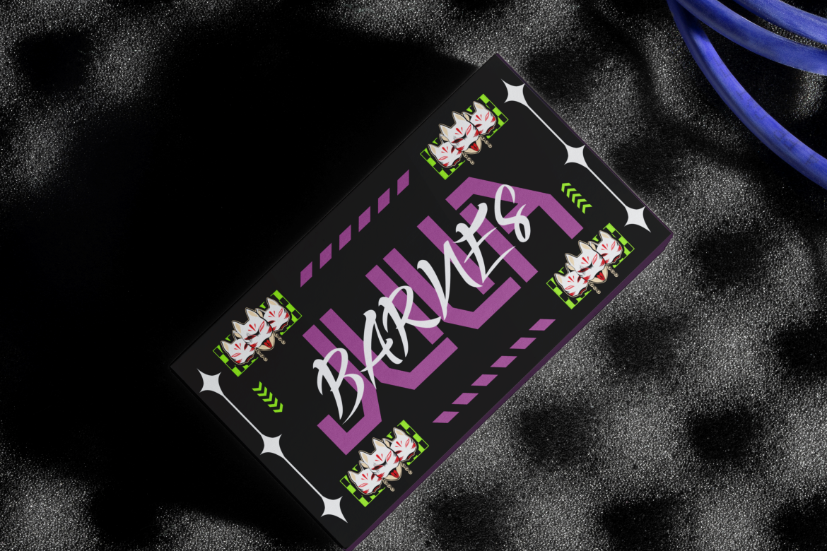
For innovative and forward-thinking brands, Nebula Avenue has the perfect futuristic feel. It works well for technology companies, software developers, and digital startups seeking a standout identity.
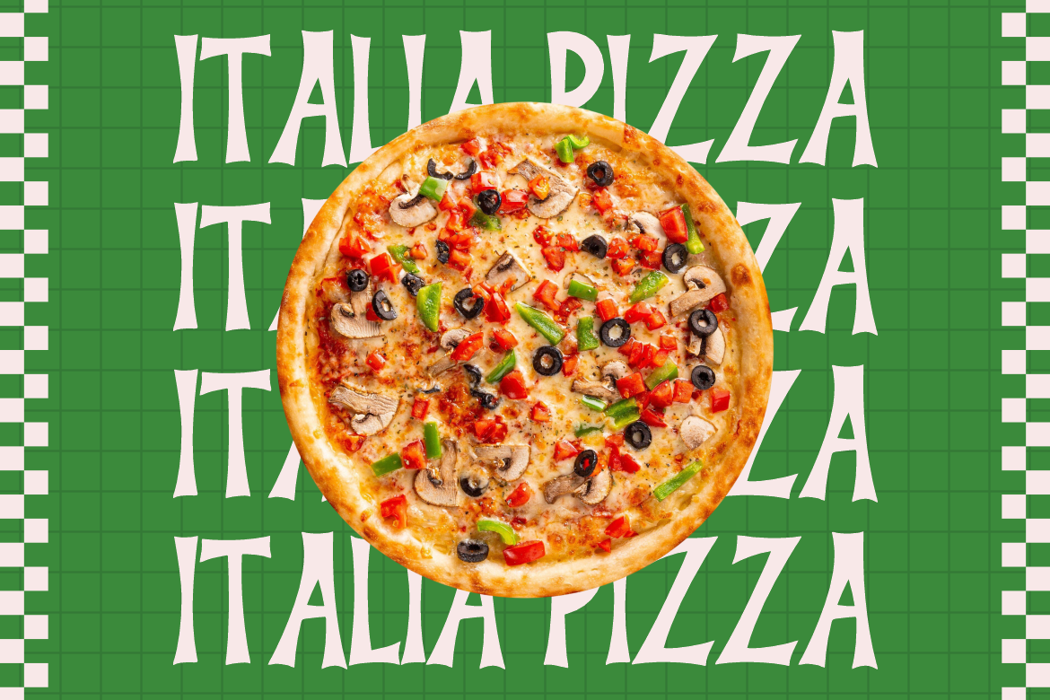
Even playful fonts can be used professionally when aligned with the right industry. Pizzalia is perfect for food-related businesses, hospitality brands, and casual restaurants looking to add personality to their logo.
Rust Barrel offers bold, solid letterforms ideal for heavy industries, construction companies, manufacturing brands, or any business that wants to communicate security and durability.
Typography is one of the most important elements of corporate identity. It shapes how people perceive your messaging even before they read the words. Corporate fonts help define:
A bold slab serif tells a different story from a soft, elegant script. The typeface you choose sets the emotional tone for your brand.
Fonts with clean geometry and organized spacing help reinforce a company’s professionalism.
When the same typeface is used across all brand assets, it creates a unified and memorable experience.
Corporate fonts allow businesses to stand out, especially when paired with strategic colors and logos.
Whether you’re working with Final Parade for elegance or Nebula Avenue for innovation, typography reinforces the brand story.
Selecting the right corporate font requires intention. Here are practical tips to ensure your choice strengthens the brand:
Clean and simple fonts make logos more versatile and timeless. Avoid overly complex typefaces.
Check how the logo performs at both large and small scale. Ensure legibility remains strong.
If the logo uses more than one font, ensure they complement each other in tone and visual structure.
Use your chosen corporate font throughout all brand materials for a unified identity.
Pick a font that will still feel relevant as the company expands into new markets.
Corporate fonts play a central role in crafting logos that are professional, consistent, and aligned with brand identity. The right typography shapes how audiences perceive a brand’s credibility, character, and values. By choosing fonts that match industry tone, support readability, and reinforce a unified brand voice, companies can build stronger and more memorable identities.
With curated options from Putracetol.com including Final Parade, Old Rocket, Sixty Niners, Greatness Culture, Nebula Avenue, and Rust Barrel businesses have access to premium typefaces that elevate visual communication and set their logos apart.
Explore the full collection and elevate your brand identity at Putracetol.com.
Thank you for taking the time to read this article. If you are looking for more great articles, feel free to visit Putracetol Blog
Additionally, if you want to explore some free typography options, you can check out Putracetol Studio on Dafont. Happy reading and designing!
