Color is one of the most powerful elements in visual communication. When used thoughtfully, it can evoke emotion, guide attention, and create lasting impressions. Among the many concepts in color theory, complementary colors stand out for their dynamic and visually striking impact.
Complementary color schemes are built on the idea that opposites on the color wheel attract—and amplify. This concept isn’t new. In fact, it dates back to Sir Isaac Newton’s 18th-century experiments with light and color. Today, it’s a foundational principle in graphic design, branding, fashion, interior decoration, and more.
In this article, we’ll explore what complementary colors are, how they function, their strengths, and best practices for using them in design.
Complementary colors are pairs of hues that sit directly opposite each other on the traditional color wheel. When placed side by side, they create high contrast and maximum visual interest. When blended, they neutralize each other into greys or browns—another key feature.
Each pair includes a primary color and its direct opposite, combining warm and cool tones to generate tension and excitement.
Complementary colors offer the strongest contrast available in any color pairing. This makes them excellent for grabbing attention and emphasizing key elements.
The contrast between complementary hues can evoke dynamic energy and emotion. Blue and orange, for instance, often create a bold and modern vibe, while purple and yellow feel vibrant and regal.
When used properly, complementary colors create visual equilibrium—balancing warm with cool, dark with light, and excitement with calm.
This color strategy works across various design disciplines—from digital user interfaces and branding to packaging and fashion.
Complementary pairs are excellent for posters, banners, and logos. They help create focal points that stand out without requiring complicated layouts.
Example: Use orange CTA buttons on a blue website background to increase clicks.
Contrasting buttons, icons, or navigation elements improve visibility and guide user flow.
Tip: Don’t use full saturation for both colors—tone down one to avoid eye strain.
Stylists and fashion designers use complementary color blocking to build visually interesting outfits.
Red shoes with a green dress? Bold—yet balanced when styled right.
Complementary schemes are used to make rooms feel lively or luxurious. A soft blue wall with burnt orange cushions, for example, brings harmony and contrast to modern spaces.
Pick one color as your main palette driver and use its complement as an accent. This ensures harmony and avoids overstimulation.
Fully saturated complementary colors can be overpowering. Use tints, shades, or tones to soften one or both colors.
Use a 70/30 or 80/20 ratio when combining complementary pairs. Too much balance may feel like a clash—dominance brings structure.
Ensure color combinations meet contrast ratio guidelines for text readability, especially in digital design.
Typography plays a crucial role in reinforcing a complementary palette. A clean or expressive font can either balance or intensify contrast in a layout.
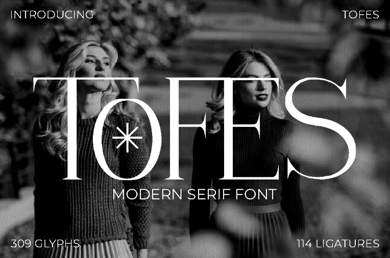
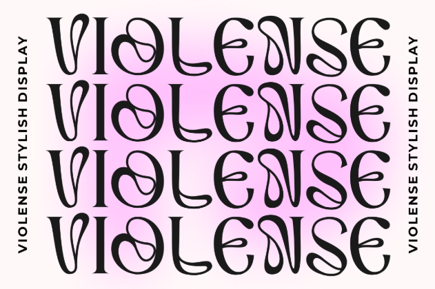
Here are a few fonts from PutraCetol Studio that pair beautifully with bold color palettes:

Use this high-drama font in bold red against a green backdrop for scary movie titles, gaming posters, or Halloween invites.

Its minimal structure complements blue-orange color schemes in web design and modern branding.

Ideal for fashion brands using complementary pairings like purple and yellow—elegant yet edgy.

Great for expressive layouts where contrast and texture meet, like posters using red and green for maximum impact.
Blue and orange dominate the fast-food brand’s visual identity, signaling both trust and appetite stimulation.
Notice the green suit and red lips—a powerful red-green contrast that reflects chaos and tension.
Designers like Versace and Moschino regularly use yellow and purple or orange and blue in high-fashion statements.
While complementary schemes can be striking, overusing both colors at full intensity can cause discomfort or create a jarring look.
Use these schemes:
Complementary colors are proof that opposites attract—and they work beautifully in design when handled with intention. From vintage posters to modern mobile apps, this timeless color theory concept continues to drive engagement, contrast, and visual appeal.
By combining this knowledge with strategic layout and the right typefaces, you can create powerful compositions that leave lasting impressions.
So the next time you’re stuck on a palette, head back to the basics: find your dominant hue, identify its complement, and start designing bold, balanced visuals that stand out.
Thank you for taking the time to read this article. If you are looking for more great articles, feel free to visit Putracetol Blog
Additionally, if you want to explore some free typography options, you can check out Putracetol Studio on Dafont. Happy reading and designing!