
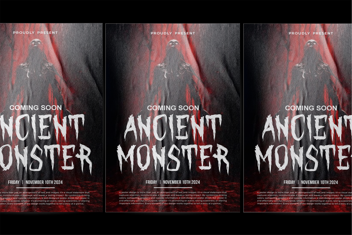
When Halloween draws near or you’re planning any horror-themed design, choosing the best horror fonts from PutraCetol Studio can instantly transform your work into a chilling masterpiece. From distorted script and dripping letters to jagged serifs and cobweb-covered displays, each of the thirteen fonts in this collection brings a unique flavor of the macabre. Perfect for movie posters, haunted house promos, party invites, or eerie branding, these fonts deliver atmosphere at first glance. But while the bold choices shine, some can be tricky to use in longer text or mixed layouts. Here’s an in-depth look at each font’s strengths and limitations, and why they made the cut.

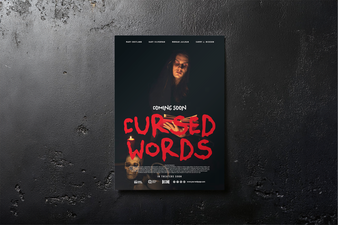
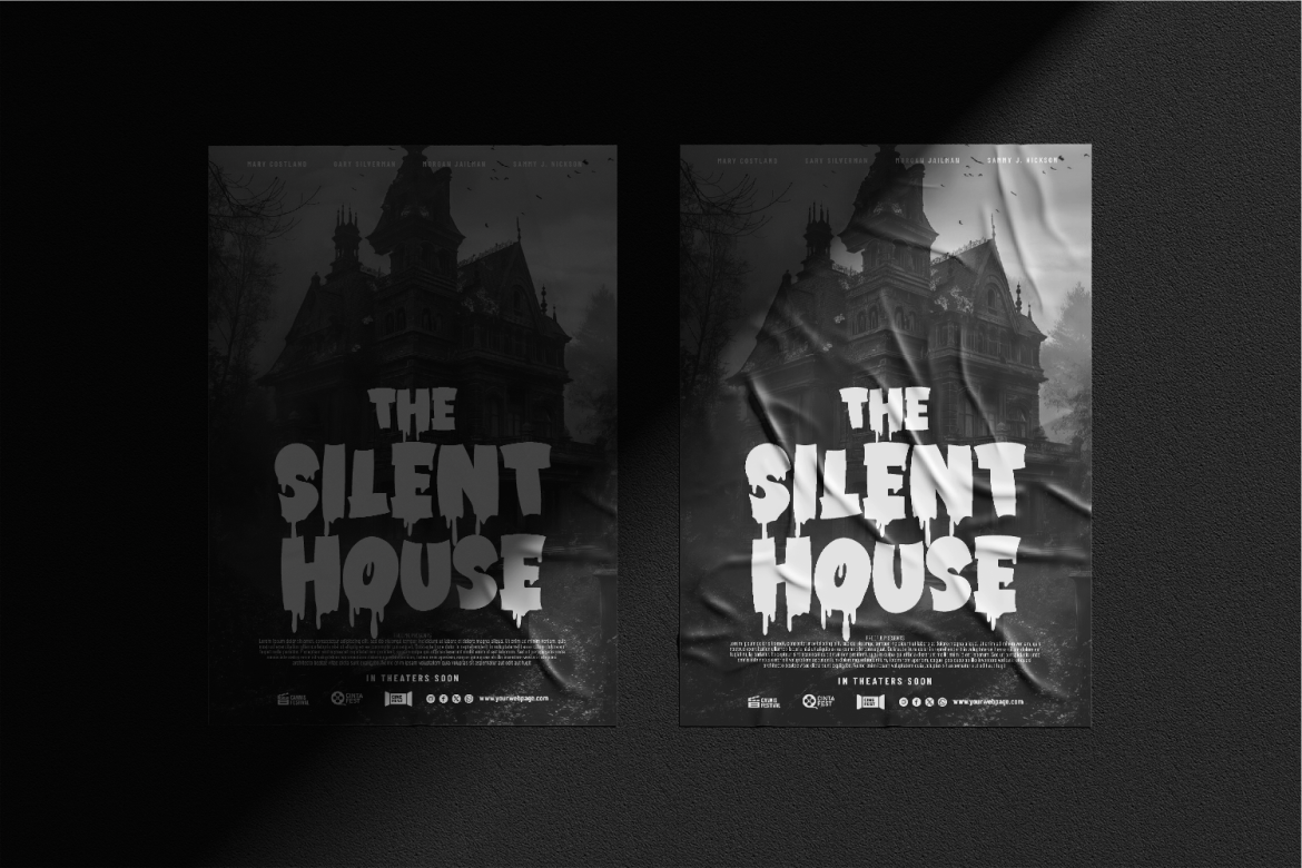
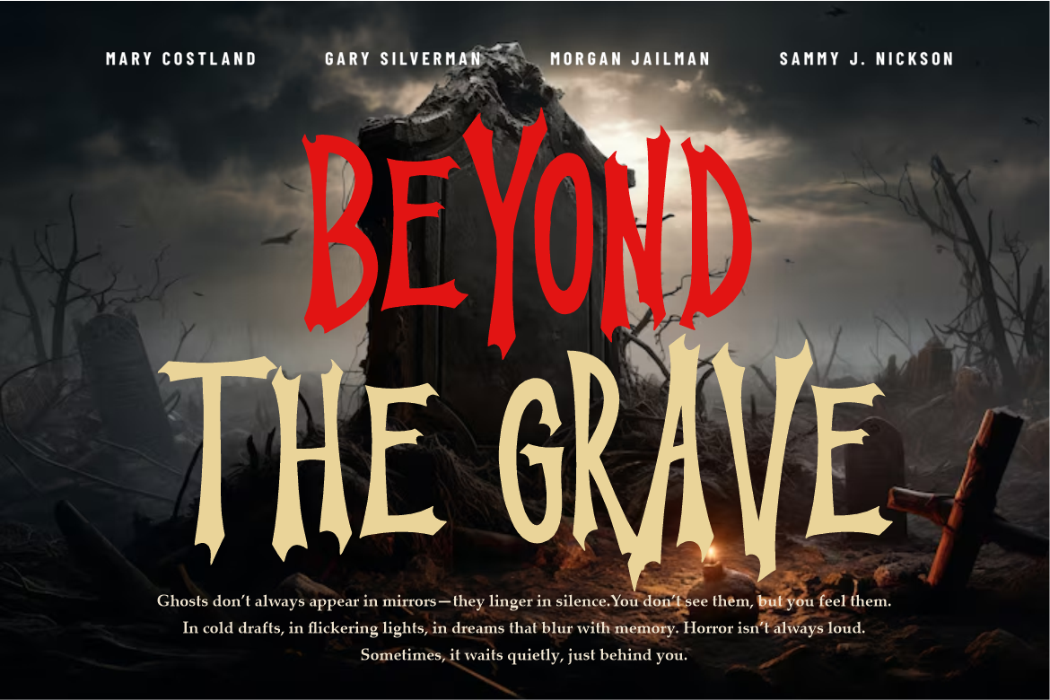
Crimson Horror sets the tone with sharp serifs and blood-drip effects, ideal for dark posters and spine-tingling titles. Its dripping details amp up the shock value, but don’t use it for body text, as small sizes make the effects less legible.
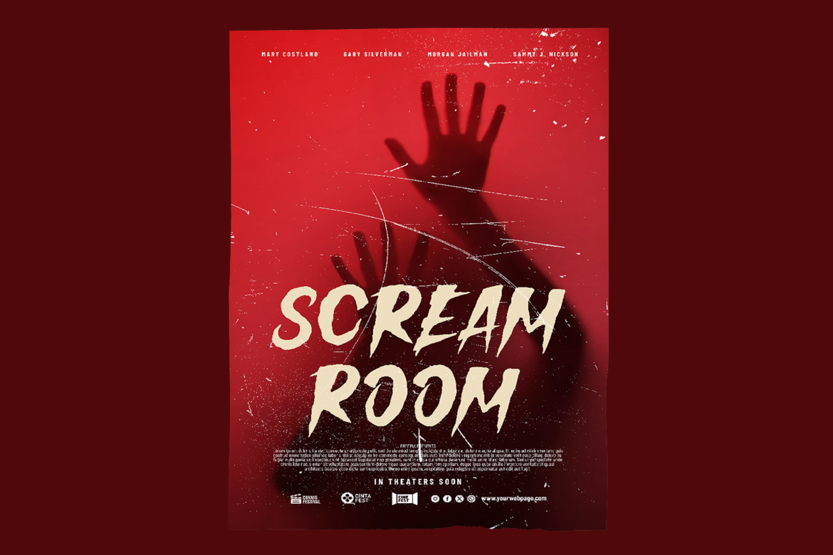
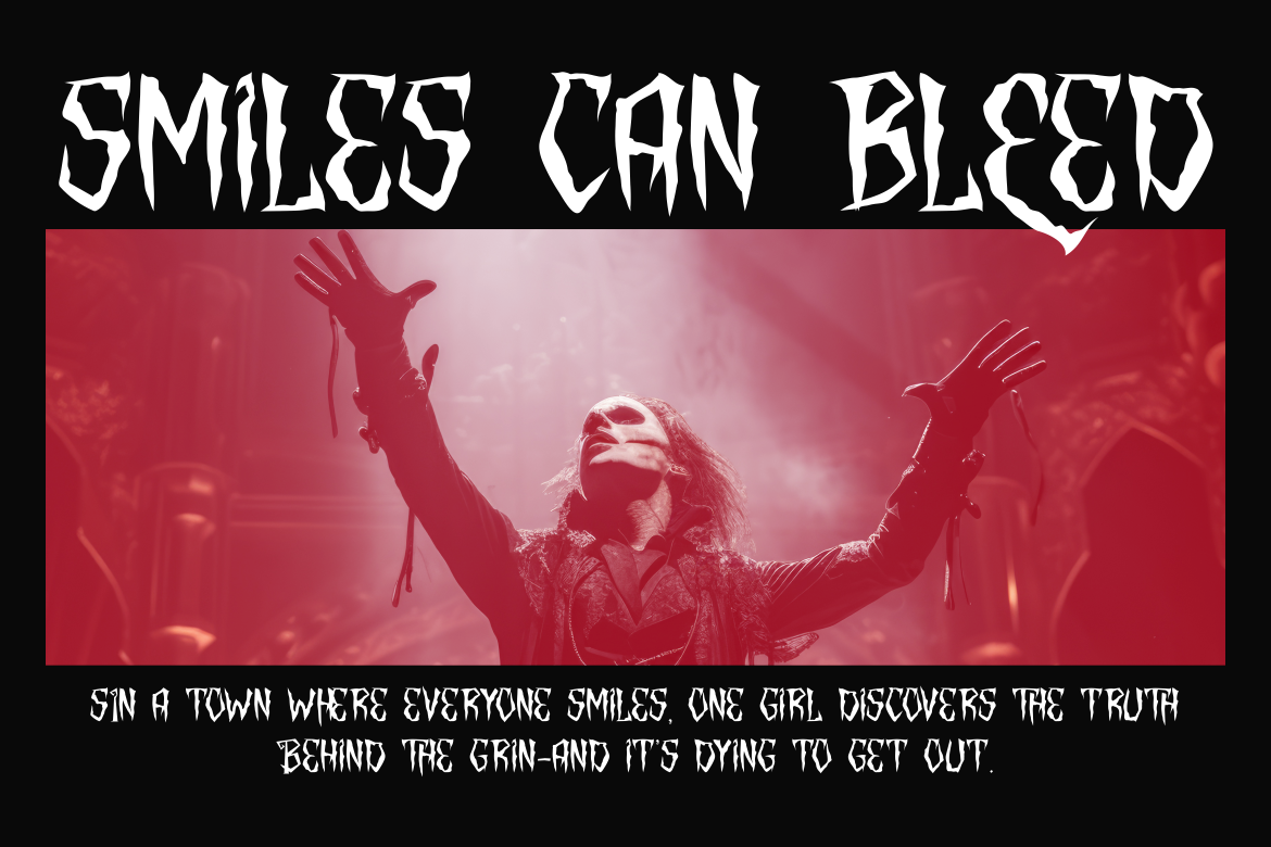
Spooky Scribble mimics frantic handwriting in fear-filled notes or quick-scribbled warnings. It’s great for layered collage-style designs. However, its uneven lines can look rough if not balanced with simpler fonts.
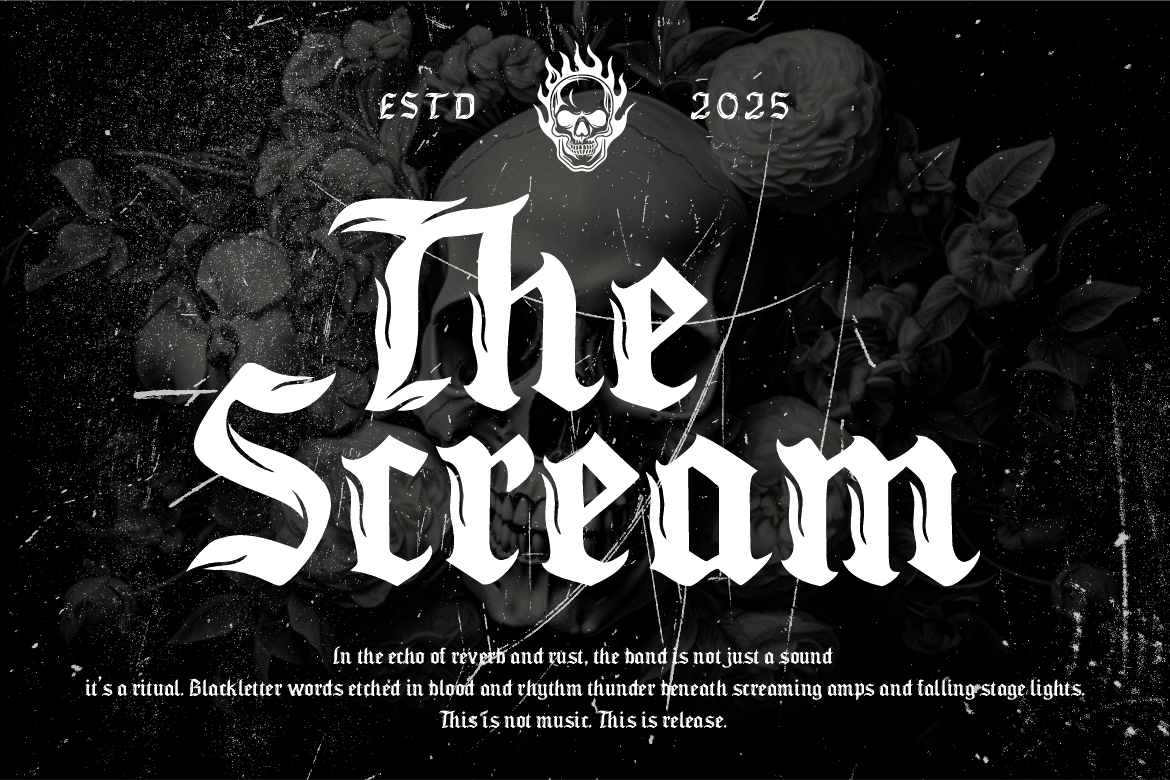
Vulture Kingdom is a hardcore blackletter font dripping with gothic intensity. It works amazing for medieval horror themes, but its ornate style can feel heavy and overly dense in modern layouts.
Rattle Dread has edgy, graffiti-influenced shapes, ideal for underground horror or urban legends. The strong linear strokes stand out, but the effect may feel out of place in classic spooky designs.
Danger Burnout evokes flickering marquee lights, perfect for retro horror movie posters. The contrast is thrilling, though the distressed texture sometimes distracts in smaller sizes.

Spooky Street blends urban decay with horror edge. It pops in event branding for haunted attractions. But when layering with busy images, it may need backing or outlines to stay readable.
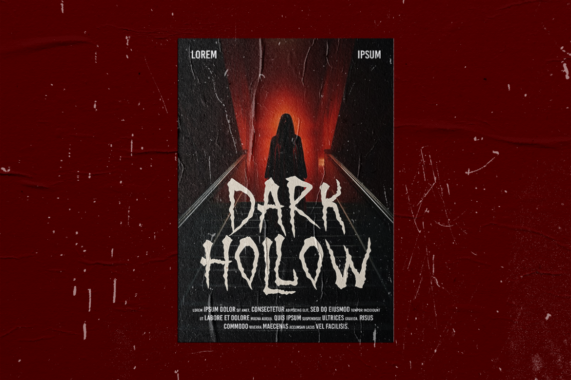
Mooneth Ghost uses a floating, foggy lettering style, great for ghost stories and night scenes. It sets a spooky mood, but may lack impact in bright or daylight-inspired layouts.
Crypt Horror channels tombstone inscriptions with carved, cracked letters. It conveys ancient dread strongly, though its narrow features might vanish in tiny sizes or light backgrounds.
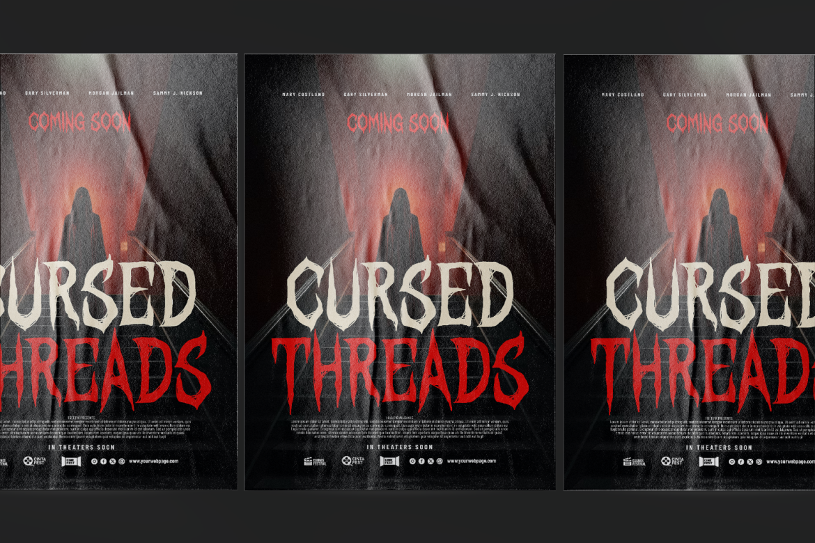
Darkest Curse offers jagged, fractured strokes perfect for psychological horror themes. It’s visually tense but can feel too chaotic if paired with other overly complex visuals.
Rotten Valley mixes moldy, broken textures for a decaying aesthetic. It works well on horror event flyers. However, its heavy texture may blur on print if unrefined.
Crimson Ritual channels handwritten occult symbolism with dripping pen strokes. It’s atmospheric and chilling, but its complexity can disrupt hierarchy when used with simpler callouts.
Halloween Bones turns letters into skeletal shapes, playful yet spooky. Ideal for family-friendly Halloween themes, but the cartoonish style may not suit serious horror.
Midnight Spider drips spiders and webs from each character, creating instant Halloween mood. It’s visually memorable, but could negatively impact readability in tight layouts.
The best horror fonts from PutraCetol Studio are selected for their strong visual impact and chilling character. But the right choice depends on your project. If you’re designing a haunted house flyer, Spider or Scribble bring that spooky energy. Want a movie poster? Choose Crimson Horror or Danger Burnout for instant horror vibes. For child-friendly Halloween decor, Halloween Bones sets a fun tone without frightening content. And if you’re aiming for gothic or medieval atmosphere, Vulture Kingdom or Crypt Horror bring the drama.
To ensure readability and hierarchy, pair these bold fonts with clean, neutral options for body text. Use size contrast, color blocking, or outlines to help readability. In digital projects, try them as headline or title fonts with simpler fonts for descriptions. In print, ensure there’s enough contrast in color and spacing.
Interestingly, many of these fonts embrace a horror-vacui feel, dripping, intricate, unraveling in every stroke. They fill the space with visual detail, grabbing attention instantly. But when overused, they lose impact. That’s why restraint matters. Let each font shine in headings or logos rather than overloading entire pages. Paired with clean layout, they maintain both impact and clarity.
Thank you for taking the time to read this article. If you are looking for more great articles, feel free to visit Putracetol Blog
Additionally, if you want to explore some free typography options, you can check out Putracetol Studio on Dafont. Happy reading and designing!
