
In 2025, website design is no longer just about colors, layouts, and images, it’s about the typography that holds it all together. The best fonts for effective and engaging website design strike a delicate balance between aesthetics and functionality. They guide the eye, enhance readability, and embody the brand’s personality. With more users accessing websites from different devices and screen sizes, font selection has become a critical step in ensuring accessibility and a seamless user experience.
This guide explores not just what makes a font great for web use, but how to choose styles that complement each other while staying true to the brand voice. To make this actionable, we’ll explore specific font styles from Putracetol.com and discuss their strengths and limitations in website design.
A good website font should be easy to read on any screen, from a smartphone to a widescreen monitor. Fonts with clean lines and minimal ornamentation ensure visitors can absorb information quickly without distraction. Using more than three different font styles in a single layout can cause visual clutter, so limiting choices maintains harmony and focus.

For this purpose, Condestro Bold Condensed works exceptionally well for headlines. Its compact yet bold structure makes it perfect for space-saving layouts, though its condensed form means it should be balanced with a lighter body font for readability in longer text.
Websites targeting creative industries, children’s products, or lifestyle brands can benefit from playful fonts with dynamic baselines. These inject a sense of movement and personality into the design, making content feel approachable and fun.
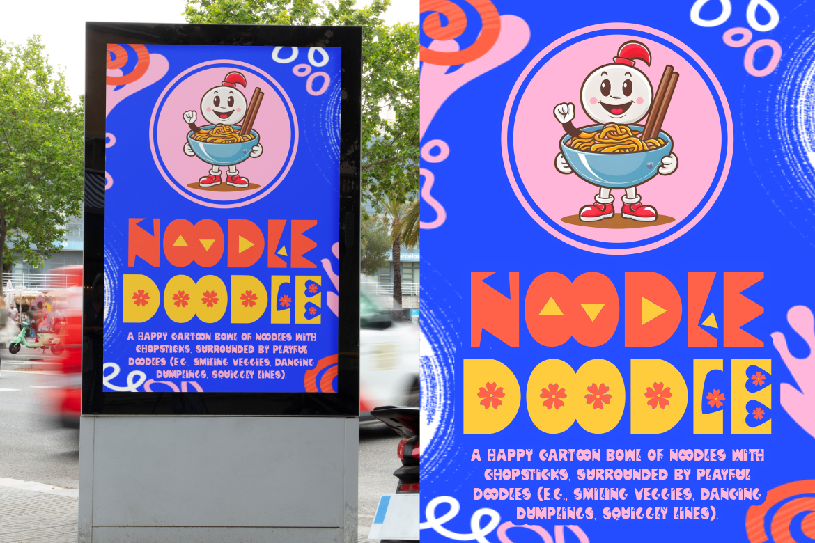
Flumbo Quirky is a prime example. Its whimsical letterforms are attention-grabbing and memorable, perfect for banners or promotional headlines. However, its irregular shapes can make long paragraphs harder to read, so it works best in small doses.
For industries like sports, automotive, or tech, bold lines and strong uppercase characters project confidence and authority. These fonts are ideal for primary headlines, call-to-action banners, or hero sections that need immediate impact.
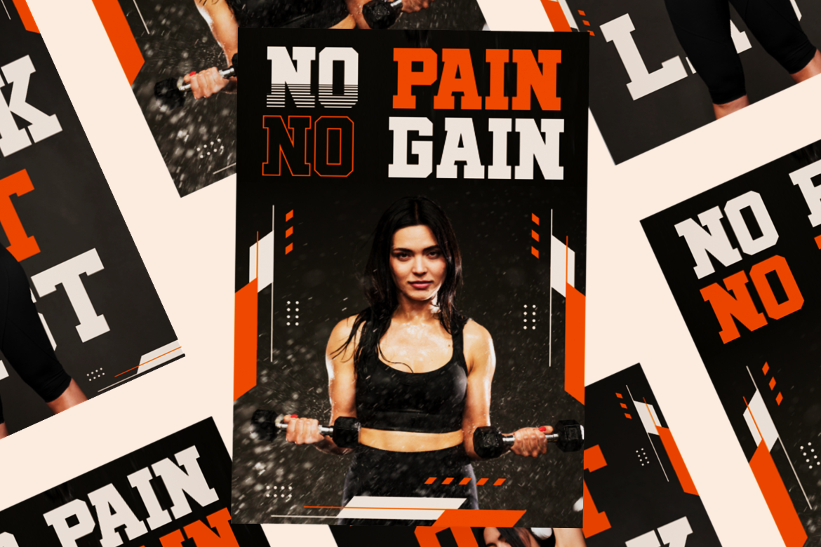
Blaze Knock delivers that energy with its solid build and sharp edges, making it excellent for drawing attention. The trade-off is that it may feel too aggressive for softer brands, so pairing it with a rounded sans serif can soften the tone.
Fashion brands, luxury services, and high-end creative portfolios often require typefaces that embody refinement. Fonts with elongated axes and stylish proportions can convey elegance without compromising legibility.
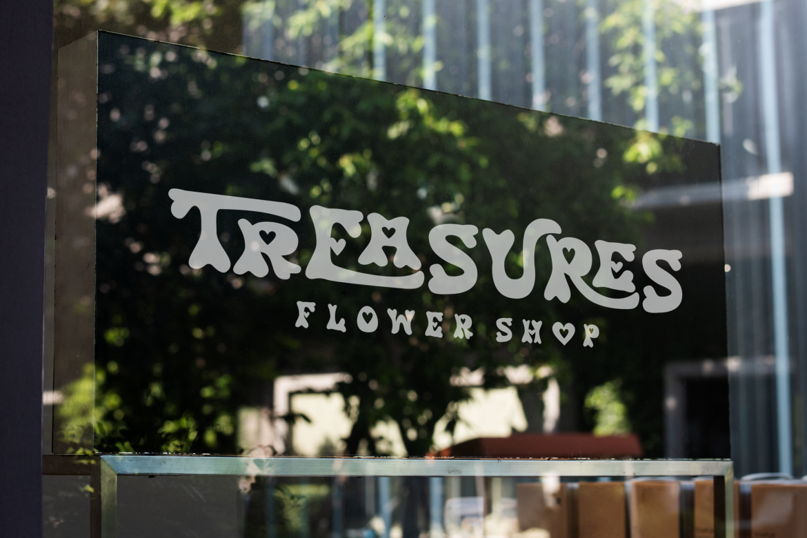
Retro Romance offers just that, a modern retro twist that feels sophisticated yet approachable. Its limitation lies in its stylized letterforms, which should be paired with a clean sans serif for content-heavy sections.
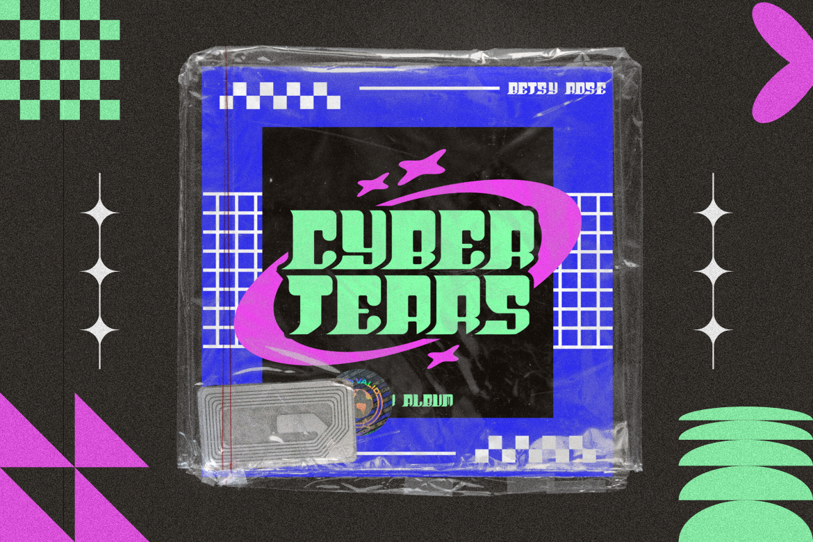
Adding subtle shadow effects to letterforms can create depth and evoke moods like a tropical sunset or vintage poster design. These work well in hero banners, special promotions, or seasonal campaign pages.
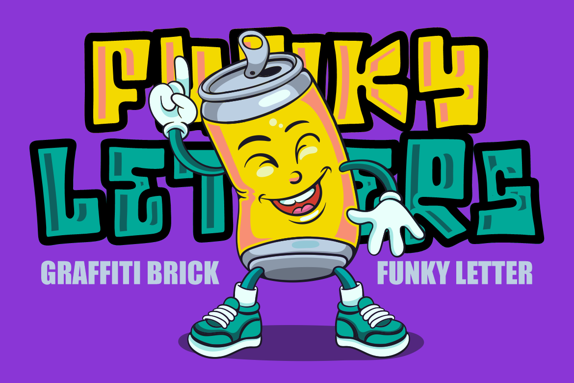
Graffiti Brick combines clear letterforms with a playful, layered texture that feels vibrant and energetic. It’s a great choice for youth-oriented campaigns, though its decorative style means it’s best reserved for display use.
The art of combining fonts lies in balancing contrast with harmony. Pairing an elegant font like Ancient Legend with a decorative option such as Smoky Glare can create a dynamic yet cohesive feel. This approach works well for storytelling websites, brand campaigns, or online magazines where visual variety keeps readers engaged.

The key is to ensure that while fonts may contrast in style, they complement each other in tone, maintaining brand consistency.
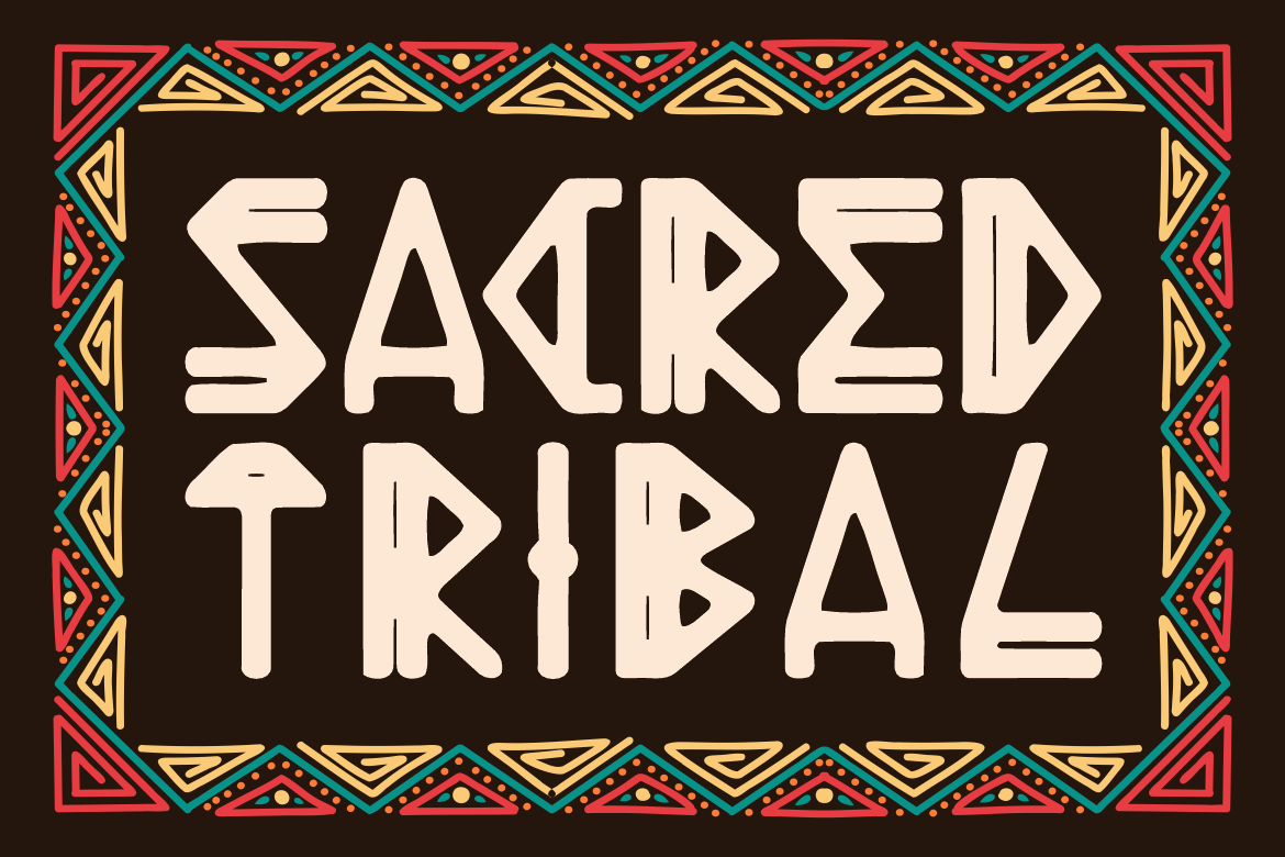
Decorative fonts add character but can quickly overwhelm a design if overused. They are most effective in specific, high-impact areas such as logos, section headers, or promotional banners, where they can shine without compromising readability.

For instance, Armor Legion offers a bold, medieval-inspired aesthetic that can elevate a gaming site’s branding. However, for main content, a simpler sans serif is essential to maintain clarity.
Fonts are more than just design elements, they are brand messengers. A law firm using Tegno might communicate innovation and modernity, while a travel blog using Toasty Curve could evoke warmth and friendliness.
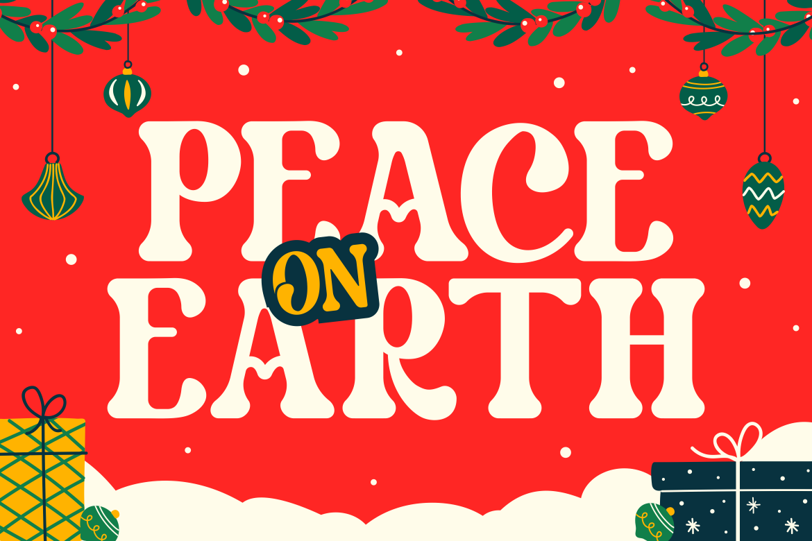
By aligning font choice with brand personality, designers ensure that every visitor subconsciously receives the right message before reading a single word.
Selecting the best fonts for effective and engaging website design isn’t complete without testing. Fonts should be evaluated for readability on different devices, load speed impact (especially if custom web fonts are used), and color contrast compliance for accessibility.

Platforms can experiment with pairing a clean body font like Kids Sketch with bold headlines to ensure both clarity and visual interest. Testing with real users ensures that font choices enhance rather than hinder user experience.
In website design, fonts are strategic assets. The best fonts for effective and engaging website design combine clarity, aesthetic appeal, and brand alignment. Whether playful, bold, elegant, or decorative, each font must serve a purpose in the overall layout. By carefully selecting and pairing styles from resources like Putracetol.com, designers can craft web experiences that are memorable, accessible, and visually compelling.
Thank you for taking the time to read this article. If you are looking for more great articles, feel free to visit Putracetol Blog
Additionally, if you want to explore some free typography options, you can check out Putracetol Studio on Dafont. Happy reading and designing!
