
First impressions count and in the world of publishing, a book cover is your most powerful marketing tool. Whether displayed on a bookstore shelf or a digital marketplace, a well-designed cover grabs attention and communicates genre, tone, and quality in seconds. At the heart of any good cover is typography. Choosing the best fonts for book covers means balancing visual impact with legibility, genre expectations, and design harmony.
With so many options available, it can be overwhelming to choose the right font. To help, we’ve curated 11 of the best fonts for book covers available on Putracetol Studio. Each one fits different genres and moods, offering authors and designers clear direction and creative flexibility.
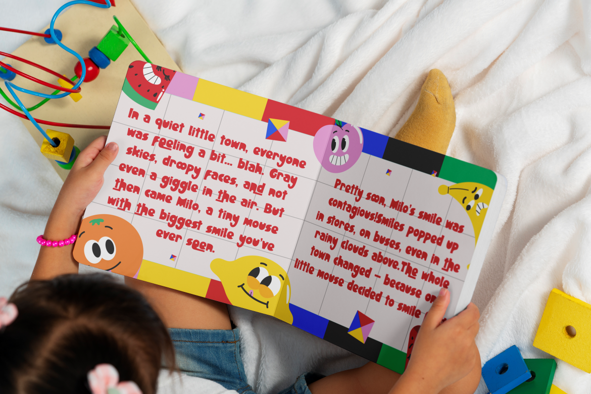
Books aimed at younger readers require fonts that feel approachable, fun, and relatable. Fun Art Friends is a perfect match for this audience. Its playful handwritten style gives off warmth and energy, making it ideal for picture books, early readers, or activity titles.

Its strength lies in its natural, unpolished flow, which evokes authenticity. However, that same irregularity may limit its use on more formal or clean-themed covers. Still, for family-friendly or creative nonfiction, this font brings personality without trying too hard.
For romance, poetry, or lifestyle memoirs, Final Parade offers a refined font duo that balances modern sans serif with elegant script. The combination is stylish and versatile, great for balancing an author’s name with a bold book title.
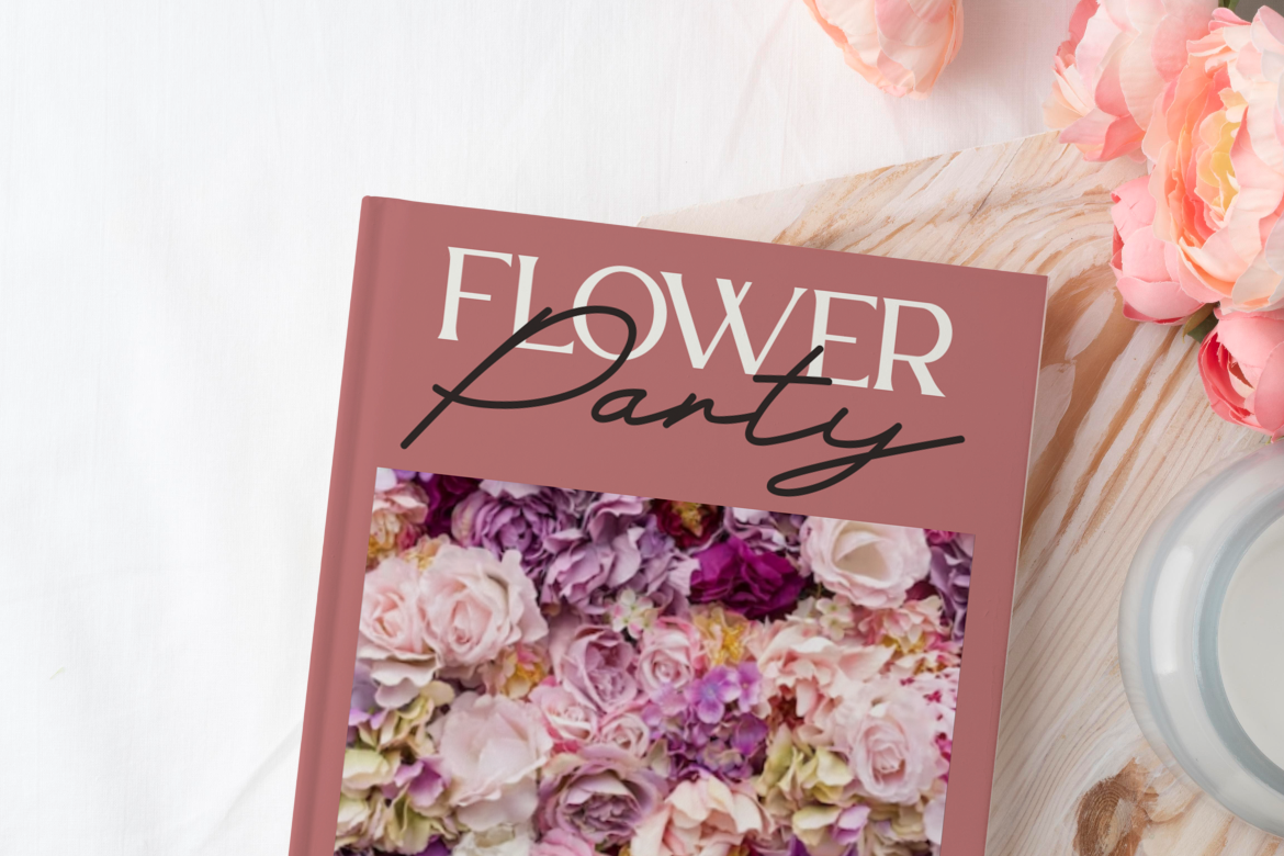
This font duo is especially useful in genres that require a touch of sophistication think romance novels, fashion anthologies, or high-end cookbooks. Its primary limitation is that its delicacy requires spacious layouts to avoid looking cramped. Use it when elegance is essential and subtlety is welcome.
When designing literary fiction or dramatic narratives, Evoke Italic stands out for its sleek, slanted serifs and timeless feel. It communicates emotion and movement, which works wonderfully for introspective novels or period pieces.
Its italic nature makes it less suitable for blocky, bold cover concepts, but when paired correctly, it can elevate a book’s sense of artistry. It’s one of the best fonts for book covers in literary categories where tone matters more than shock value.
Some book covers need to shout and Mega Boldy is made to do just that. With thick strokes and rounded edges, it’s ideal for self-help, business, or motivational books where grabbing attention is everything.
This font excels in standing out in thumbnails and on shelves. However, its boldness can overpower more delicate elements like subtitles or background art. The key is to use it selectively and pair it with neutral accents to maintain balance.
For horror, punk, or urban genres, Spooky Punk delivers raw energy. Its sharp angles and distressed texture make it an excellent option for covers that need edge, rebellion, or mystery.

Its strongest use case is within alternative or dark genre fiction. That said, it’s less legible in small sizes or when used in dense title layouts. Choose this font when the vibe is more important than polish and when making a bold statement is part of the plan.
If your cover screams horror or dark fantasy, Shaky Halloween is a font that literally shakes with dread. Its jagged, irregular strokes resemble scratched walls or handwritten warnings, ideal for thriller titles or Halloween-themed anthologies.
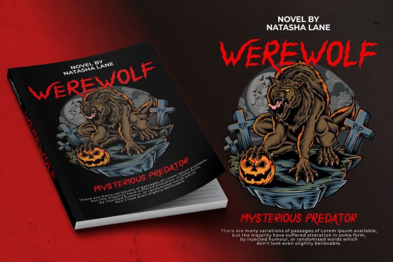
While effective in genre-specific designs, its usability outside horror is limited. Still, when paired with grunge textures and dramatic imagery, it completes the eerie aesthetic perfectly.
Historical novels, dark fantasy, and epic sagas benefit from blackletter fonts like Black Eoghan. It brings gravitas, history, and ornate detail ideal for fantasy maps, gothic covers, or ancient-themed manuscripts.
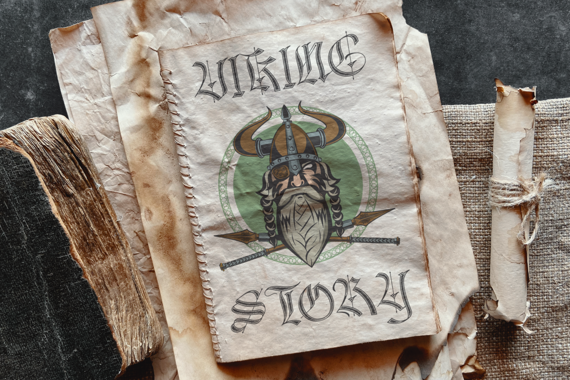
Its primary strength is visual drama, though it can be hard to read in long titles or on small covers. Use it in moderation, ideally for the book title or initials, and support it with simpler fonts for balance.
Science fiction and tech thrillers need fonts that feel advanced yet grounded. Tectron Modern fits that mold with its bold geometry and subtle cyber influence. It’s sharp without being overly stylized, giving it wider versatility in tech, nonfiction, or sci-fi thrillers.
However, its structured formality may not suit genres that call for softness or organic flow. For tech-savvy authors or content focused on digital culture, it’s a standout choice.
Florals don’t always mean soft and Rumble Thorns proves it. This cactus-style font feels organic, spiky, and unexpected. It works beautifully for magical realism, nature-driven fantasy, or desert-themed fiction.
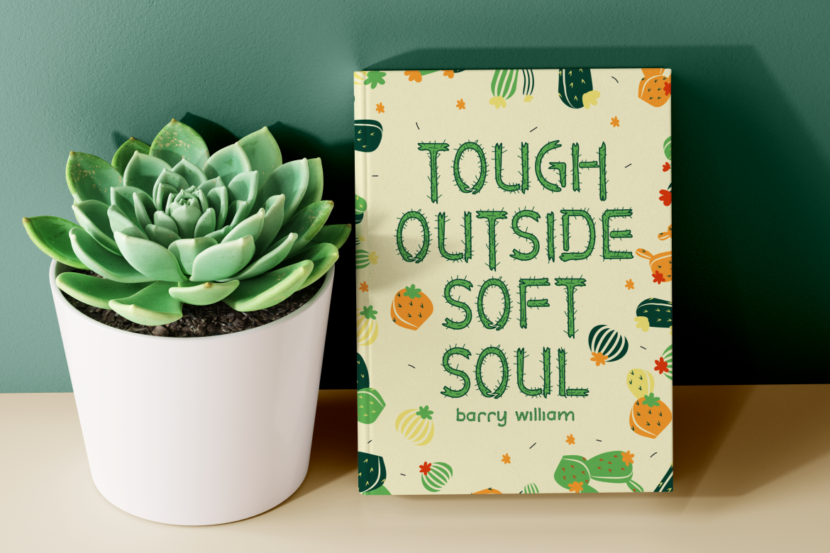
Its uniqueness is both a strength and a limitation. In the wrong context, it may feel out of place but used thoughtfully, it creates a memorable visual identity that sticks.
Sometimes you just need a solid serif and Firanza delivers. It’s crisp, classic, and clear ideal for nonfiction, biographies, and historical fiction. It’s one of the best fonts for book covers in traditional publishing because it doesn’t distract from the content.
Its weakness is that it can feel a bit too conventional if the rest of your design doesn’t elevate it. But when paired with strong layout and color, Firanza shines as a professional, timeless option.
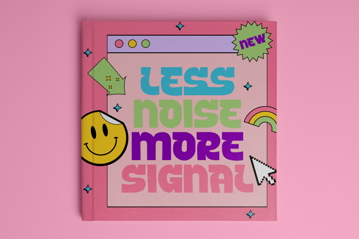
Last on the list is Typo Tingle, a wild, uneven font that dances across the page. This typeface is perfect for humor, satire, zines, or any book that doesn’t take itself too seriously. It attracts attention and conveys fun with every letter.
Its chaotic rhythm, however, may challenge readability for longer titles. Keep it for punchy one-word names or subtext that supports a bold visual direction.
Selecting the best fonts for book covers isn’t just about style it’s about intention. Each genre demands its own mood and message, and the right font enhances the reader’s first impression. Whether you’re self-publishing or working with a design team, font choice is your silent spokesperson on the shelf.
From the sharp edges of Spooky Punk to the high-end polish of Final Parade, each of these fonts offers an opportunity to tell your story before a reader opens the book.
Explore all the featured fonts at Putracetol Studio, and take your cover from average to exceptional. With the right typography, your book won’t just be read it’ll be remembered.
Thank you for taking the time to read this article. If you are looking for more great articles, feel free to visit Putracetol Blog
Additionally, if you want to explore some free typography options, you can check out Putracetol Studio on Dafont. Happy reading and designing!
