
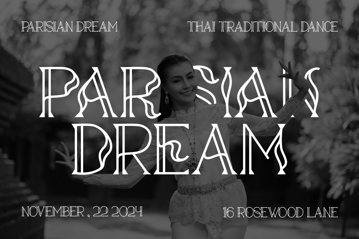
In the fast-paced world of digital design, choosing the best font pairings is essential to communicate clearly and impactfully. A great combination balances personality and readability, ensures flexibility for motion, and aligns with branding. Whether you’re creating animated social media ads, website headlines, or video title sequences, knowing how fonts work together elevates your visuals and keeps your message sharp.

Good font pairings combine contrast and unity. Use a bold, character-rich font for headlines and a cleaner, simpler companion for body text. For instance, pairing Luxerna Display a strong, elegant display type with Vanetta, a neutral sans serif, gives clear hierarchy. Luxerna makes titles feel upscale, while Vanetta supports legibility in descriptions. However, Luxerna’s bold shapes may overpower small motion layouts, and Vanetta might feel plain in expressive designs, so balance through scale and placement.


When you need personality, consider a dynamic display like Honey Berry, with rounded, playful terminals that feel warm and approachable. Pair it with Vanetta or a neutral sans serif for descriptions. Honey Berry conveys friendliness in headers but can reduce clarity at small sizes or long copy. The pairing creates visual contrast and a lively tone great for informal brands and social posts.
If your design needs a refined, polished look, combine a script or refined serif with a neutral sans serif. Using Gilded Glint, with its elegant swashes, as a header adds sophistication, while Vanetta keeps the body clean and readable. Gilded Glint adds luxury but can clutter small layouts or motion effects use it sparingly for impact.

For bold, tech-forward visuals, use a sharp display font like De Rolande for headers and Vanetta or Luxerna for text. De Rolande’s thin lines add modern elegance, but its narrow letterforms limit readability in motion. Still, its contrast with a heavyweight serif makes a striking combination in tech ads, app interfaces, and editorial layouts.

If your work is fun and animated like explainer videos, event invites, or motion storytelling combine playful headers with a sane body font. A curved, friendly display like Honey Berry or a funky brush type like Silky Candy can pop in motion sequences. Silky Candy mimics handwritten notes for charm but loses clarity if overused. Follow with Vanetta or Luxerna for descriptions. This keeps energy high without sacrificing readability.
When fonts animate, ensure they remain legible in motion. Thin strokes, like in De Rolande may disappear under blur or fast transitions, while decorative edges like those in Luxerna or Honey Berry can break under compression. For best results, keep descriptive text on screen longer, use larger sizes, and test contrast across devices. Strong font pairings require strong motion design, so test pacing and weight together.
Each combination uses contrast thick vs thin, curved vs straight lines making visuals dynamic and accessible. By choosing fonts that complement each other, you ensure your message shines across static and animated formats.
Thank you for taking the time to read this article. If you are looking for more great articles, feel free to visit Putracetol Blog
Additionally, if you want to explore some free typography options, you can check out Putracetol Studio on Dafont. Happy reading and designing!
